
Display & flex
Use display and flex utilities for responsive layouts, alignment, and spacing.
Display utilities
Section titled “Display utilities”Flexbox utilities control alignment, wrapping, and ordering. Display is a shared group used across many Bootstrap components so you can hide/show elements per breakpoint and control display mode.
Card example
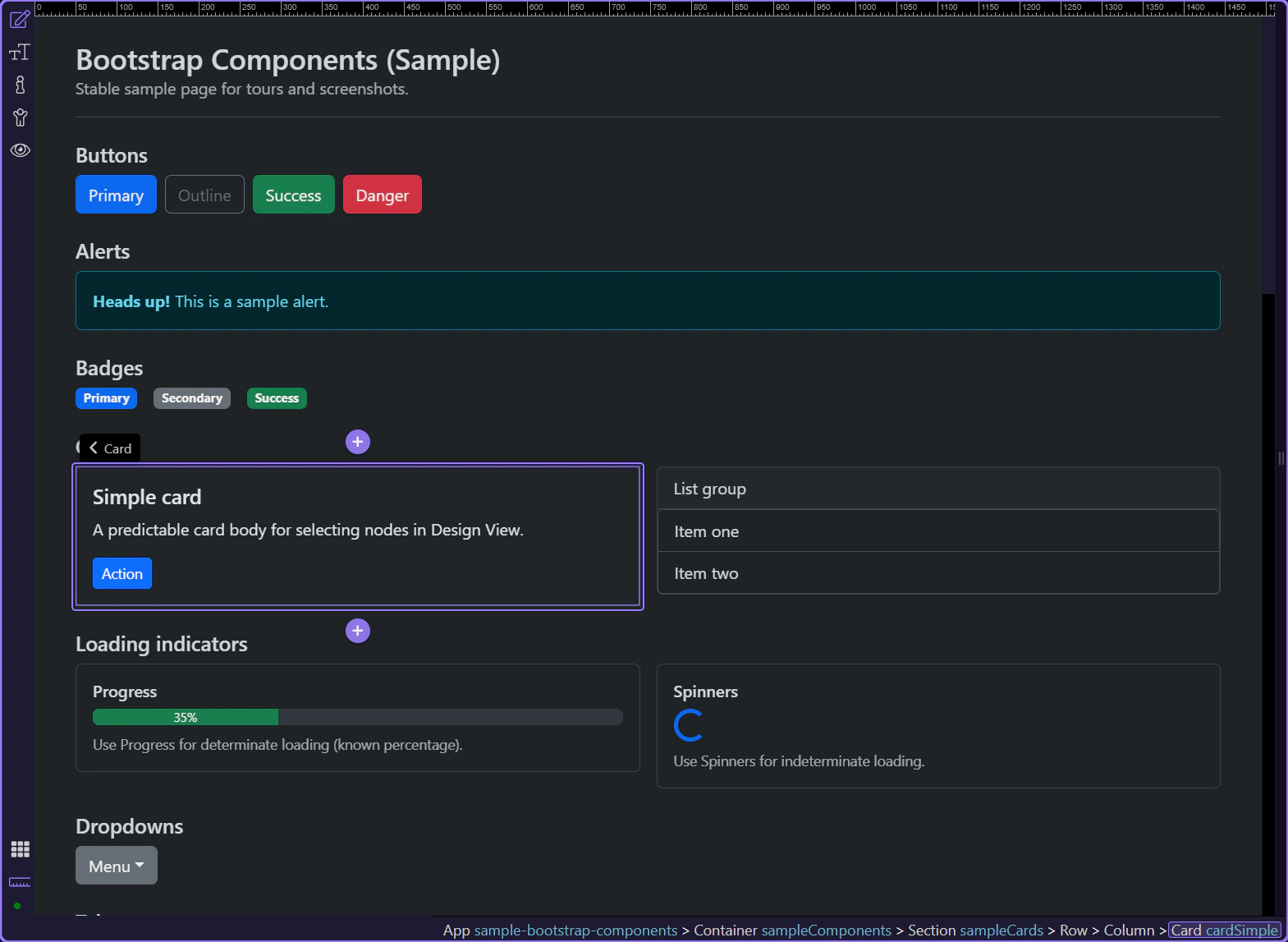
Section titled “Card example”Cards are a practical example for Display utilities because they appear across many pages and are often shown/hidden at different breakpoints. The card is selected so Display options are visible in Properties.
Hide on breakpoints
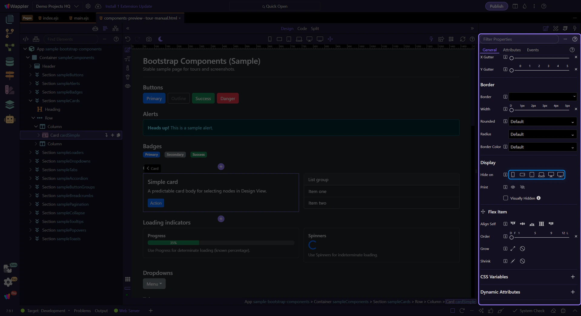
Section titled “Hide on breakpoints”Use Display → Hide on to hide an element on specific device sizes. This produces Bootstrap d-*-none classes.
Flex Item utilities
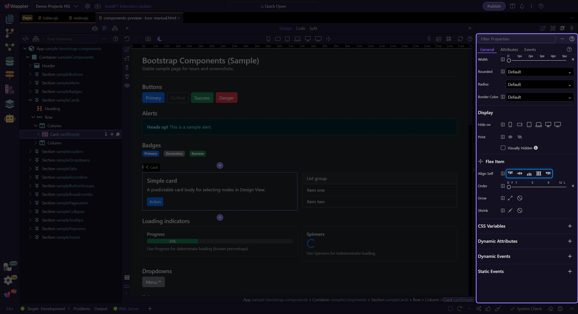
Section titled “Flex Item utilities”When an element sits inside a flex container, the Flex Item group lets you control alignment and ordering.
Align self
Section titled “Align self”Use Flex Item → Align Self to override cross-axis alignment for this one item.
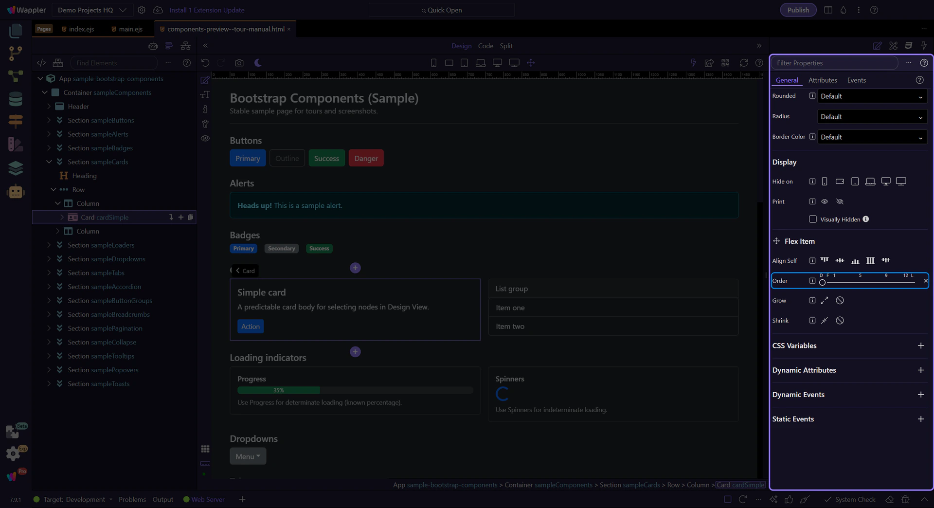
Use Order to reorder items without changing your HTML structure.
Next steps
Section titled “Next steps”That’s the core set of shared utilities. Next, revisit the Utilities menu or continue with a components tour.