
Spacing (margin & padding)
Use Bootstrap spacing utilities (margin/padding) to tune layout quickly and consistently.
Spacing utilities
Section titled “Spacing utilities”Spacing utilities control layout rhythm and breathing room. Learn it once and you’ll reuse it on cards, buttons, layout containers, and more.
Card example
Section titled “Card example”Spacing utilities are easiest to learn on a simple component like a card, because the padding/margins are immediately visible.
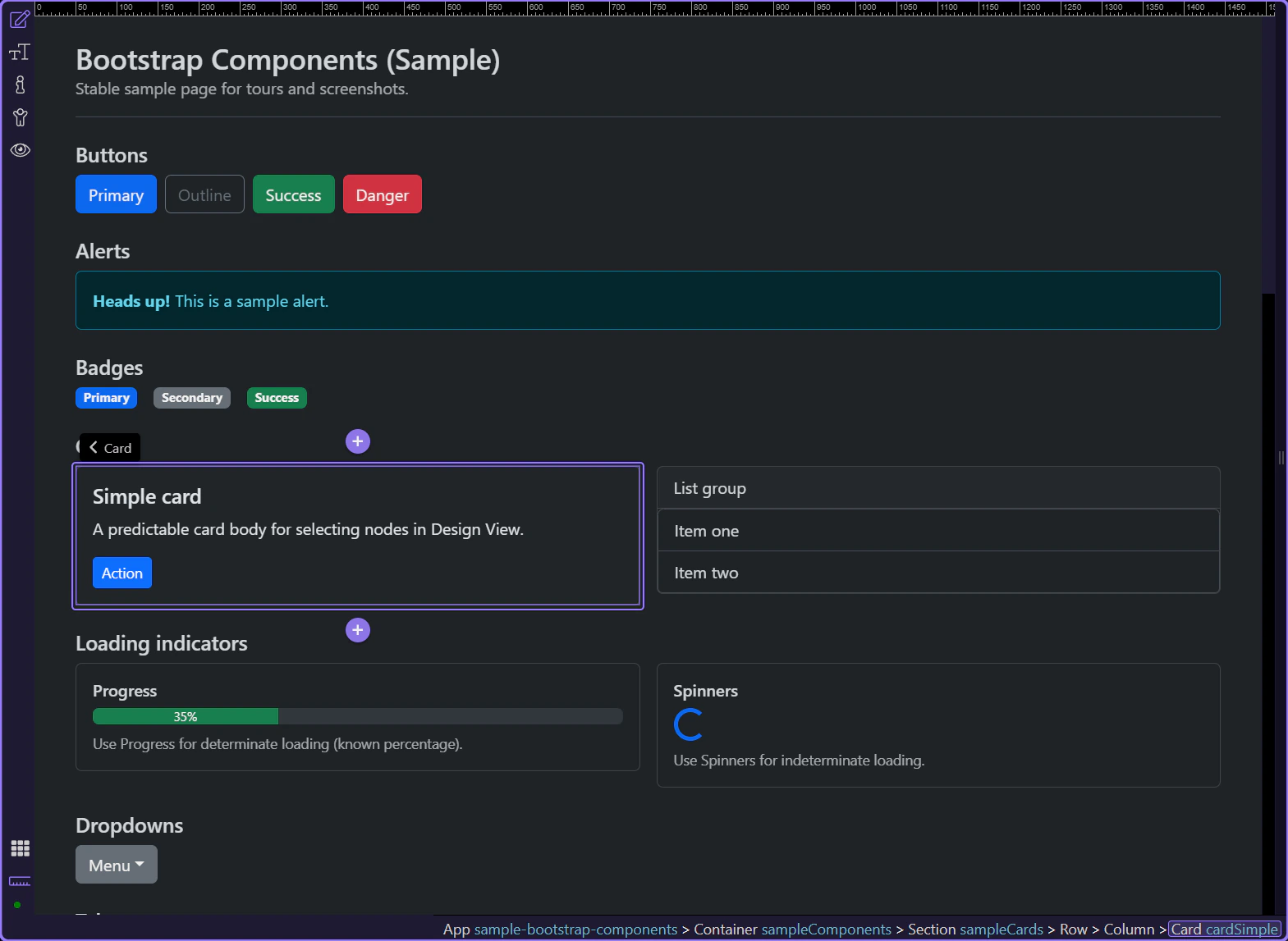
Spacing: Margin & Padding
Section titled “Spacing: Margin & Padding”Use Spacing → Margin & Padding to apply Bootstrap spacing classes. This is responsive-aware: when you’re editing a specific device width, Wappler can store the correct breakpoint variant.
tip: This is the same concept as Bootstrap’s spacing utilities (m*, p*, mt-, px-, etc.), surfaced as a single control in Properties.

Next steps
Section titled “Next steps”Spacing is a core utility group. Next, learn colors/backgrounds and display/flex.