
Mobile project
Creates an app-ready project with web assets under www.
Create a Bootstrap 5 Mobile project and organize its App Connect routes, layouts, content pages, navigation, data, and responsive device workflow.
Use Bootstrap 5 when you want its responsive grid, utilities, forms, navigation, and component model in an installable mobile app. The project type must be Mobile: it supplies the Capacitor runtime and app publishing workflow, while Bootstrap 5 supplies the visible interface and App Connect supplies routing, data, events, and state.
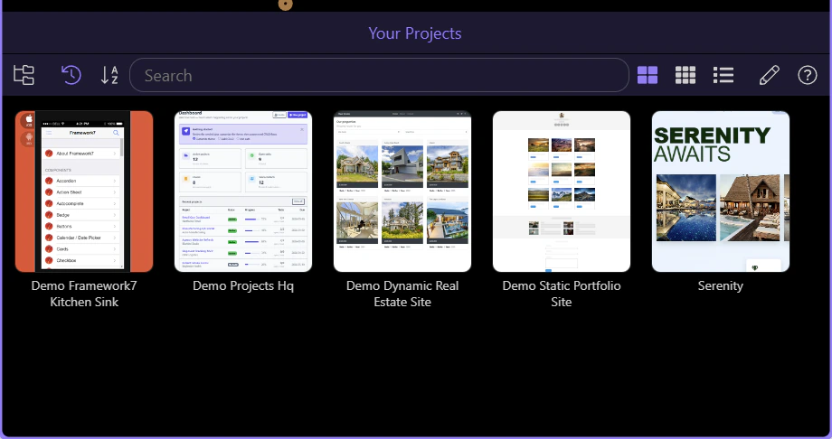
New Project opens the template catalog. Wappler then selects the Mobile category so the catalog exposes the supported app starters, Capacitor runtime, platform controls, and mobile settings that a normal Web project does not provide.

Bootstrap Blank is the focused Bootstrap 5 mobile starter. It includes App Connect routing, a main app shell, and a clean place to add routed content without inheriting a large sample application.
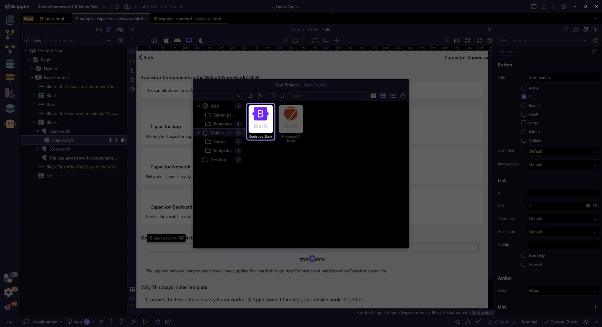
Give the project a unique name and empty folder, keep Capacitor as the runtime, keep Bootstrap 5 as the design framework, and use App Connect routing. Review the app file, style and asset paths, app title, application ID, version, author, icons, and Android/iOS settings before creating native platforms.
| Area | Choice | Why it matters |
|---|---|---|
| Project | Mobile → Bootstrap Blank | Creates the supported Bootstrap 5 app structure |
| Runtime | Capacitor | Provides Android, iOS, web, and app publishing controls |
| Routing | App Connect | Connects route definitions to content pages |
| Identity | Title, ID, version, author | Feeds native package and release metadata |
| Assets | App file, styles, icons | Keeps startup and branding paths deliberate |
The main index page is the persistent shell: place global navigation, app-level data, shared modals, and the routed view there. Build each screen as a content page. Register its URL and content-page path in the routes file, then navigate with route-aware internal links. This keeps screen changes fast and avoids duplicating the app chrome.
| Layer | Owns | Typical content |
|---|---|---|
| Main shell | Persistent application frame | Navbar, offcanvas menu, footer, app data, routed view |
| Content page | One routed screen | Containers, rows, cards, forms, lists, screen-specific data |
| Route definition | URL-to-page mapping | Path, content page, parameters, transition behavior |
| Internal link | Navigation intent | Static or dynamic route URL |
Define meaningful routes such as /products/:id, bind links to each record’s ID, read the route parameter on the destination screen, and use it as the input for the page’s data request. Include loading, empty, error, offline, and ready states so navigation never lands on an unexplained blank screen.
Use Bootstrap containers, grid breakpoints, utilities, navbars, offcanvas navigation, forms, modals, and cards to make every screen work from narrow phones through tablets. Preview responsive states in Wappler, then build and run the Mobile project on Android and iOS targets to verify safe areas, keyboard behavior, scrolling, permissions, connectivity changes, and hardware back behavior.
IMPORTANT: Browser preview proves the responsive web layer. A device or simulator run proves the native container, permissions, lifecycle, and platform-specific behavior.
The same Bootstrap 5 and App Connect skills transfer to desktop apps. For mobile delivery, continue with the Capacitor setup tour before adding native plugins.