
Framework7 Components in Wappler
Use the current Framework7 8 component catalog in a Wappler mobile project, from insertion and nesting to properties, events, and live interaction.
Framework7 components require a Framework7 Mobile project
Section titled “Framework7 components require a Framework7 Mobile project”This workflow assumes the open project is a Mobile project using Framework7 8. The demo provides a complete catalog and a curated showcase, so you can learn both the component families and the Wappler insertion/configuration pattern without building an empty shell first.
Open a current Framework7 component showcase
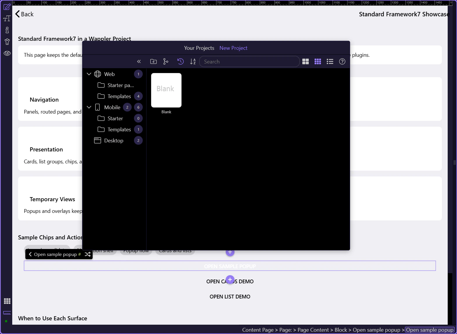
Section titled “Open a current Framework7 component showcase”The standard showcase combines cards, a responsive Framework7 grid, chips, buttons, a popup, lists, accordions, navbar navigation, and routed links on one real content page.
Choose a component family by the interaction you need
Section titled “Choose a component family by the interaction you need”Framework7 has a broad catalog. Start with the interaction and information hierarchy, then choose the component. This prevents every mobile screen from becoming an undifferentiated stack of blocks and buttons.
| Family | Current examples | Use it for |
|---|---|---|
| App shell | App, View, Page, Navbar, Toolbar, Panel | Navigation ownership and persistent app structure |
| Content | Block, Card, List, Media List, Timeline, Treeview | Readable information hierarchy and repeated records |
| Input | Inputs, Checkbox, Radio, Range, Stepper, Toggle, Smart Select | Forms and compact mobile controls |
| Navigation | Links List, Tabs, Routable Tabs, Breadcrumbs, Subnavbar | Moving between pages, sections, and modes |
| Temporary UI | Action Sheet, Dialog, Popup, Popover, Sheet Modal, Toast | Focused choices, confirmations, and short-lived tasks |
| Data-heavy | Data Table, Virtual List, Infinite Scroll, Pull To Refresh | Large or progressively loaded collections |
| Media and feedback | Photo Browser, Swiper, Gauge, Charts, Progressbar, Skeleton, Preloader | Visual content, progress, loading, and status |
Insert from Structure or the Components picker
Section titled “Insert from Structure or the Components picker”Select the intended parent in Structure, open Insert Child, then search the Components picker. Wappler filters and organizes entries through the Framework7 rules, so parent selection matters. Page Content accepts normal visible content; special components such as Action Sheet groups or list items have their own allowed-child structure.
TIP: When an item is unavailable, first check the selected parent. Framework7 nesting rules usually explain why the component cannot be inserted at that location.
Cards organize short, independent stories
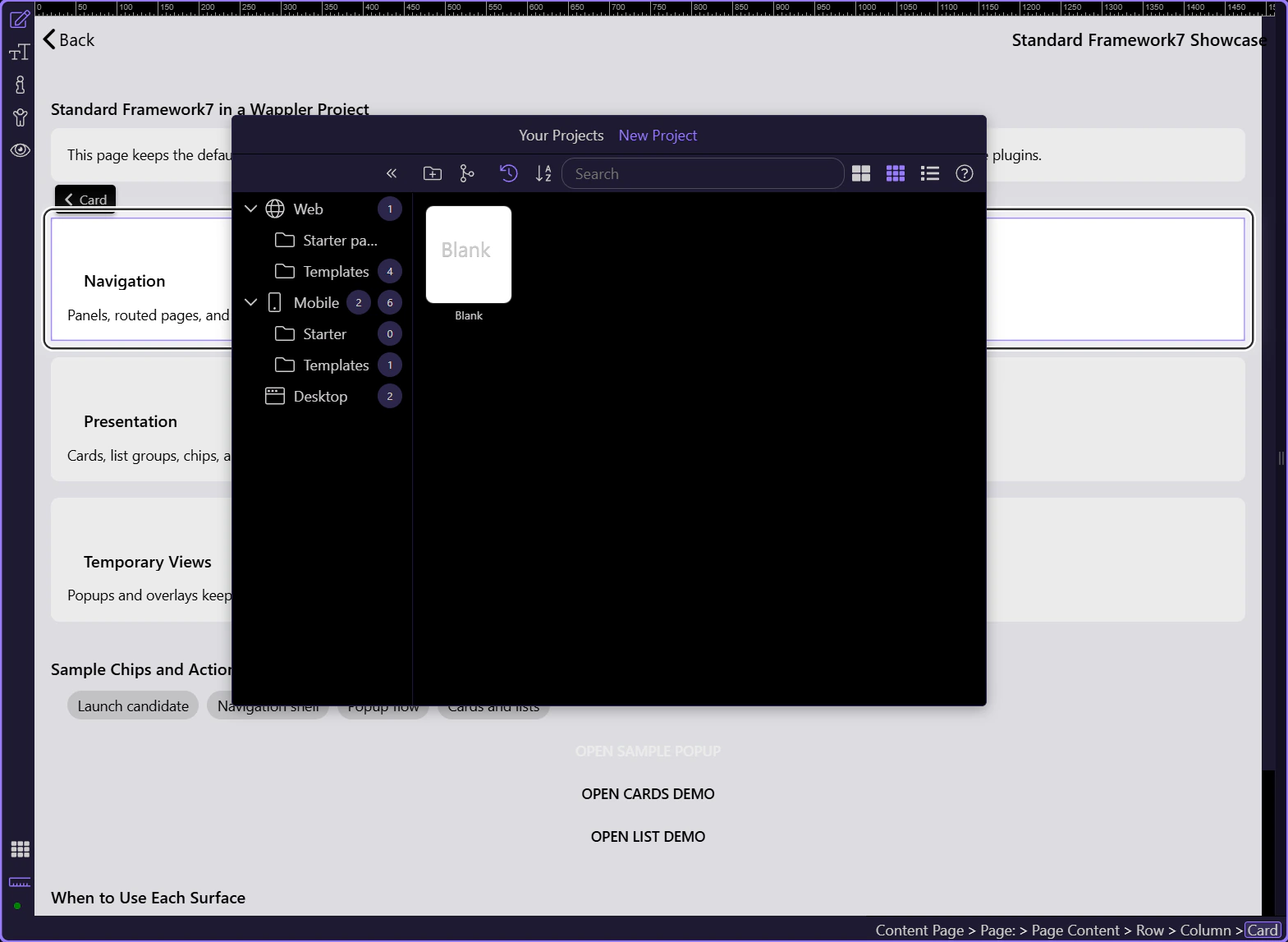
Section titled “Cards organize short, independent stories”The showcase uses cards inside a Framework7 row. Select a real card and inspect its content, padding, responsive column, and surrounding page hierarchy. Cards work best when each one represents a self-contained task, metric, or summary.
Temporary views need both content and a trigger
Section titled “Temporary views need both content and a trigger”A popup, sheet, panel, popover, or action sheet is a component plus the control that opens it. Keep IDs/classes and trigger settings aligned, close the surface explicitly, and avoid hiding critical navigation inside a temporary layer.
| Surface | Best use | Trigger pattern |
|---|---|---|
| Dialog | Short confirmations or input | Framework7 dialog action |
| Action Sheet | A small set of mobile choices | Action Sheet open action or linked trigger |
| Popup | Focused multi-element task | popup-open linked to the popup selector |
| Sheet Modal | Bottom-docked supporting task | sheet-open linked to the sheet selector |
| Panel | Secondary navigation or tools | panel-open linked to left/right panel |
| Toast | Non-blocking status feedback | Framework7 toast action |
Inspect the real popup trigger and target wiring
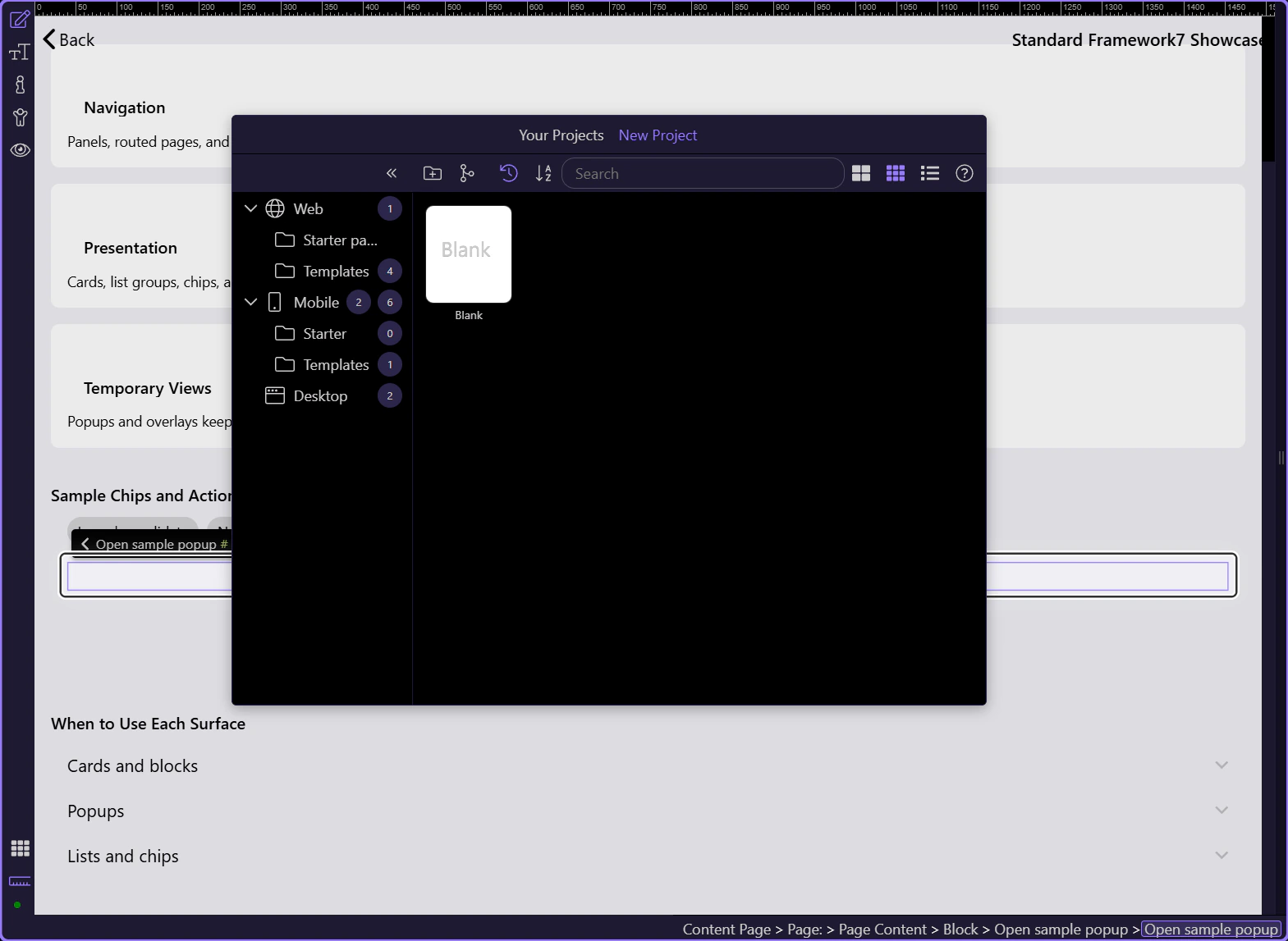
Section titled “Inspect the real popup trigger and target wiring”The tour selects the showcase trigger so you can inspect its popup-open class and data-popup target together with the matching Popup and popup-close control in Structure. Design View keeps runtime overlays unmounted; use Preview or the installed app to execute the open and close path with the Framework7 runtime active.
Properties define the component; App Connect makes it dynamic
Section titled “Properties define the component; App Connect makes it dynamic”Use Properties for the component’s Framework7-specific configuration. Use Dynamic Attributes for bound text, classes, values, visibility, and repeat data. Use Dynamic Events or Flow actions for clicks, lifecycle events, opening/closing surfaces, navigation, server calls, and device operations.
Validate responsive layout and native behavior separately
Section titled “Validate responsive layout and native behavior separately”Use Framework7 columns and breakpoints to make tablet and larger layouts intentional, then test touch targets, safe areas, keyboard behavior, overlays, and device-specific rendering on the actual Capacitor platforms you support.
IMPORTANT: Do not treat a desktop-sized Design View as the only mobile test. Validate small screens, rotation where supported, safe-area insets, and the target platform theme.
Next: routed dynamic pages
Section titled “Next: routed dynamic pages”Now connect the components to real records and route parameters. The next tour builds the list-to-detail pattern for Framework7 content pages.