Bootstrap Cards
About A card is a flexible and extensible content container. It includes options for headers and footers, a wide variety of content, contextual background colors, and powerful display options. Cards a
A card is a flexible and extensible content container. It includes options for headers and footers, a wide variety of content, contextual background colors, and powerful display options.
Cards are built with as little markup and styles as possible, but still manage to deliver a ton of control and customization. Built with flexbox, they offer easy alignment and mix well with other Bootstrap components. They have no margin by default, so use spacing utilities as needed.
Example
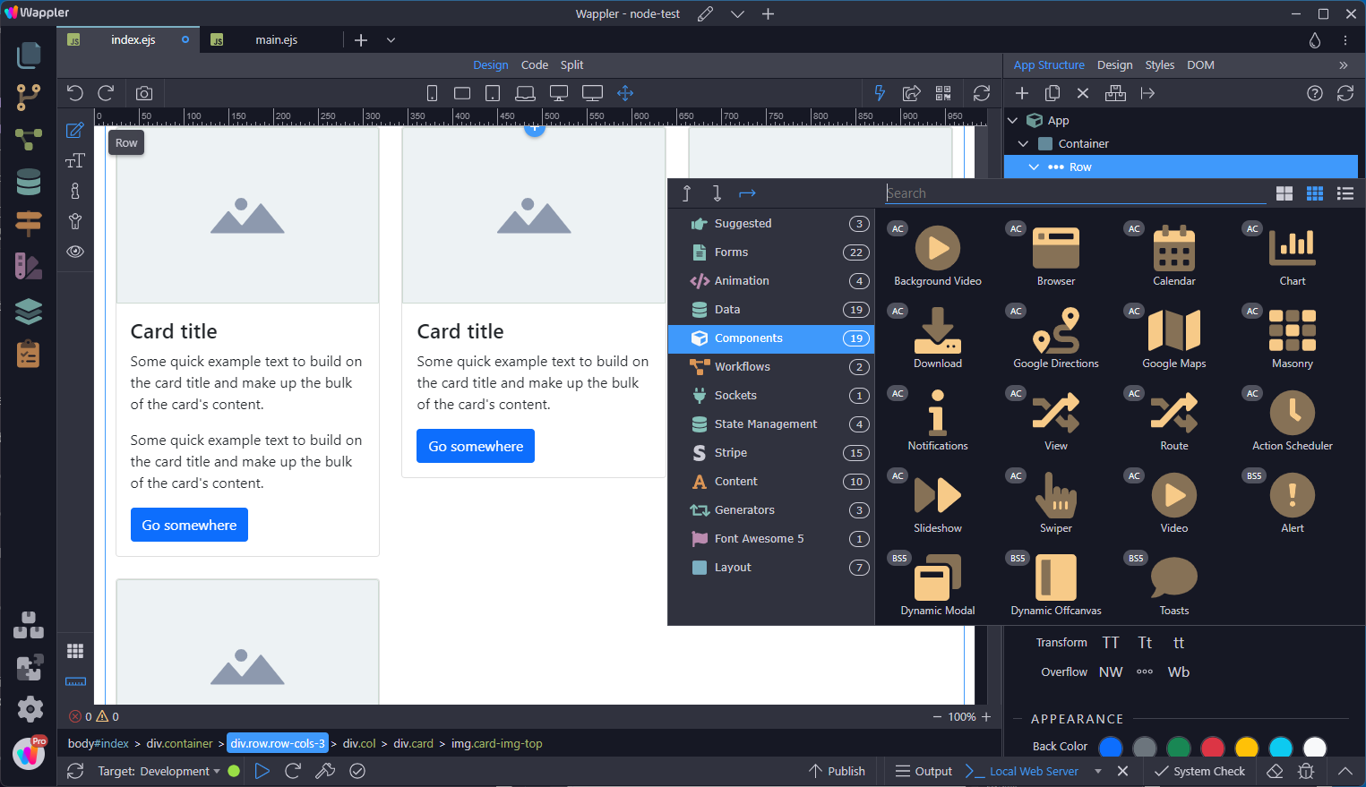
Section titled “Example”Below is an example of a basic card with mixed content. Cards have no fixed width to start, so they’ll naturally fill the full width of its parent element. This is easily customized with our various sizing options.
Adding a Card
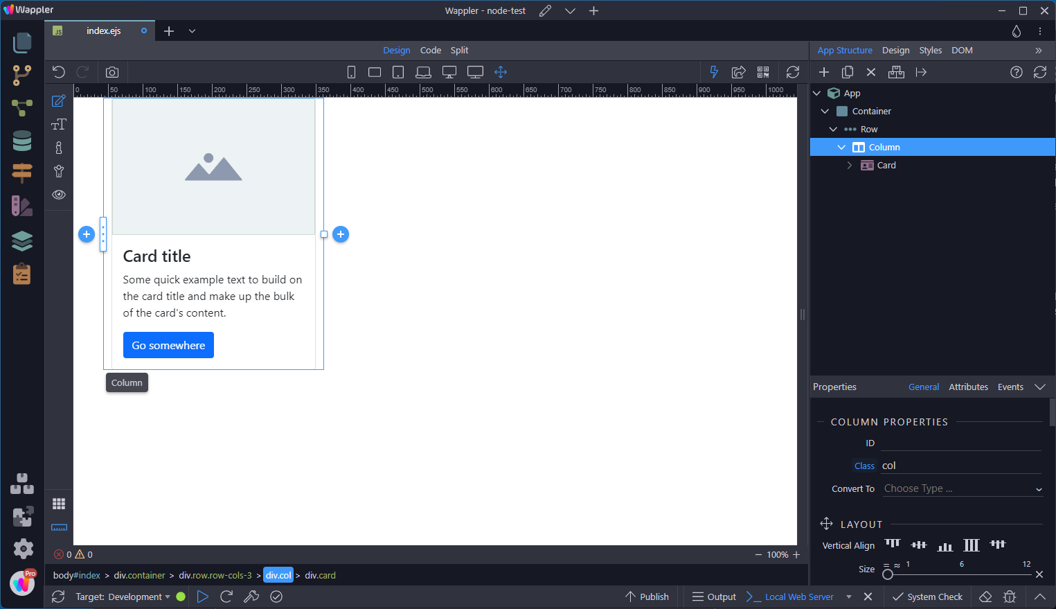
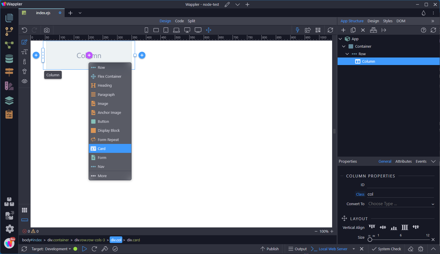
Section titled “Adding a Card”With an empty column, click on the add sign inside the column. This opens a context menu where the card can be selected. The result is as in the example shown above.
Content Types
Section titled “Content Types”Cards support a wide variety of content, including images, text, list groups, links, and more. Below are examples of what’s supported.
The building block of a card is the .card-body . Use it whenever you need a padded section within a card.

Titles
Section titled “Titles”Card titles are used by adding .card-title to a <h*> Heading tag.

Body text is added using the <p> Paragraph tag.
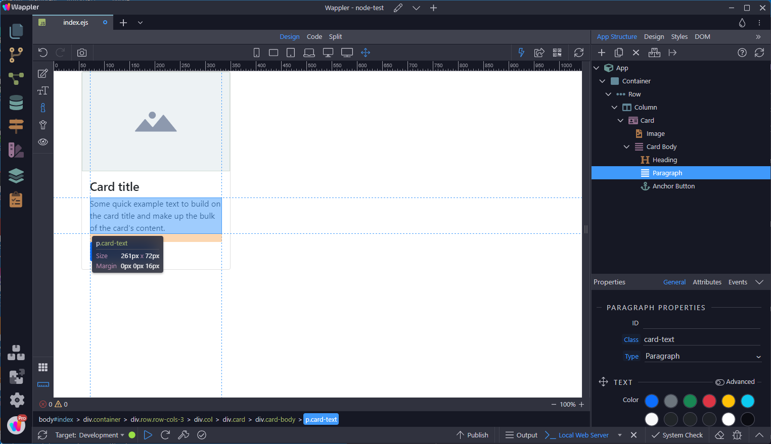
In this case, an Anchor Button was added to add a link.
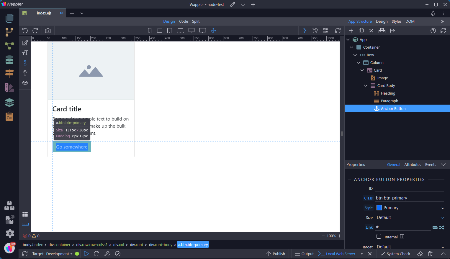
Normal links can be added by selecting Card Link.
Section titled “Normal links can be added by selecting Card Link.”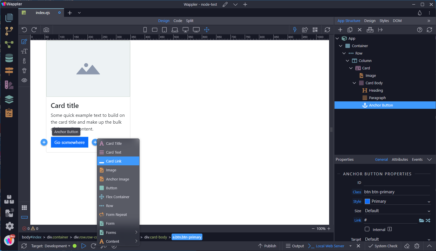
Stretched Link
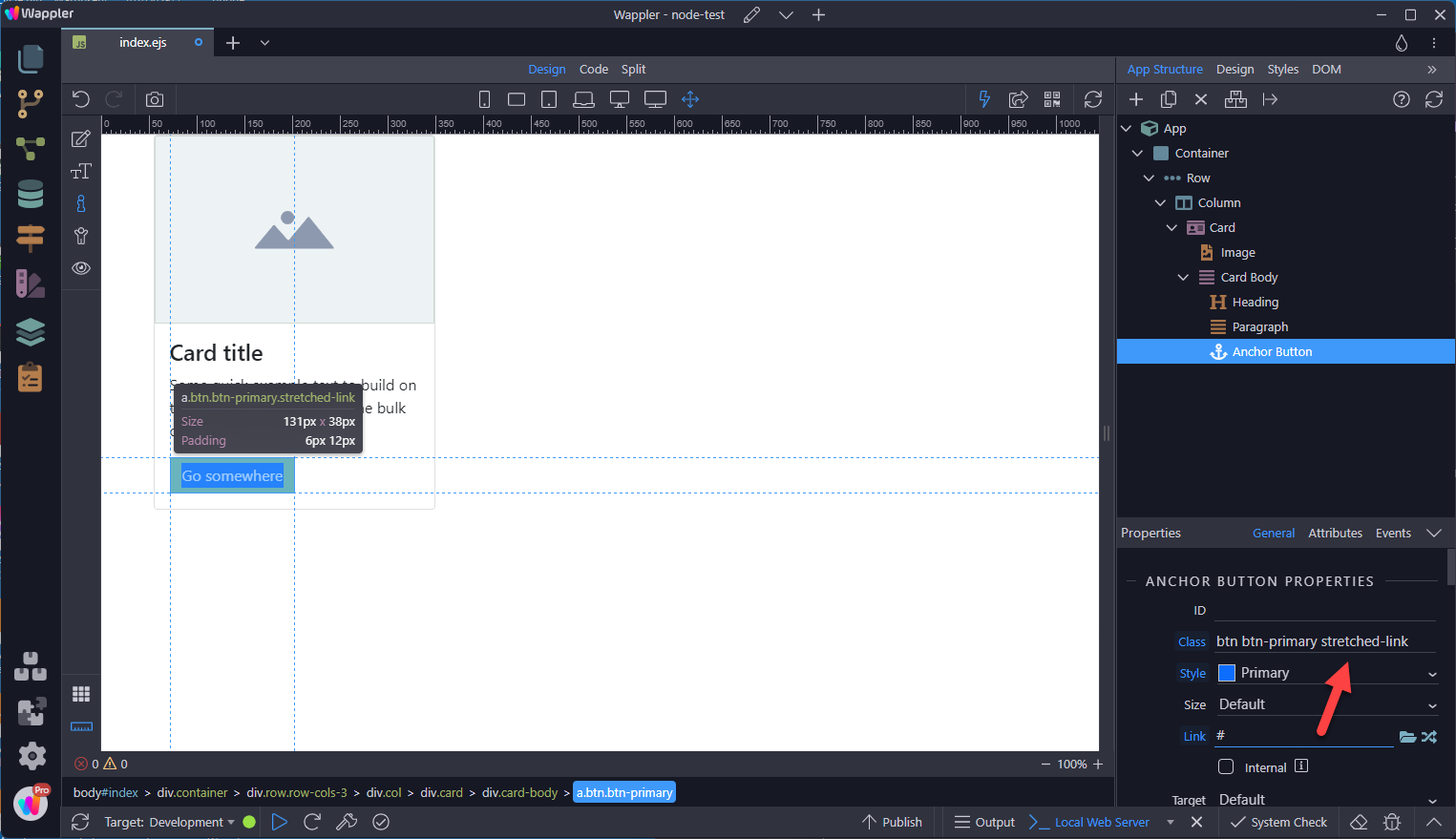
Section titled “Stretched Link”If you want the whole card to be clickable as a link, then you can use .stretched-link
Images
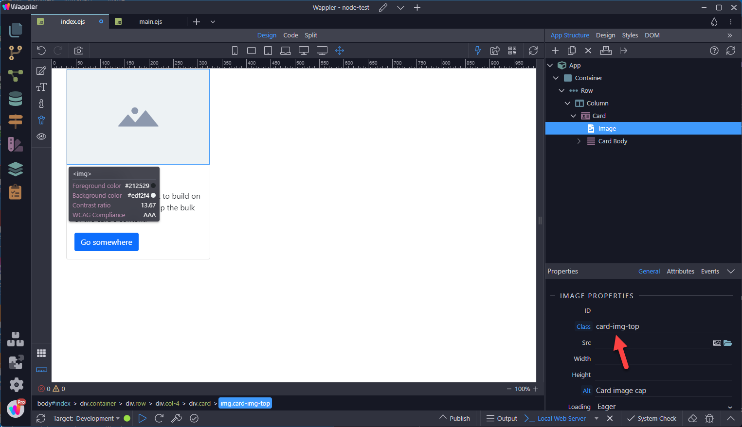
Section titled “Images”.card-img-top places an image to the top of the card.

List Groups
Section titled “List Groups”Create lists of content in a card with a flush list group.

This results in
Section titled “This results in”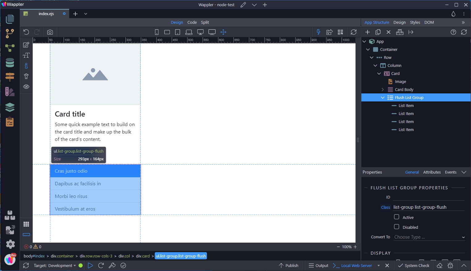
A variant is to delete all of the other content, leaving the List Group as a card.
Section titled “A variant is to delete all of the other content, leaving the List Group as a card.”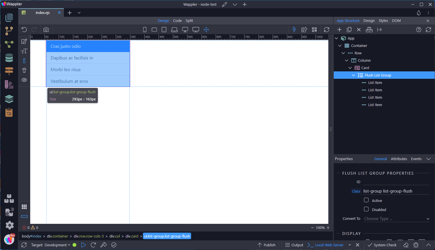
Header
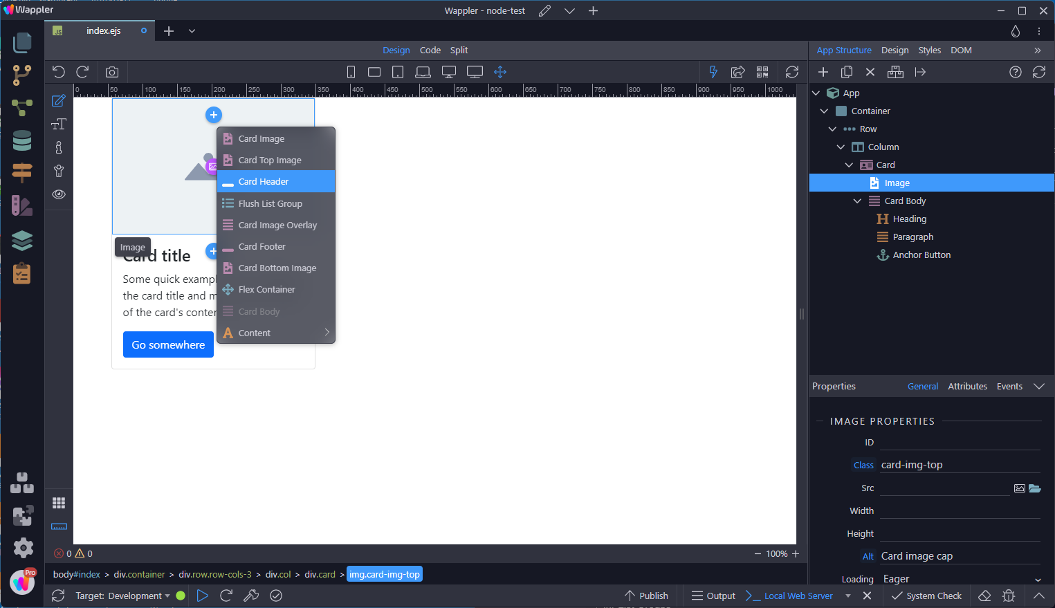
Section titled “Header”Add a Card Header before the Top Image
This results in
Section titled “This results in”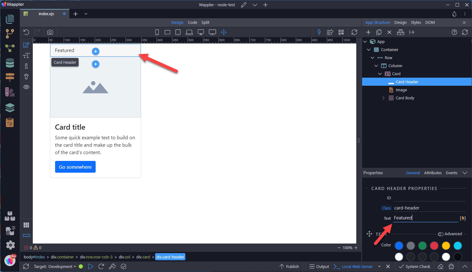
Card headers can be styled by adding an .h* class and coloring.
Section titled “Card headers can be styled by adding an .h* class and coloring.”
Footer
Section titled “Footer”Footers are added after the Card Body
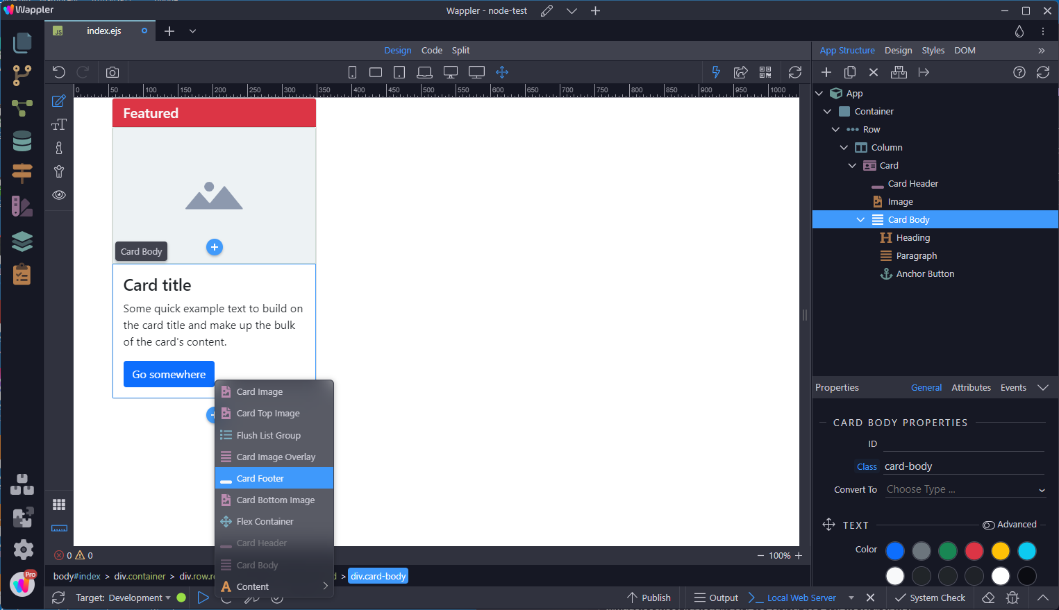
This results in. - Note: The footer can be styled in a similar manner to the Header.
Section titled “This results in. - Note: The footer can be styled in a similar manner to the Header.”
Sizing
Section titled “Sizing”Cards assume no specific width to start, so they’ll be 100% wide unless otherwise stated. You can change this as needed with custom CSS, grid classes or utilities.
Using Grid Markup
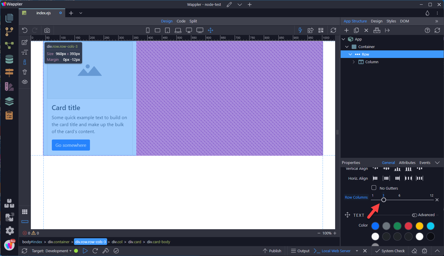
Section titled “Using Grid Markup”Grid Markup uses two different methods to size the columns
- Column level
- Row level
Each of these levels requires that you start with the mobile view. For more info, see the documentation on Bootstrap Layout Basics.
Column Level
Section titled “Column Level”Set the size of the column in the layout section as in

Row Level
Section titled “Row Level”Set the number of columns per row as in
Using Utilities
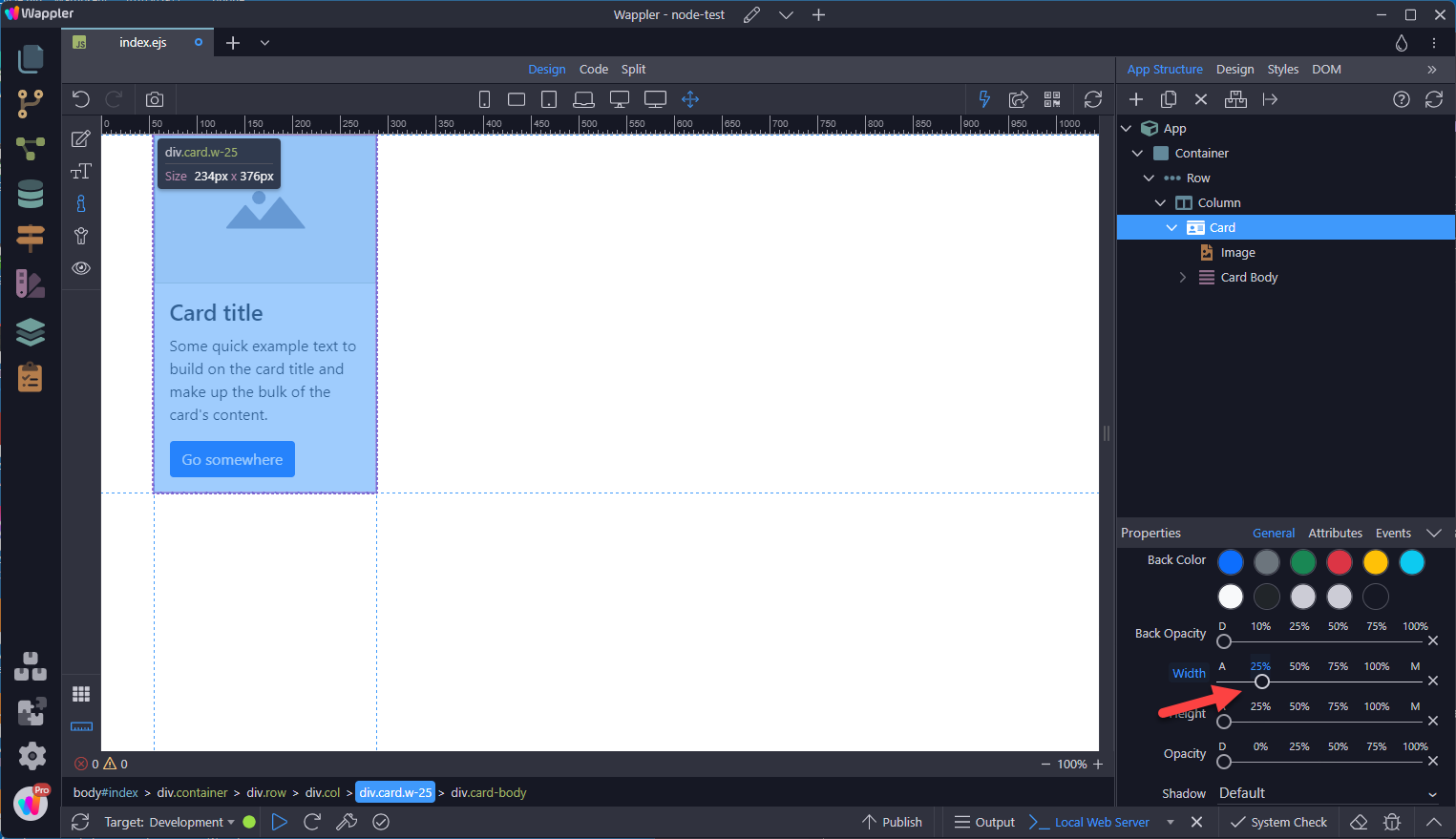
Section titled “Using Utilities”Use our handful of available sizing utilities to quickly set a card’s width.

Using Custom CSS
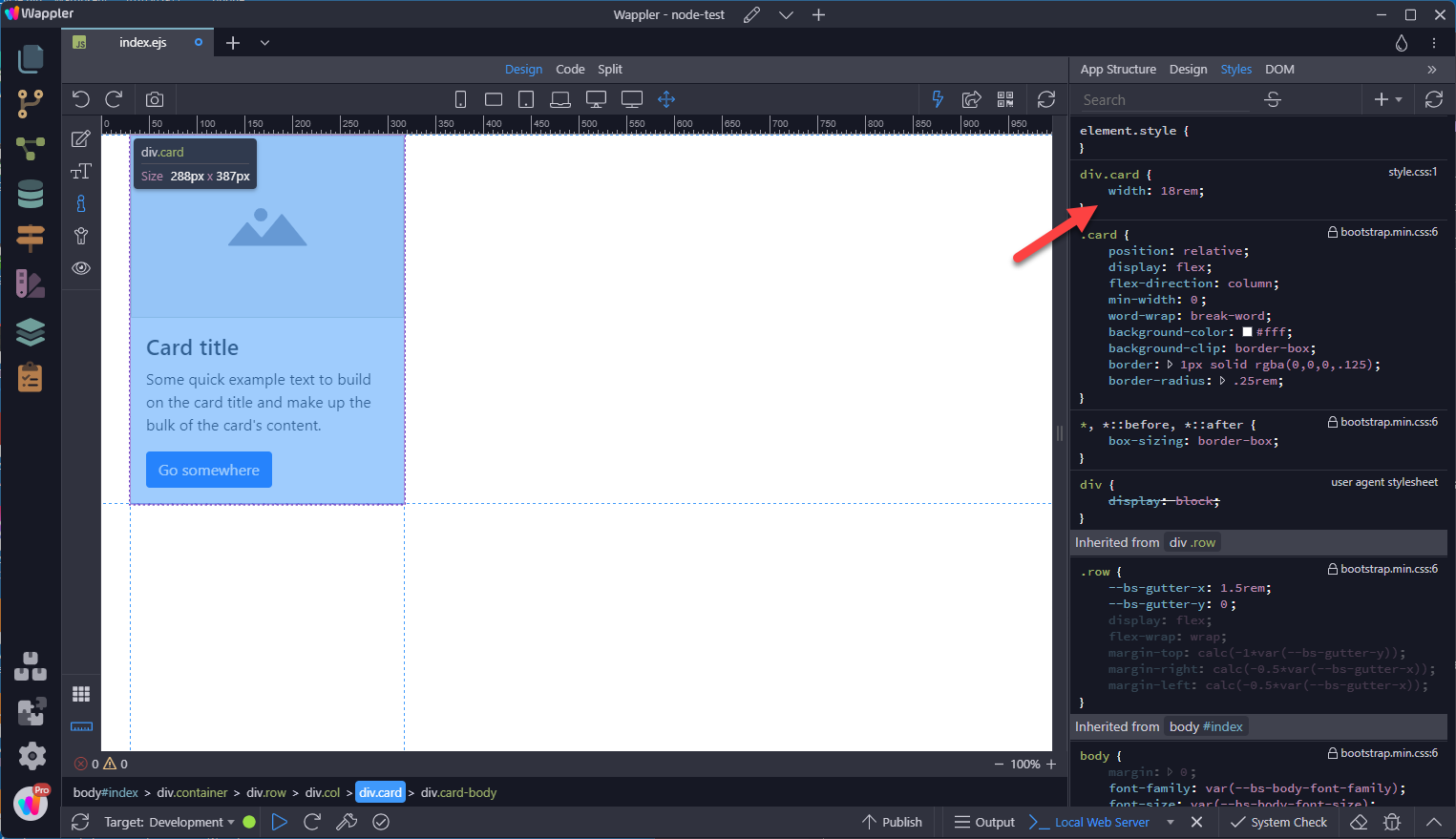
Section titled “Using Custom CSS”In the Styles panel, add the width style rule for the Card as in
Sizing the Height
Section titled “Sizing the Height”In some instances, you may want the cards to be the same height despite the amount of content in the Card Body.

This is done by setting the card height to 100% as in
Section titled “This is done by setting the card height to 100% as in”
Text Alignment
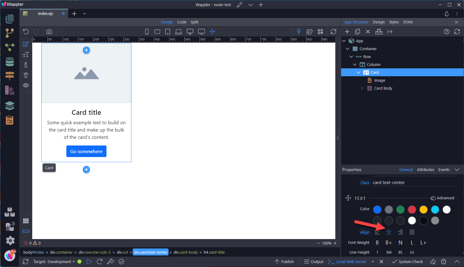
Section titled “Text Alignment”You can quickly change the text alignment of any card—in its entirety or specific parts—with our text align classes.
Card Level
Section titled “Card Level”Select the card and choose the required alignment.
Element Level
Section titled “Element Level”Select the element and choose the required alignment.
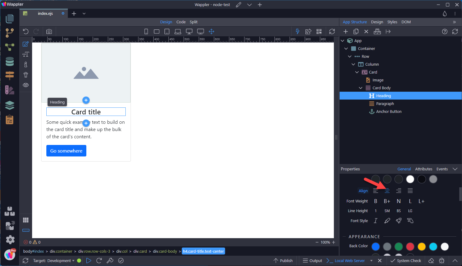
Image Options
Section titled “Image Options”Cards include a few options for working with images. Choose from appending “image caps” at either end of a card, overlaying images with card content, or simply embedding the image in a card.
Image Caps
Section titled “Image Caps”Similar to headers and footers, cards can include top and bottom “image caps”—images at the top or bottom of a card.
Our example card has a top image
To add a bottom image, select the Card Body, click on the add-after-button and choose Card Bottom Image.
Section titled “To add a bottom image, select the Card Body, click on the add-after-button and choose Card Bottom Image.”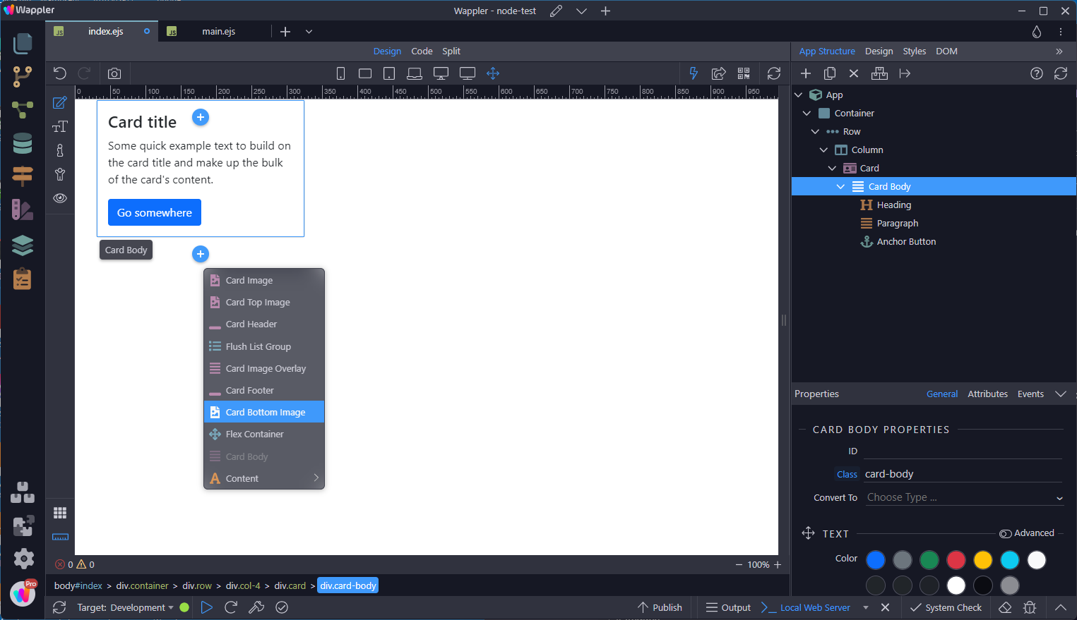
This adds the image at the bottom.
Section titled “This adds the image at the bottom.”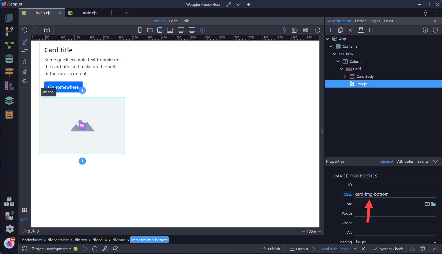
Image Overlays
Section titled “Image Overlays”Turn an image into a card background and overlay your card’s text. Depending on the image, you may or may not need additional styles or utilities.
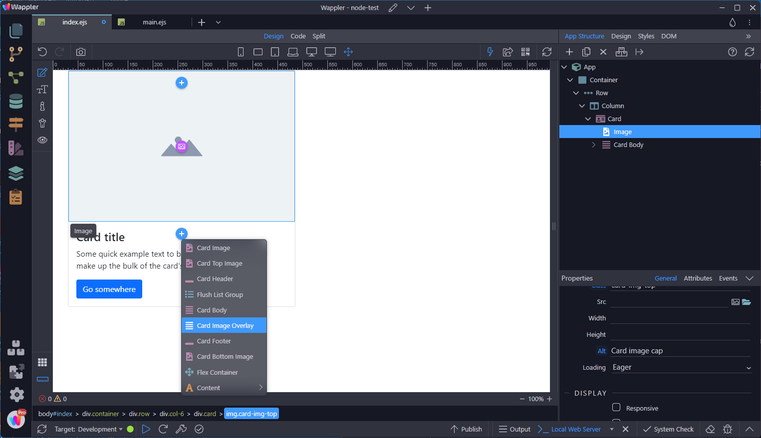
To add an Image Overlay, select the image and click on the add-after-button. In the context menu, choose Card Image Overlay
Inside the Card Image Overlay, add the required elements
Section titled “Inside the Card Image Overlay, add the required elements”
This shows the addition of a Card Title and Card Text,
Section titled “This shows the addition of a Card Title and Card Text,”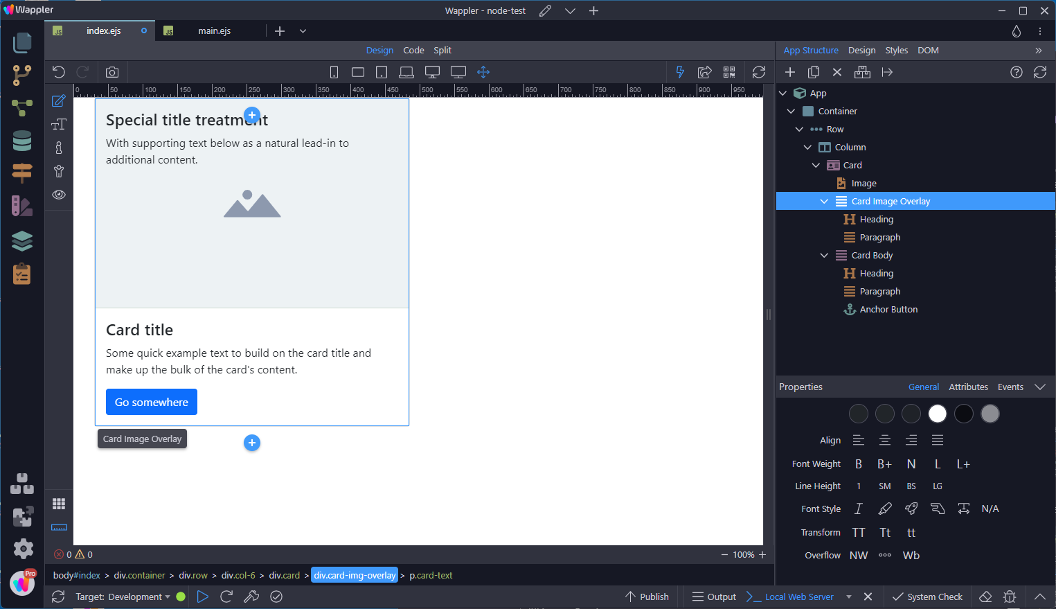
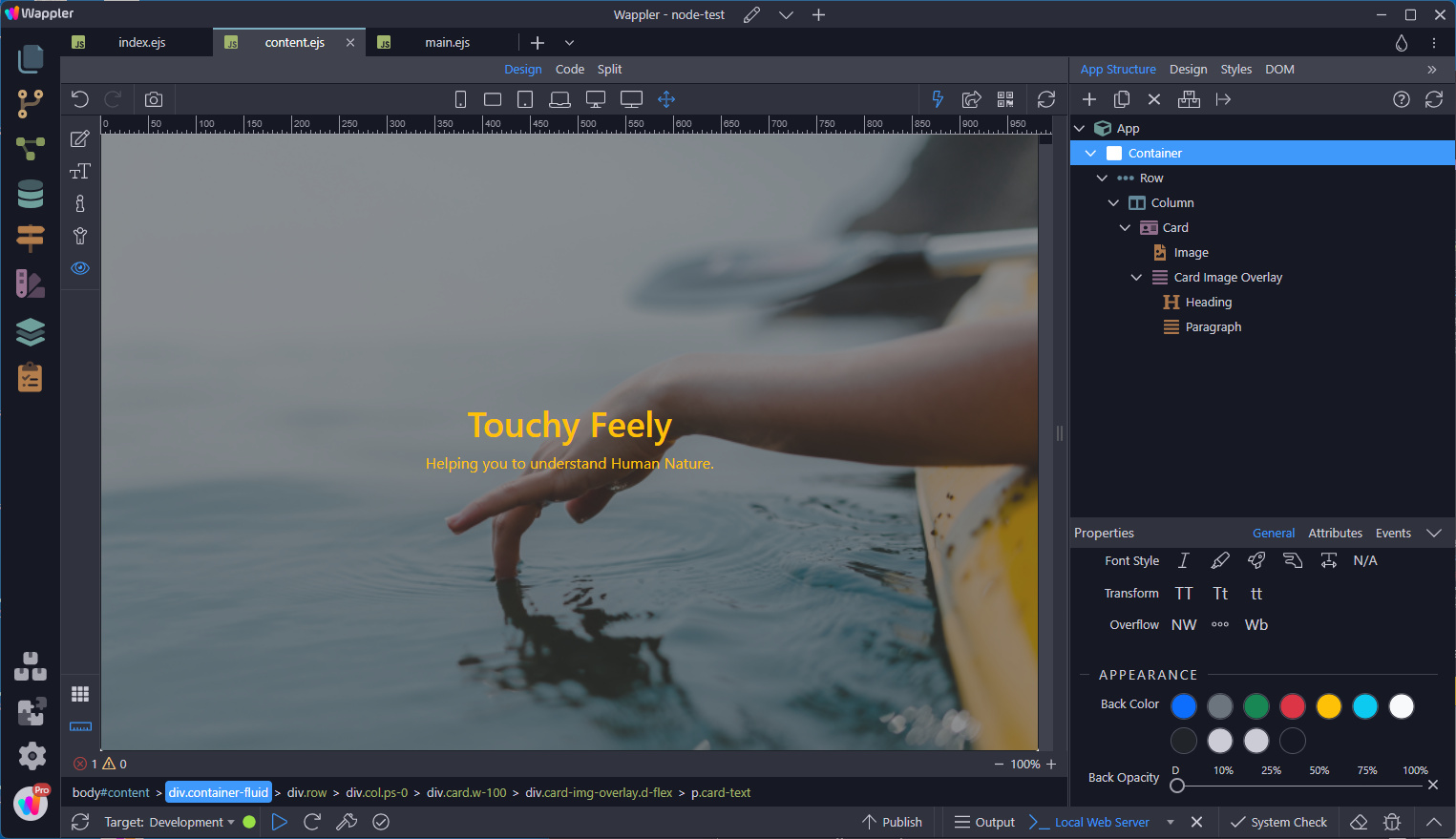
How about this, using Card Image Overlay for the home page:
Section titled “How about this, using Card Image Overlay for the home page:”Note that content should not be larger than the height of the image. If content is larger than the image the content will be displayed outside the image.
How about this, using Card Image Overlay for the home page:
Card Layout
Section titled “Card Layout”In addition to styling the content within cards, Bootstrap includes a few options for laying out series of cards.
Card Groups
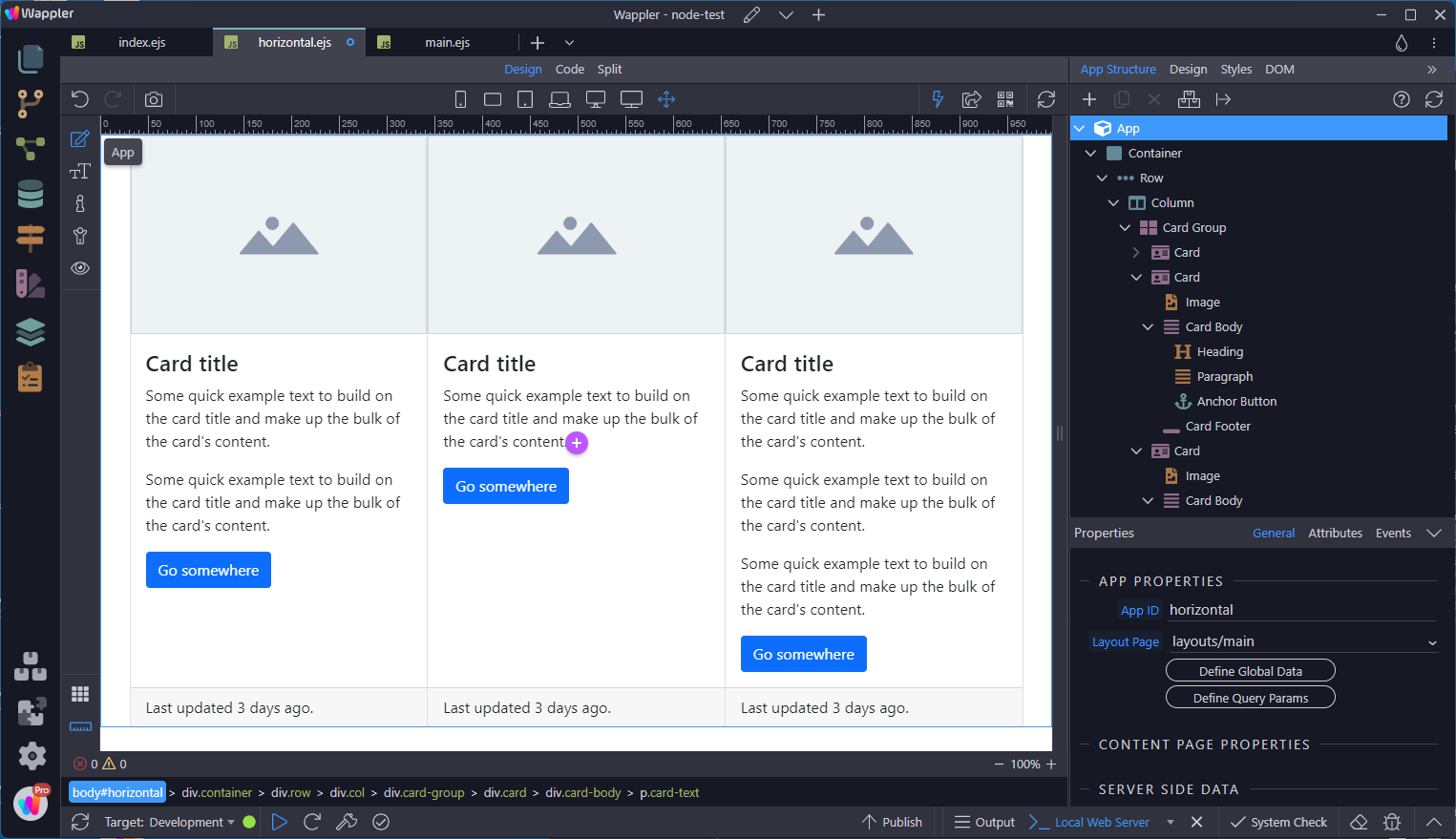
Section titled “Card Groups”Use card groups to render cards as a single, attached element with equal width and height columns. Card groups start off stacked and use display: flex; to become attached with uniform dimensions starting at the sm breakpoint. For the time being, this layout option is not yet responsive .
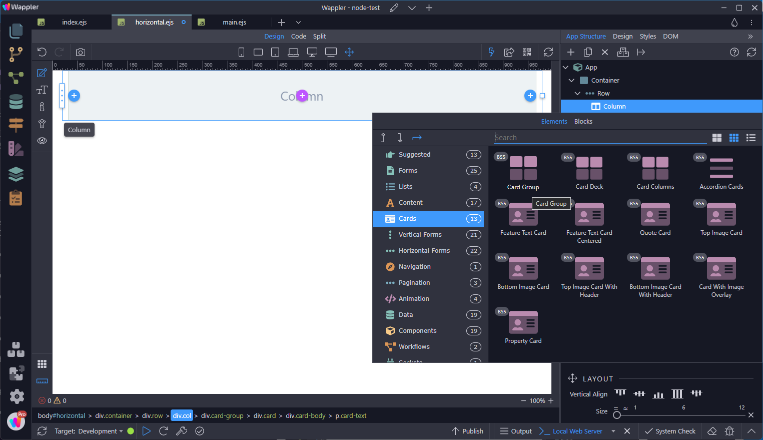
To create a Card Group, click the add-inside-button, select Cards and Card Group
Step 63
Section titled “Step 63”Inside the Card Group, add three Cards. When using card groups with footers, their content will automatically line up.
Grid Cards
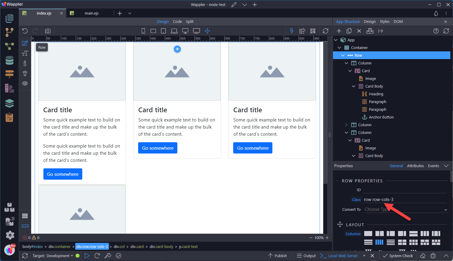
Section titled “Grid Cards”Use the Bootstrap grid system and its.row-cols classes to control how many grid columns (wrapped around your cards) you show per row. For example, here’s .row-cols-3 splitting three cards to equal width across multiple rows. This is the preferred layout method for multiple cards.
Adding a gutter of 4 to the Y axis, will add a space between the rows.
Section titled “Adding a gutter of 4 to the Y axis, will add a space between the rows.”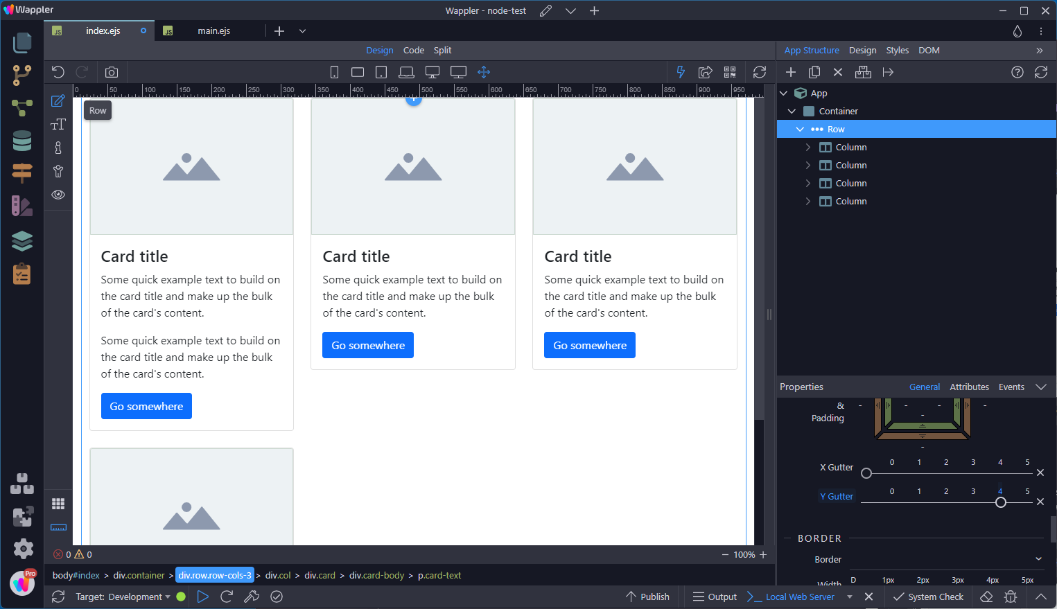
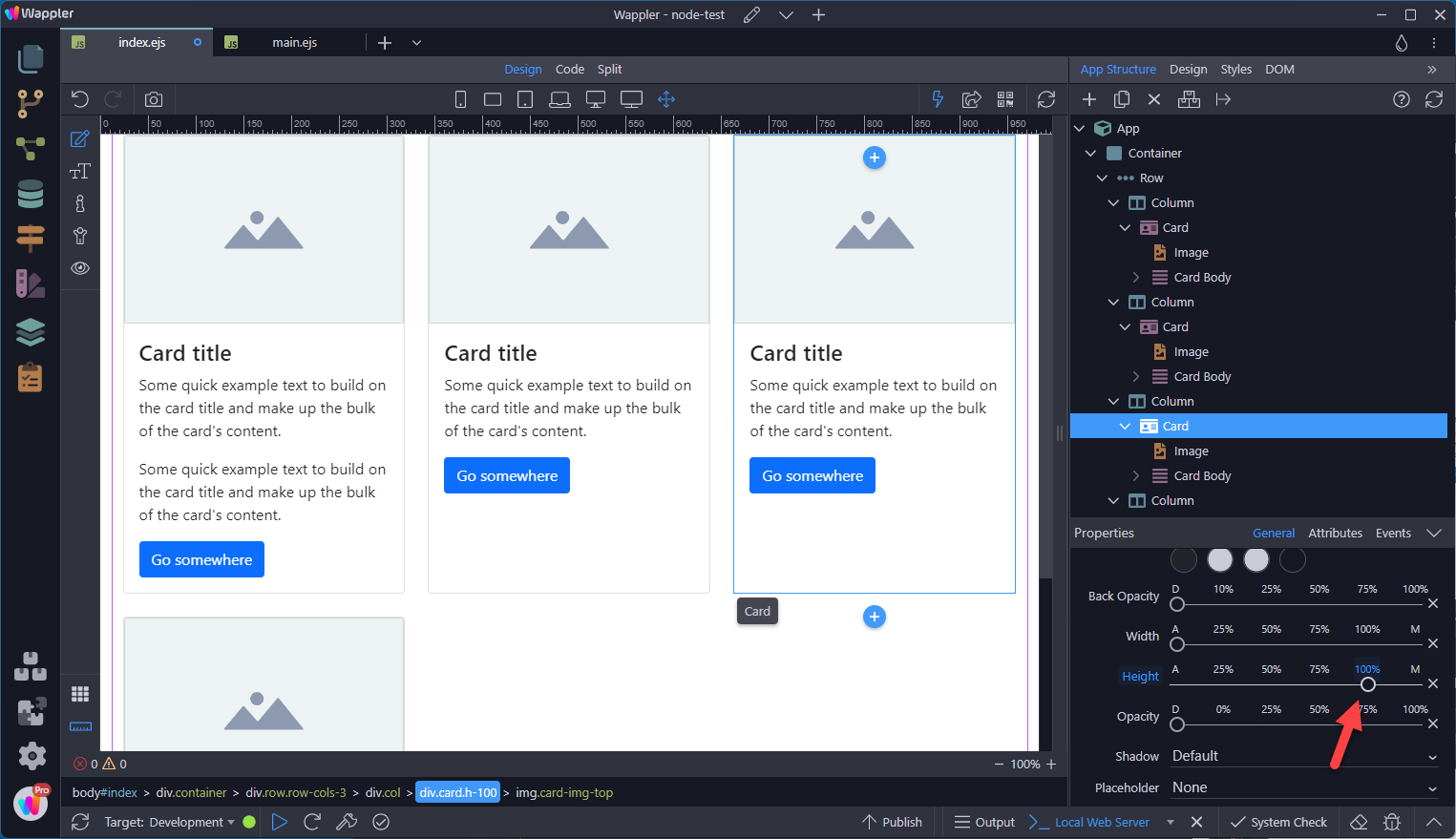
When you need equal height, add .h-100 to the cards.
Section titled “When you need equal height, add .h-100 to the cards.”When you need equal height, add .h-100 to the cards.
Masonry
Section titled “Masonry”If you want to have this type of layout, you can just make use of Masonry plugin. Masonry is not included in Bootstrap