Using Bootstrap 5 Placeholders
Intro Placeholders can be used to enhance the experience of your application. You can display an animated placeholder, having a similar layout to your content, while your data is still loading. The ap
Placeholders can be used to enhance the experience of your application. You can display an animated placeholder, having a similar layout to your content, while your data is still loading.
The appearance, color, and sizing of the placeholders can be easily customized.
Creating a Placeholder
Section titled “Creating a Placeholder”In this example we have a dynamic page, getting its data from a database. The layout of the page is using cards with image, title, text and a button:
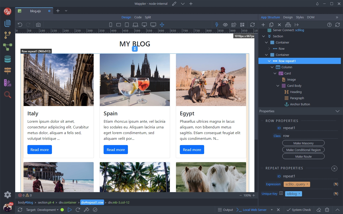
We are going to create a “loading card” placeholder which matches our layout.
Section titled “We are going to create a “loading card” placeholder which matches our layout.”Let’s add a new container, before the container holding our content:
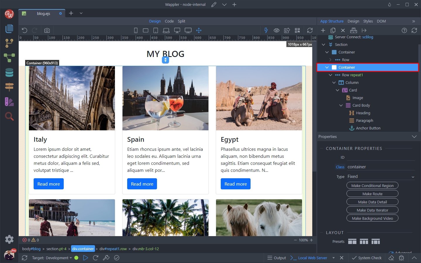
Click Add Before and add a Container:
Section titled “Click Add Before and add a Container:”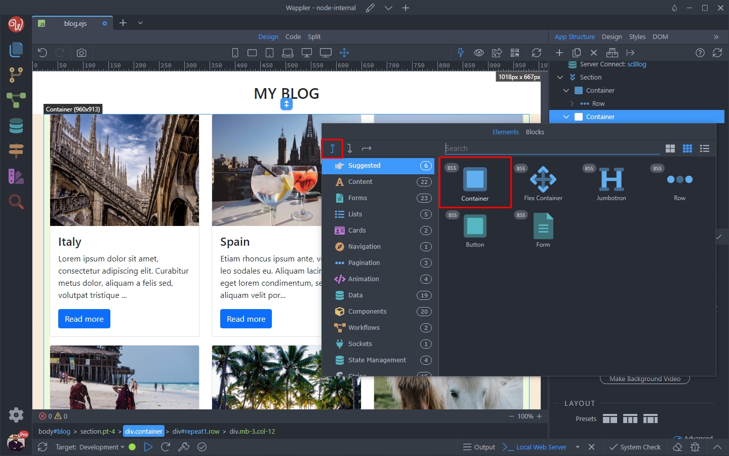
Add a row inside it:
Section titled “Add a row inside it:”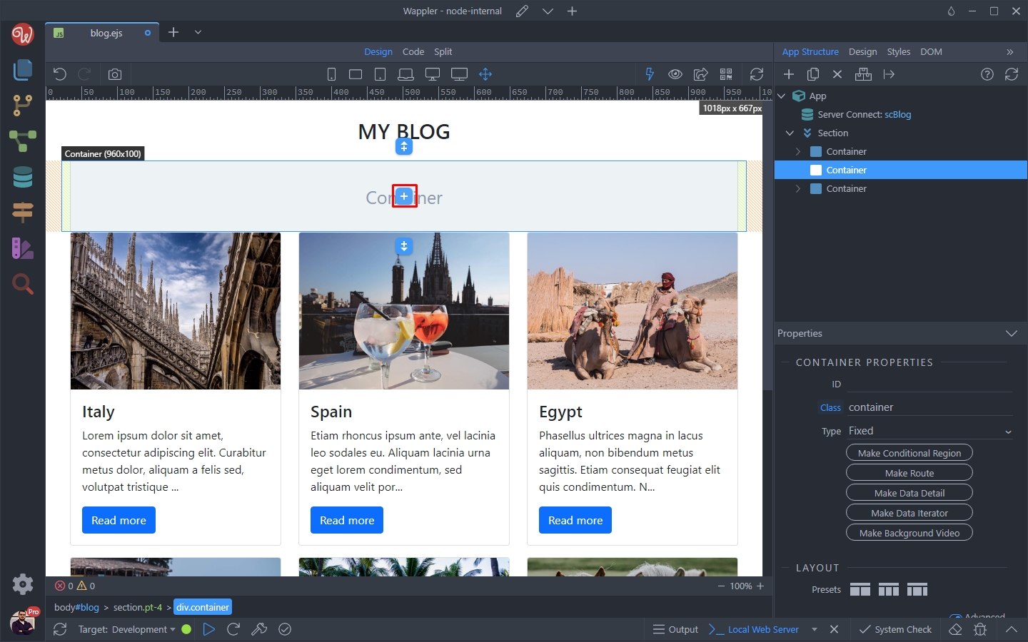
Step 7
Section titled “Step 7”
And then add a Column, inside the Row:
Section titled “And then add a Column, inside the Row:”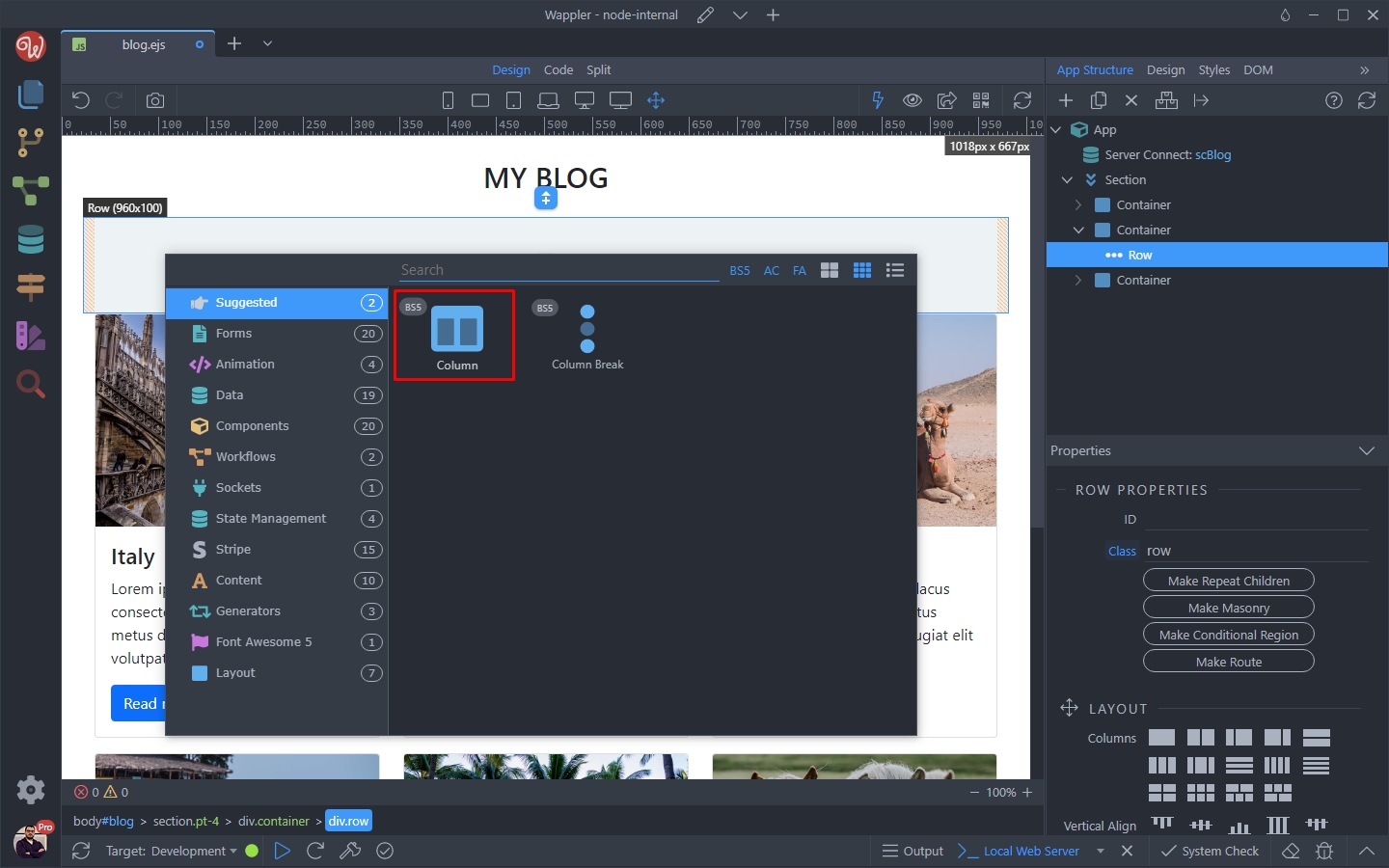
Then we adjust the width of the row, so that it matches the content layout:
Section titled “Then we adjust the width of the row, so that it matches the content layout:”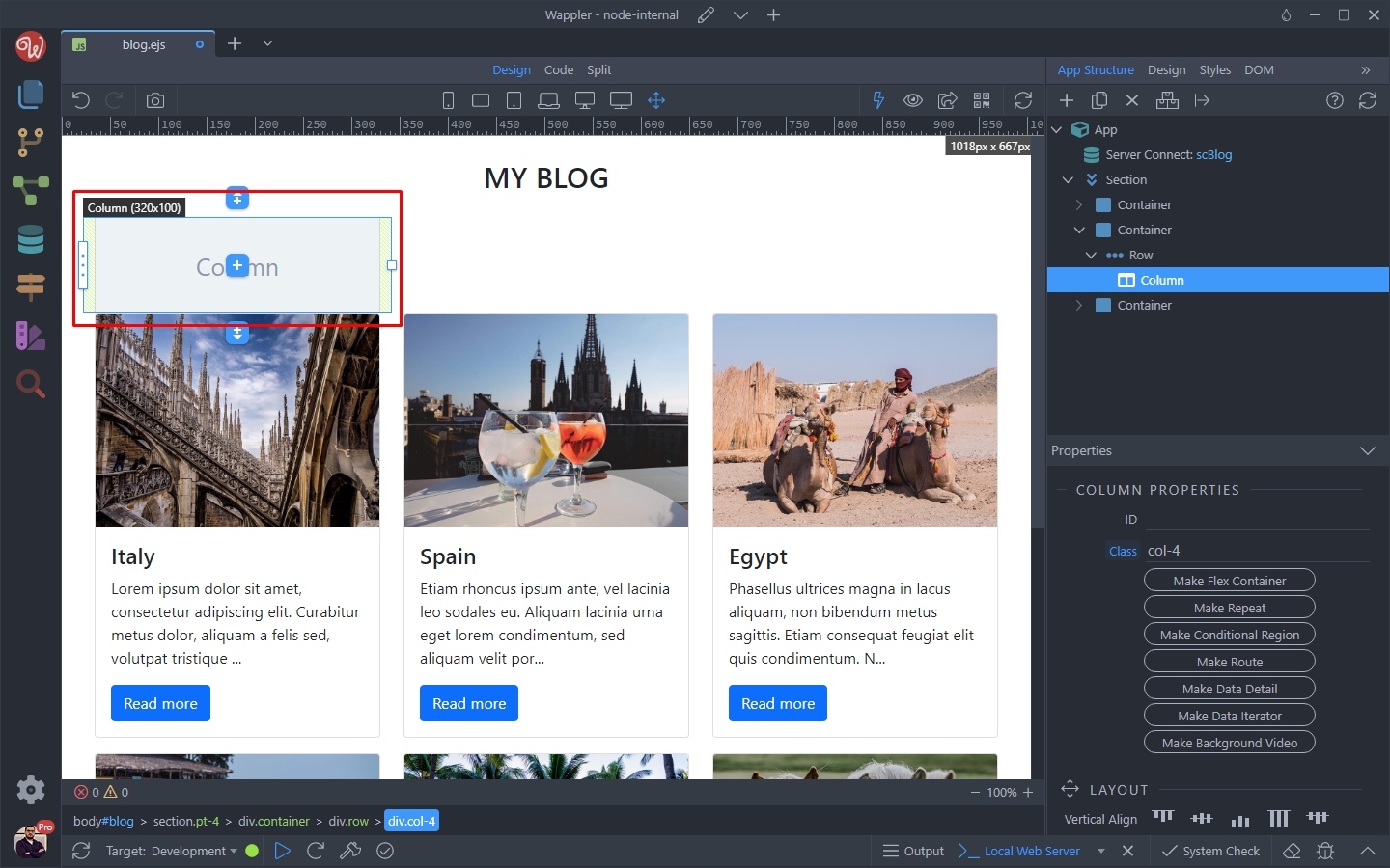
Click the Add Element button inside the Column:
Section titled “Click the Add Element button inside the Column:”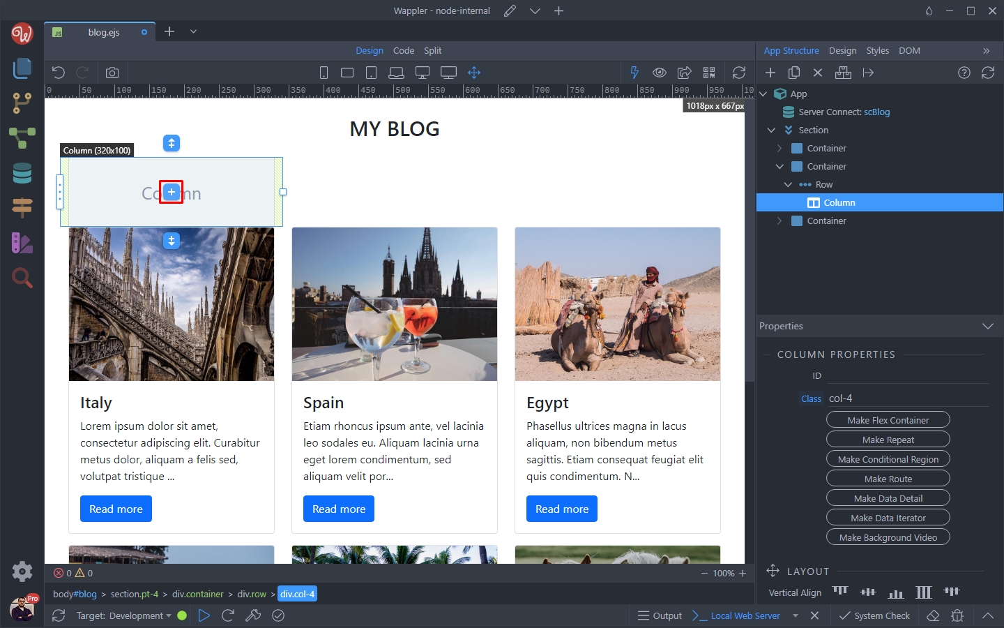
And select a Top Image Card with Header, as that is the closest to our layout:
Section titled “And select a Top Image Card with Header, as that is the closest to our layout:”And select a Top Image Card with Header, as that is the closest to our layout:
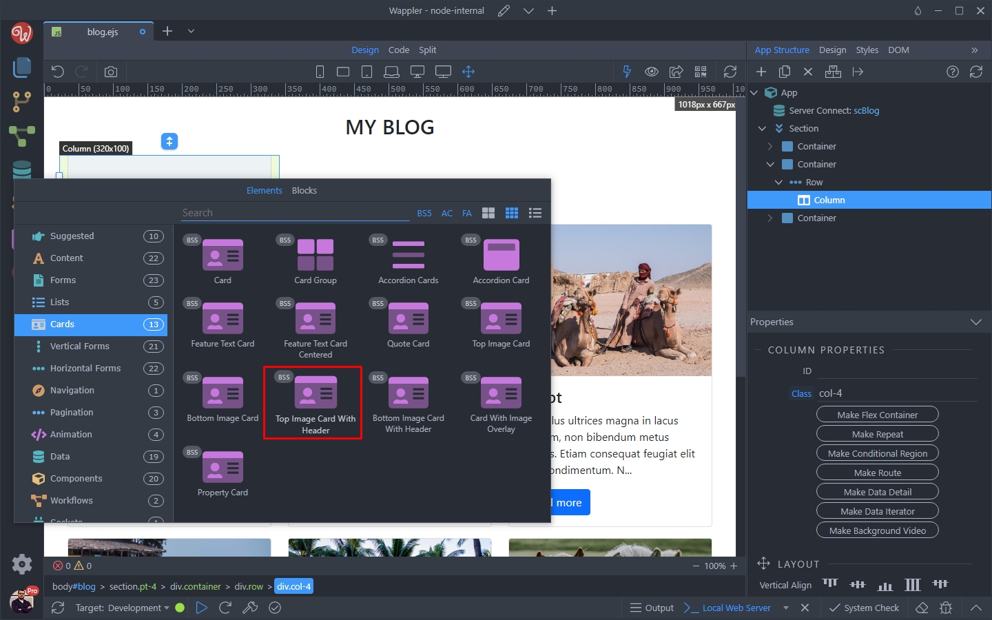
We remove the card header, as we don’t need it:
Section titled “We remove the card header, as we don’t need it:”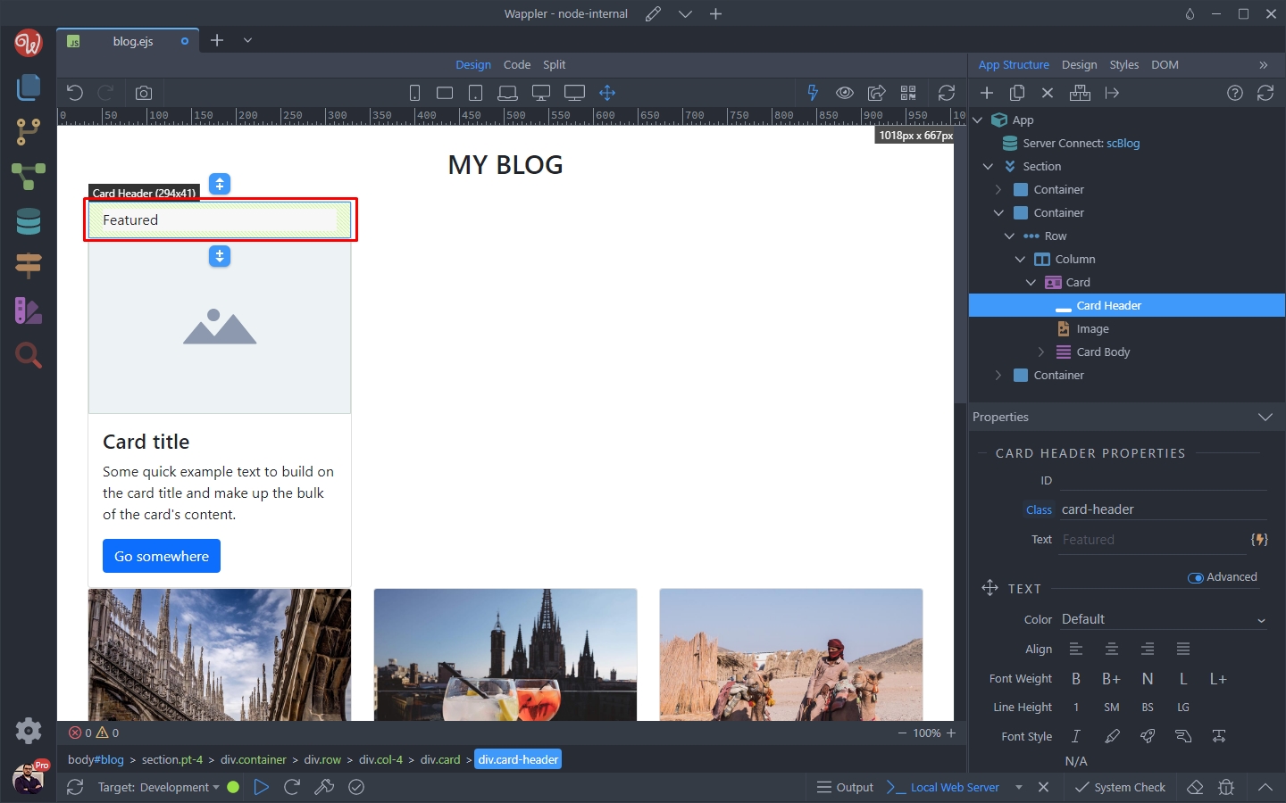
Then select the card image:
Section titled “Then select the card image:”
Scroll down to the Appearance Section and open the Placeholder Menu:
Section titled “Scroll down to the Appearance Section and open the Placeholder Menu:”
Select This Element, to make the image a placeholder:
Section titled “Select This Element, to make the image a placeholder:”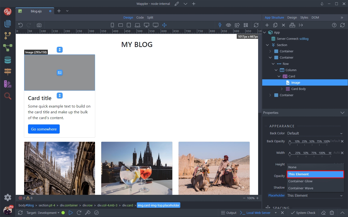
Then select the Card Title:
Section titled “Then select the Card Title:”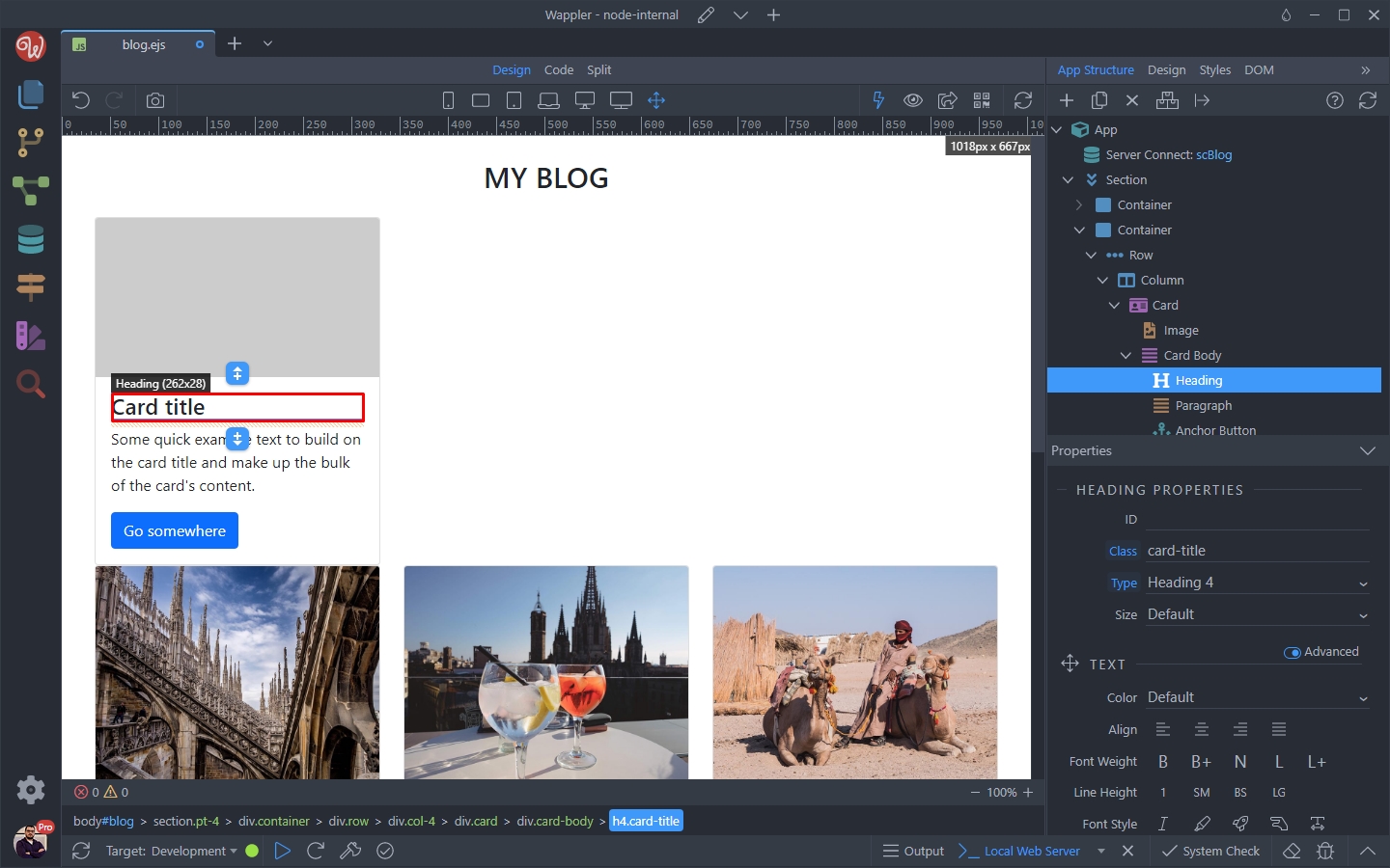
Open the Placeholder Menu:
Section titled “Open the Placeholder Menu:”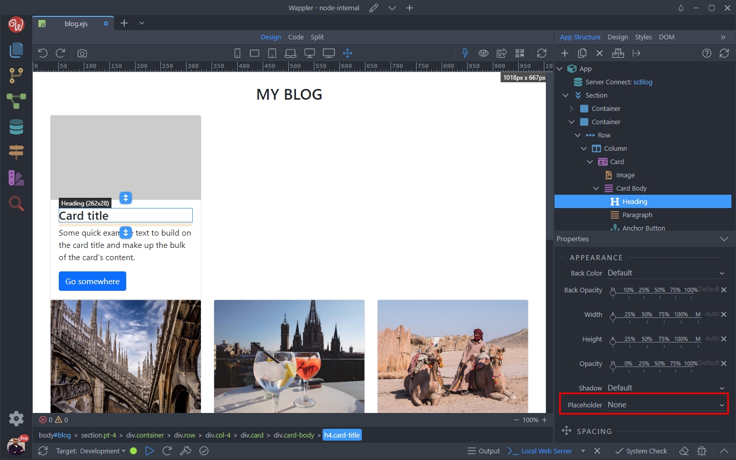
Select This Element, to make the title a placeholder:
Section titled “Select This Element, to make the title a placeholder:”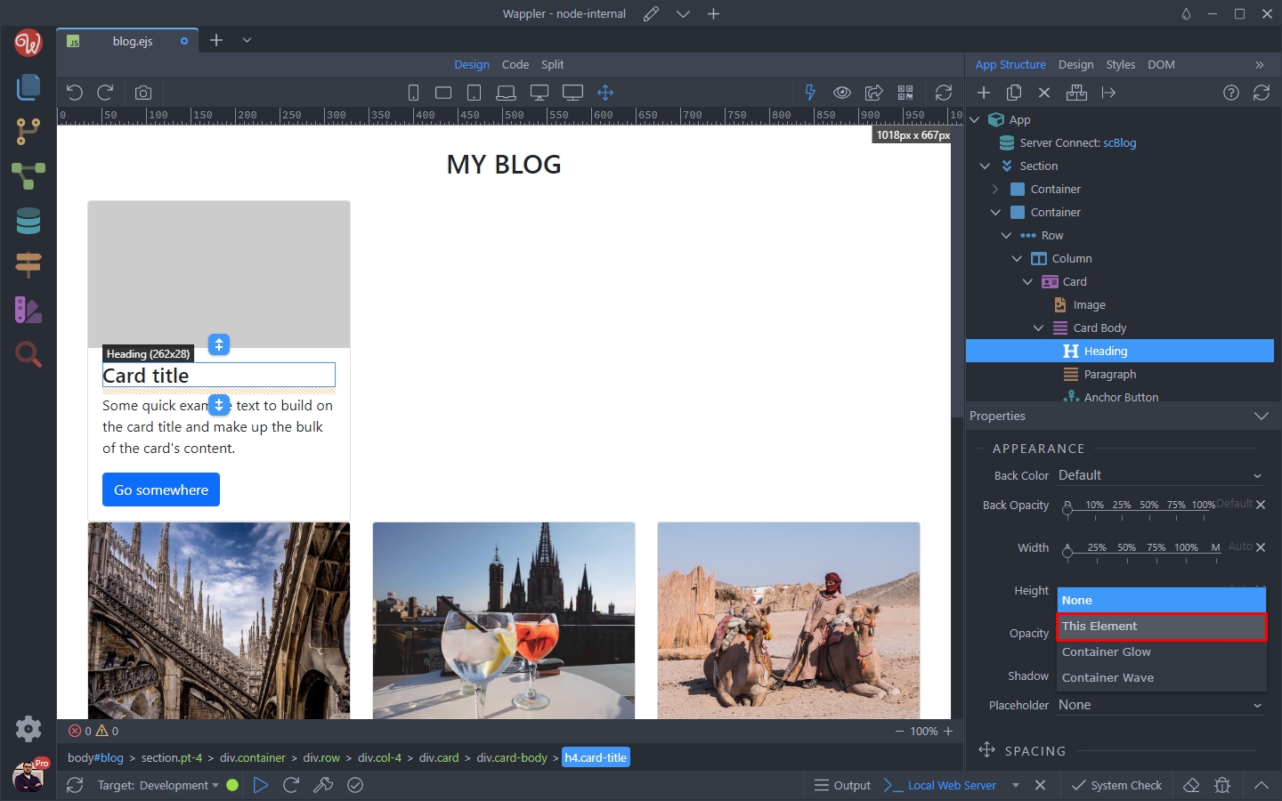
Then you can double click the title and remove the text from it, so we can adjust the width:
Section titled “Then you can double click the title and remove the text from it, so we can adjust the width:”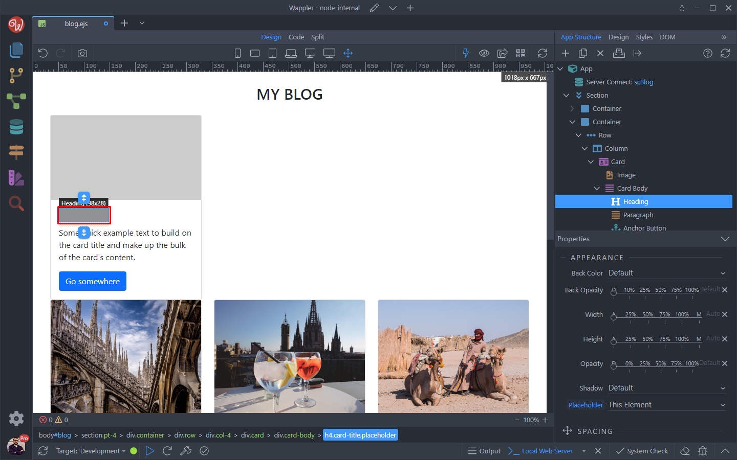
When you remove the text from the title, use the width slider to adjust its width. We set it to 50%:
Section titled “When you remove the text from the title, use the width slider to adjust its width. We set it to 50%:”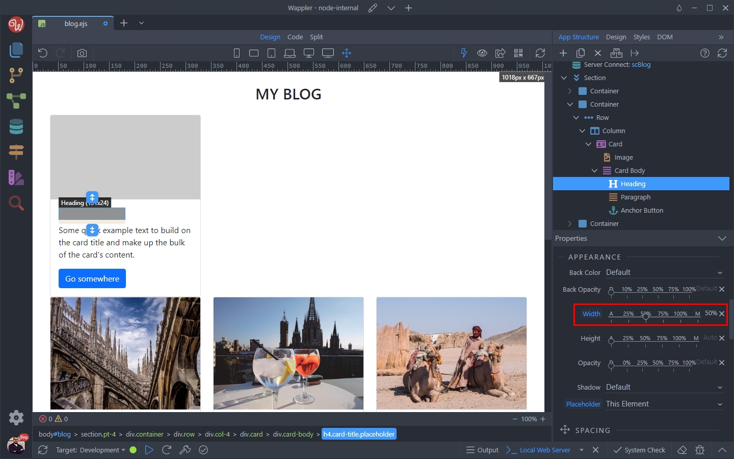
Then we do the same for the card body text. Select the text:
Section titled “Then we do the same for the card body text. Select the text:”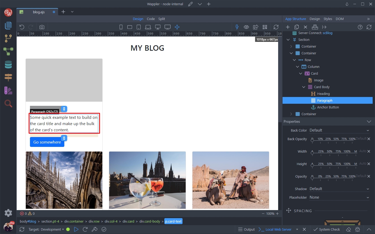
Open the placeholder menu and select This Element:
Section titled “Open the placeholder menu and select This Element:”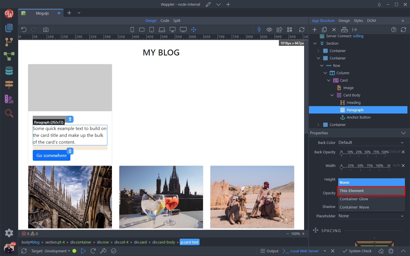
Step 23
Section titled “Step 23”Double click the paragraph and remove the text.
Then use the width slider to set the placeholder width to 100%:
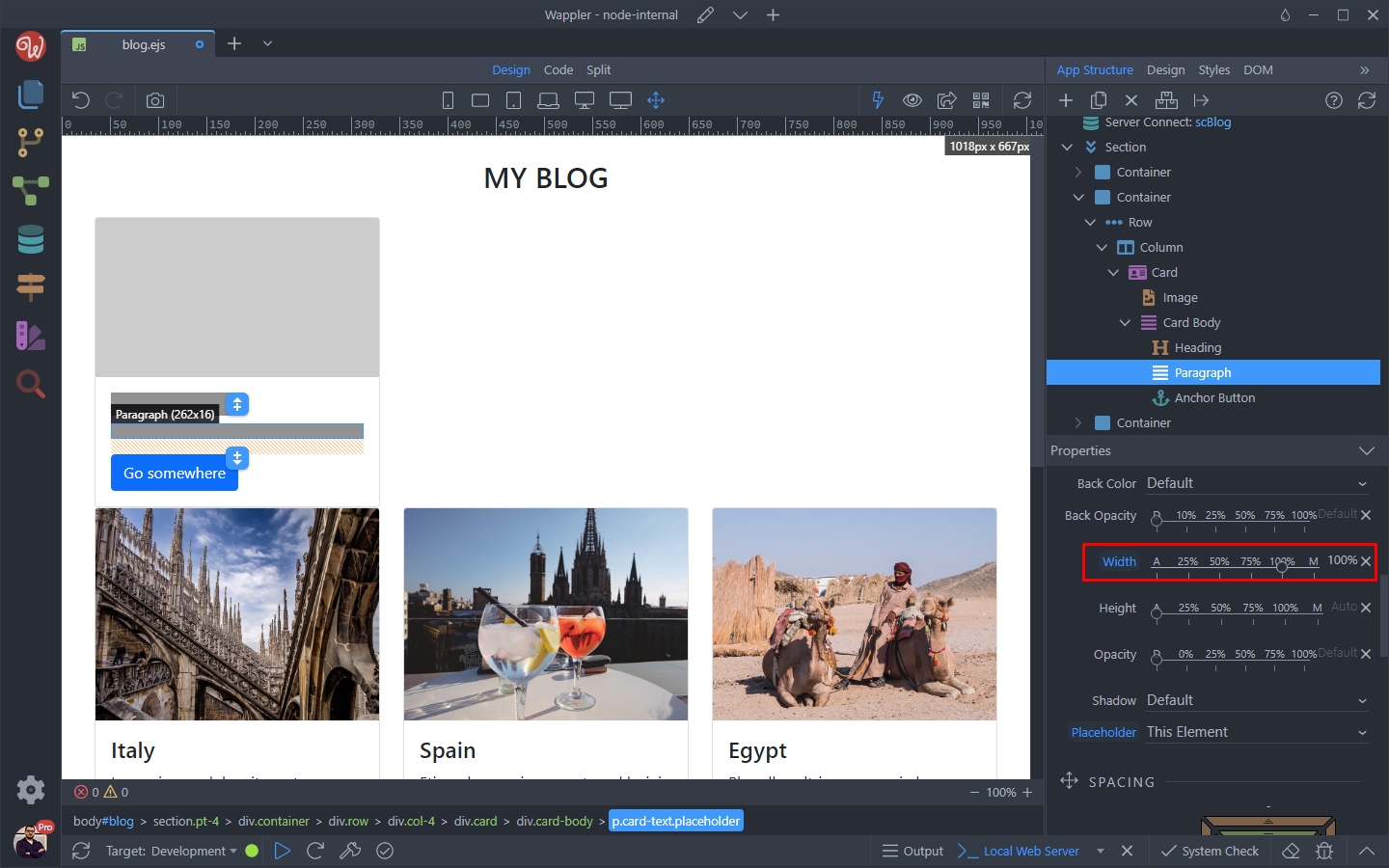
Then we select the button:
Section titled “Then we select the button:”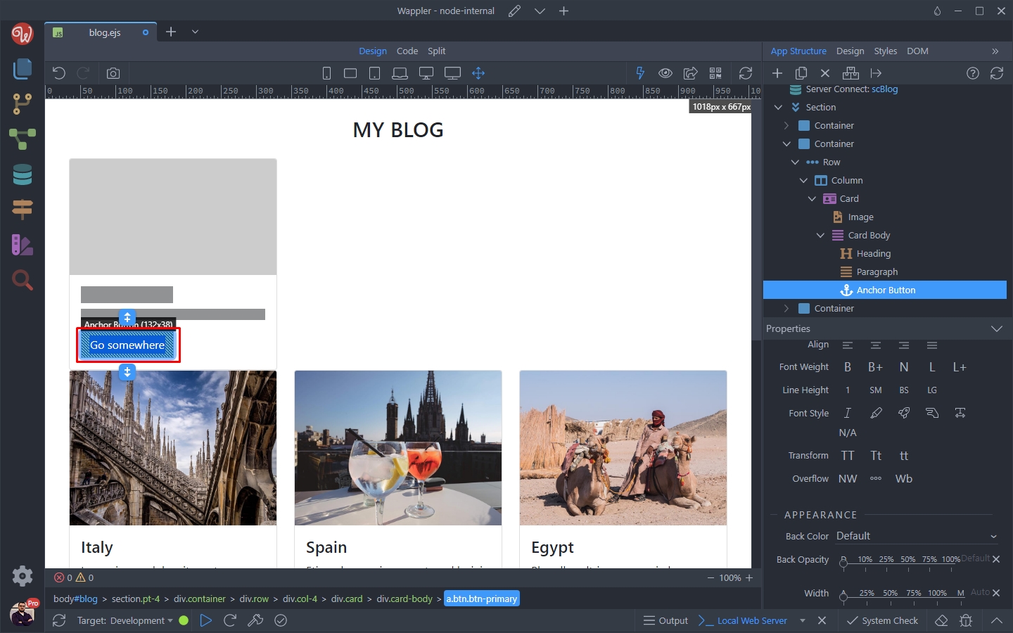
We set the Placeholder option to This Element, remove the button text and set the width to 25%:
Section titled “We set the Placeholder option to This Element, remove the button text and set the width to 25%:”
In the Button Properties section, set it to Disabled:
Section titled “In the Button Properties section, set it to Disabled:”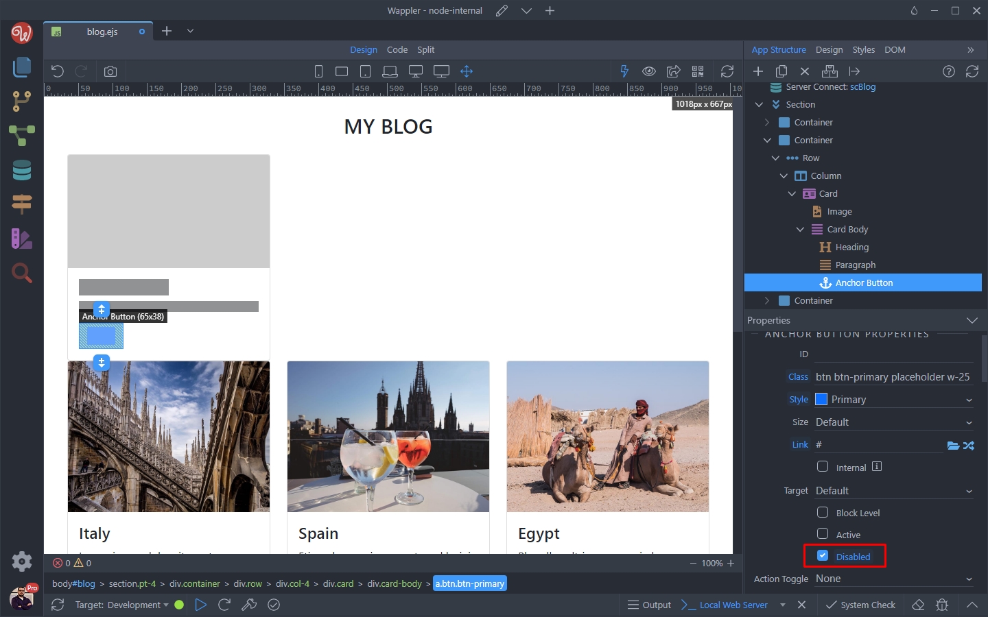
Step 27
Section titled “Step 27”We’ve created our placeholder elements. Now let’s setup the animation, showing the loading state.
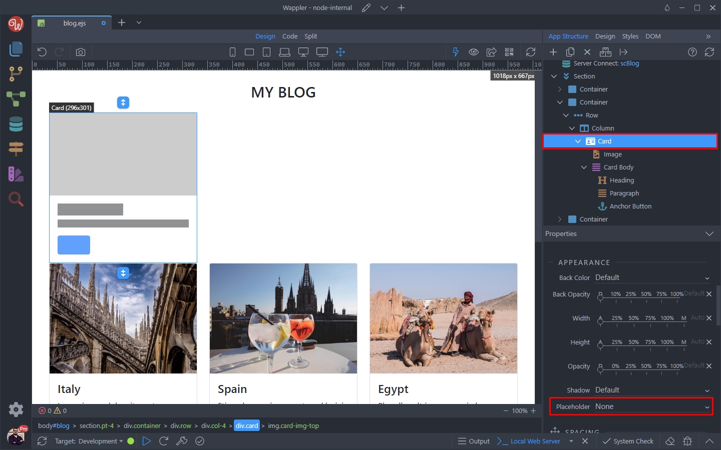
Select the Card element and open the Placeholder menu:
Step 28
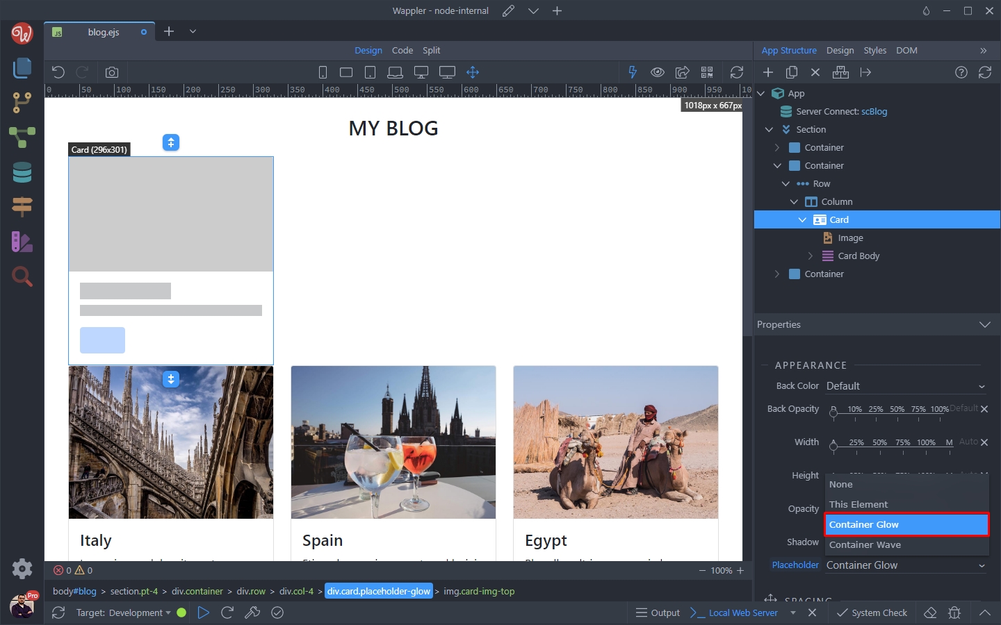
Section titled “Step 28”There are two animation options - Glow and Wave. These animations should be applied to the element wrapping your placeholders - in our case the Card component.
We select the Glow animation:
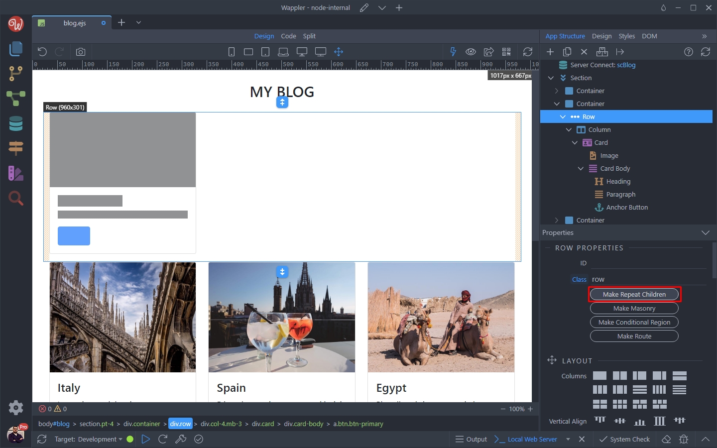
Select the row element which wraps our card and click the Make Repeat Children button:
Section titled “Select the row element which wraps our card and click the Make Repeat Children button:”In order to make the placeholder as close to the actual data being displayed on the page, we can repeat it. In our case we display 6 dynamic cards on the page, so we can repeat our placeholder 6 times.
Select the row element which wraps our card and click the Make Repeat Children button:
We want to repeat the card 6 times, so we enter 6 in the expression field:
Section titled “We want to repeat the card 6 times, so we enter 6 in the expression field:”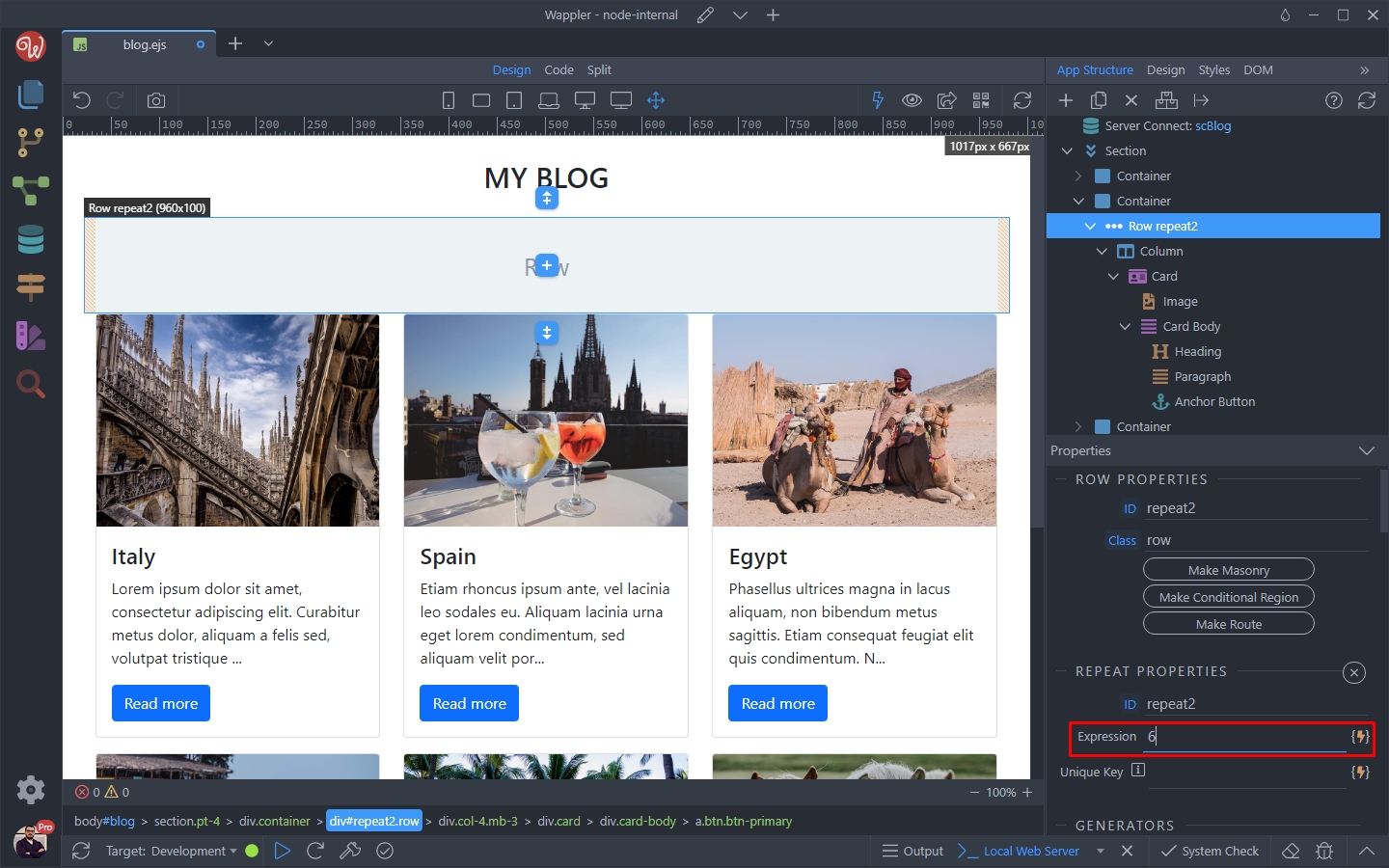
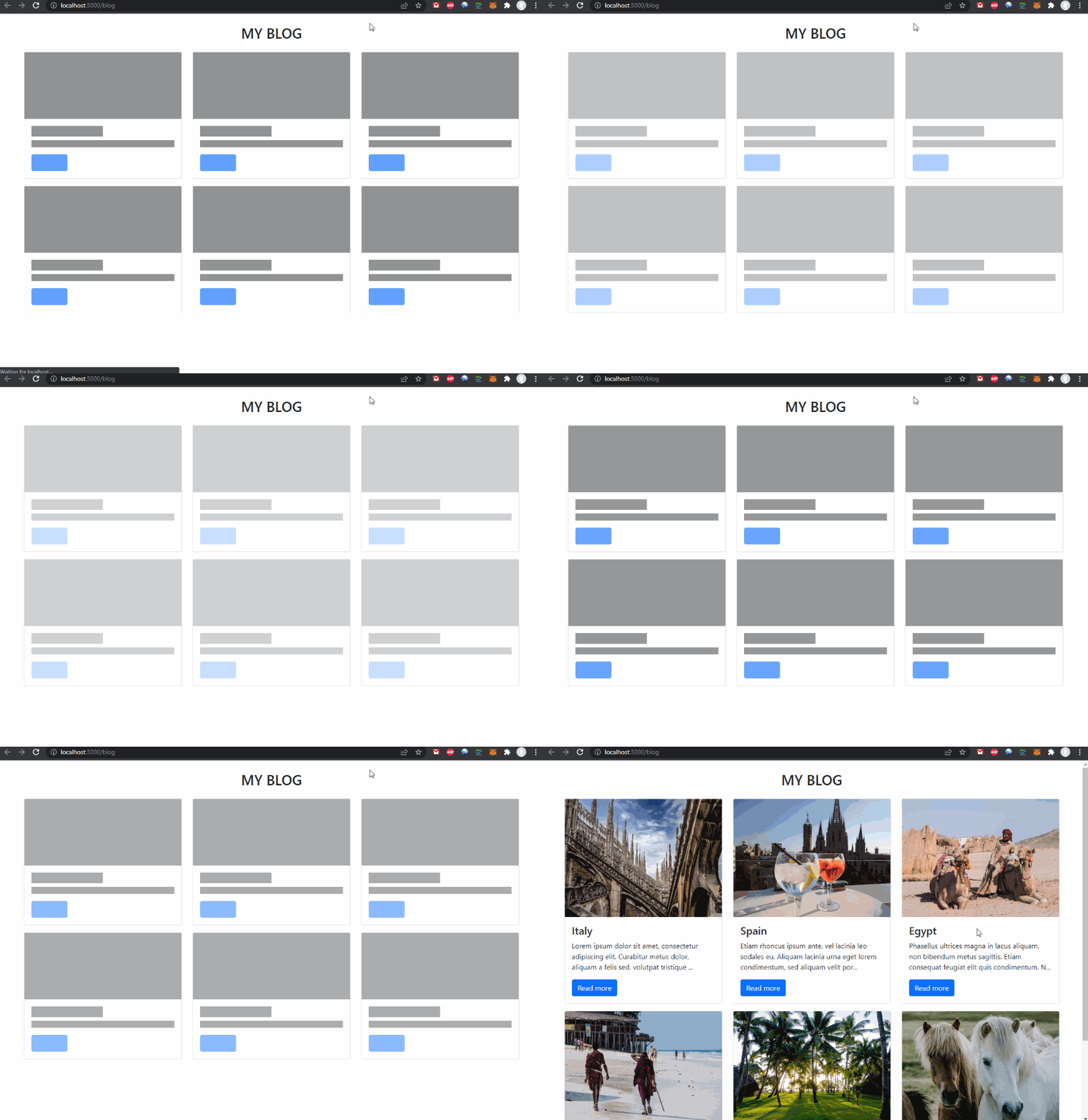
And we are done. We now have 6 card loaders on the page:
Section titled “And we are done. We now have 6 card loaders on the page:”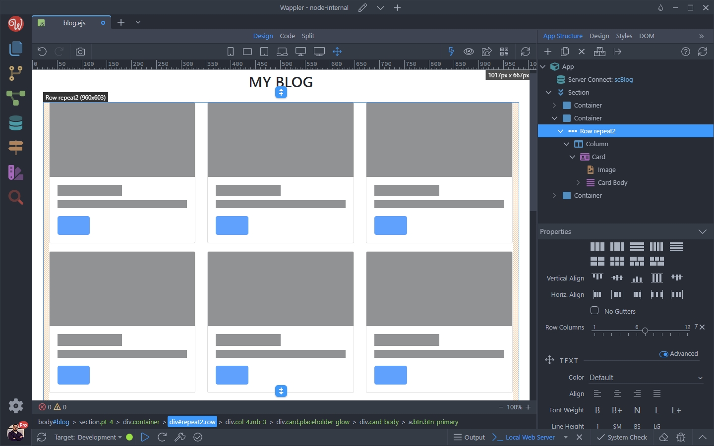
Show/Hide the Placeholder
Section titled “Show/Hide the Placeholder”We only want to show the loading card placeholder when the data is being loaded and hide it, when the data is fully loaded. To do this, we need to setup a conditional region.
Select the Container, where our loading card is placed and click the Make Conditional Region button:
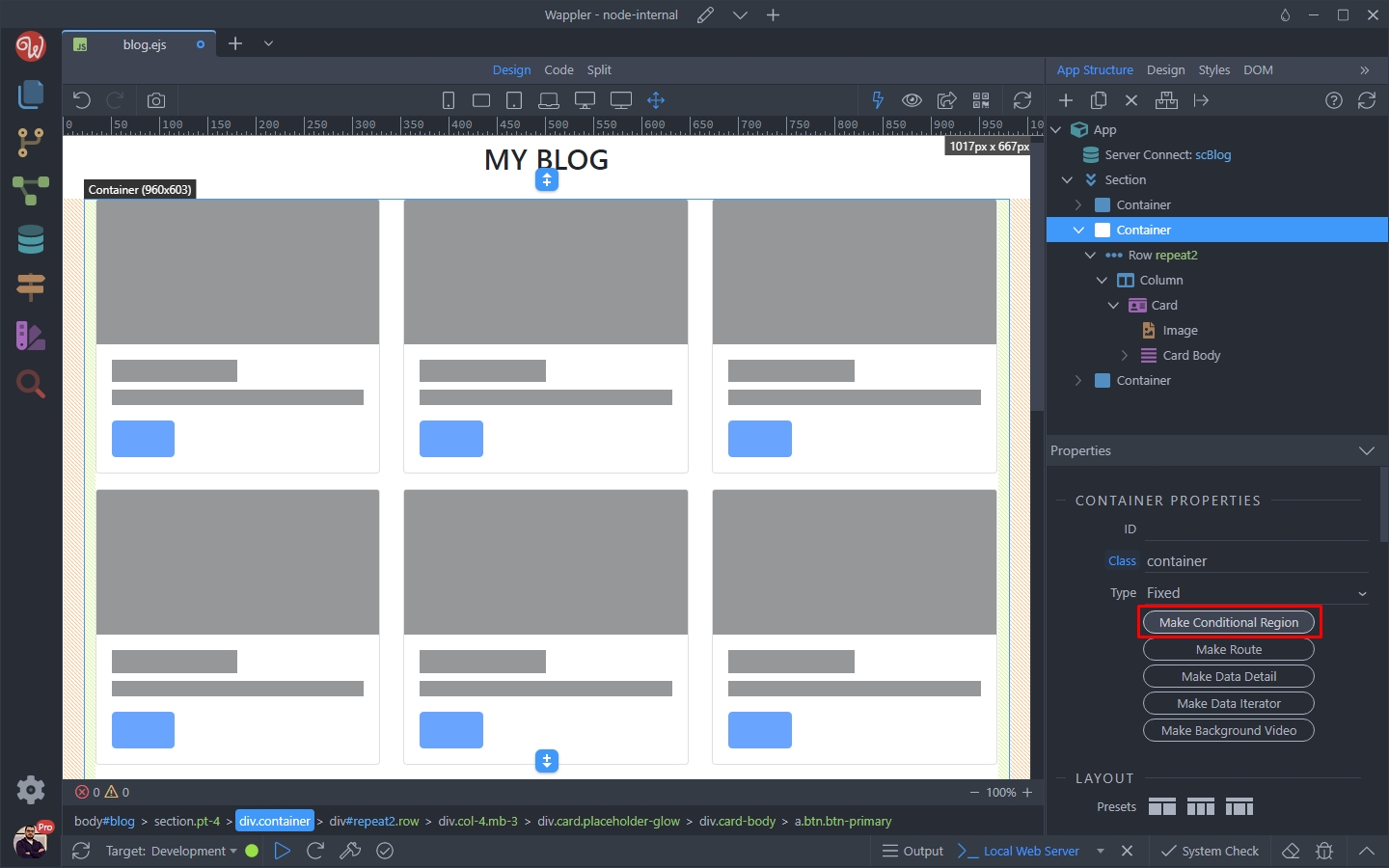
Click the dynamic data picker for the condition:
Section titled “Click the dynamic data picker for the condition:”
And under the Server Action > State select executing:
Section titled “And under the Server Action > State select executing:”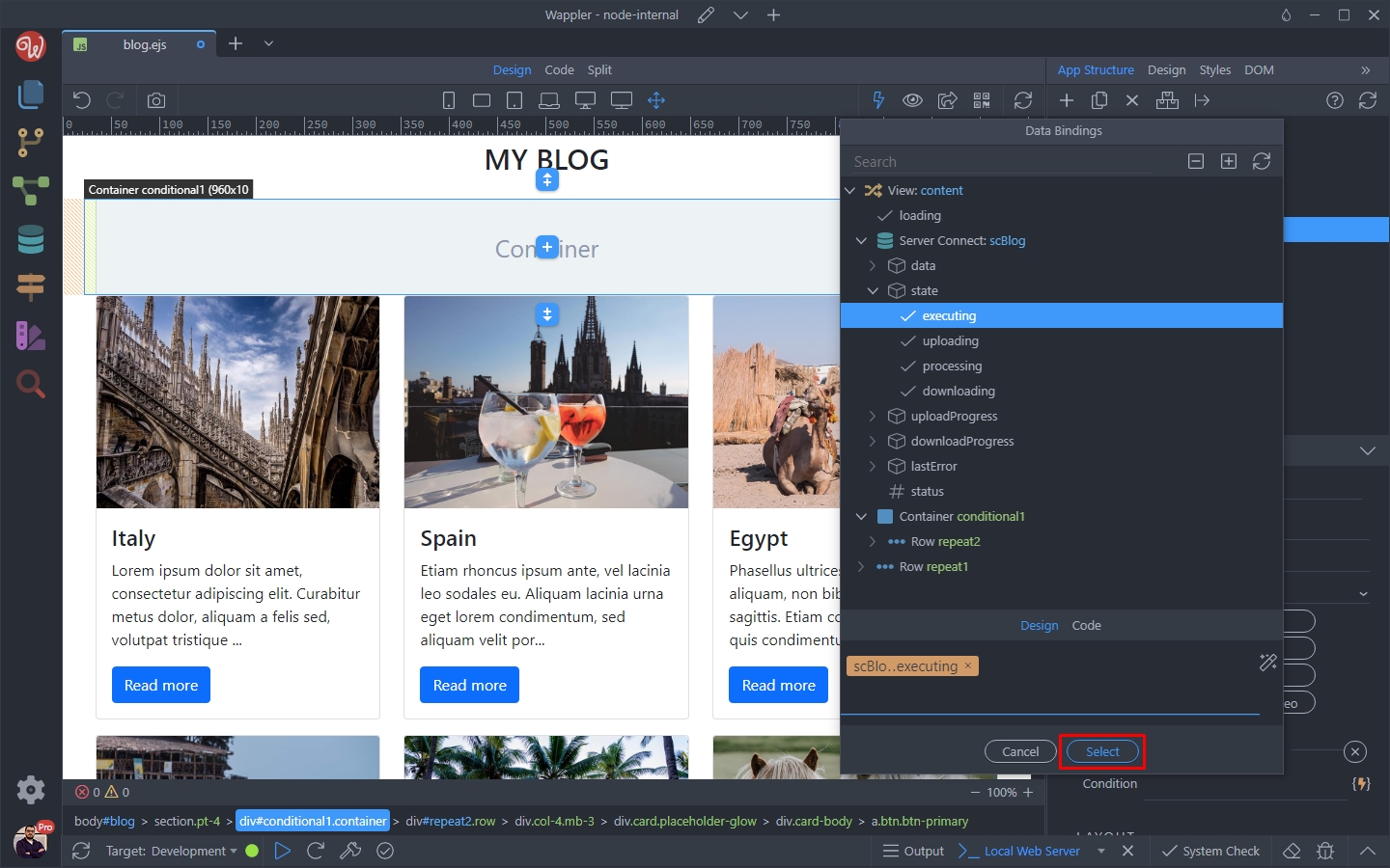
And we are done. Our placeholder card will be displayed while the data is loading:
Section titled “And we are done. Our placeholder card will be displayed while the data is loading:”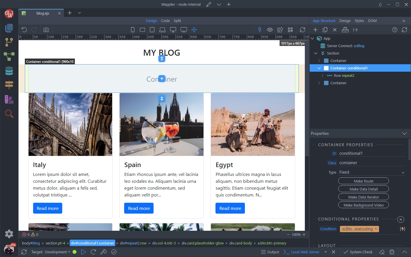
Final Result
Section titled “Final Result”You can load the page in the browser and preview the result: