Theme Manager - Advanced Options
You already know how to customize the basic styles and appearance of your Bootstrap 4 theme, using the Theme Manager. This week we integrated an Advanced Mode, which allows you to customize every sing
Step 1
Section titled “Step 1”You already know how to customize the basic styles and appearance of your Bootstrap 4 theme, using the Theme Manager. This week we integrated an Advanced Mode, which allows you to customize every single aspect of Bootstrap 4!
Theme Manager Advanced Options
Section titled “Theme Manager Advanced Options”The Advanced Mode allows you to customize every variable of your Bootstrap 4 theme - colors, spacing, fonts, grid breakpoints … everything you can think of.
Enabling Advanced Mode
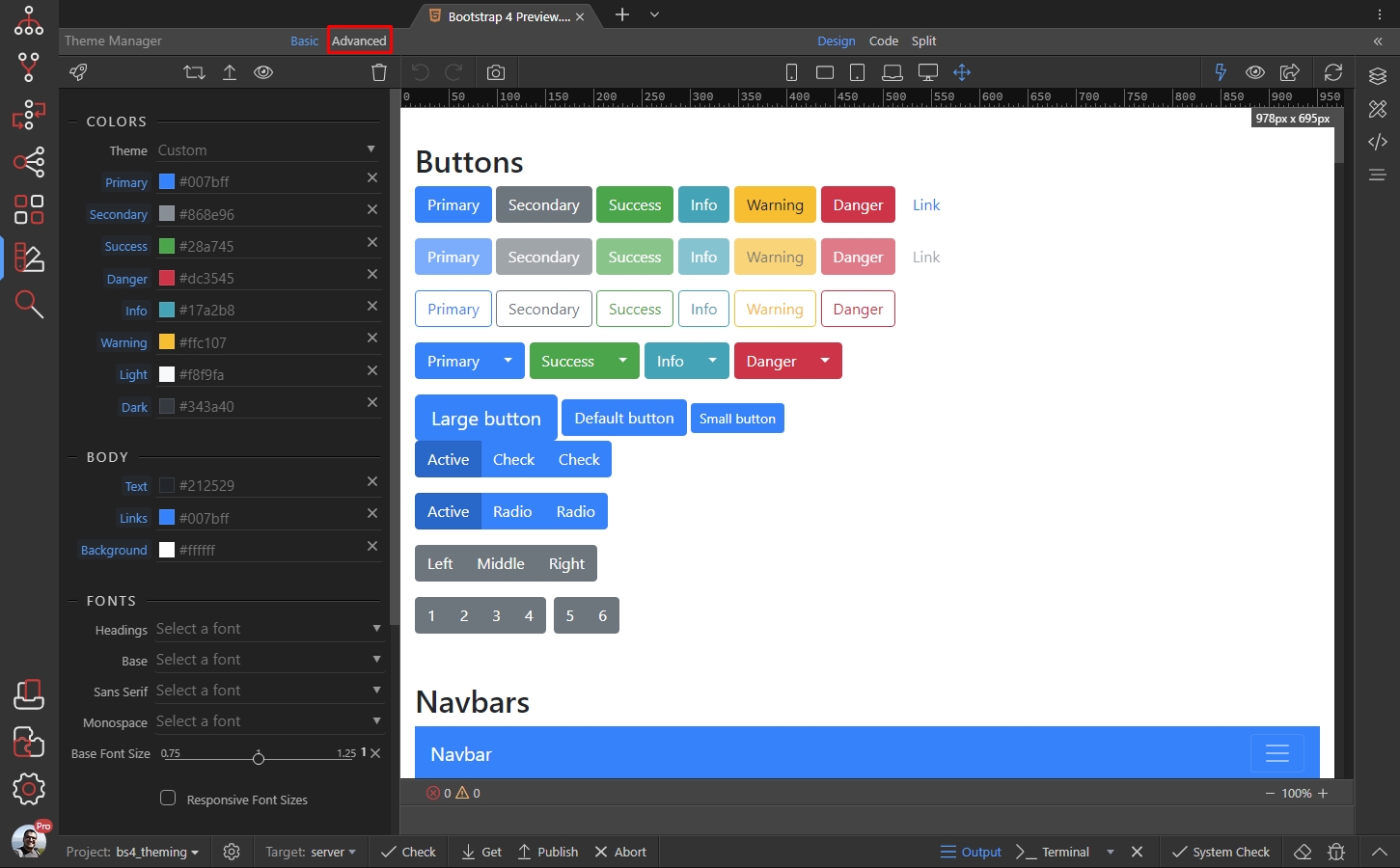
Section titled “Enabling Advanced Mode”In order to enable the Advanced Mode, click the Advanced button in the Theme Manager panel:
Step 4
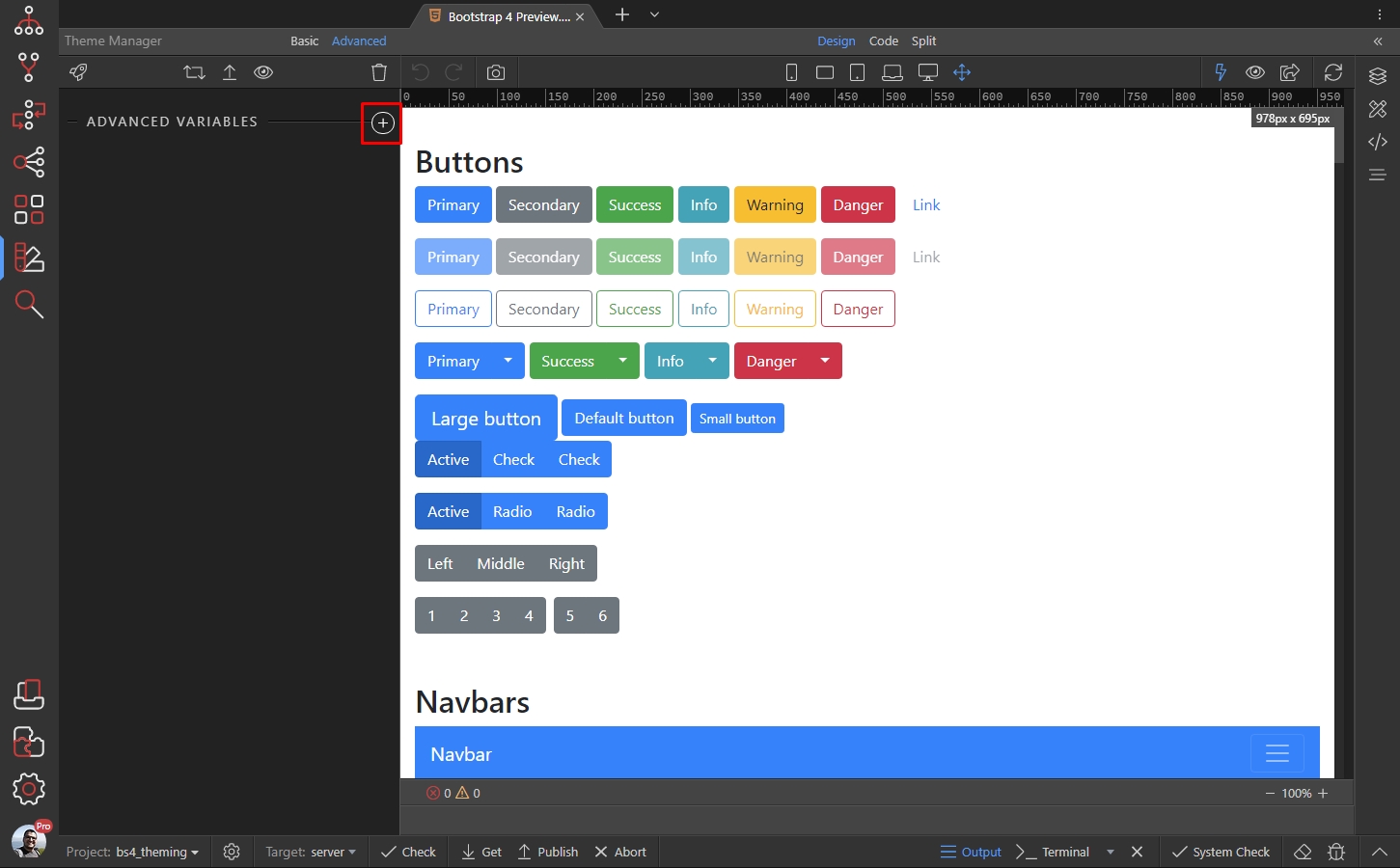
Section titled “Step 4”In order to customize any option, you need to add it here first. Click the add button to access all the available options:
Step 5
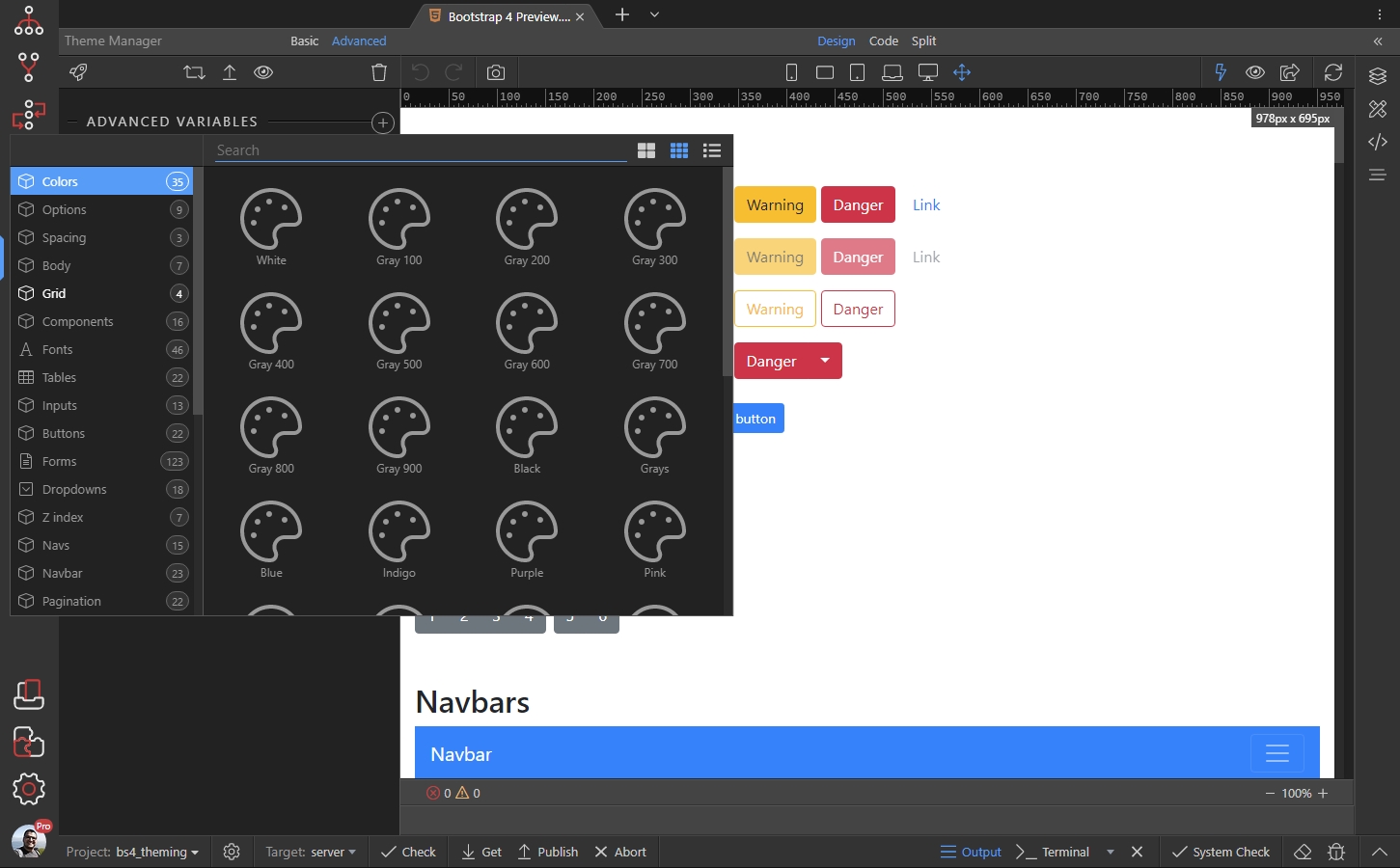
Section titled “Step 5”You can find them in the dialog which appears. The different options are grouped in different categories, for easier navigation:
Using Advanced Options
Section titled “Using Advanced Options”We will show you a few of examples, showing how to use the Advanced Options of the Theme Manager to style the primary color and the default buttons’ padding and borders width.
Changing the Primary Color
Section titled “Changing the Primary Color”In order to change the primary color, we need to add its variable here. Click the add button, open the Colors category and select Primary:

Step 9
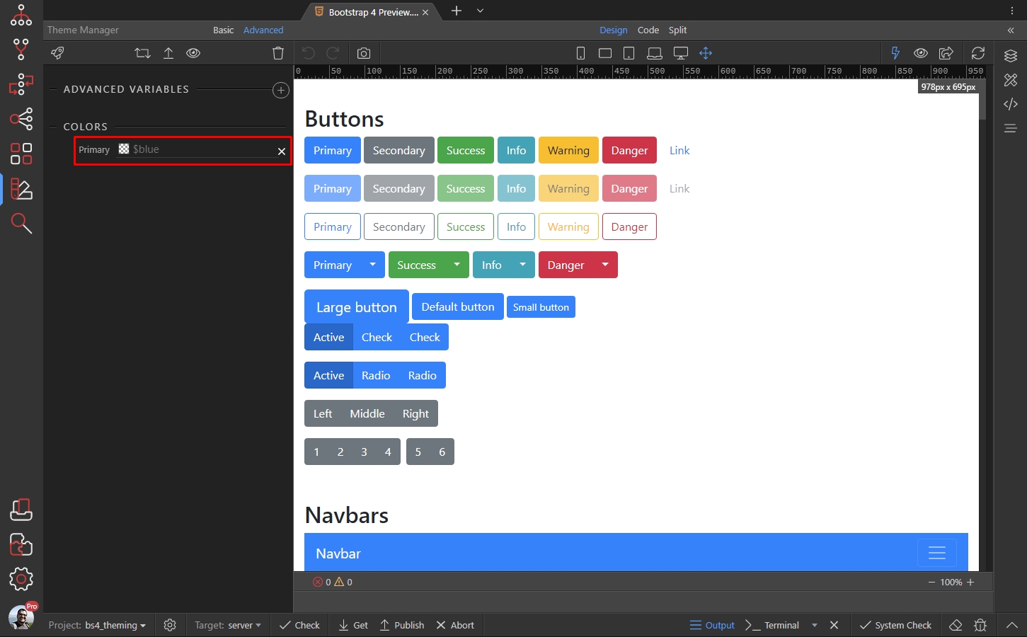
Section titled “Step 9”You can see that by default, it uses the $blue variable as a value.
You can replace this variable with a specific color, selected using the color picker:
Step 10
Section titled “Step 10”But you can also do this in the Basic Options. So we won’t apply this color here. We will show you how to assign a different variable as a primary color.
In order to use a specific variable as a value for the Primary Color option we need to add it here first. So click the add button:
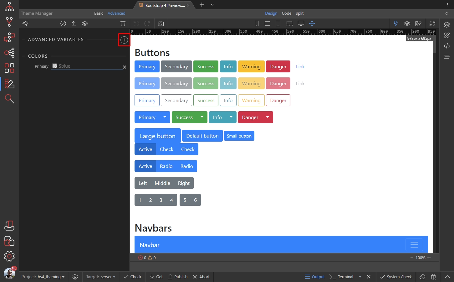
We open the Colors category and select Purple:
Section titled “We open the Colors category and select Purple:”
You can see the Purple variable added in the variables list. It has a specific color set:
Section titled “You can see the Purple variable added in the variables list. It has a specific color set:”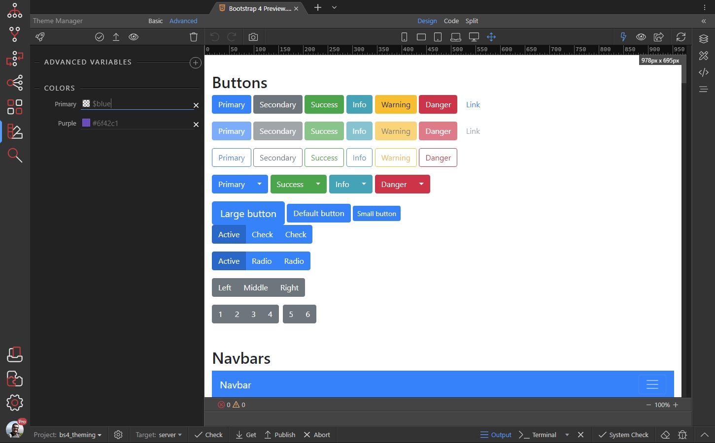
Step 13
Section titled “Step 13”Change the Primary color value to: $purple in order to use the purple color as a primary color. You can see the changes immediately:
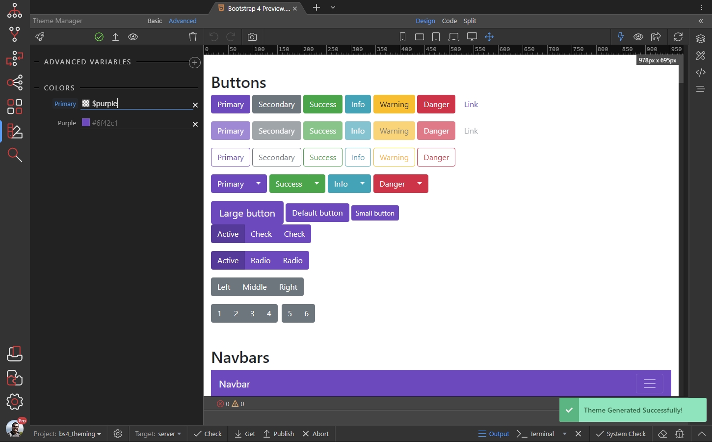
You can customize the Purple variable color, by using the color picker:
Section titled “You can customize the Purple variable color, by using the color picker:”
So now you have a new primary color:
Section titled “So now you have a new primary color:”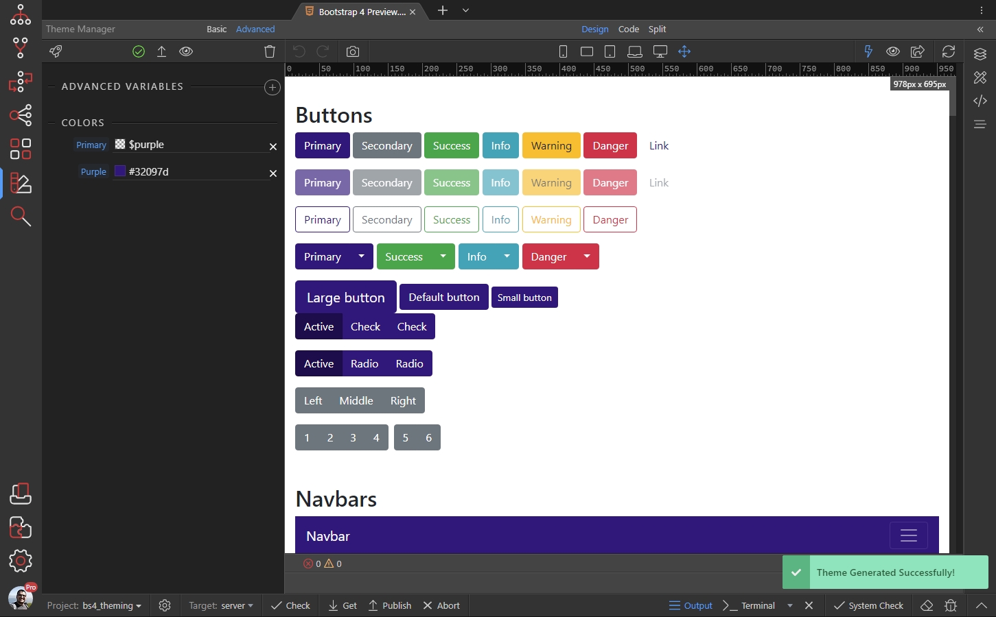
You can do this for all the basic Bootstrap 4 Colors - Primary, Secondary, Success … etc.
Section titled “You can do this for all the basic Bootstrap 4 Colors - Primary, Secondary, Success … etc.”Customizing Buttons
Section titled “Customizing Buttons”Another example is customizing the buttons. We will show you how to change their padding and border width.
Click the add button:
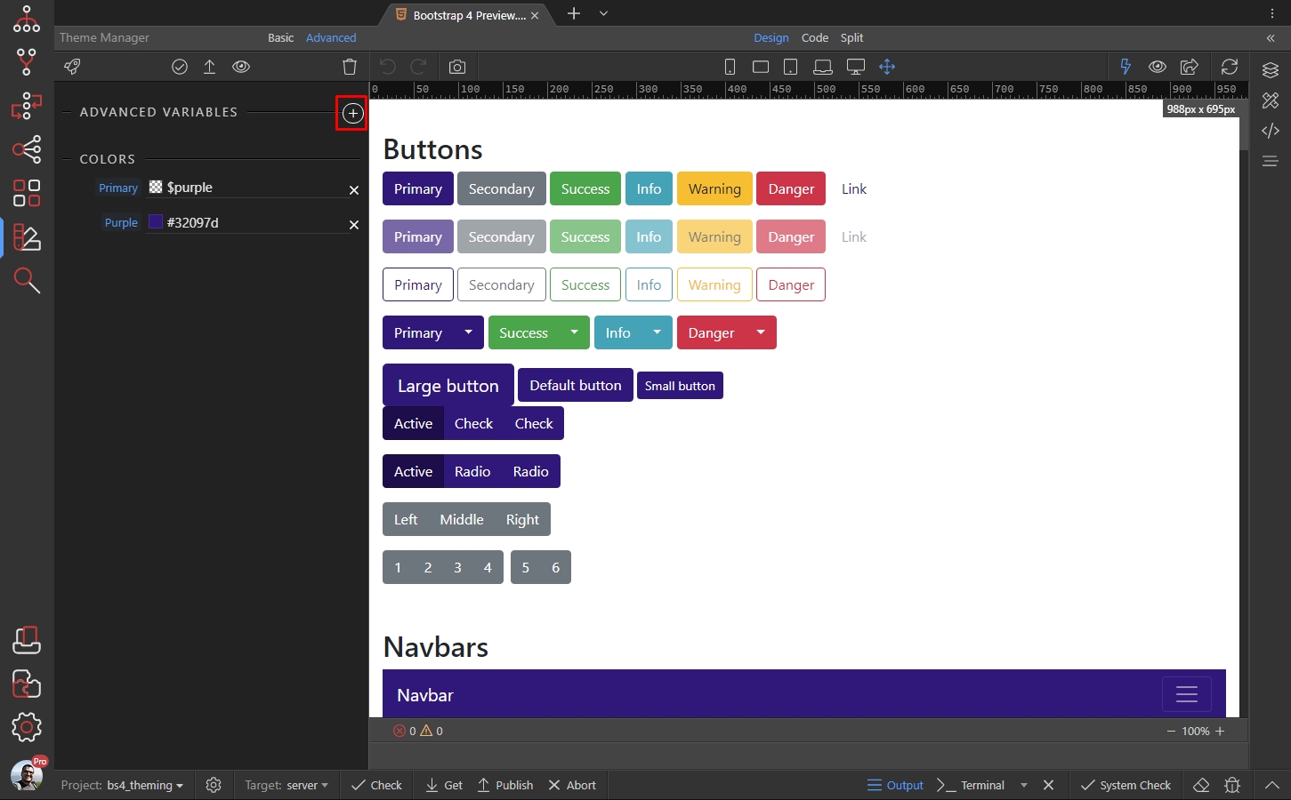
Step 18
Section titled “Step 18”Open the Inputs category and select Input button padding x - this variable corresponds to the horizontal padding of the buttons:
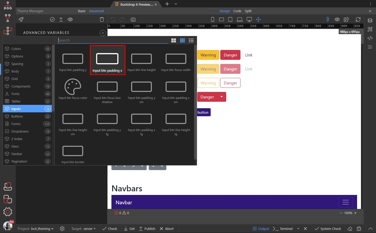
It has a default value of 0.75rem, which we’d like to change:
Section titled “It has a default value of 0.75rem, which we’d like to change:”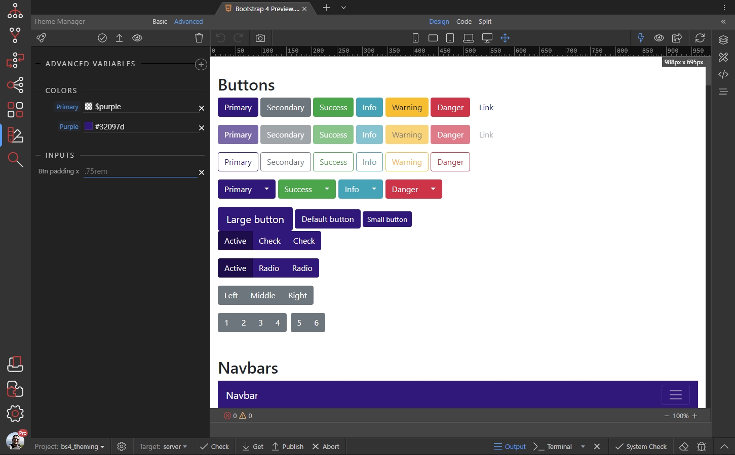
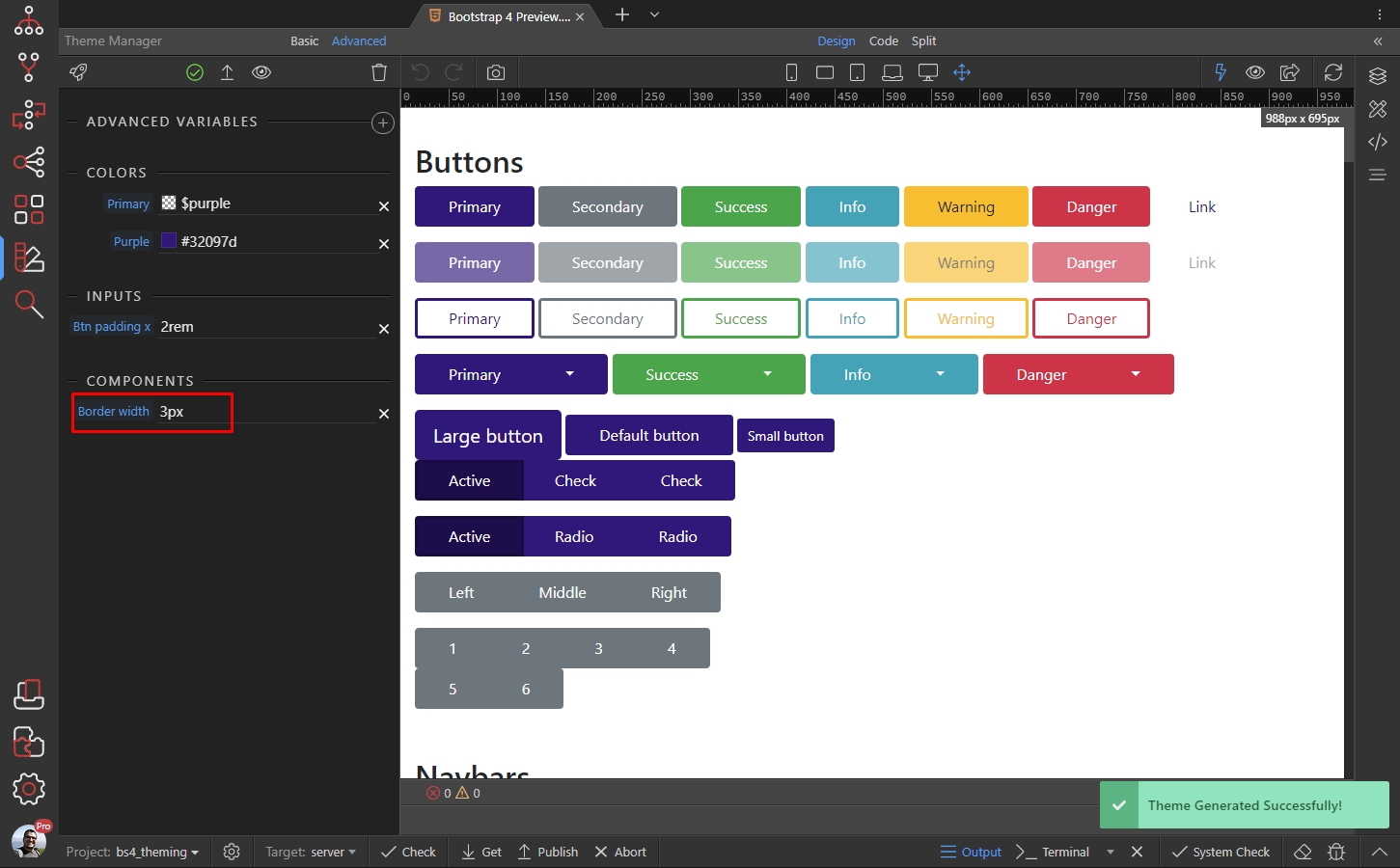
We enter a new value of 2rem and the changes are immediately applied:
Section titled “We enter a new value of 2rem and the changes are immediately applied:”
Then we click the add button:
Section titled “Then we click the add button:”Under Components category we select Border Width:
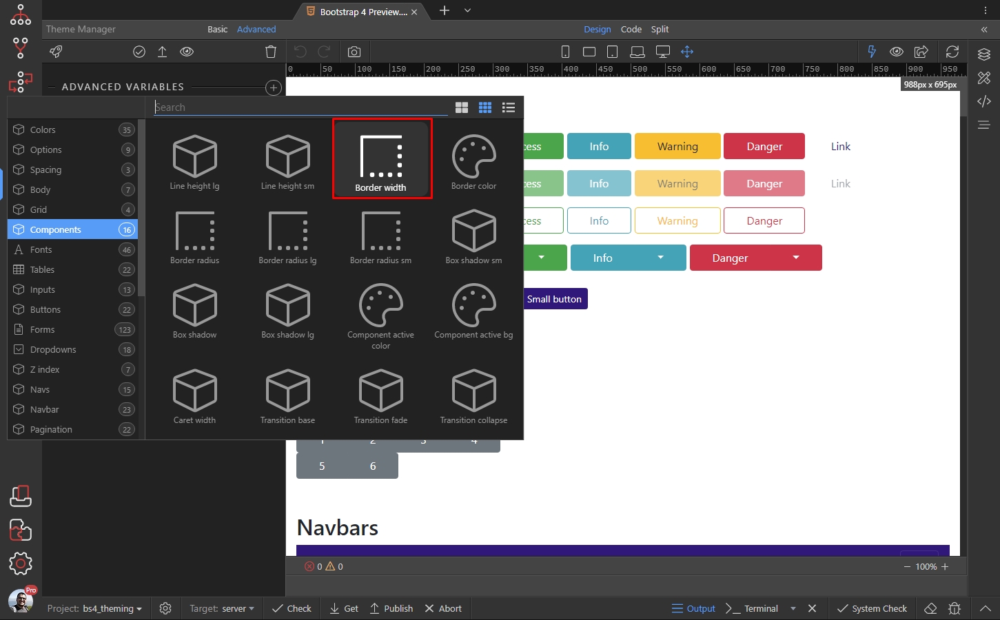
The default border width in Bootstrap 4 is 1px:
Section titled “The default border width in Bootstrap 4 is 1px:”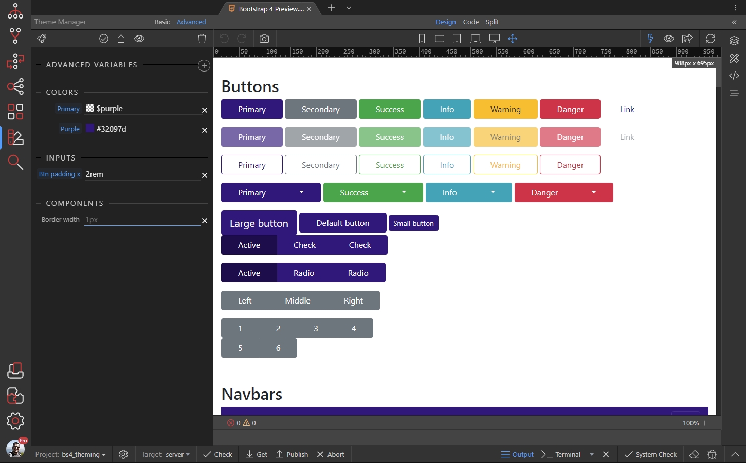
Let’s change that to 3px, the changes are applied immediately:
Section titled “Let’s change that to 3px, the changes are applied immediately:”