
Creating a Bootstrap 5 Navbar
Intro In this tutorial we will show you how to build a Bootstrap 5 Navbar from scratch. We will build a basic navbar with a logo and the navigation links aligned right. We will also apply a dark theme
In this tutorial we will show you how to build a Bootstrap 5 Navbar from scratch. We will build a basic navbar with a logo and the navigation links aligned right. We will also apply a dark theme to the navbar.
The navbar component consists of a few parts:
- Navbar brand - this is your logo or company name.
- Navbar toggler - this is the button use to open the navigation links on smaller screens, where it’s collapsed.
- Navbar collapse - this is the element which hides/collapses the navigation links on smaller screens
- Navbar nav with Links - these are your navigation links.
- A container (optional) - you can add a container inside the navbar if you don’t want it to expand to the full width of the screen, but instead use the standard Bootstrap 5 container width.
Creating the Navbar
Section titled “Creating the Navbar”We created a new blank page:

Click on add new component button:
Section titled “Click on add new component button:”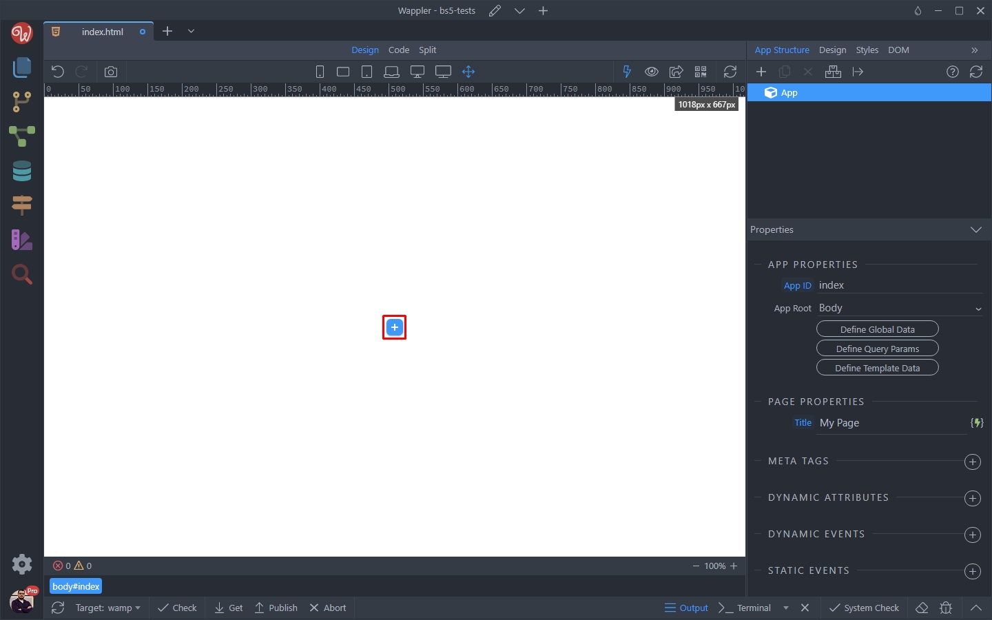
Select Elements > Navigation > Navbar
Section titled “Select Elements > Navigation > Navbar”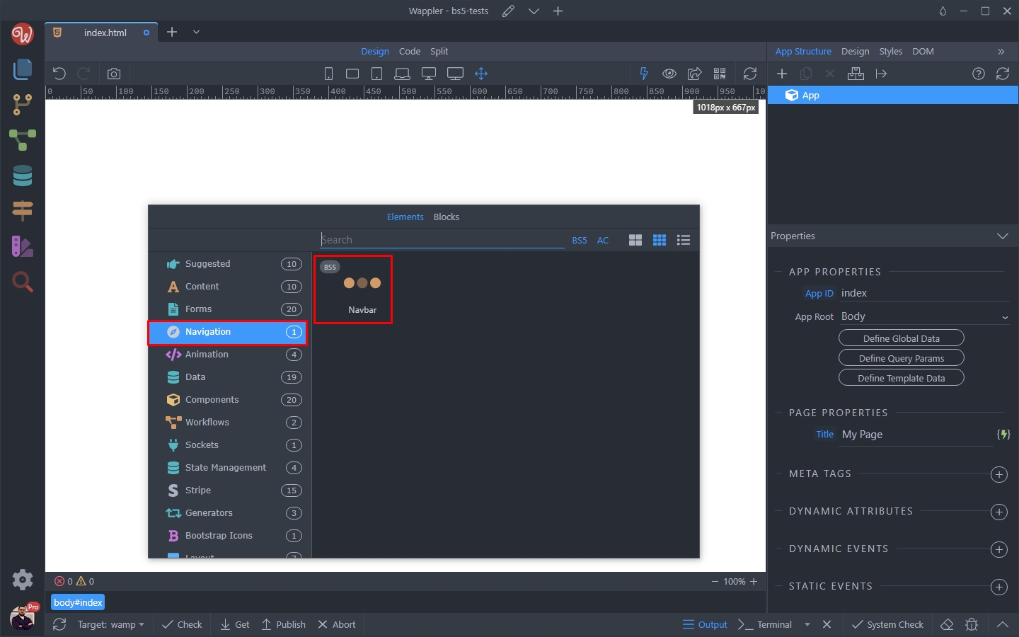
Then click the add element inside the Navbar:
Section titled “Then click the add element inside the Navbar:”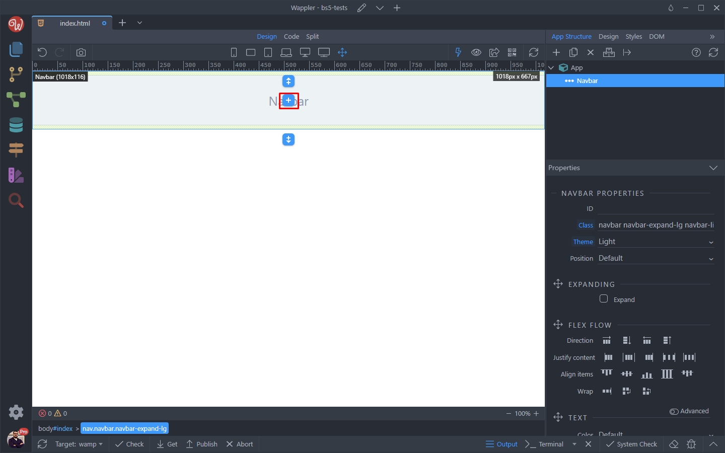
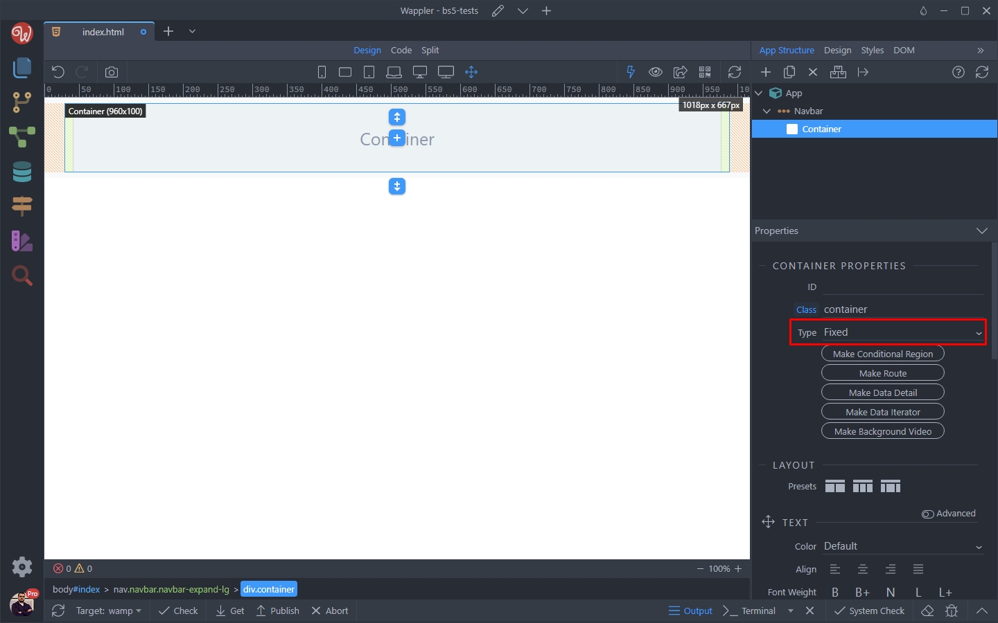
First we add a container, as we don’t want our navbar to expand to the full width of the screen:
Section titled “First we add a container, as we don’t want our navbar to expand to the full width of the screen:”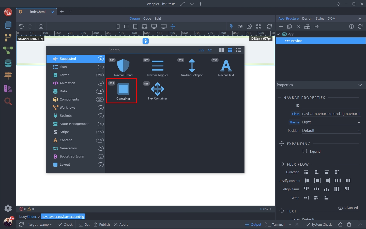
Step 8
Section titled “Step 8”You can change the container type to Fluid (instead of fixed) if you want to have your navbar expand to the full width of the screen:
Then inside the container, add new component:
Section titled “Then inside the container, add new component:”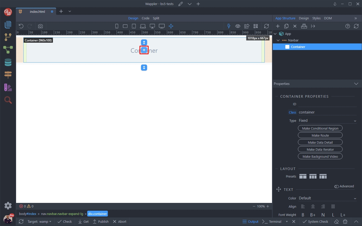
Select Navbar Brand:
Section titled “Select Navbar Brand:”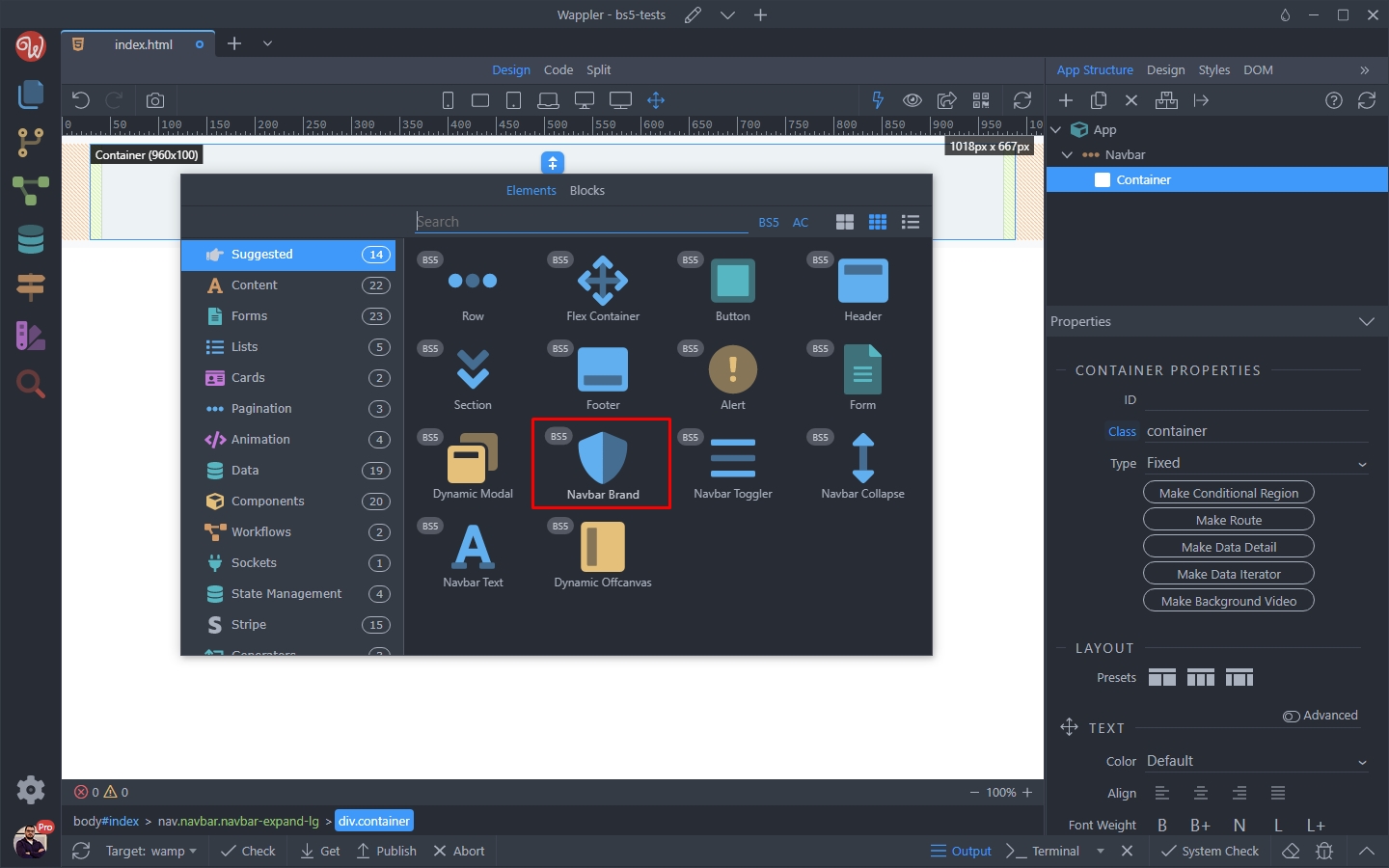
Step 11
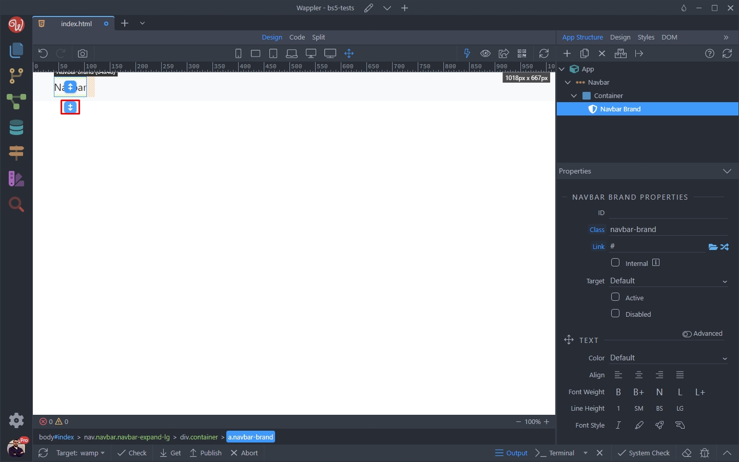
Section titled “Step 11”A Navbar Brand with a default text is added, we will change this later.
Add an element after the Navbar Brand:
Select Navbar Toggler:
Section titled “Select Navbar Toggler:”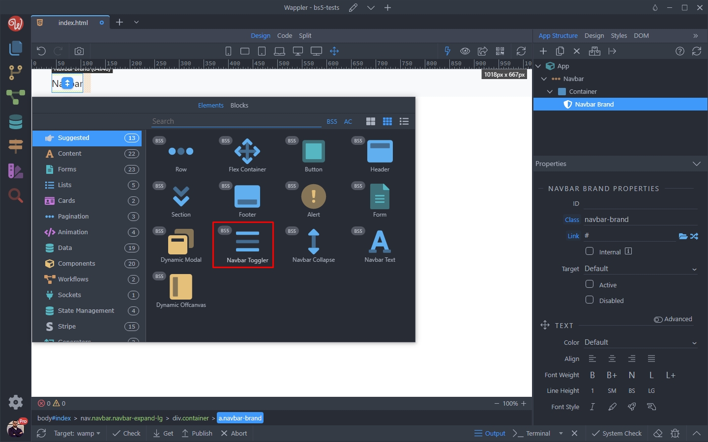
Step 13
Section titled “Step 13”The Navbar Toggler is added on your page, along with the Navbar Collapse which it controls.
Add new element inside the Collapse element:
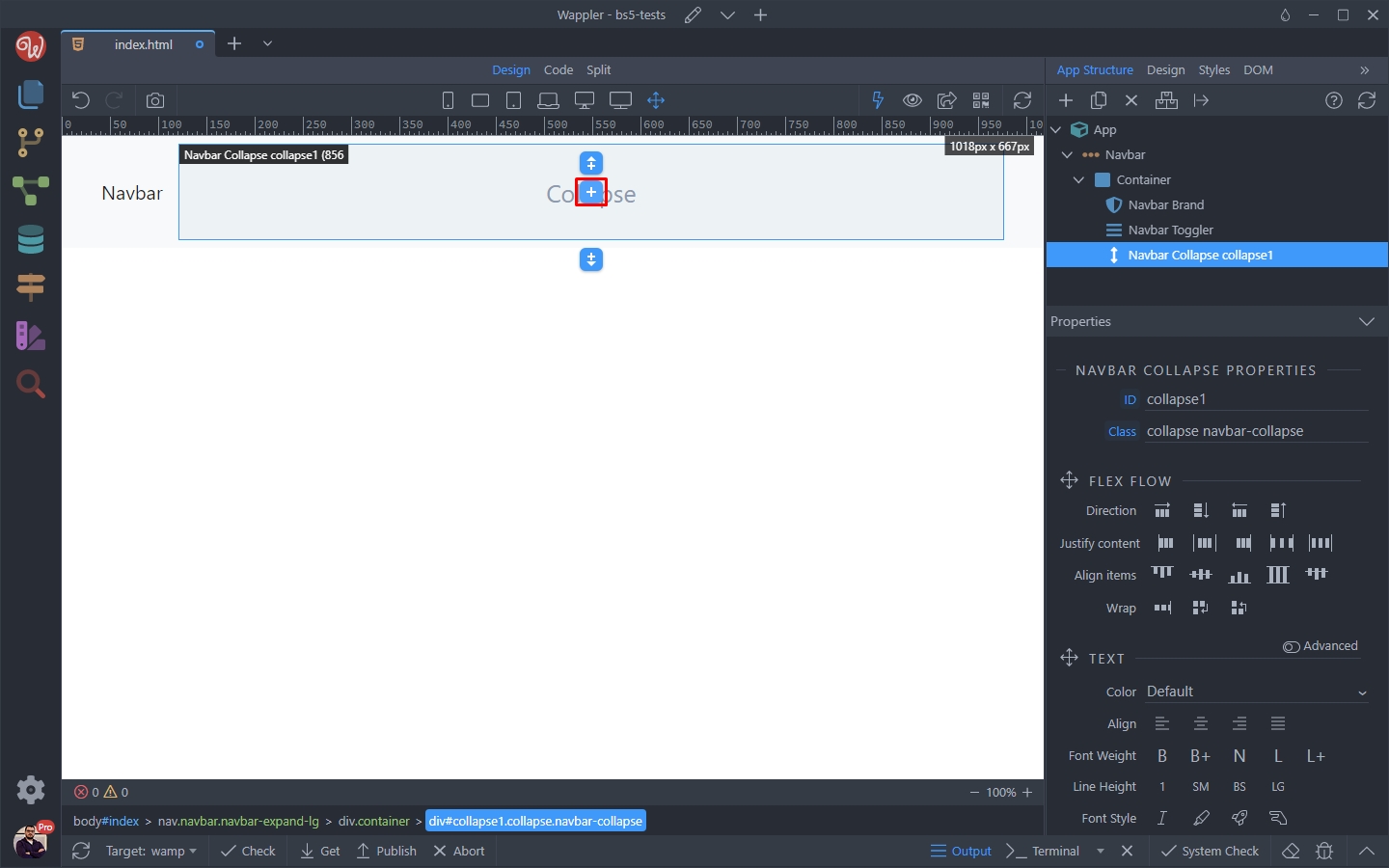
And select Lists > Navbar Nav:
Section titled “And select Lists > Navbar Nav:”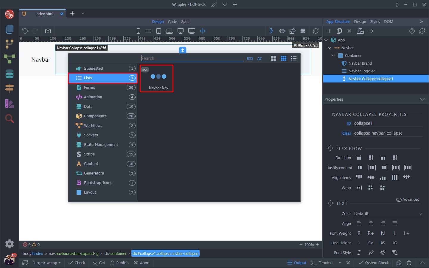
Finally, inside the Navbar Nav, add a new element:
Section titled “Finally, inside the Navbar Nav, add a new element:”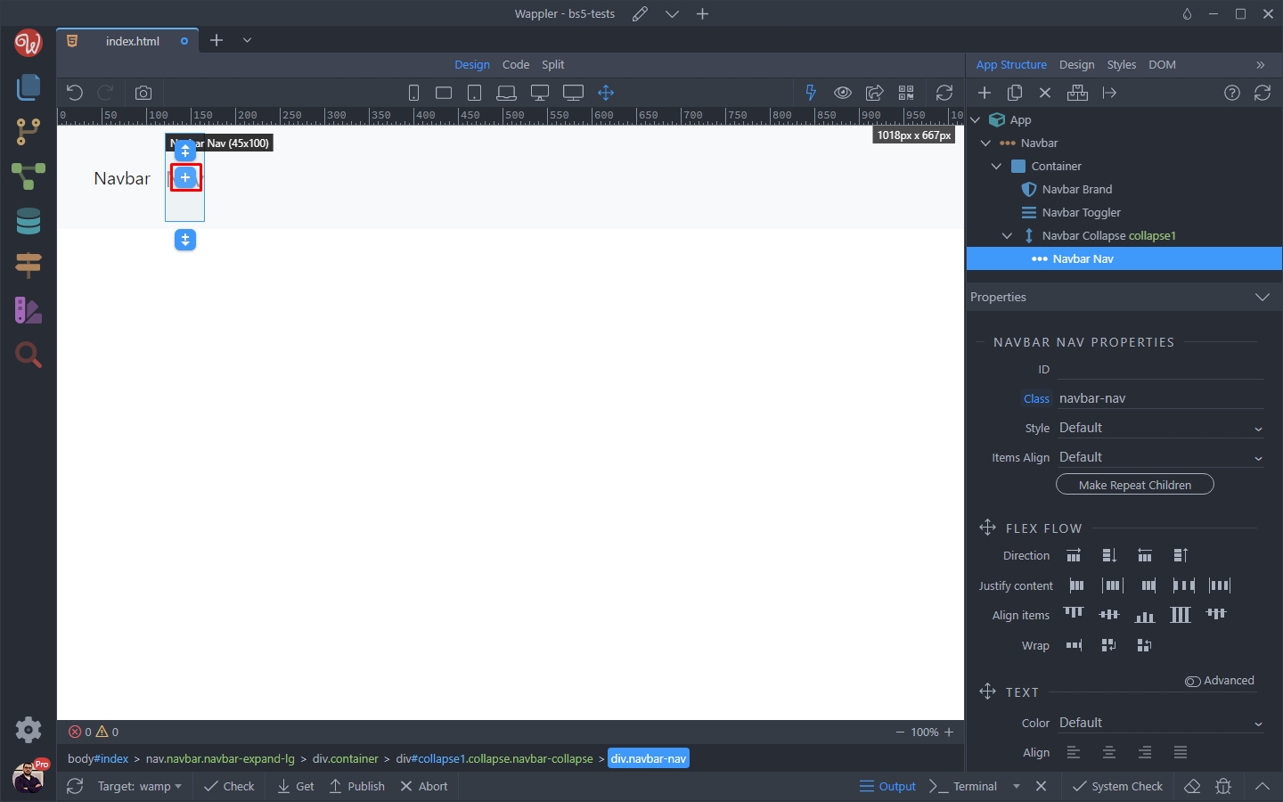
And select Nav Item or Nav Dropdown:
Section titled “And select Nav Item or Nav Dropdown:”
Add as many items or dropdowns as you need. This is the result, a basic navbar with a basic styling:
Section titled “Add as many items or dropdowns as you need. This is the result, a basic navbar with a basic styling:”
Customizing the Navbar
Section titled “Customizing the Navbar”We can customize the Navbar a bit.
Align Nav Items Right
Section titled “Align Nav Items Right”By default the nav items are aligned left, next to the Nav Brand element. You can easily change this and align them right.
Select the Navbar Nav element in the App Structure:
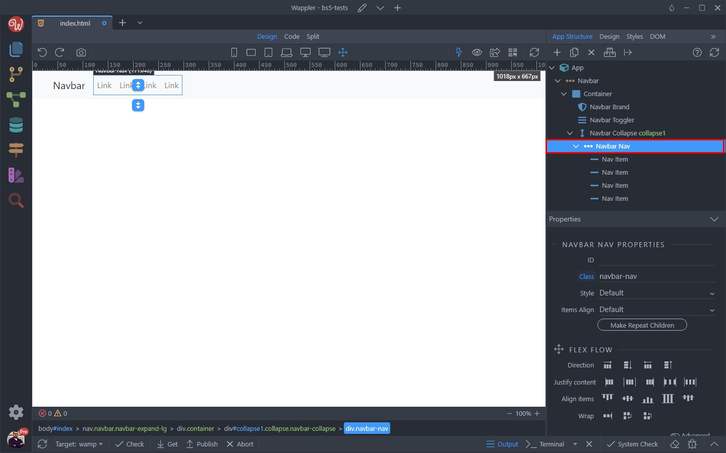
Scroll down and change the Margin Left to Auto by dragging the margin left handle:
Section titled “Scroll down and change the Margin Left to Auto by dragging the margin left handle:”
And that’s all. You have your nav items aligned right!
Section titled “And that’s all. You have your nav items aligned right!”Add a Logo
Section titled “Add a Logo”By default the Navbar Brand comes with a default text. You can change this text or add a logo instead:
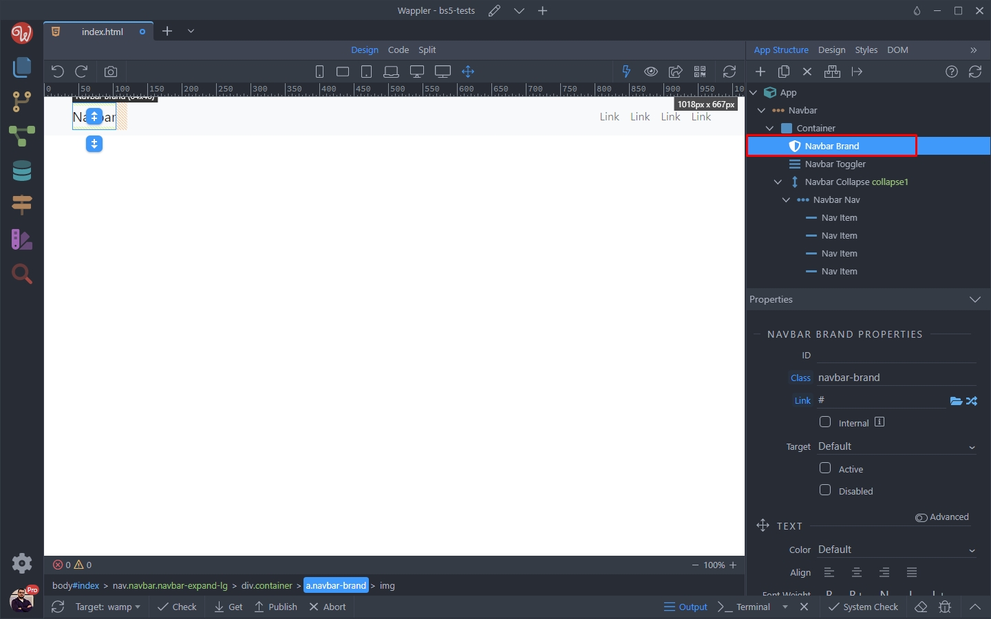
Double click the Navbar Brand text in design view:
Section titled “Double click the Navbar Brand text in design view:”
And just delete the default text. Then right click the Navbar Brand element in App Structure:
Section titled “And just delete the default text. Then right click the Navbar Brand element in App Structure:”And just delete the default text.
Then right click the Navbar Brand element in App Structure:
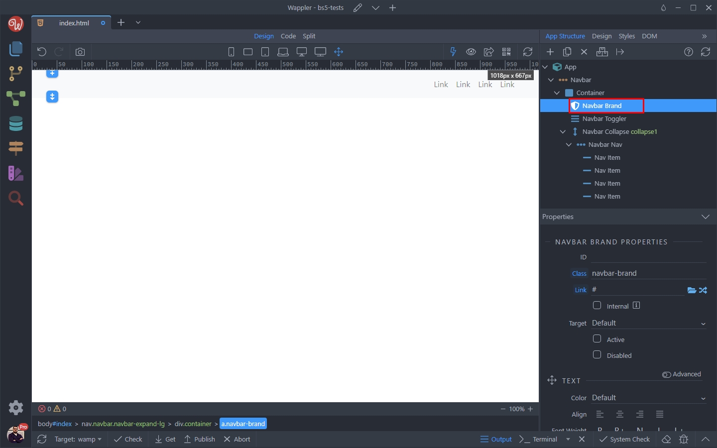
And add an image inside it:
Section titled “And add an image inside it:”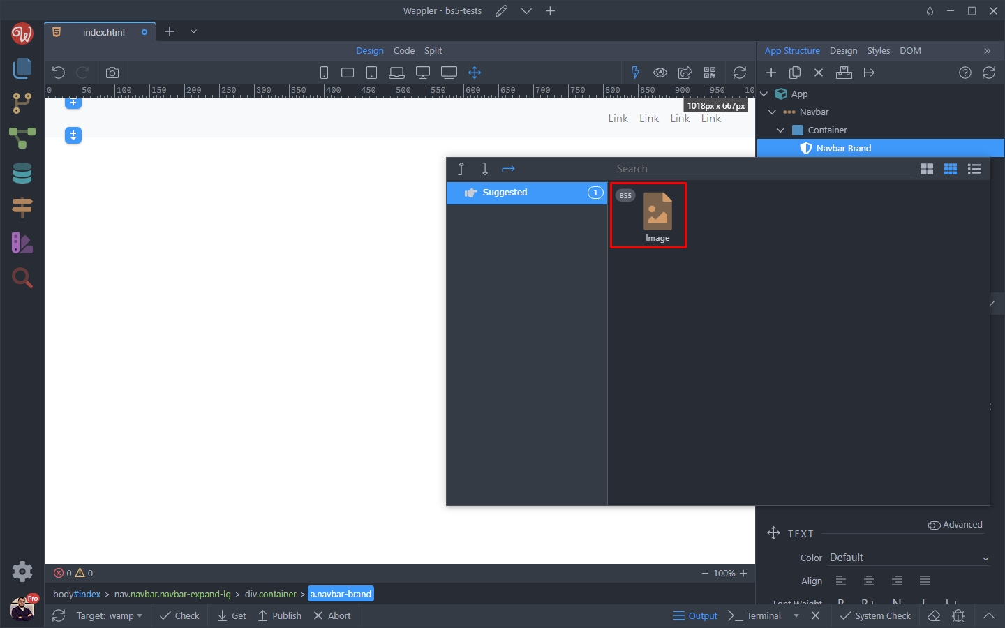
Select your image/logo:
Section titled “Select your image/logo:”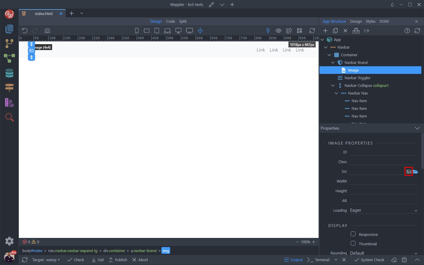
The Assests picker appears - so we select our logo:
Section titled “The Assests picker appears - so we select our logo:”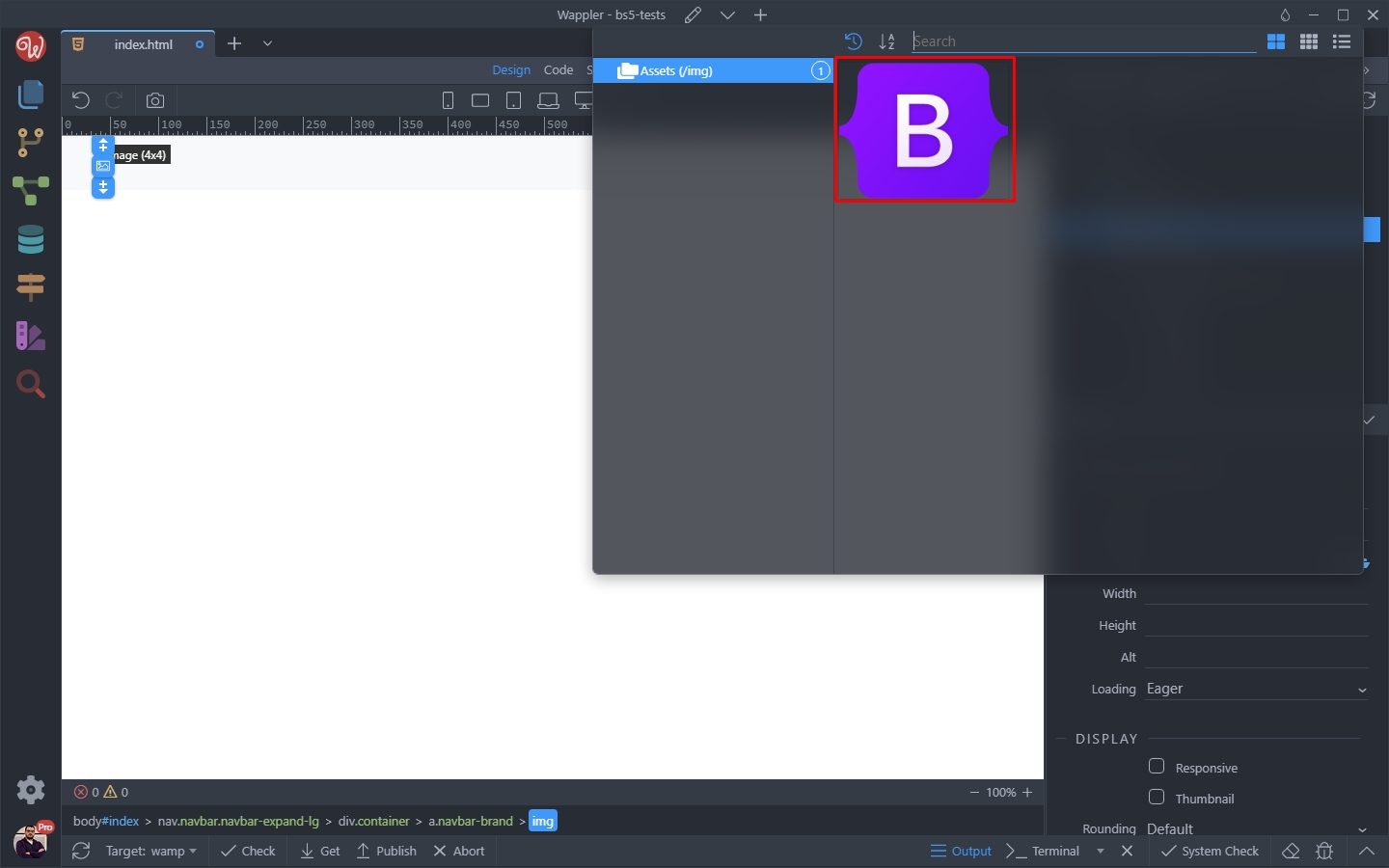
Set the width and height for your logo:
Section titled “Set the width and height for your logo:”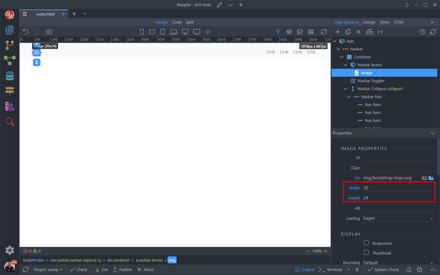
And you are done. You have the logo added to your Navbar:
Section titled “And you are done. You have the logo added to your Navbar:”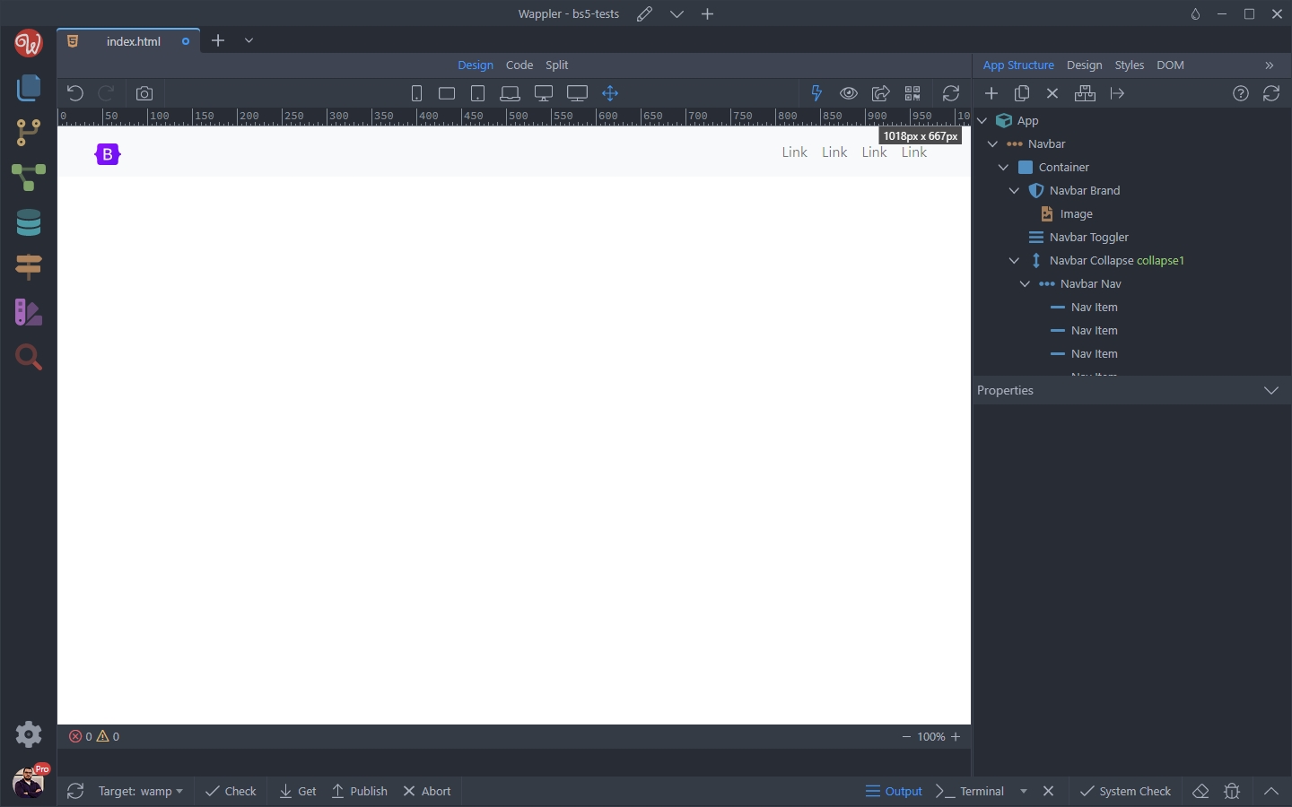
Apply a Dark Theme
Section titled “Apply a Dark Theme”You can change the theme of the navbar - it’s background and links colors.
Select your Navbar element in the App Structure:
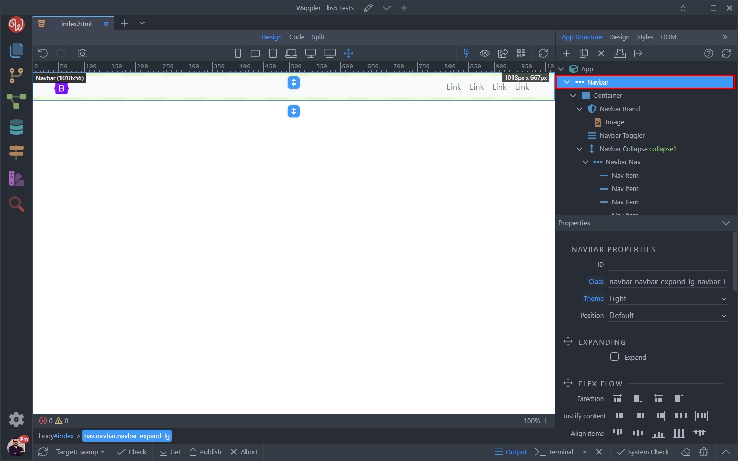
Scroll down to Appearance in the Properties panel and change a Back Color - in our case we select Dark:
Section titled “Scroll down to Appearance in the Properties panel and change a Back Color - in our case we select Dark:”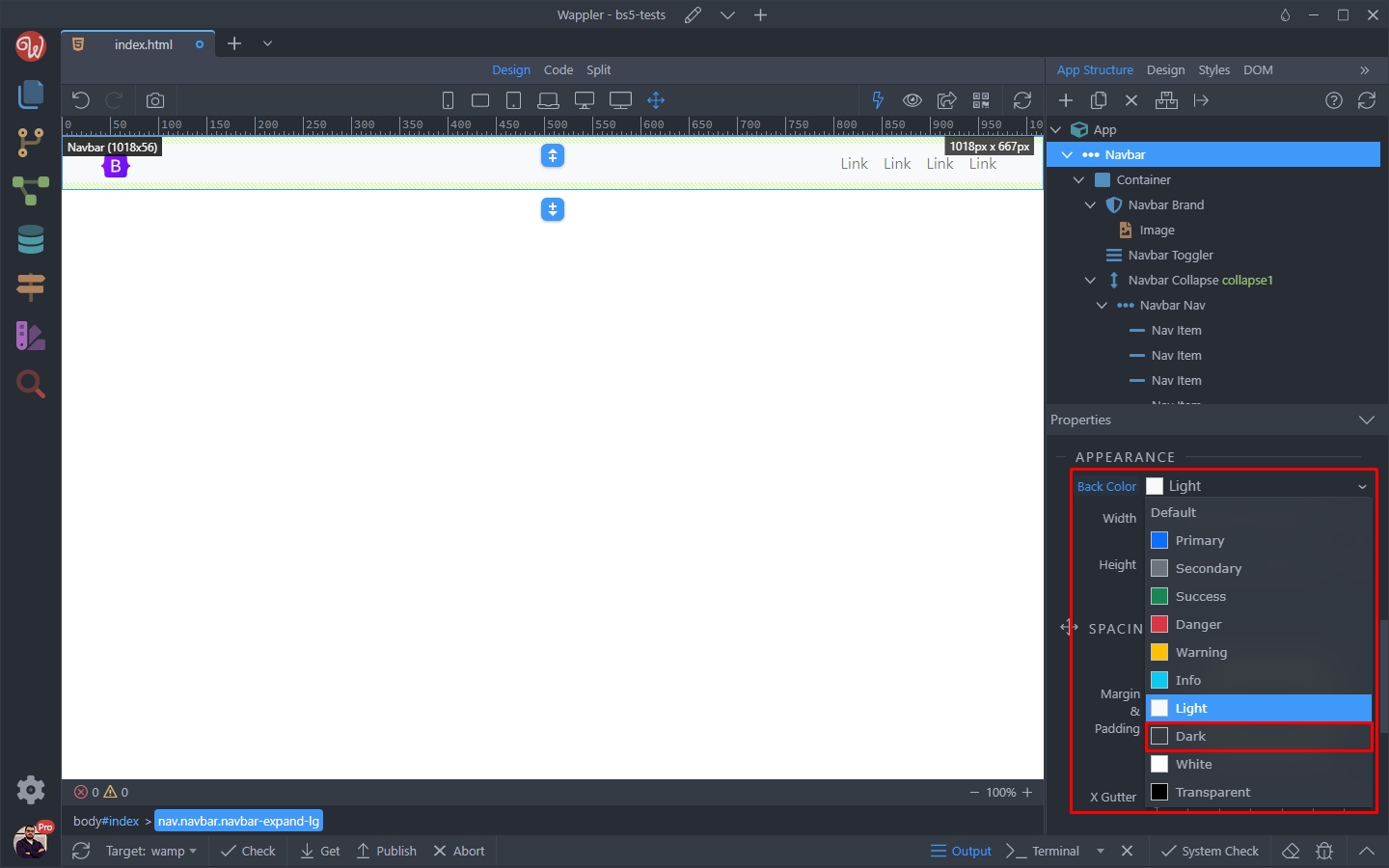
Step 34
Section titled “Step 34”Then, in order to make the links colors look nice on the dark background you need to change the Navbar theme. Open the Theme dropdown, which defaults to Light:
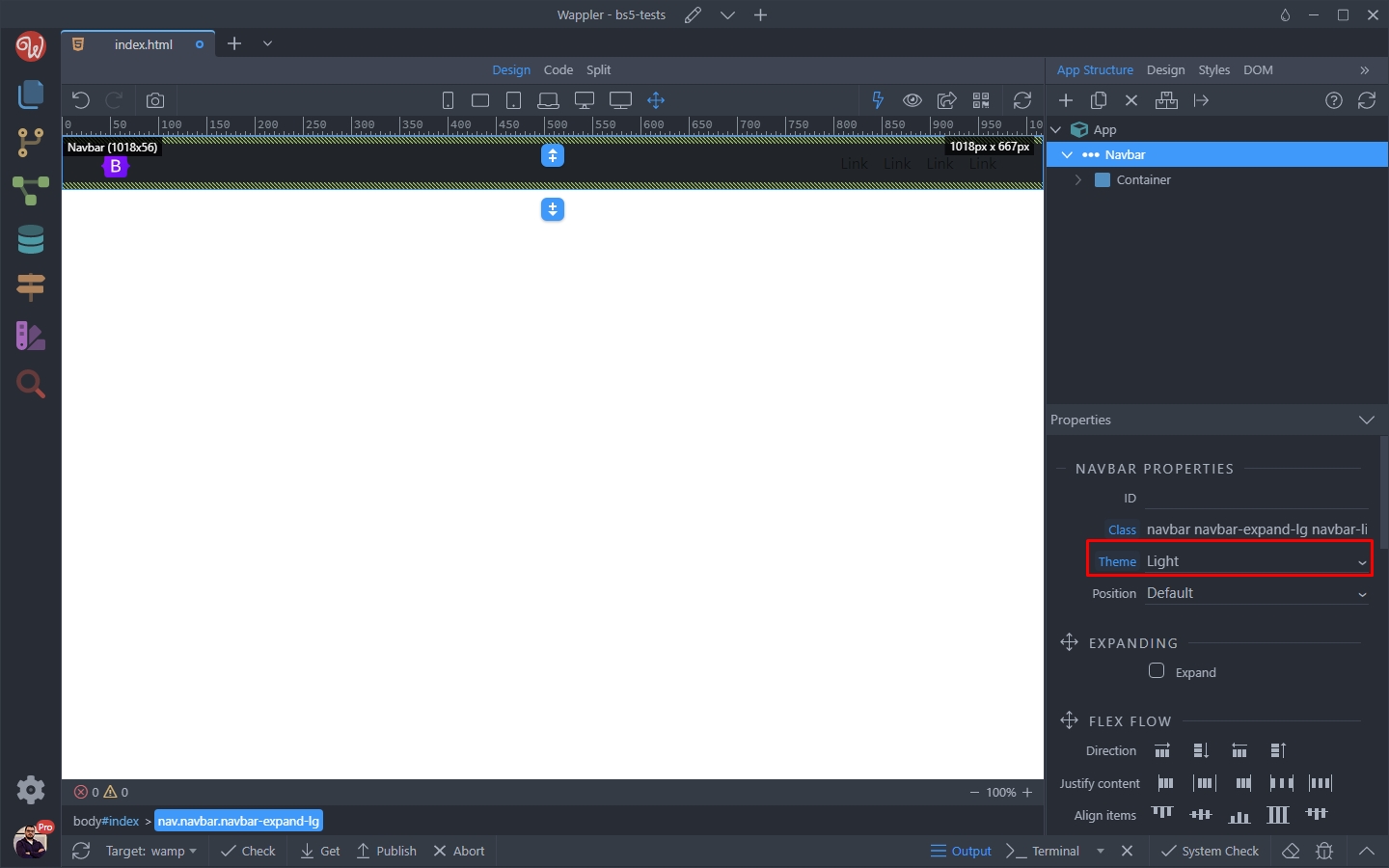
Step 35
Section titled “Step 35”And set it to Dark, as we selected a dark background color. When using light background colors, the theme should be set to Light:
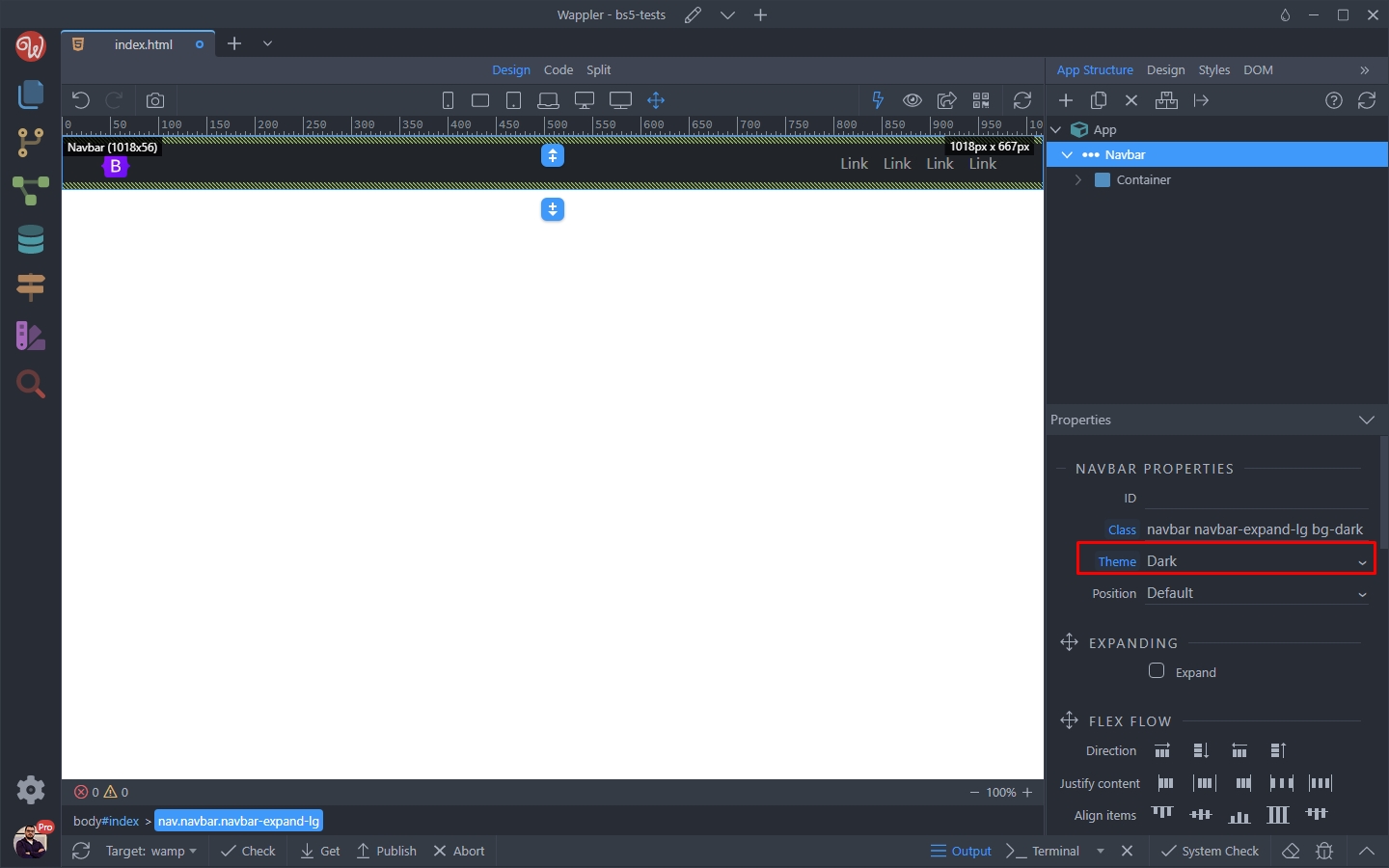
Change the Expand Properties
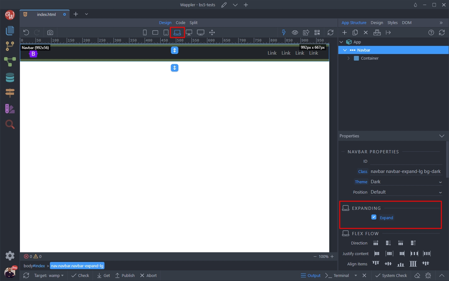
Section titled “Change the Expand Properties”By default, the Navbar is collapsed on small screens, up to lg (laptop) size. Then on lg and bigger screen sizes it’s expanded. You can see this, by checking the Expand option on a lg screen size:
If you switch to a md (tablet) size or smaller - the Expand option is not checked:
Section titled “If you switch to a md (tablet) size or smaller - the Expand option is not checked:”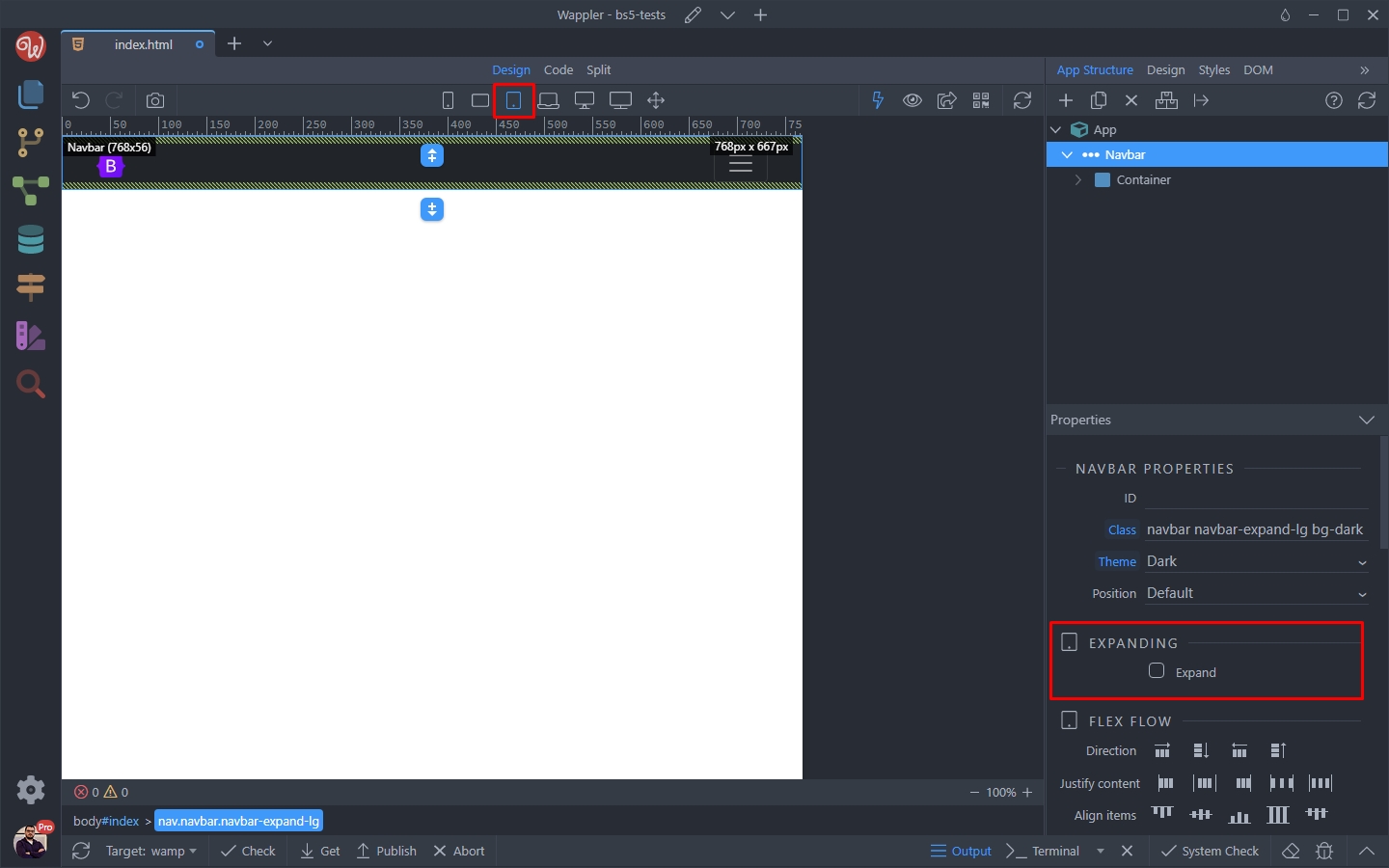
Step 39
Section titled “Step 39”You can make your navbar expand on md (tablet) size, by simply clicking this option while on a md screen size:
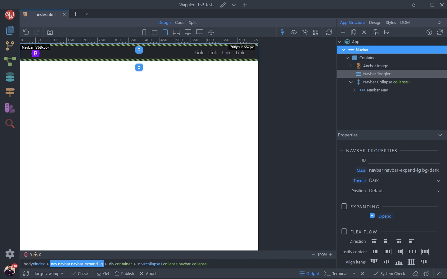
Step 40
Section titled “Step 40”And you are done! Adjust the actual navbar links urls and texts and you have a fully functional navbar for your website or app.