Bootstrap Layout
Core Concept Bootstrap is a mobile first responsive design framework. This means that any styling - like setting the number of columns - in mobile view, will also apply to larger screens. This can be
Core Concept
Section titled “Core Concept”Bootstrap is a mobile first responsive design framework. This means that any styling - like setting the number of columns - in mobile view, will also apply to larger screens. This can be offset by applying different styling to larger screens.
Conversely, setting a style to larger screen sizes will not affect smaller screen sizes.
This is an important concept to remember to avoid layout problems.
Containers
Section titled “Containers”Containers are the most basic layout element in Bootstrap and are required when using the default grid system.
- They wrap and contain the content.
- Provide basic padding and margin to the content.
- Centre the content on the page.
- Can be Fixed, Fluid or Responsive.
Adding a Fixed Container
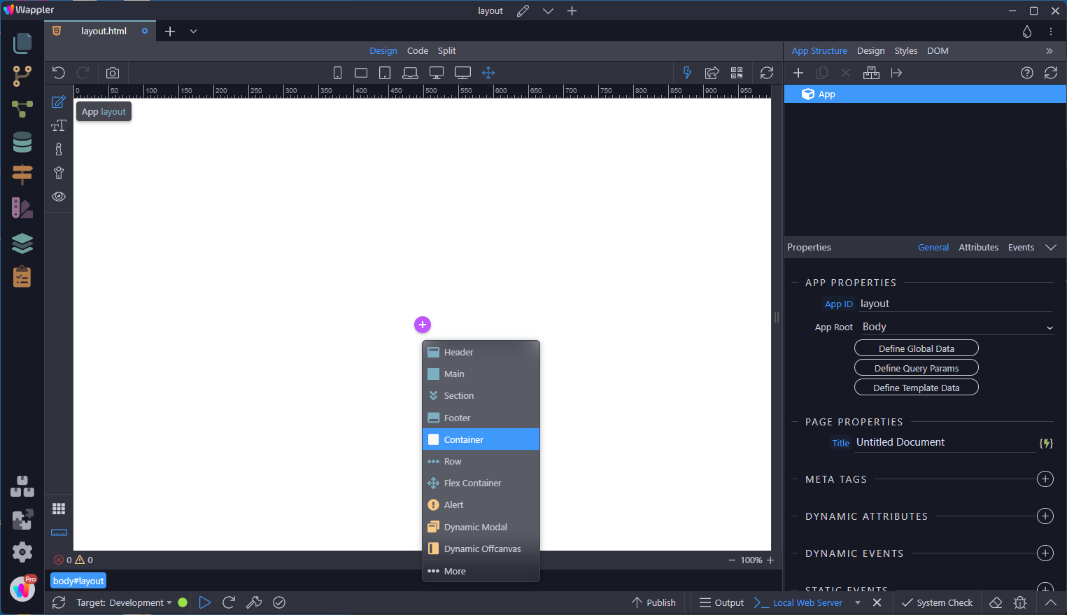
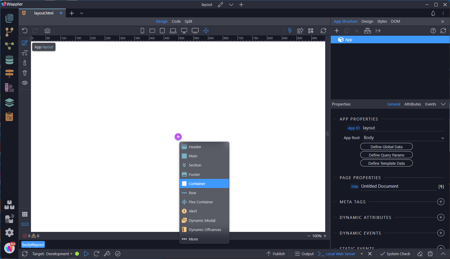
Section titled “Adding a Fixed Container”With App selected, click on the add-inside-button and choose Container
Step 5
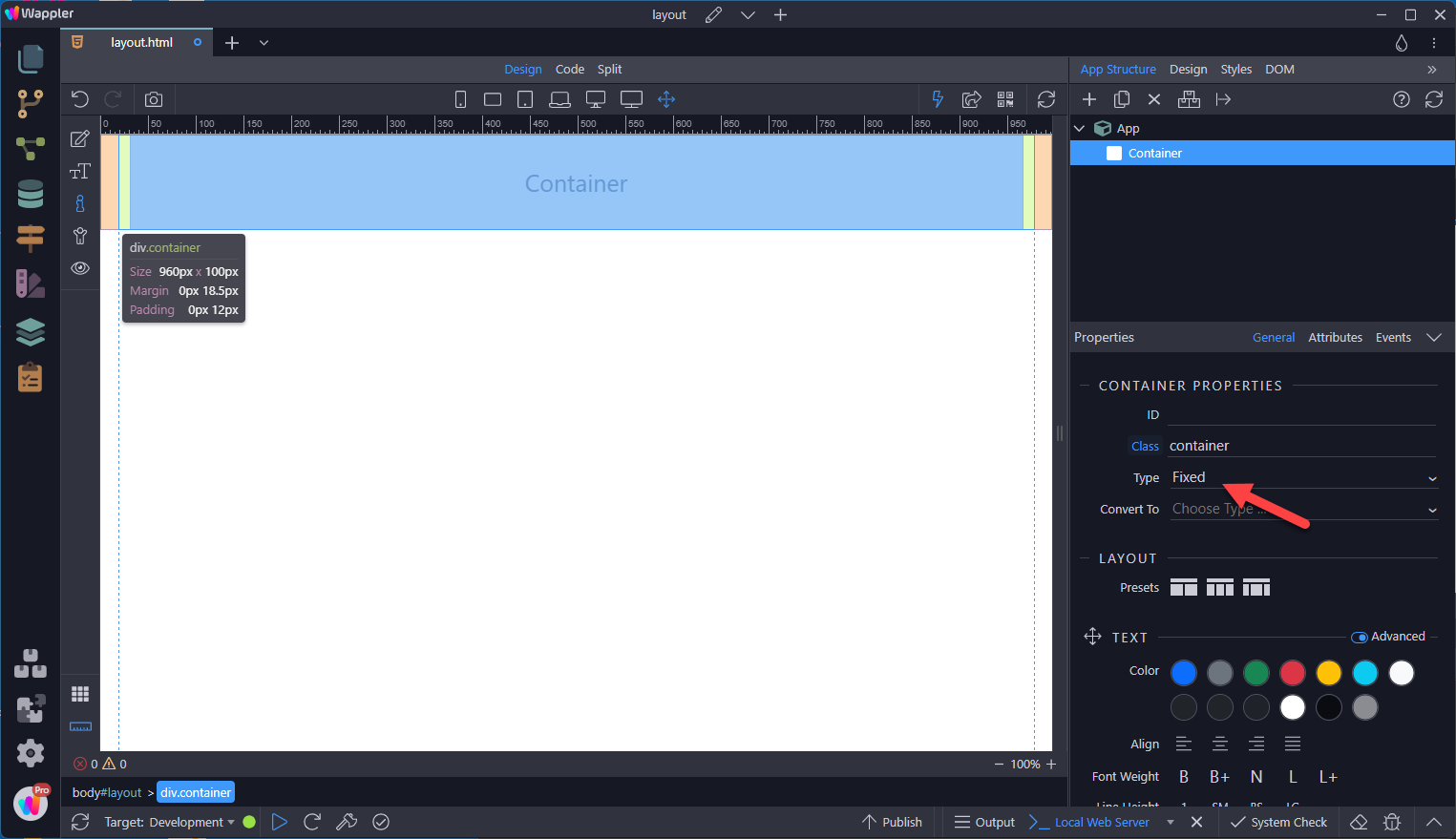
Section titled “Step 5”This gives us a fixed container with a left and right padding of 12px. It also has a left and right margin 18.5px.
Step 6
Section titled “Step 6”In actual fact, the margins have been set to auto and when the viewport changes, you will see the values for the margin change as well.
Changing to a Fluid Container
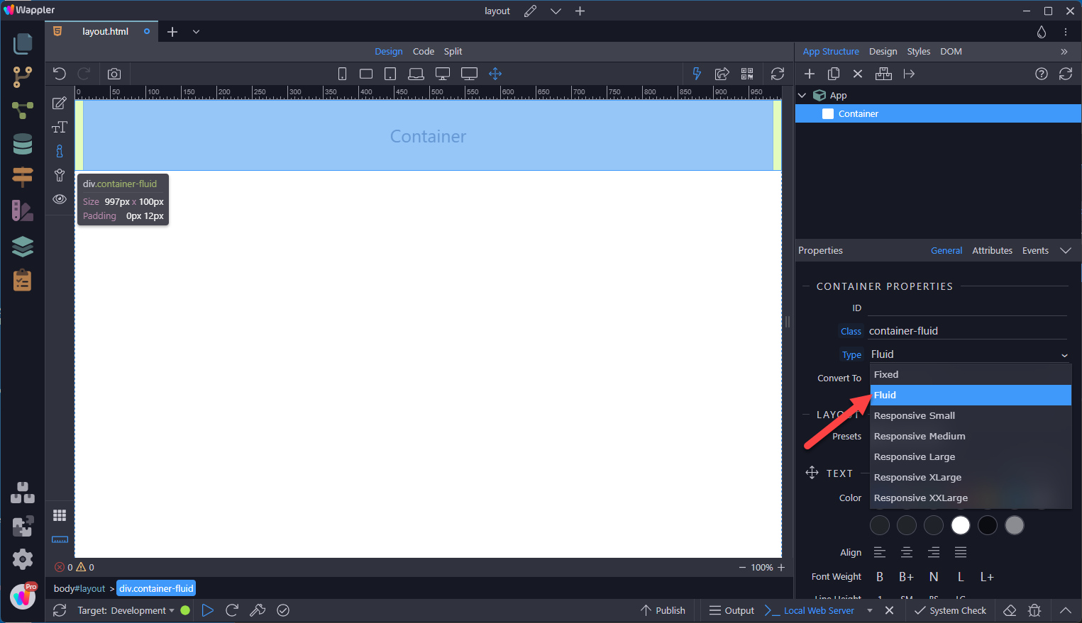
Section titled “Changing to a Fluid Container”Selecting the Type dropdown and choosing Fluid, gives us a container void of margins.
Changing to a Responsive Container
Section titled “Changing to a Responsive Container”There may be instances where a fluid container becomes far too large in larger screen sizes. In that case Bootstrap has the Responsive option which allows a Fluid Container for handheld devices and a Fixed Container for larger devices. In the following image, Responsive Large has been chosen. Notice the return of the margin.
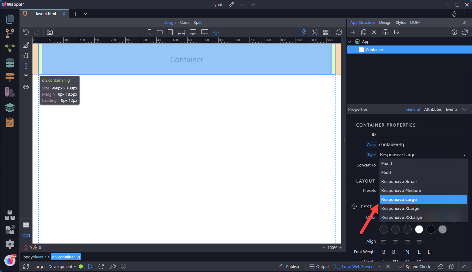
When changing to the Tablet view, the margin disappears.
Section titled “When changing to the Tablet view, the margin disappears.”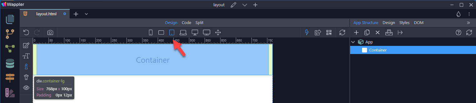
Adding a Container to a Semantic Element
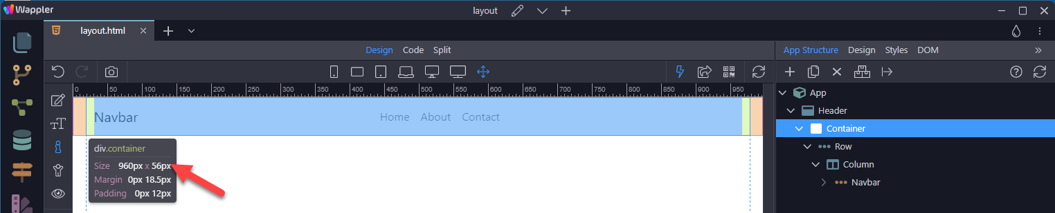
Section titled “Adding a Container to a Semantic Element”In the above examples, the Container was added inside the App element. But you may want to divide your document into semantic sections, such as header, nav, main, footer, section or article.
In that case, you can add the container inside the semantic section as in the following example. You may have noted the change in the height of the Container. The original height shown in Wappler is a Wappler thing, it is not the true height of the Container.
The height of the Container and subsequent Row and Column, is related to the amount of content inside the Column. In other words, the height is fluid.
Bootstrap Grid
Section titled “Bootstrap Grid”Bootstrap’s grid system uses a series of containers, rows, and columns to layout and align content. It’s built with flexbox and is fully responsive. Below is an example and an in-depth explanation for how the grid system comes together.
New to or unfamiliar with flexbox? Read this CSS Tricks flexbox guide for background, terminology, guidelines, and code snippets.
Example
Section titled “Example”Add a Container
Add a Row
Section titled “Add a Row”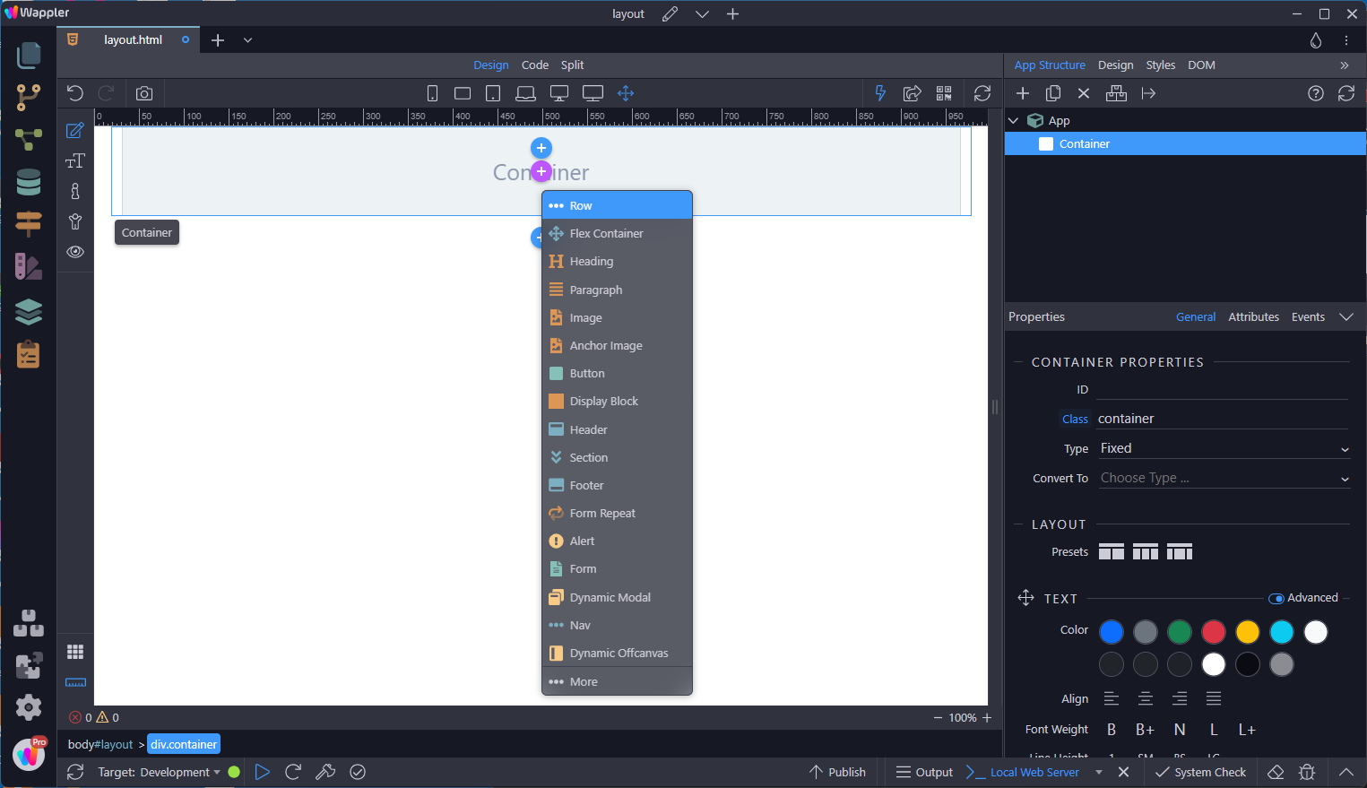
Add a Column
Section titled “Add a Column”
Inside the Column, add a Paragraph.
Section titled “Inside the Column, add a Paragraph.”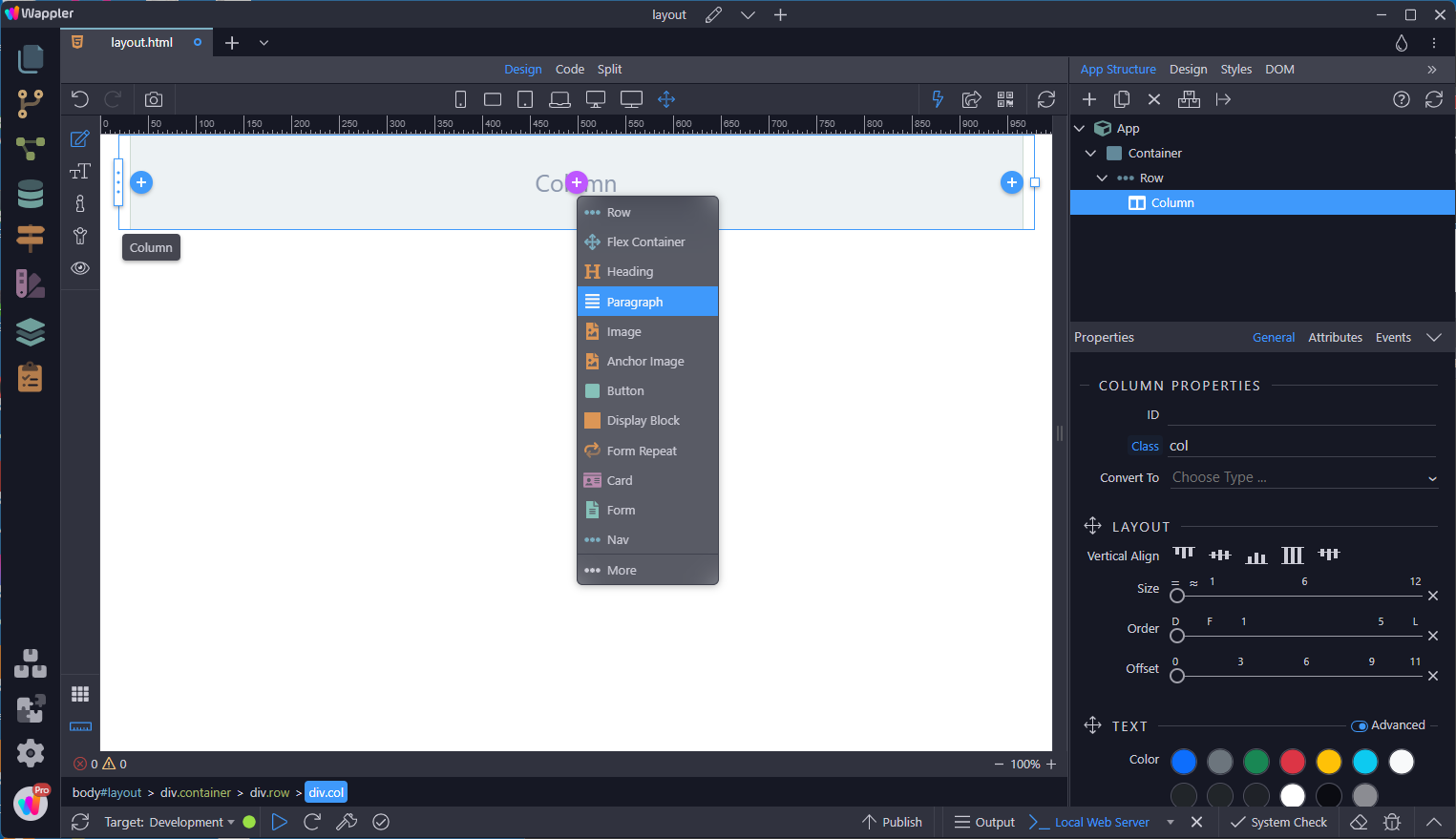
Change the Paragraph text
Section titled “Change the Paragraph text”
And center it
Section titled “And center it”
Add a margin above the paragraph. This places the paragraph in the vertical centre of the column.
Section titled “Add a margin above the paragraph. This places the paragraph in the vertical centre of the column.”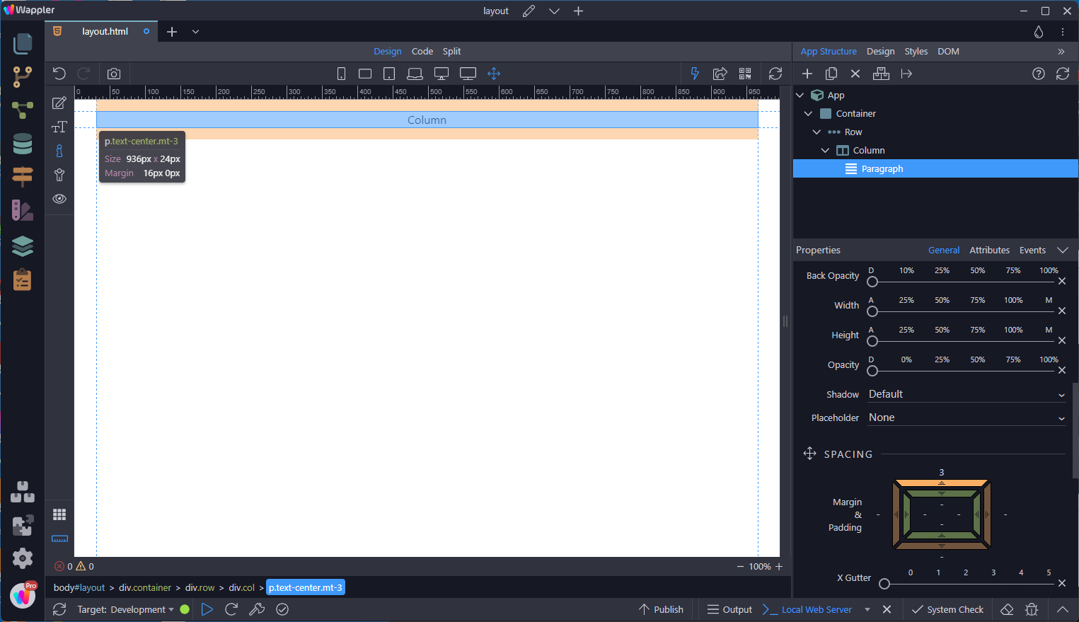
Change the background color of the column
Section titled “Change the background color of the column”
Add a border of 2px wide with a dark color.
Section titled “Add a border of 2px wide with a dark color.”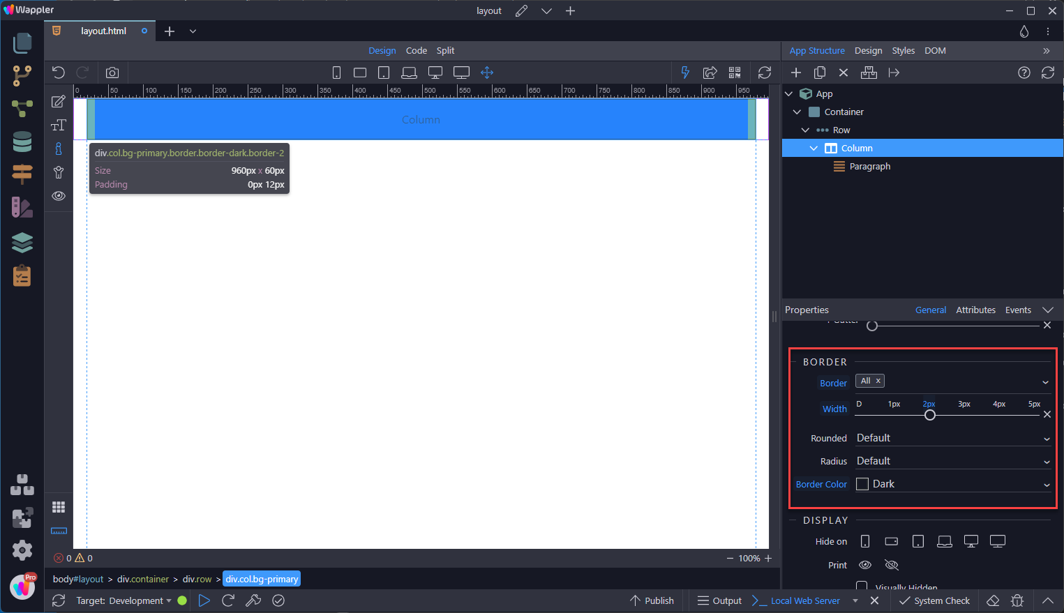
Duplicate the column to give us three columns of equal width.
Section titled “Duplicate the column to give us three columns of equal width.”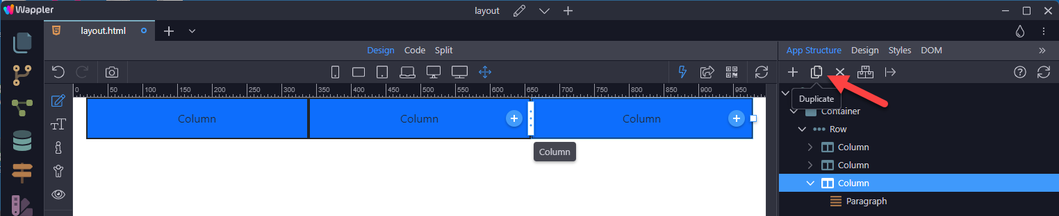
How it Works
Section titled “How it Works”Breaking it down, here’s how the grid system comes together:
- Containers are wrappers for Rows.
- Rows are wrappers for Columns…
- Columns are wrappers for content.
Grid Options
Section titled “Grid Options”Along the top of the canvas, are icons depicting from left to right

Phone (xs) Landscape Phone (sm) Tablet (md) Laptop (lg) Desktop (xl) Wide (xxl)
Section titled “Phone (xs) Landscape Phone (sm) Tablet (md) Laptop (lg) Desktop (xl) Wide (xxl)”- Phone (xs)
- Landscape Phone (sm)
- Tablet (md)
- Laptop (lg)
- Desktop (xl)
- Wide (xxl)
The last icon is for Wappler’s full size view.
Bootstrap’s grid system can adapt across all six default breakpoints, and any breakpoints you customize.
Auto Layout Columns
Section titled “Auto Layout Columns”Utilize breakpoint-specific column classes for easy column sizing without an explicit numbered class like .col-sm-6.
Equal Width
Section titled “Equal Width”For example, here are two grid layouts that apply to every device and viewport, from xs to xxl. Add any number of unit-less classes for each breakpoint you need and every column will be the same width.
Setting One Column Width
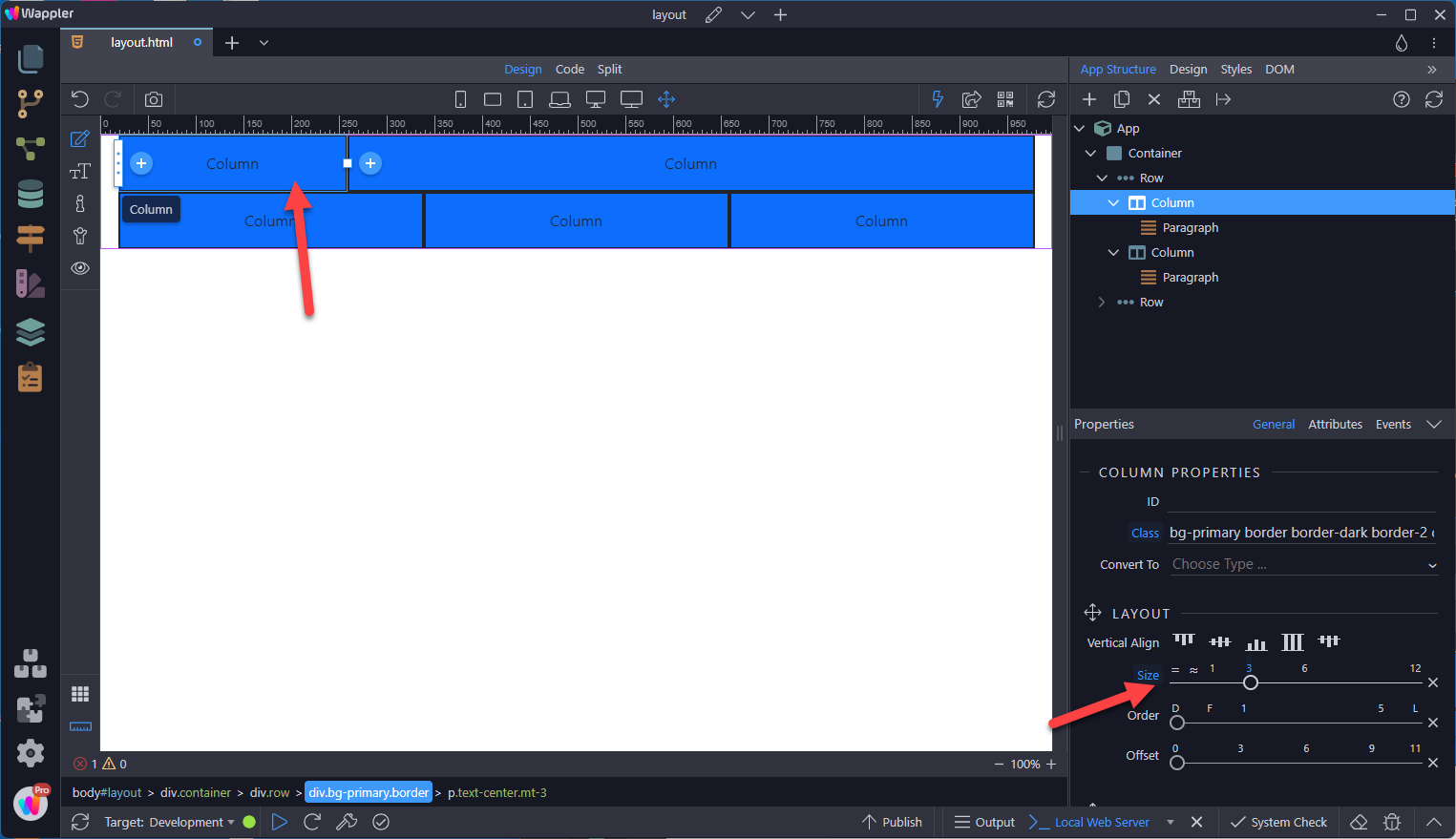
Section titled “Setting One Column Width”Auto-layout for flexbox grid columns also means you can set the width of one column and have the sibling columns automatically resize around it. Note that the other columns will resize.
Variable Width Content
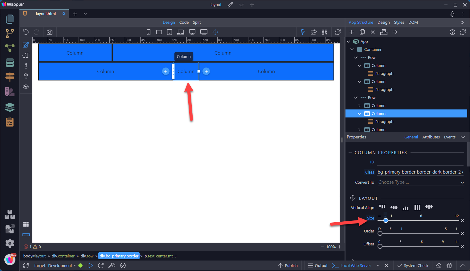
Section titled “Variable Width Content”Use the Variable Width option to size the column according to the content.
Responsive Classes
Section titled “Responsive Classes”Bootstrap’s grid includes six tiers of predefined classes for building complex responsive layouts. Customize the size of your columns on extra small, small, medium, large, or extra-large devices however you see fit.
All Breakpoints
Section titled “All Breakpoints”For layouts that are the same from smallest of devices to the largest, use the Full Screen icon.

Stacked to Horizontal
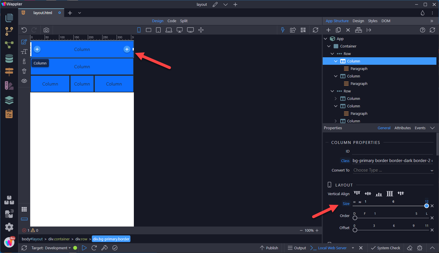
Section titled “Stacked to Horizontal”For the smallest devices, you may need to stack the columns due to a lack of real estate. For this you need to select the Mobile icon.

Step 40
Section titled “Step 40”For a two column layout, only one of the two columns needs to have the size set. The other column will fill the remaining space in the row.
Step 41
Section titled “Step 41”For a three column layout, only the centre column need to have the size set; the other columns will fill the remaining space in the row.
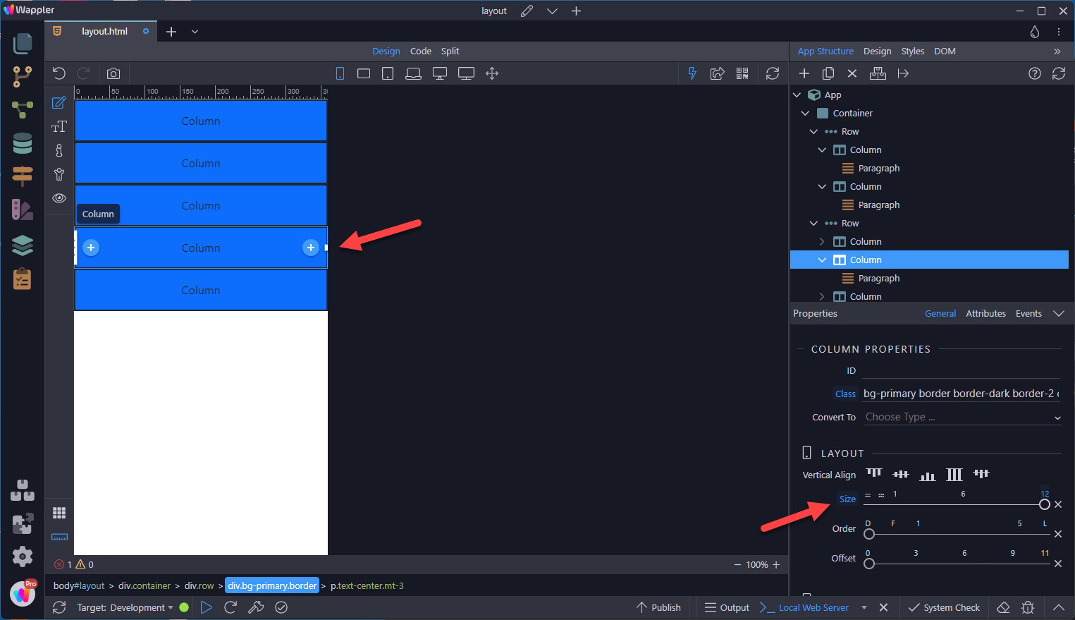
Mix and Match
Section titled “Mix and Match”Don’t want your columns to simply stack in some grid tiers? Use a combination of different classes for each tier as needed. See the example below for a better idea of how it all works. The second column was sized when in Full Screen mode, meaning that it applies to all screen sizes.
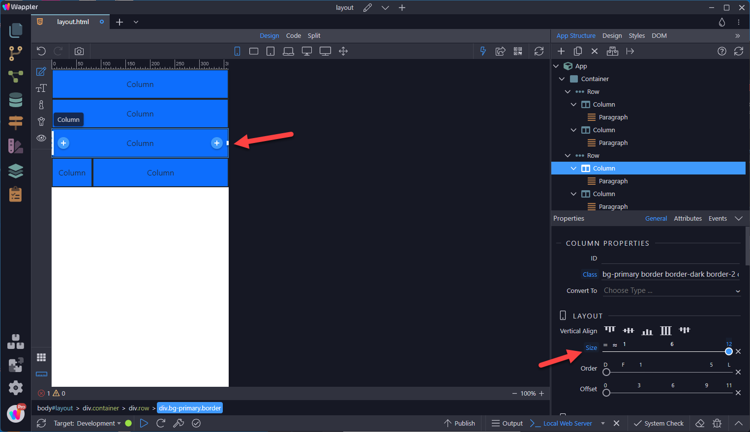
Responsive Layout
Section titled “Responsive Layout”Being a Mobile First framework, setting the layout in Mobile view will carry through to larger screen sizes.
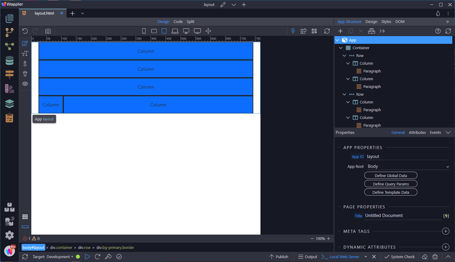
Step 46
Section titled “Step 46”With a larger device selected, change the size of the column(s) that are affected. The resulting layout will carry through to larger sizes.
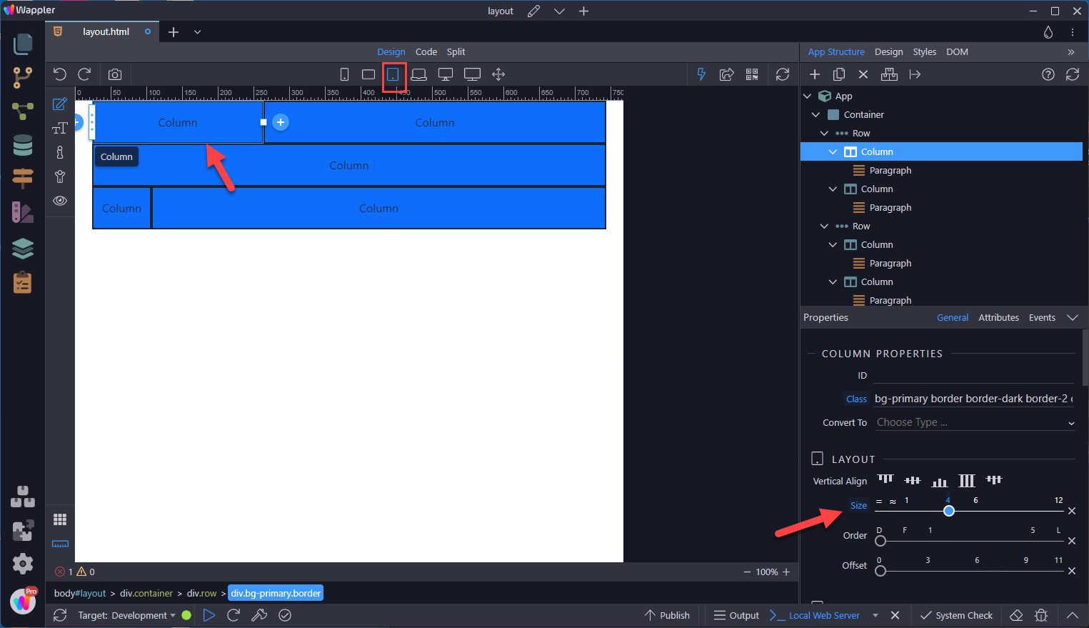
Step 47
Section titled “Step 47”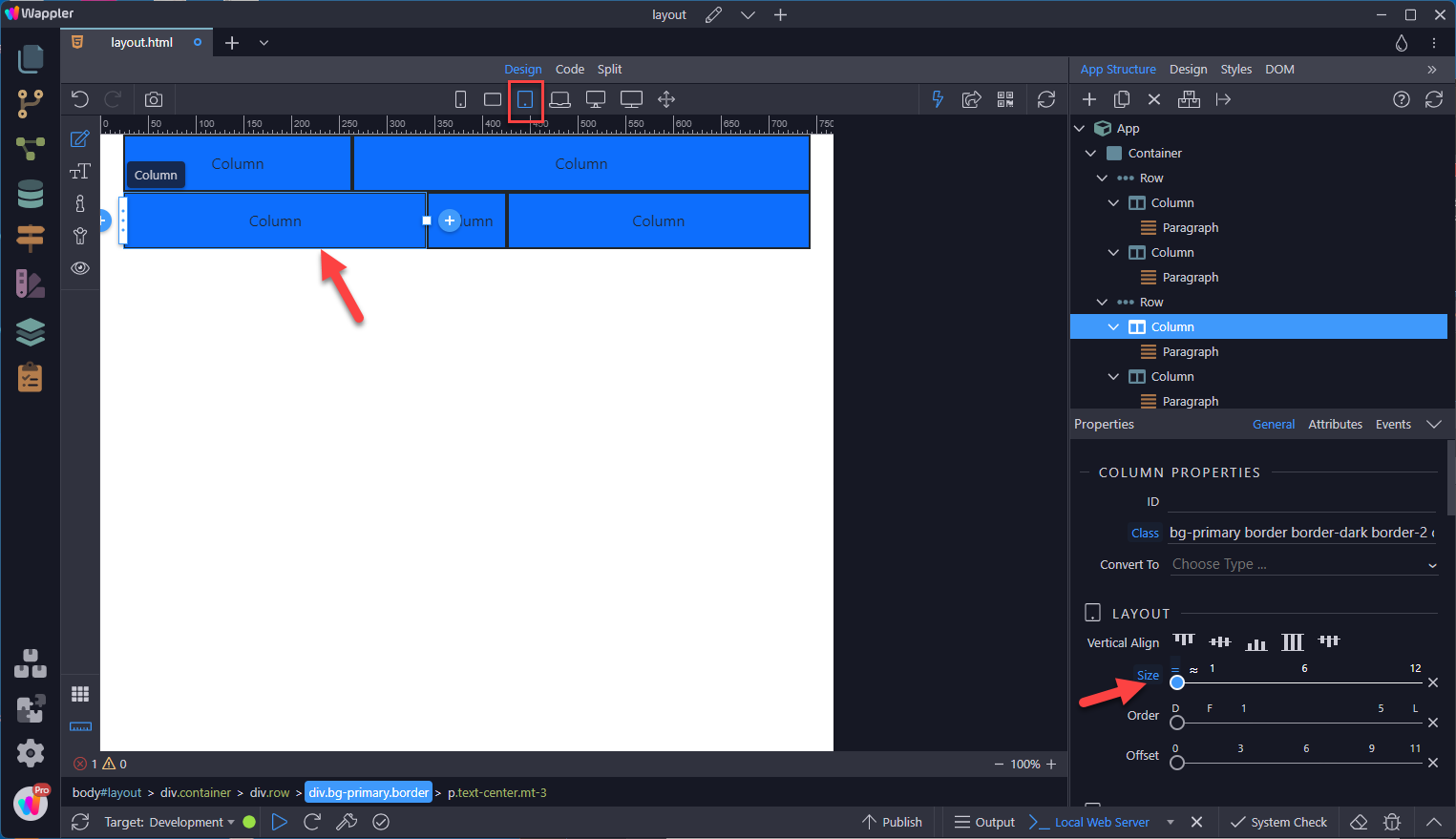
Row Columns
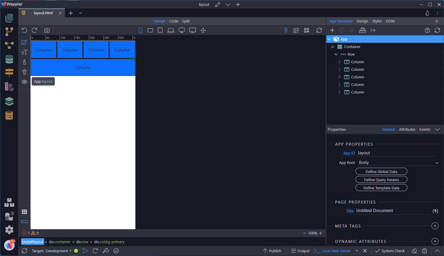
Section titled “Row Columns”If a row has 5 equal sized columns, this is what it looks like in Mobile view.
To quickly stack the equal sized columns, use Row Columns
Section titled “To quickly stack the equal sized columns, use Row Columns”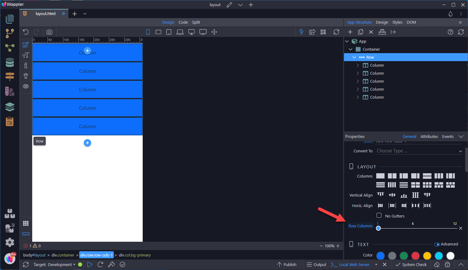
For subsequent screen sizes, use the same Row Columns as required
Section titled “For subsequent screen sizes, use the same Row Columns as required”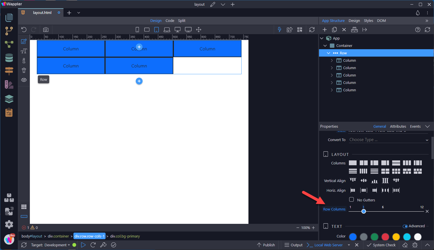
Nesting
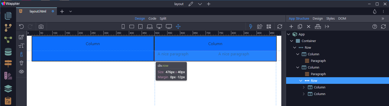
Section titled “Nesting”To nest your content with the default grid, add a new row and column as in
Alignment
Section titled “Alignment”Use flexbox alignment utilities to vertically and horizontally align columns.
Vertical Alignment
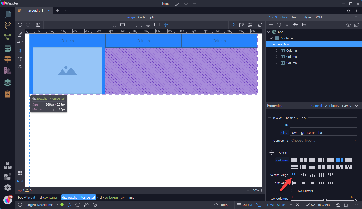
Section titled “Vertical Alignment”With the Row selected, change the vertical alignment with any of the alignment options.
This is the default option when none is chosen.
Step 57
Section titled “Step 57”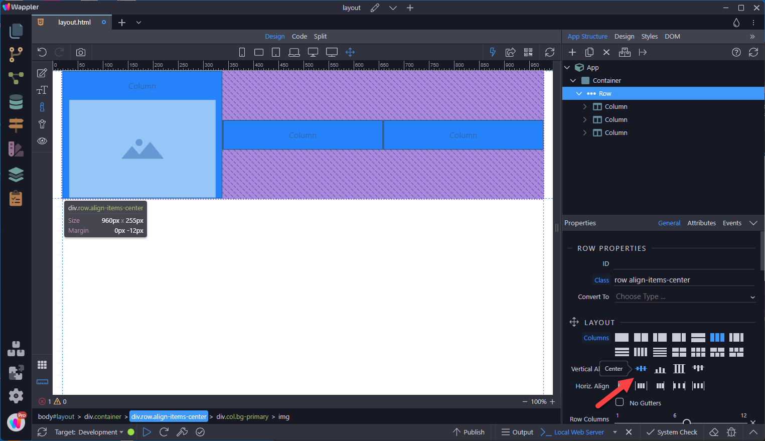
Step 58
Section titled “Step 58”
Or, change the alignment of each column individually
Section titled “Or, change the alignment of each column individually”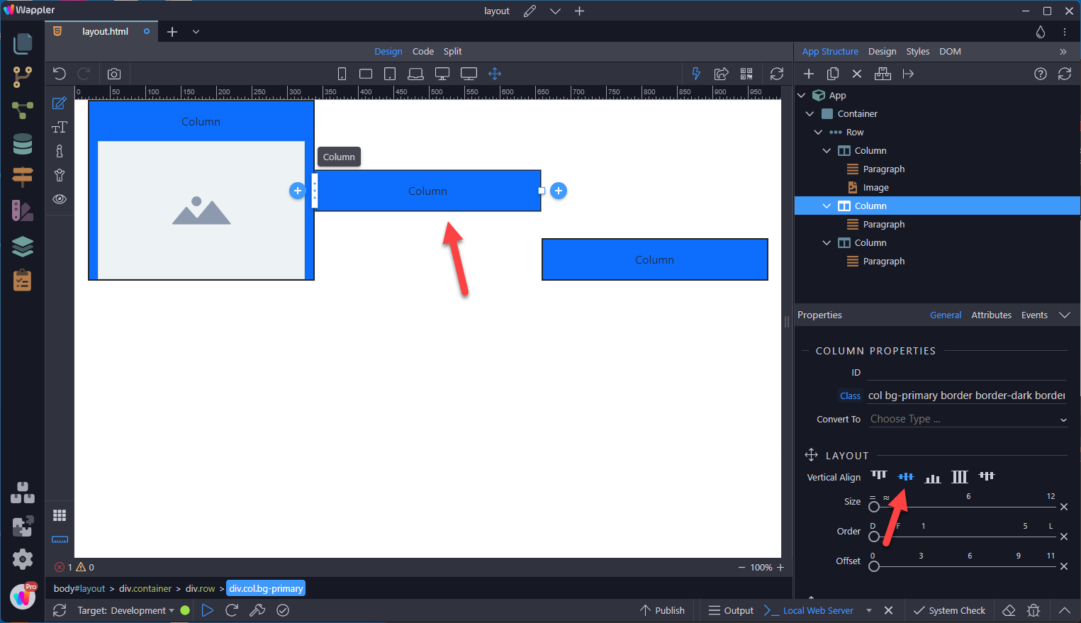
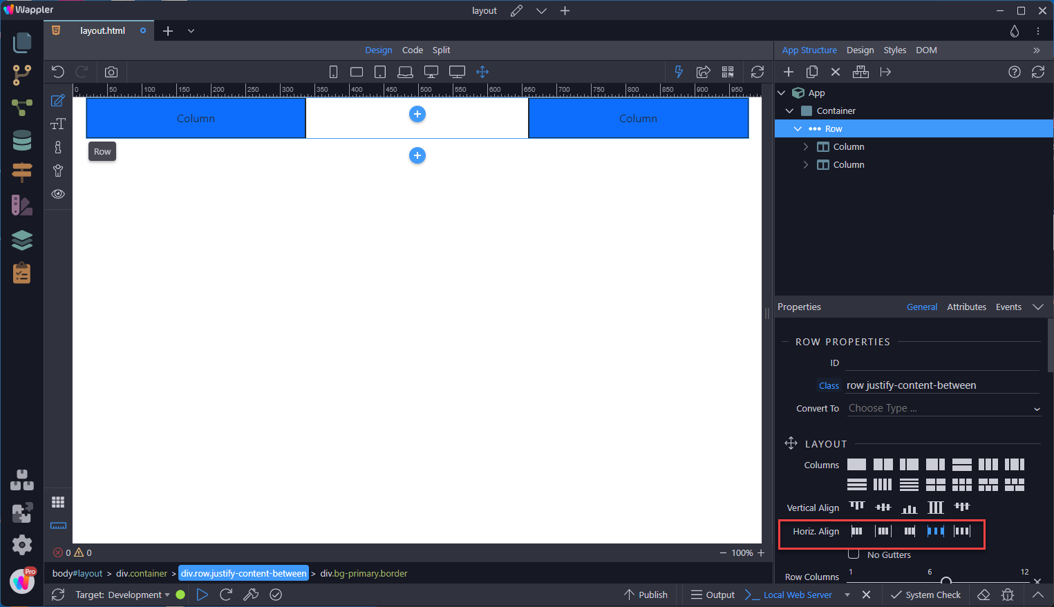
Horizontal Alignment
Section titled “Horizontal Alignment”With the Row selected, choose the horizontal align option.
Column Wrapping
Section titled “Column Wrapping”If more than 12 columns are placed within a single row, each group of extra columns will, as one unit, wrap onto a new line.
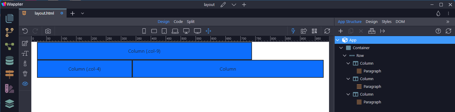
Column Breaks
Section titled “Column Breaks”Normally this is accomplished with multiple rows, but not every implementation method can account for this.
Breaking columns into a new line is done by choosing the column and selecting the add after button. In the context menu, choose Column Break;

This is the result
Section titled “This is the result”
Reordering
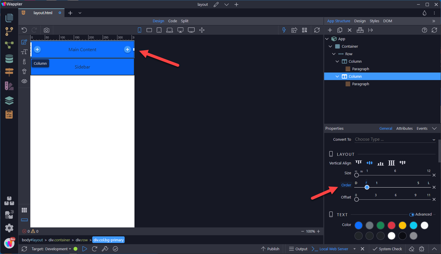
Section titled “Reordering”A common layout has a sidebar and a main content section.

In Mobile view, this shows as
Section titled “In Mobile view, this shows as”
But this is not very good for user experience. The main content needs to be shown first.
Section titled “But this is not very good for user experience. The main content needs to be shown first.”With the Main Content column selected, choose the order to First.
Step 71
Section titled “Step 71”The Order class is responsive, so you can set the order by device. Other options include Last and rankings 1 - 5 in case more items need to be reordered.
Offsetting Columns
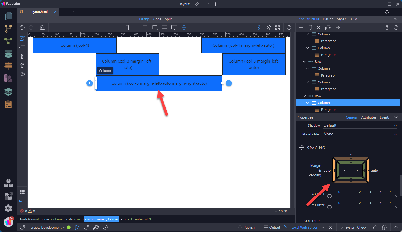
Section titled “Offsetting Columns”You can offset grid columns in two ways:
- responsive .offset- grid classes
- margin utilities.
Grid classes are sized to match columns while margins are more useful for quick layouts where the width of the offset is variable.
Offset Classes
Section titled “Offset Classes”Move columns to the right using .offset-- classes. These classes increase the left margin of a column by * columns. For example, .offset-md-4 moves .col-md-4 over four columns in Tablets and larger devices.

Margin Utilities
Section titled “Margin Utilities”Use margin utilities like .me-auto to force sibling columns away from one another.
Gutters
Section titled “Gutters”Gutters are the padding between your columns, used to responsively space and align content in the Bootstrap grid system.
- Gutters are the gaps between column content, created by horizontal padding. We set padding-right and padding-left on each column, and use negative margin to offset that at the start and end of each row to align content.
- Gutters start at 1.5rem (24px) wide. This allows us to match our grid to the padding and margin spacers scale.
- Gutters can be responsively adjusted. Use breakpoint-specific gutter classes to modify horizontal gutters, vertical gutters, and all gutters.
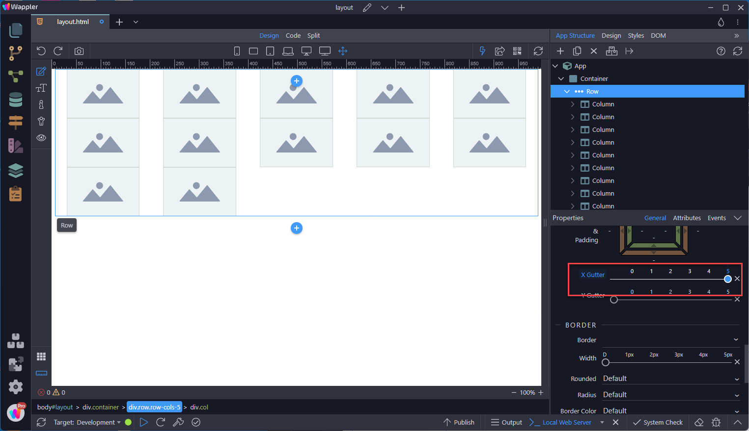
Horizontal Gutters
Section titled “Horizontal Gutters”.gx-* classes are used to control the horizontal gutter widths.
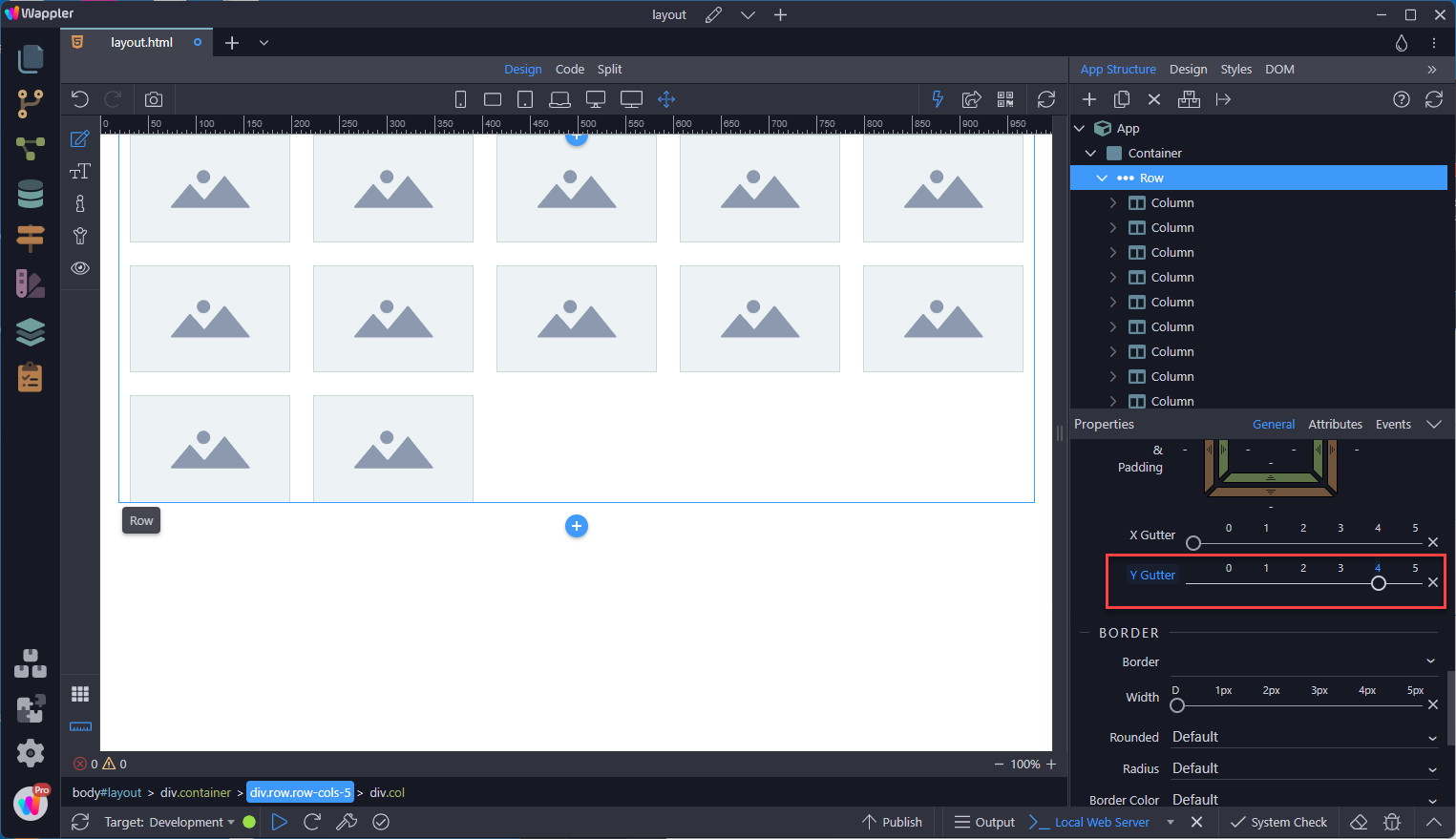
Vertical Gutters
Section titled “Vertical Gutters”.gy-* classes can be used to control the vertical gutter widths within a row when columns wrap to new lines.
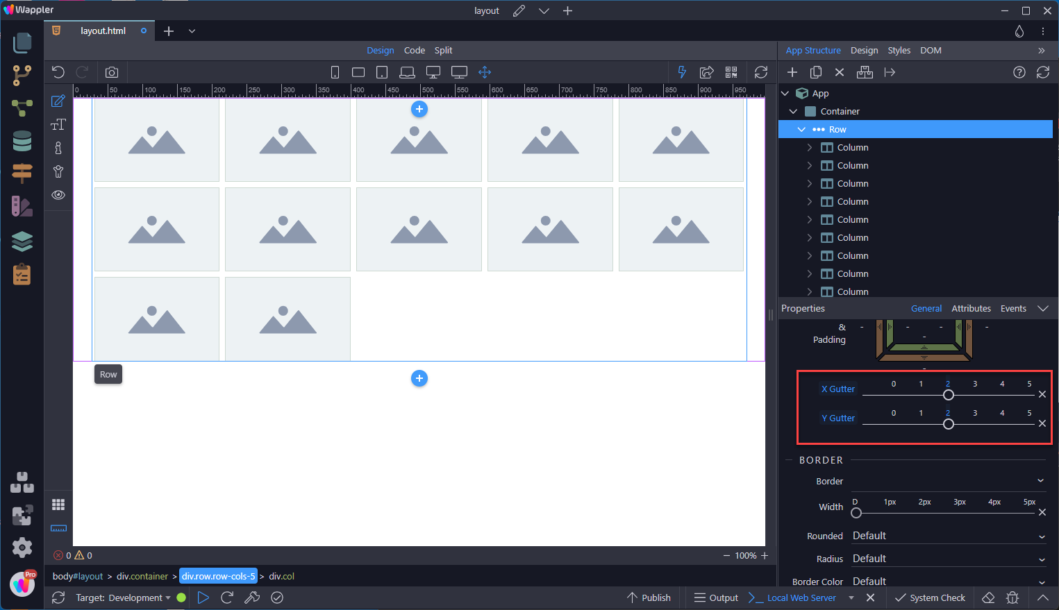
Horizontal and Vertical Gutters
Section titled “Horizontal and Vertical Gutters”.g-* classes can be used to control the horizontal gutter widths, for the following example we use a smaller gutter width.
No Gutters
Section titled “No Gutters”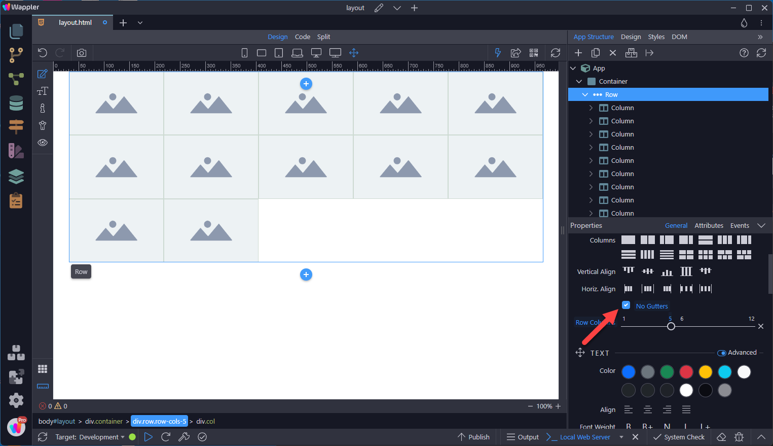
Step 85
Section titled “Step 85”