Bootstrap Typography and Text
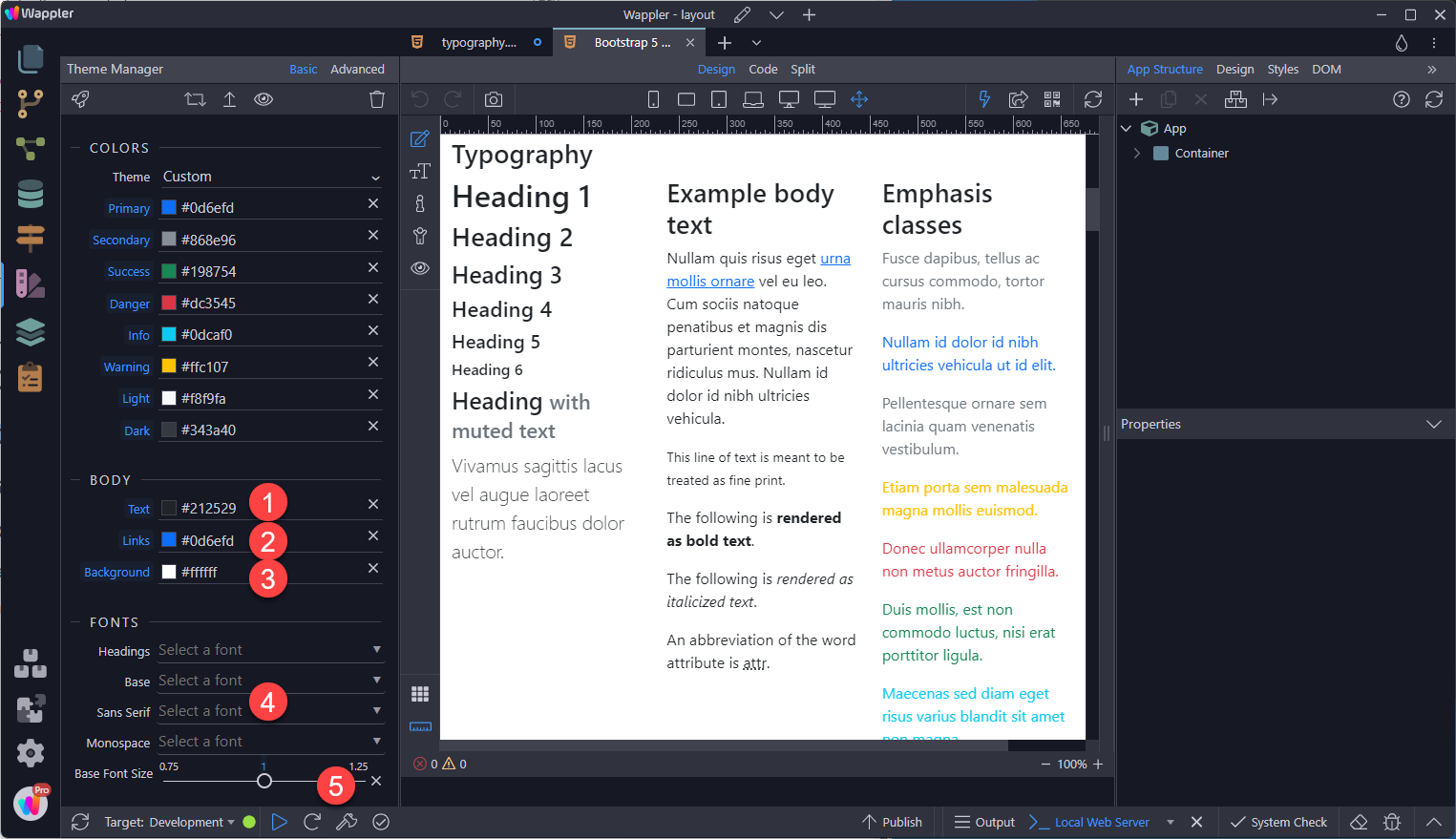
Global Settings Bootstrap sets basic global display, typography, and link styles as follows. 1. body text colour 2. link colour 3. body colour 4. native font stack that selects the best font-family fo
Global Settings
Section titled “Global Settings”Bootstrap sets basic global display, typography, and link styles as follows.
1. body text colour
2. link colour
3. body colour
4. native font stack that selects the best font-family for each OS and device
5. font size of 1em (typically 16px)
Headings and Paragraphs
Section titled “Headings and Paragraphs”Headings communicate the organization of the content on the page. Web browsers, plug-ins, and assistive technologies can use them to provide in-page navigation.
Nest headings by their rank (or level). The most important heading has the rank 1 (<h1>), the least important heading rank 6 (<h6>). Headings with an equal or higher rank start a new section, headings with a lower rank start new subsections that are part of the higher ranked section. For more, see https://www.w3.org/WAI/tutorials/page-structure/headings/
Adding a Heading and Paragraphs
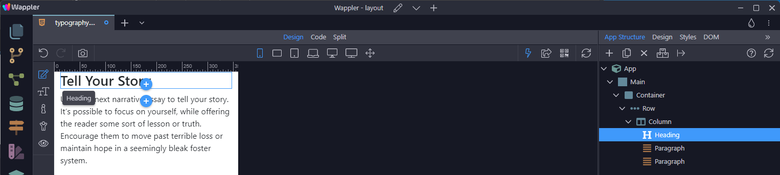
Section titled “Adding a Heading and Paragraphs”In an empty column, select the add-inside-button and choose Heading from the context menu.

Select the level (Type) that is required. Make sure to follow the recommendation as outlined above.
Section titled “Select the level (Type) that is required. Make sure to follow the recommendation as outlined above.”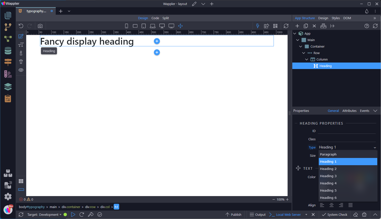
Select the Heading click-after-button and select Paragraph from the context menu.
Section titled “Select the Heading click-after-button and select Paragraph from the context menu.”
To add extra paragraphs, choose the duplicate button while the paragraph is selected.
Section titled “To add extra paragraphs, choose the duplicate button while the paragraph is selected.”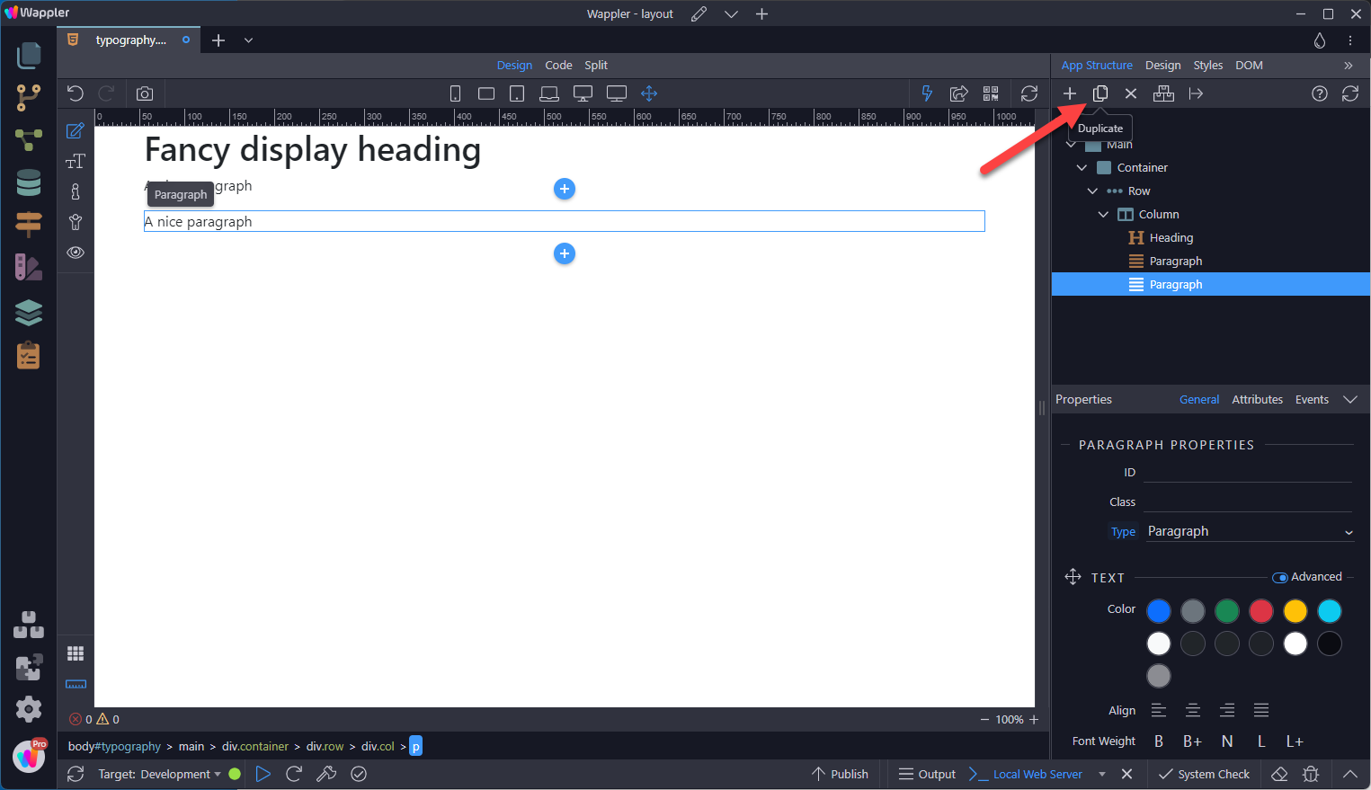
To change the text, select the Text Edit Mode
Section titled “To change the text, select the Text Edit Mode”
Click on the text a few times so that it is highlighted
Section titled “Click on the text a few times so that it is highlighted”
Type or paste the text as wanted.
Section titled “Type or paste the text as wanted.”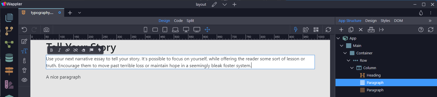
Using the Context Menu
Section titled “Using the Context Menu”When a text is highlighted, a context menu appears. The icons denote
1. Changing the text to bold
2. Changing the text to italic
3. Changing the text to a link
4. Undoing the link
5. Undoing the bold and italic formatting
6. Adding a Font Awesome icon
7. Changing the text to dynamic text
The last of these will be discussed in a document that covers dynamic web sites.
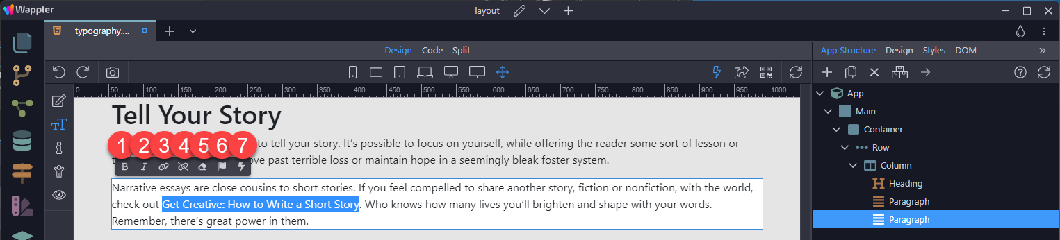
To add a link, simply highlight the text and select the link icon.
Section titled “To add a link, simply highlight the text and select the link icon.”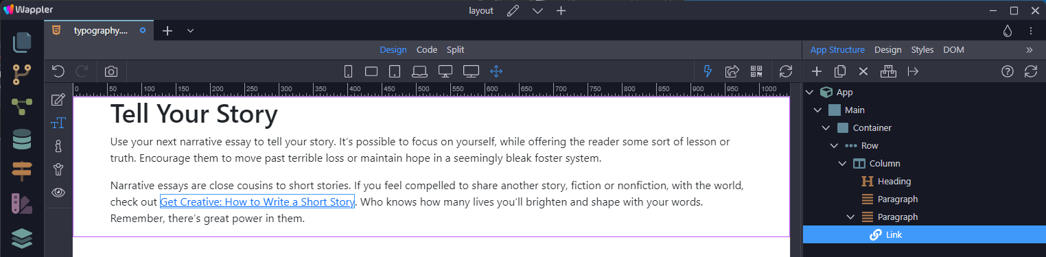
The same applies to the bold and italic icons.
Section titled “The same applies to the bold and italic icons.”To add a Font Awesome icon, select the spot to insert the icon and choose the Font Awesome icon
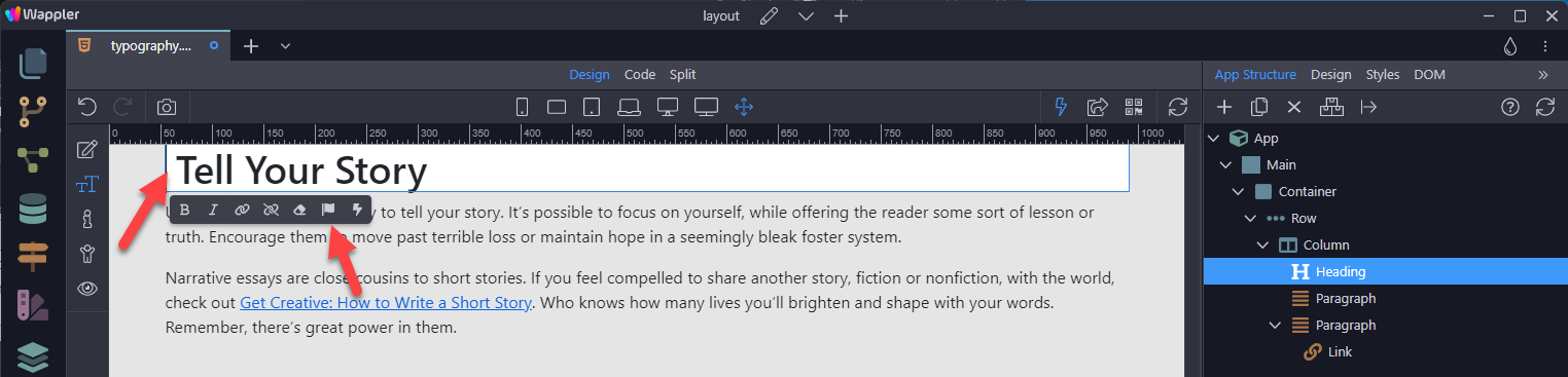
In the pop-up, select the wanted icon
Section titled “In the pop-up, select the wanted icon”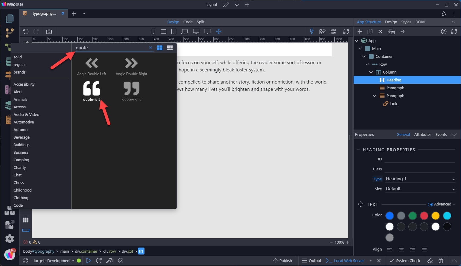
The result
Section titled “The result”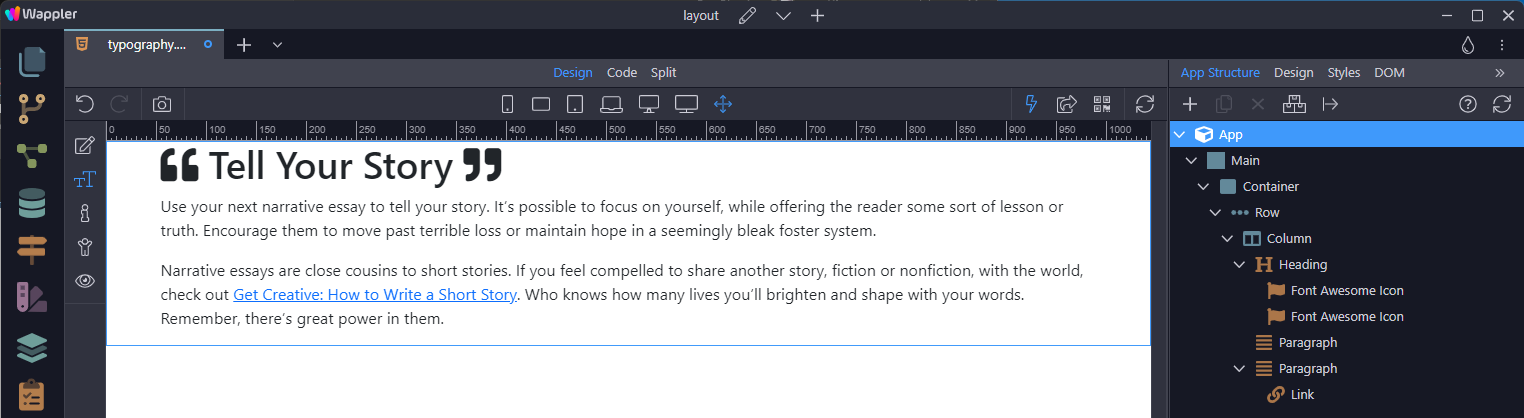
Using Classes to resize
Section titled “Using Classes to resize”.h1 through .h6 classes are also available, for when you want to match the font styling of a heading but cannot use the associated HTML element.
To change the size of the heading from
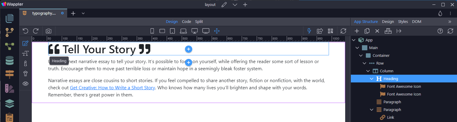
Add an appropriate class to the heading. In this case an .h3 is added.
Section titled “Add an appropriate class to the heading. In this case an .h3 is added.”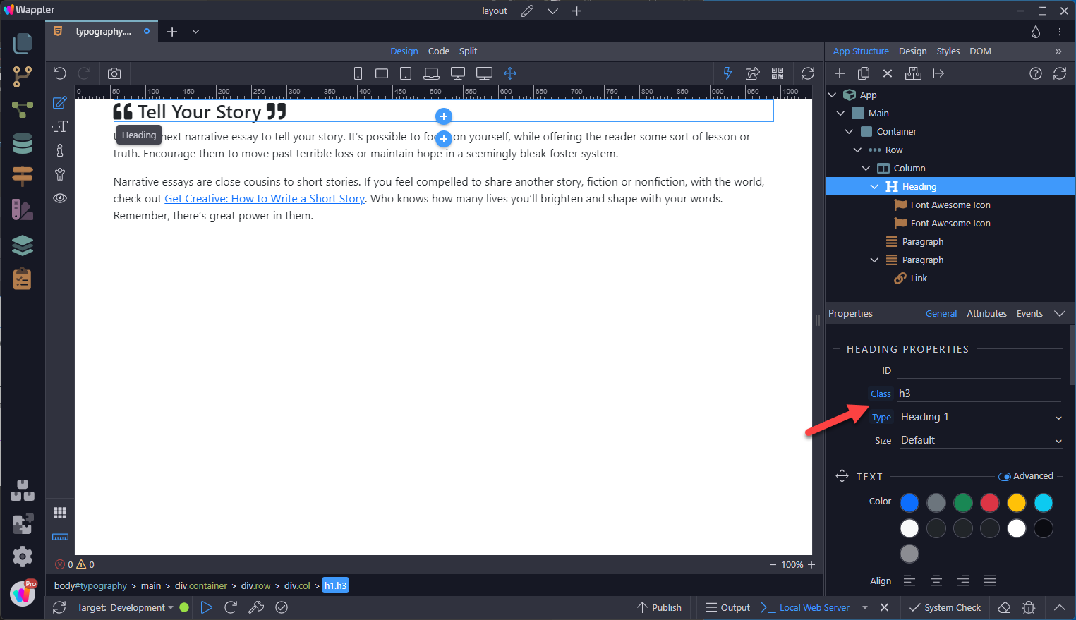
In a similar way, a paragraph can be transformed.
Section titled “In a similar way, a paragraph can be transformed.”
Step 22
Section titled “Step 22”As with heading classes (.h*), there are also Font Size classes (.fs-*). Sizing for these utilities matches HTML’s heading elements, so as the number increases, their size decreases.
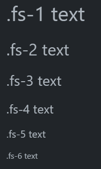
At the moment, these classes have to be entered by hand, as in
Section titled “At the moment, these classes have to be entered by hand, as in”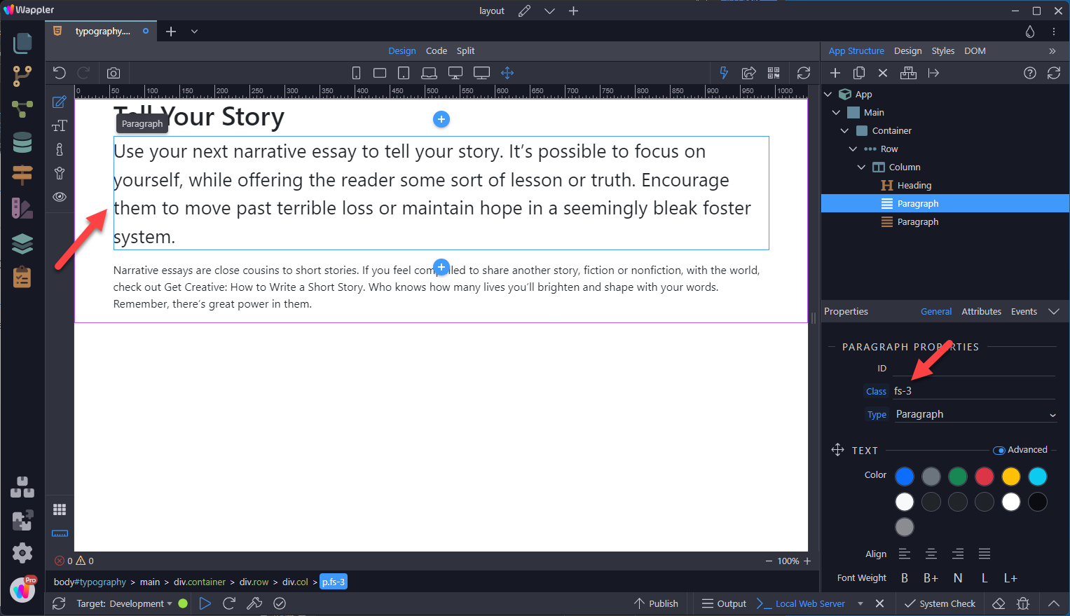
Adding Secondary Text
Section titled “Adding Secondary Text”To add secondary text to the heading, select the insert-after-button and choose More.
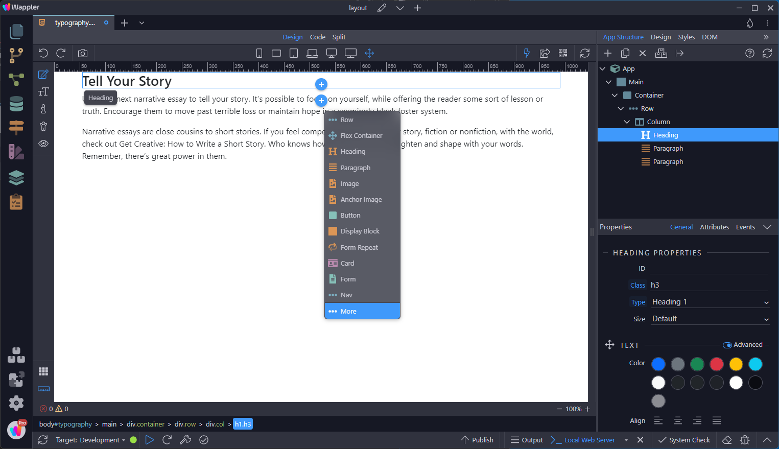
Choose Secondary Text
Section titled “Choose Secondary Text”
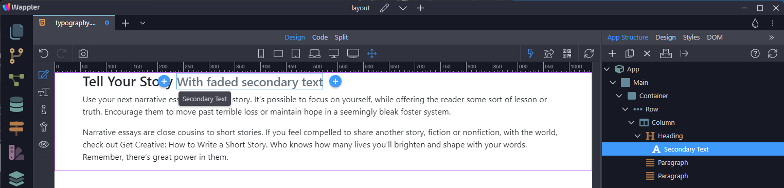
This places a line of secondary text beneath the heading.
Section titled “This places a line of secondary text beneath the heading.”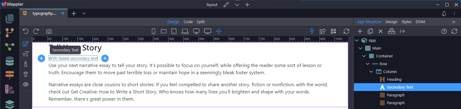
Step 28
Section titled “Step 28”To place the secondary text next to the heading, grab the Secondary Text element in App Structure and move it inside the heading.
Display Headings
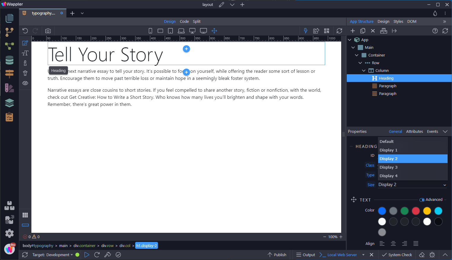
Section titled “Display Headings”Traditional heading elements are designed to work best in the meat of your page content. When you need a heading to stand out, consider using a display heading—a larger, slightly more opinionated heading style.
Select the heading, in the Properties panel, go down to Size in the properties panel and choose the size
Documentation and examples for common text utilities to control alignment, wrapping, weight, and more. Previously we saw that selecting a portion of the text, it was possible to convert that portion to Bold, Italic and or a Link.
In this section we discuss the utilities that are applied to the element that contains the text, such as <h*> and <p>.
Colour
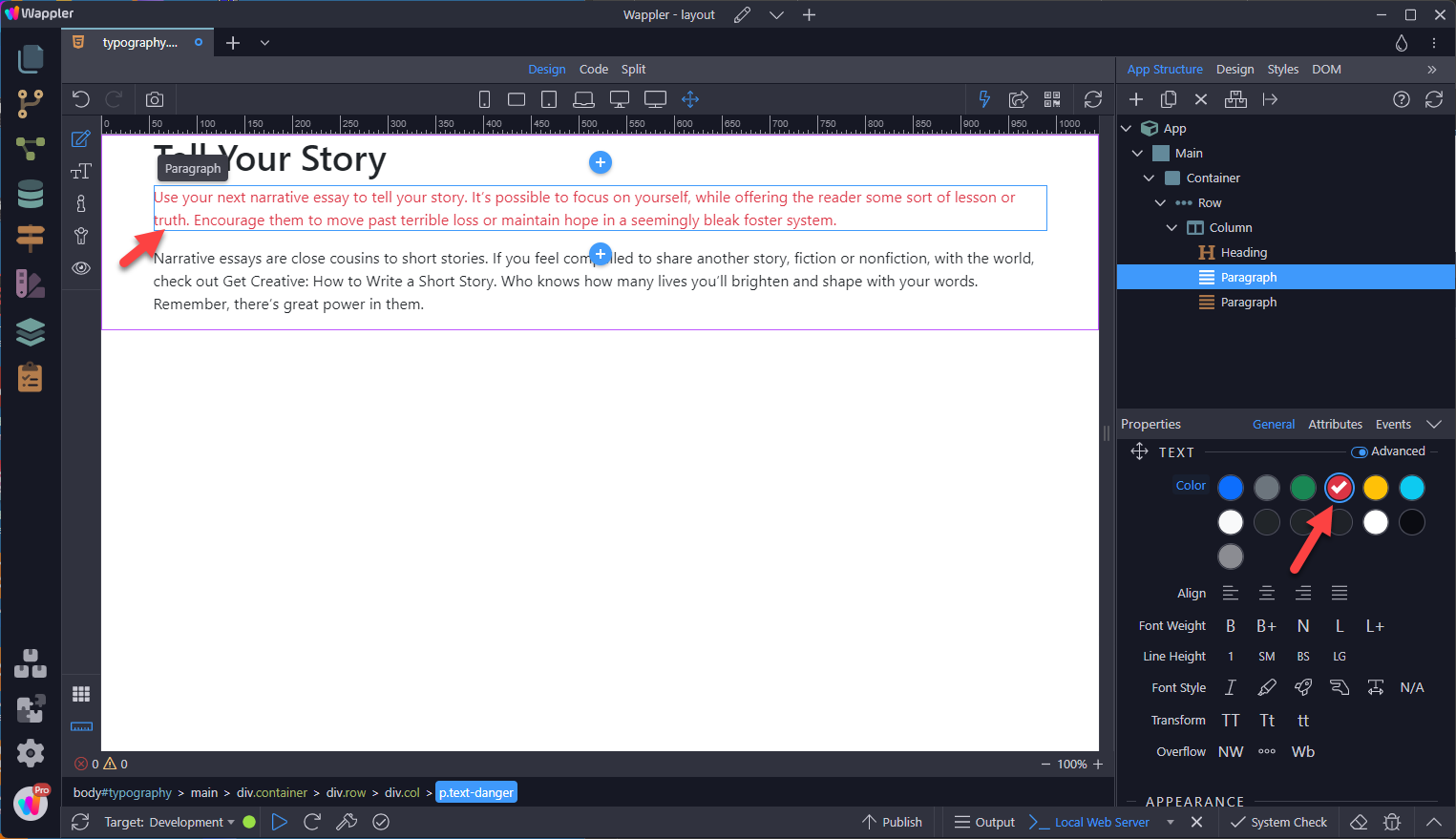
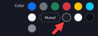
Section titled “Colour”Select the element, in this case
, and choose a colour from the Properties panel
Step 34
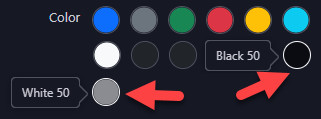
Section titled “Step 34”Deprecation: the .text-black-50 and .text-white-50 are deprecated as of v5.1.0. They’ll be removed in v6.0.0.
Step 35
Section titled “Step 35”Deprecation: the .text-muted utility has been deprecated as of v5.3.0. It will be removed in v6.0.0.
Step 36
Section titled “Step 36”Conveying meaning to assistive technologies
Using colour to add meaning only provides a visual indication, which will not be conveyed to users of assistive technologies – such as screen readers. Ensure that information denoted by the colour is either obvious from the content itself (e.g. the visible text), or is included through alternative means, such as additional text hidden with the .visually-hidden class.
Alignment
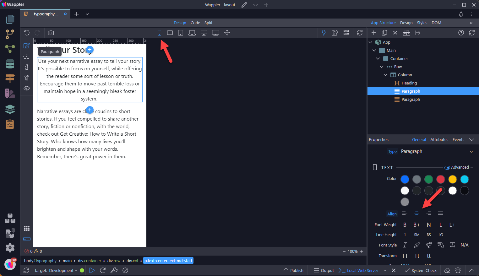
Section titled “Alignment”Easily realign text to components with text alignment classes. For start, end, and centre alignment, responsive classes are available that use the same viewport width breakpoints as the grid system.
In the following example, the text has been centred for the Mobile view and start aligned for Tablets and larger devices.
Step 38
Section titled “Step 38”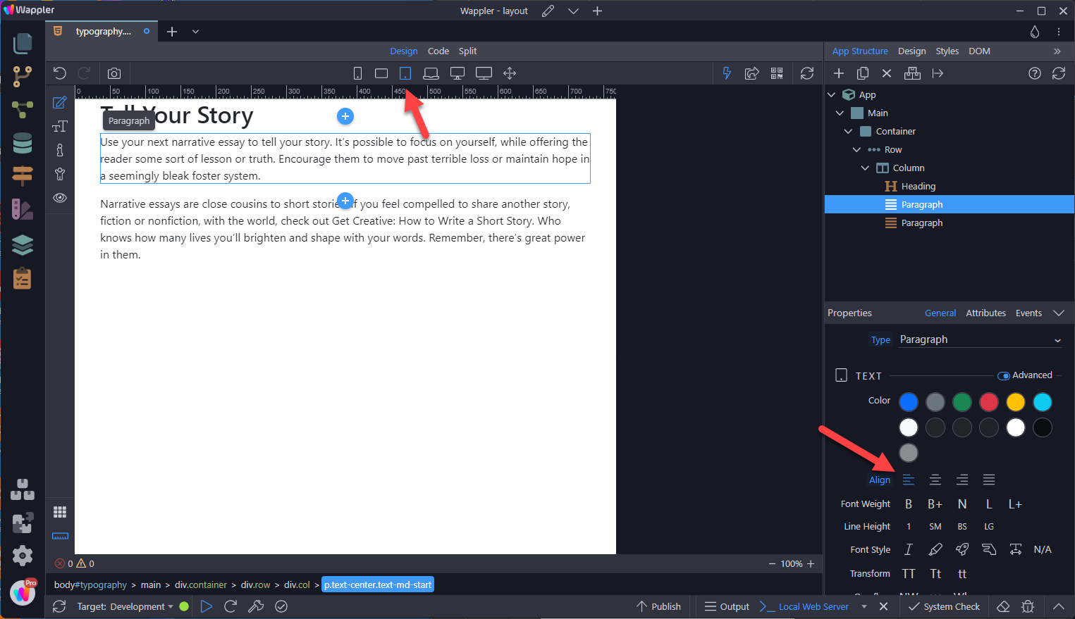
Font Weight
Section titled “Font Weight”Quickly change the font weight using the Font Weight utilities. These are not responsive, meaning that they are applied to all screens sizes.

Line Height
Section titled “Line Height”Using Line Height utilities.

Font Style
Section titled “Font Style”Change the style of the text.
Italic
Section titled “Italic”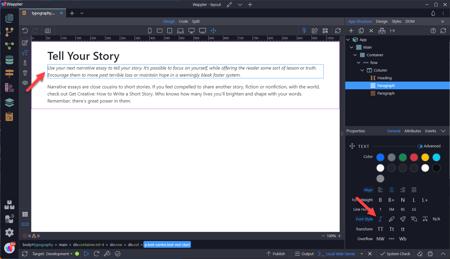
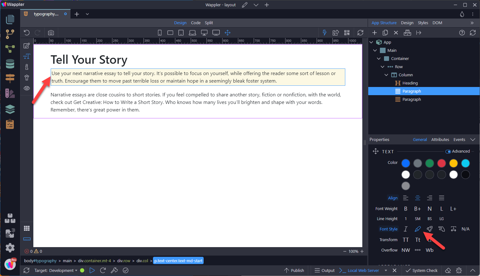
You can use Mark to highlight the text.
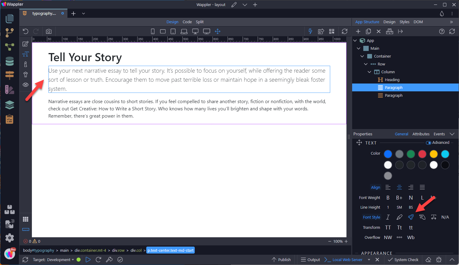
Make a paragraph stand out by adding .lead.
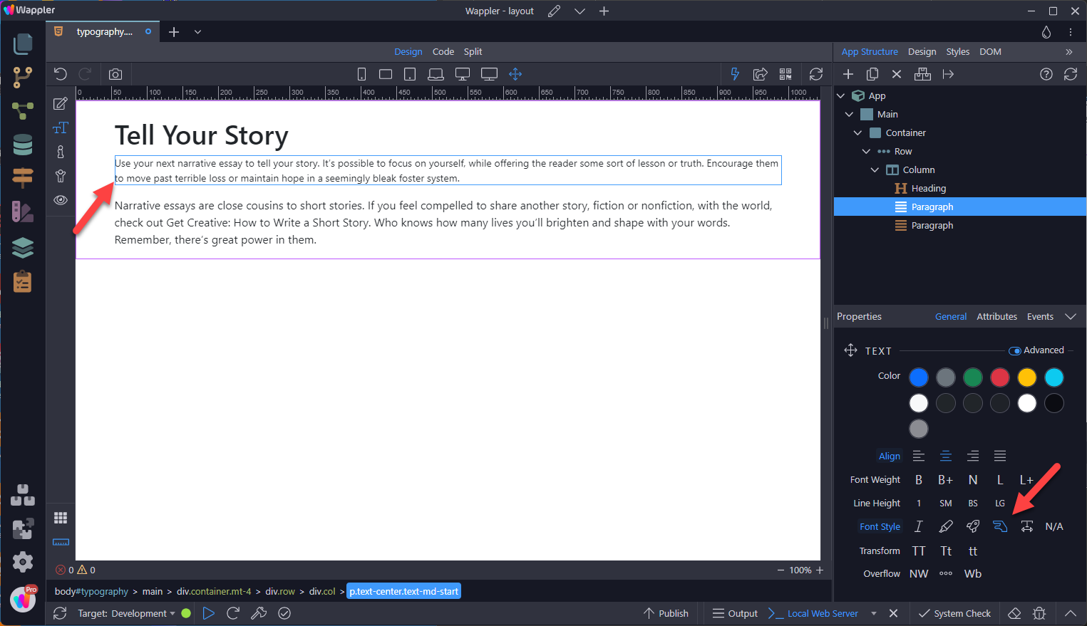
In contrast (to Lead), this makes the text less important,
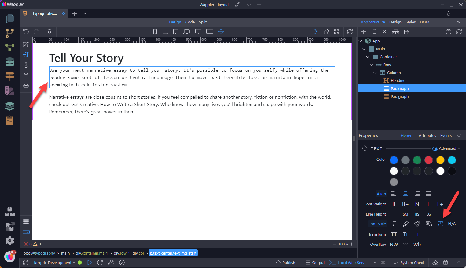
Monospace
Section titled “Monospace”Want a typewriter style? The font type can be changed in the Theme Manager.
Text Transform
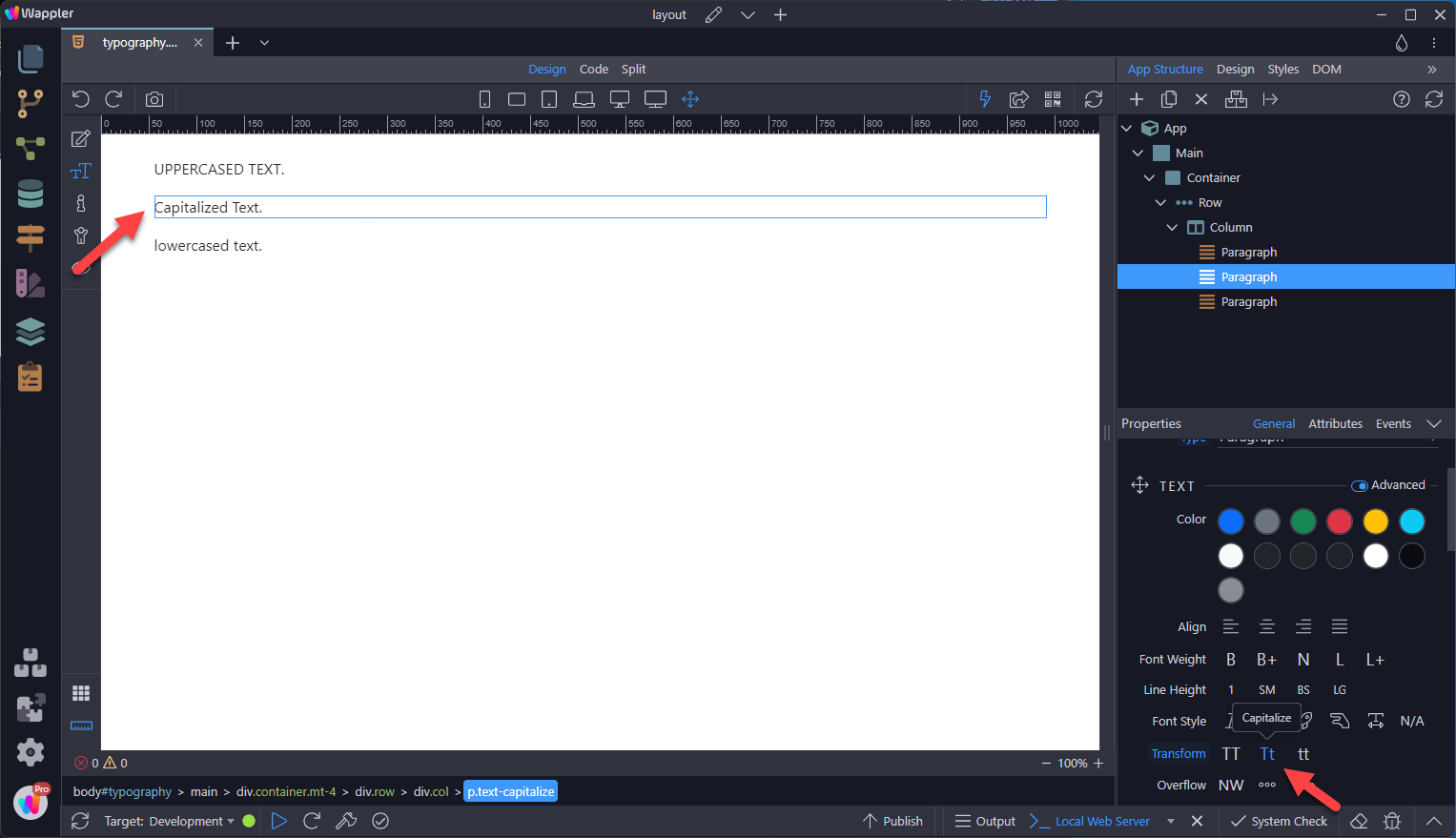
Section titled “Text Transform”Transform text in components with text capitalization classes.
Note how .text-capitalize only changes the first letter of each word, leaving the case of any other letters unaffected.
Text Wrapping and Overflow
Section titled “Text Wrapping and Overflow”If you do not want the text to wrap to the next line as in
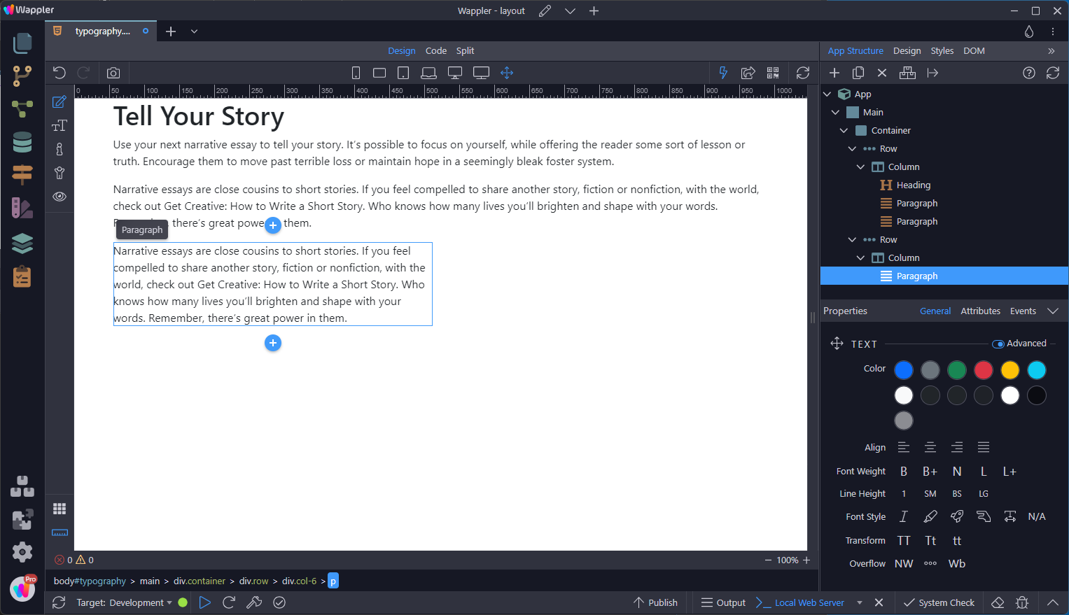
You can use the .text-nowrap class as in
Section titled “You can use the .text-nowrap class as in”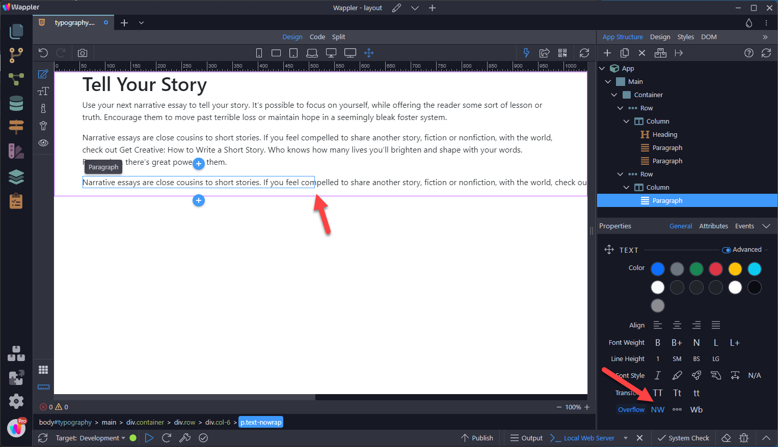
Text Truncation
Section titled “Text Truncation”To truncate long strings of text with an ellipsis use the .text-truncate class. This will truncate the text to fit inside the container.

Word Break
Section titled “Word Break”A hill near Porangahau in New Zealand is called Taumatawhakatangihangakoauauotamateaturipukakapikimaungahoronukupokaiwhenuakitanatahu
When .text-nowrap is set, it will break the component as in
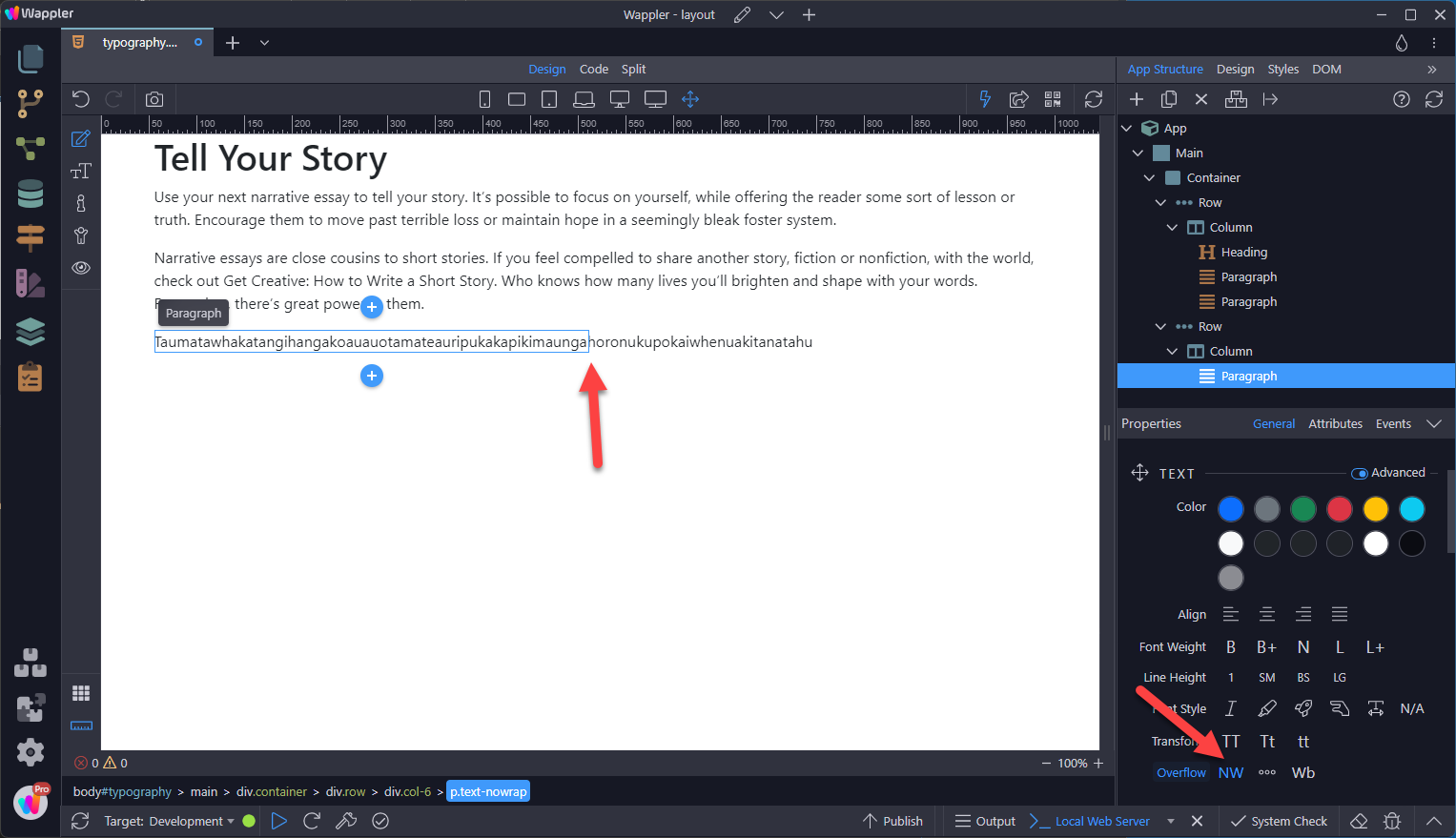
To break this word we use the .text-break class as in
Section titled “To break this word we use the .text-break class as in”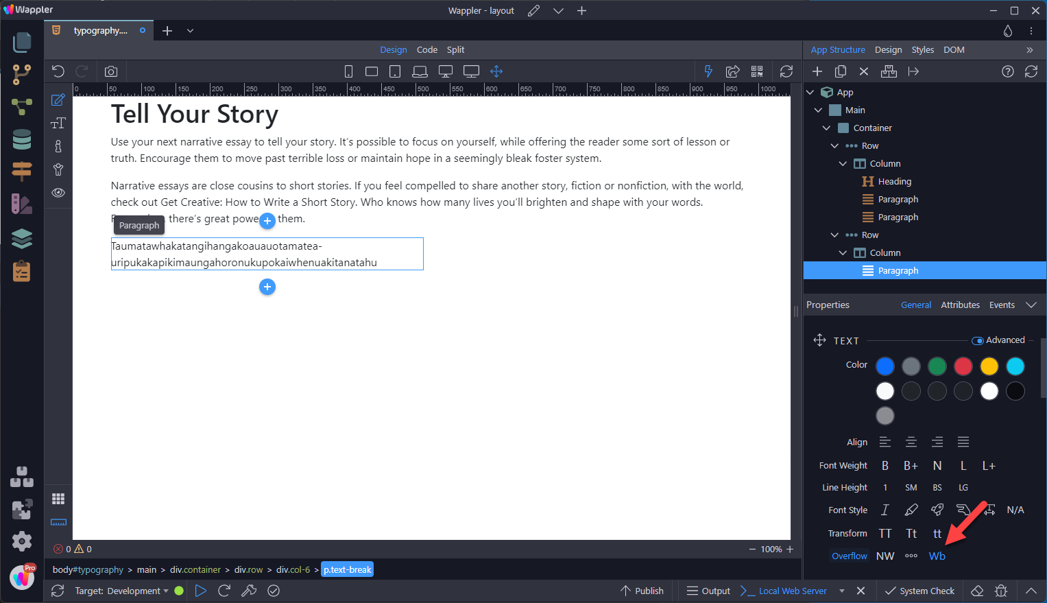
Responsive Font Sizes
Section titled “Responsive Font Sizes”In Bootstrap 5, responsive font sizes have been enabled by default, allowing text to scale more naturally across device and viewport sizes. Have a look at the RFS page to find out how this works

Step 66
Section titled “Step 66”