Breadcrumbs
Build Bootstrap breadcrumbs in Wappler, including separators and the active page state for accessible navigation.
Breadcrumbs
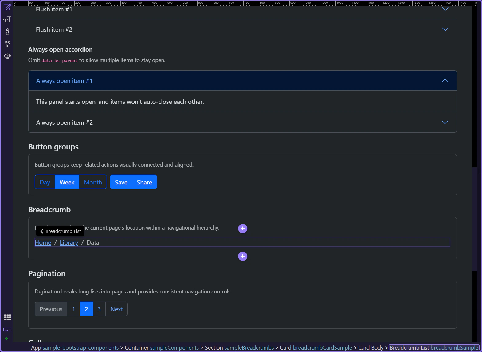
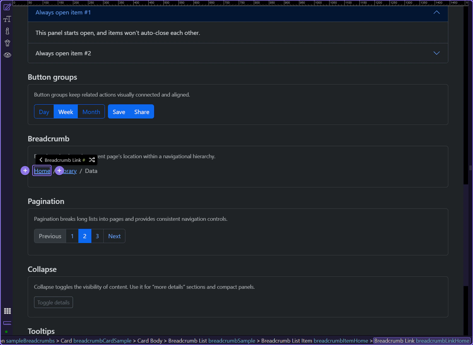
Breadcrumbs show the current page’s location within a navigational hierarchy. They should reflect structure (not history).
Breadcrumb example
Breadcrumbs show hierarchy and help users understand where they are in a site structure. This step matters because Breadcrumb example is part of Design View, and understanding that context makes the next action easier to repeat in your own project.
Tip: Keep the last item current
In Bootstrap docs, the current page is typically the last breadcrumb item and should not be a link.
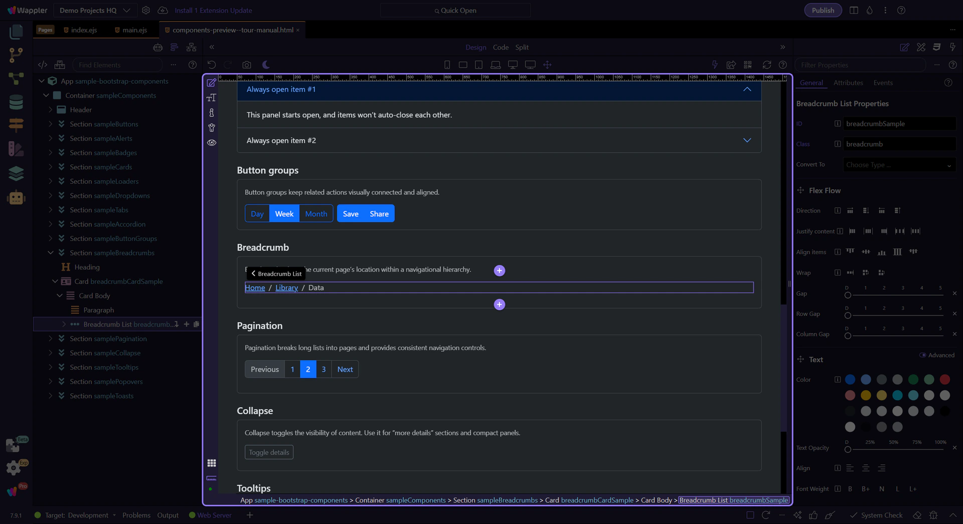
Items and links
Use breadcrumb items for the hierarchy levels, and links for the navigable levels.
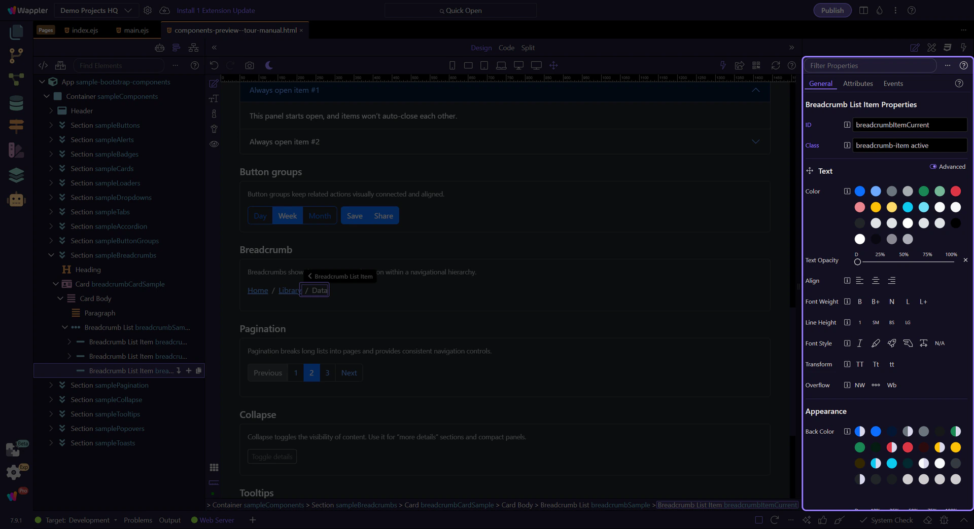
Current breadcrumb item
The last breadcrumb item typically represents the current page. This step matters because Current breadcrumb item is part of Design View, and understanding that context makes the next action easier to repeat in your own project.
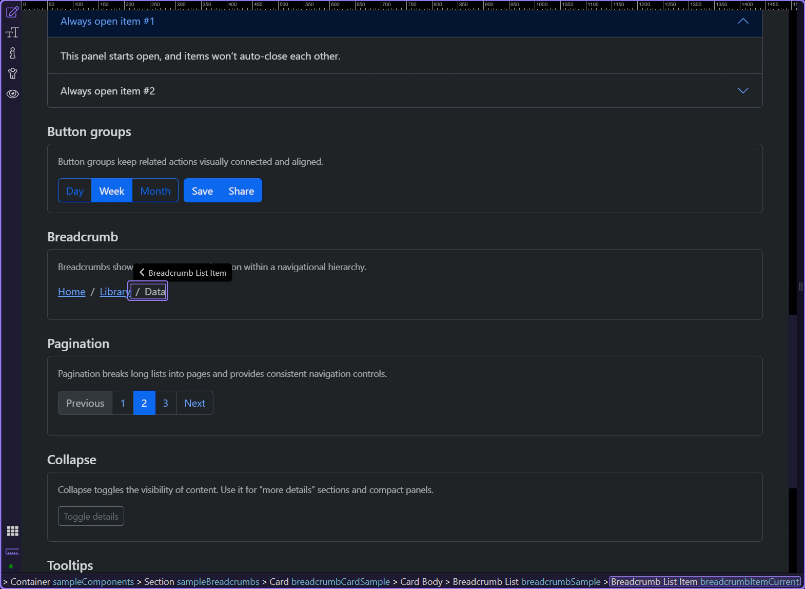
Breadcrumb item: Active
Use Active for the current page. This matches the Bootstrap pattern of marking the current level.
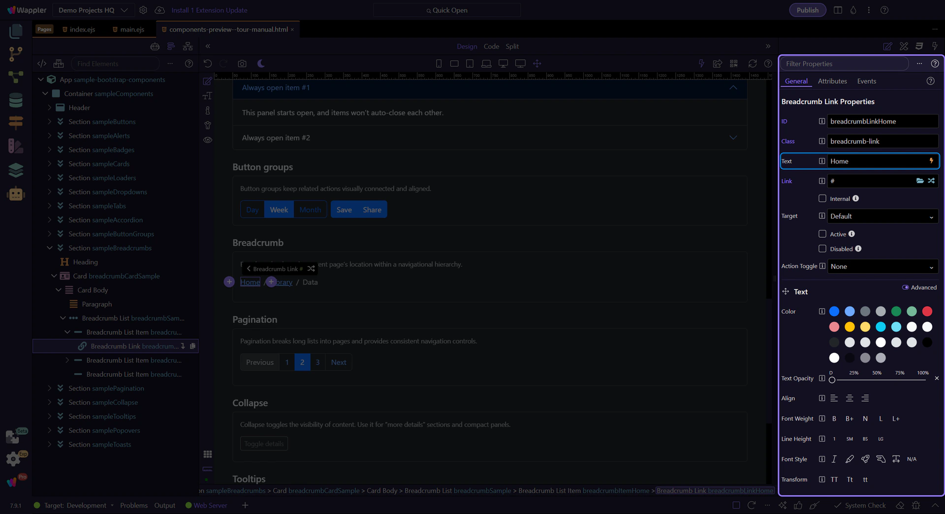
Breadcrumb link item
Breadcrumb links represent navigable hierarchy levels (for example, “Home”). This step matters because Breadcrumb link item is part of Design View, and understanding that context makes the next action easier to repeat in your own project.
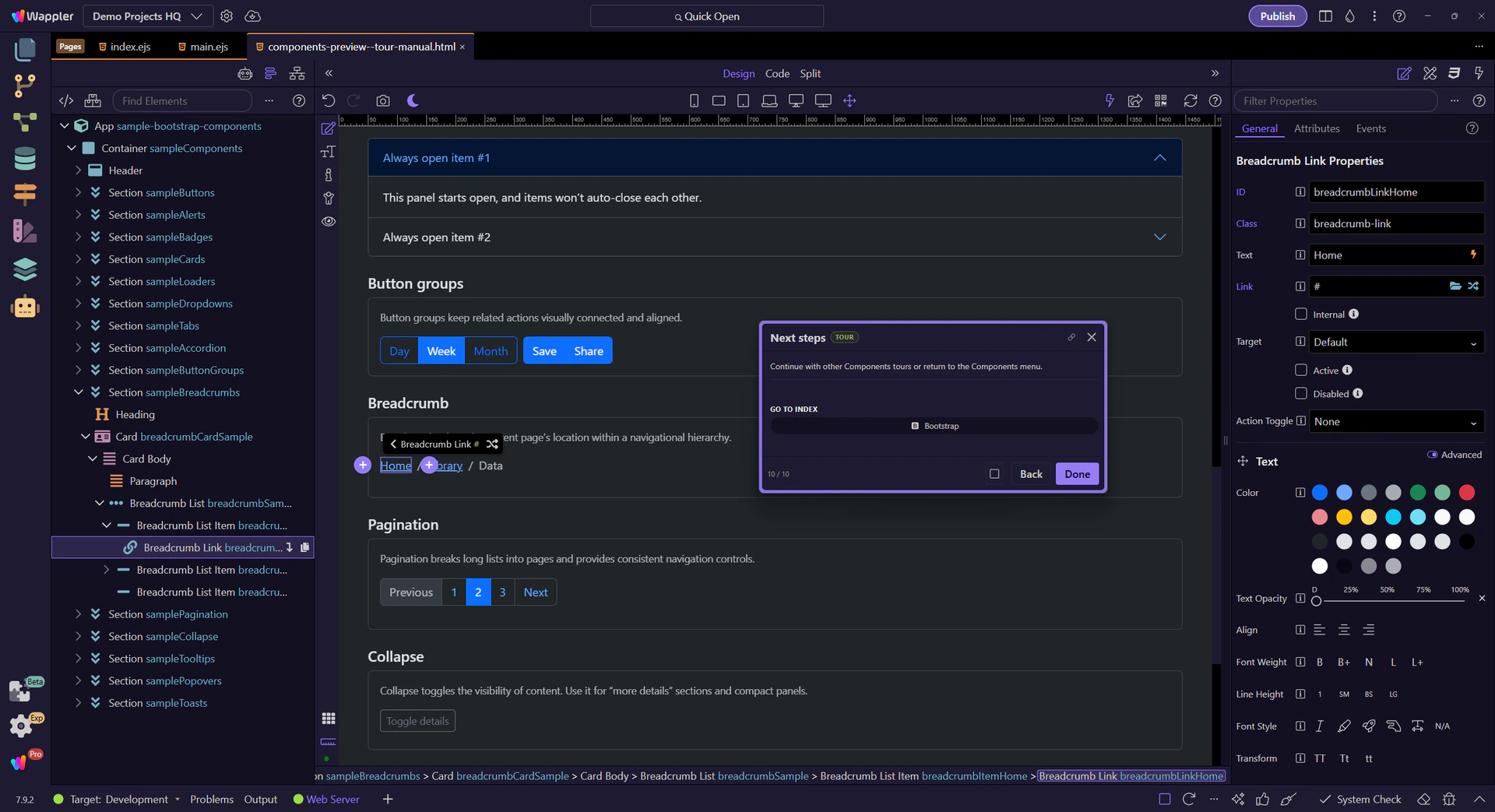
Breadcrumb link: Text and Link
Use Text to change the label and Link to pick a route or file. Keep breadcrumb labels short and descriptive. This step matters because Breadcrumb link: Text and Link is part of Selection Panels Properties Breadcrumblinktext, and understanding that context makes the next action easier to repeat in your own project.
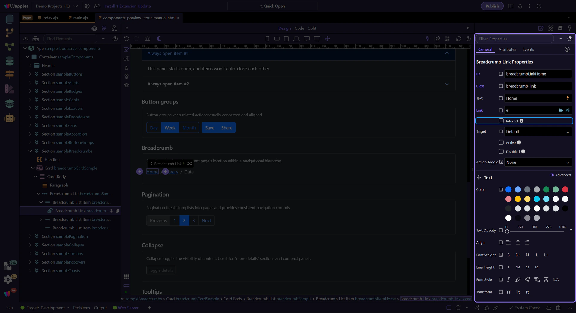
Tip: Internal navigation
If you’re using Wappler partial loads, enable Internal so the route loads inside the current view.
Next steps
Continue with other Components tours or return to the Components menu.