Buttons
Use Bootstrap buttons: variants, sizes, states, icons, and common button patterns.
Variants, sizes, and states
Bootstrap buttons are about clarity and hierarchy. Start by choosing a variant (primary/secondary/etc.), then size/state based on context.
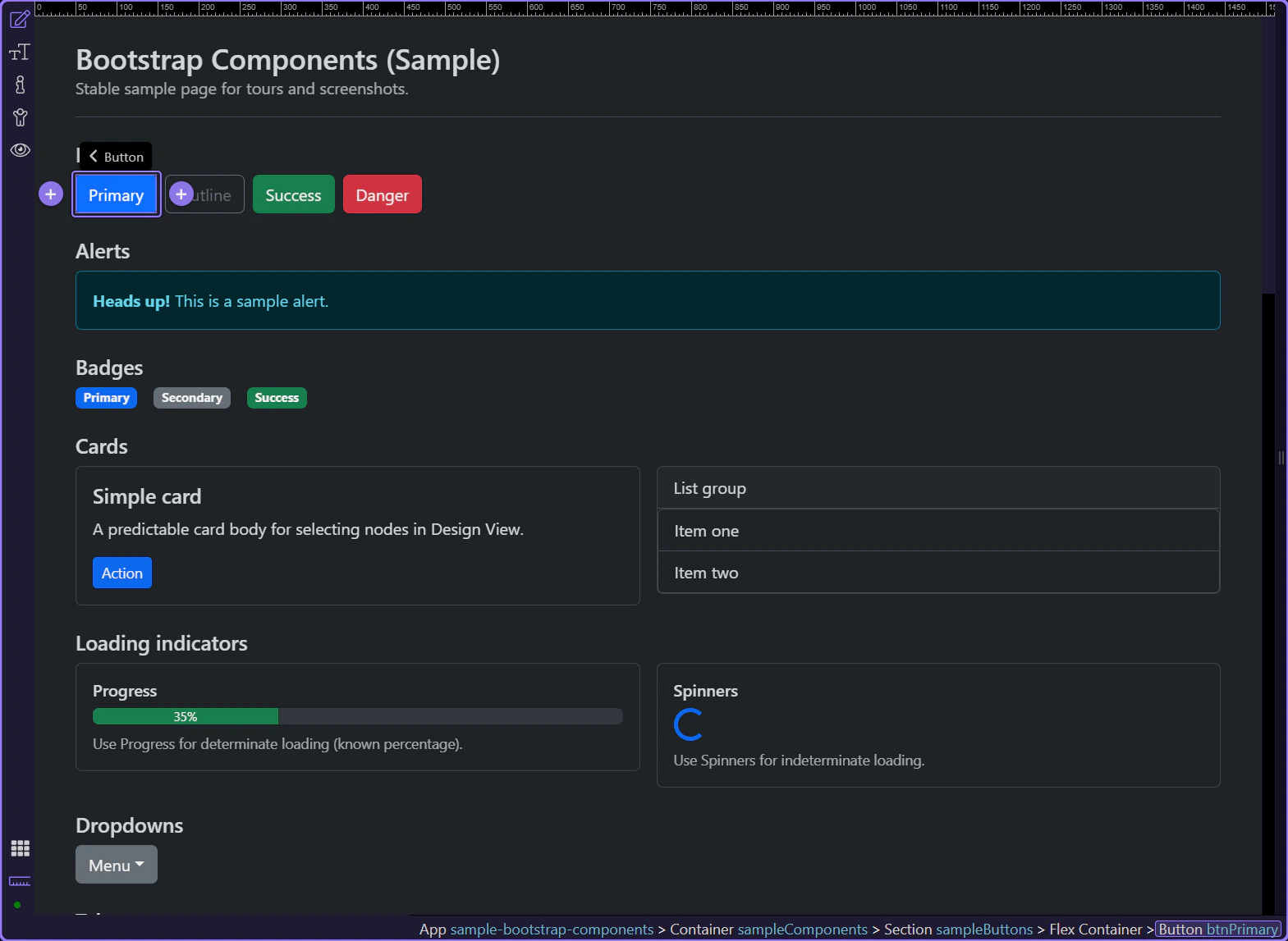
Button example
Buttons are interactive controls for actions. This example uses the primary variant to represent a main action.
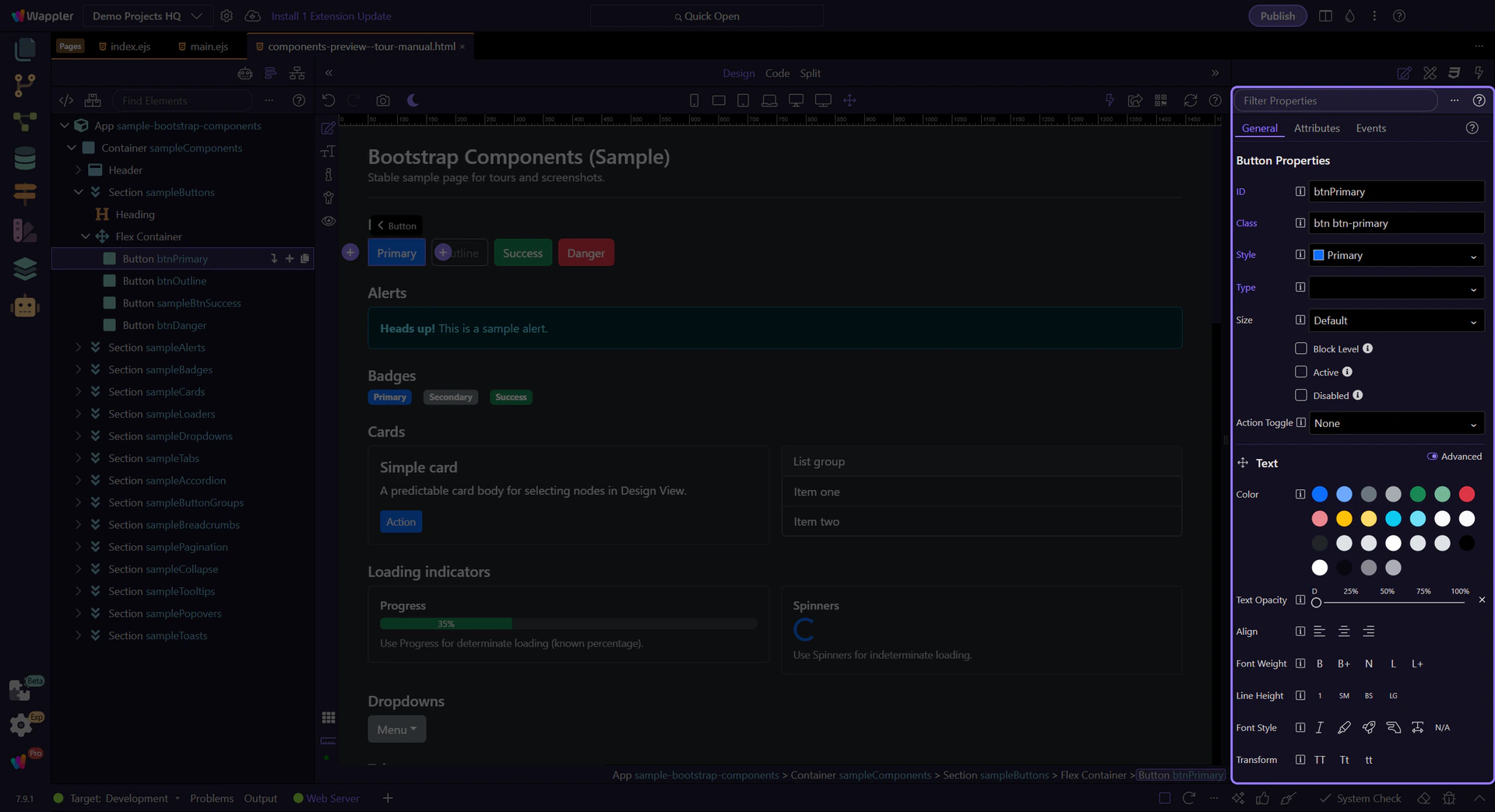
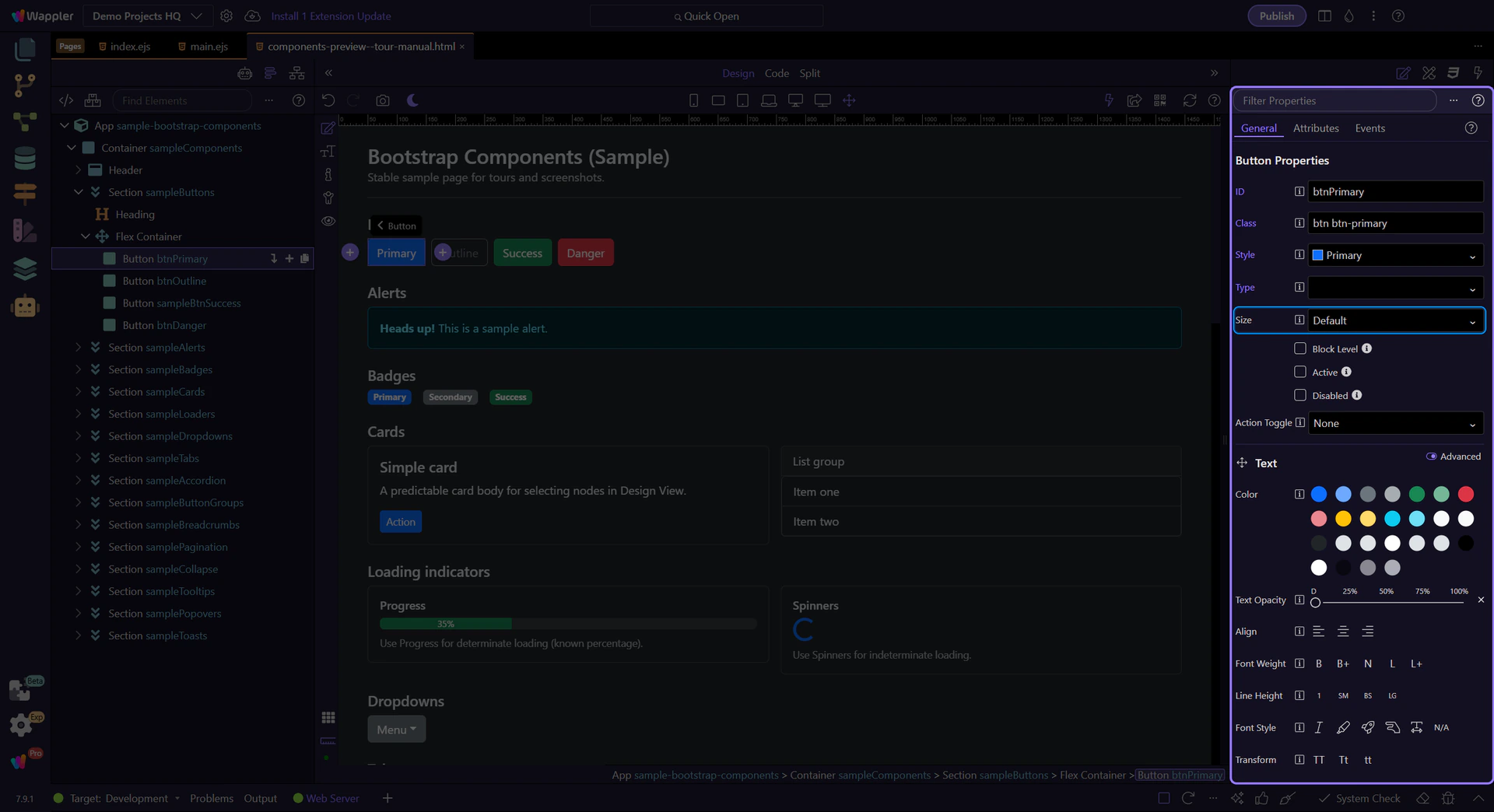
Orient yourself in Properties panel
Start with the wider context in the Properties panel so the next control makes sense in the full workflow. In the next step, you will focus on Button: Style and see how it fits into this area.
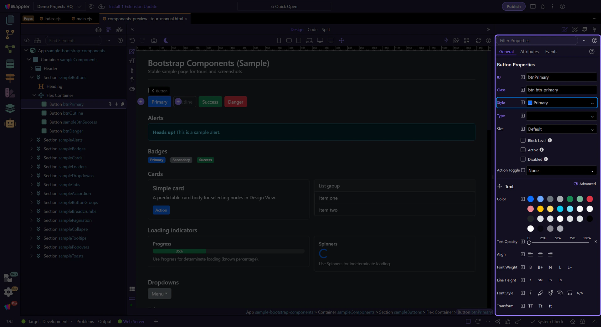
Button: Style
Use Style to switch between solid, outline, and semantic variants (primary, secondary, success, etc.). This step matters because Button: Style is part of Selection Panels Properties Btnbtnstyle, and understanding that context makes the next action easier to repeat in your own project.
Button: Size
Use Size for compact toolbars or prominent primary actions. This step matters because Button: Size is part of Selection Panels Properties Btnsizen, and understanding that context makes the next action easier to repeat in your own project.
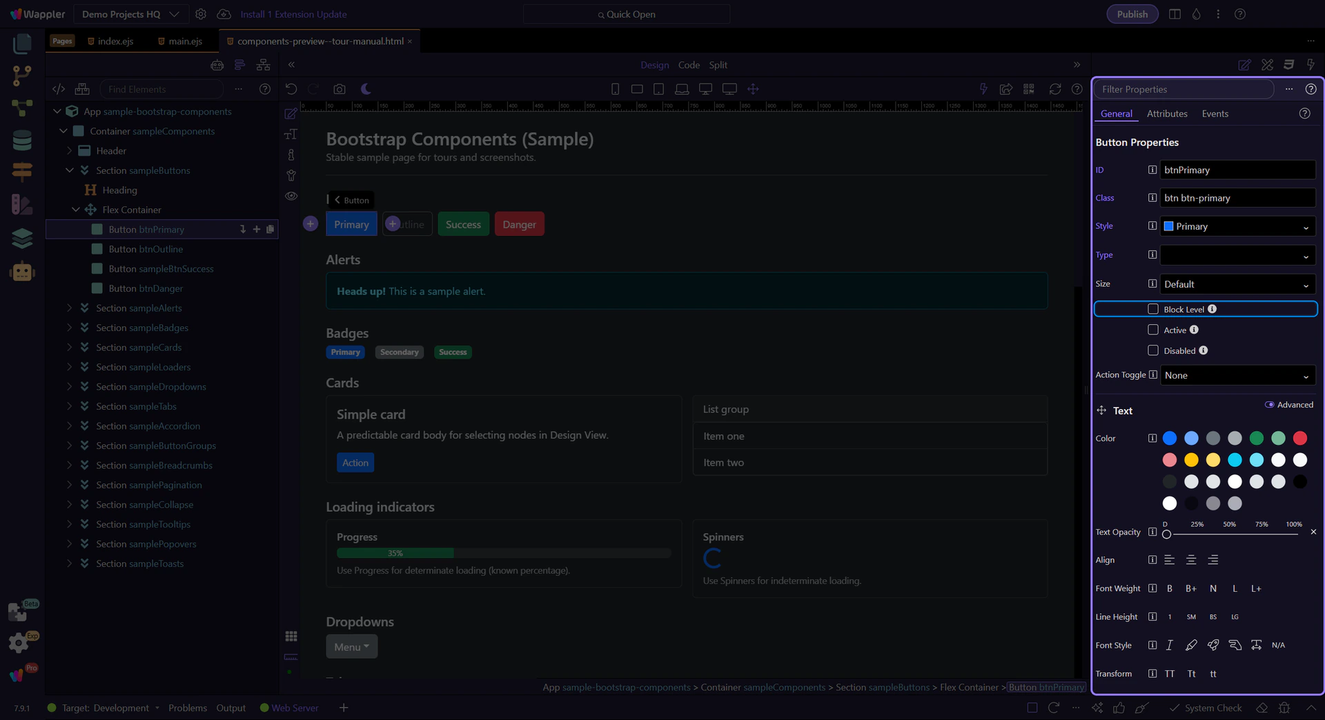
Button: Block level
Use Block Level to make a button span the full width of its container (great for mobile layouts). This step matters because Button: Block level is part of Selection Panels Properties Btnblocklevel, and understanding that context makes the next action easier to repeat in your own project.
Button: Type (forms)
Use Type to control form behavior. Use button for normal actions, and submit only when the button should submit a form. This step matters because Button: Type (forms) is part of Selection Panels Properties Buttontype, and understanding that context makes the next action easier to repeat in your own project.

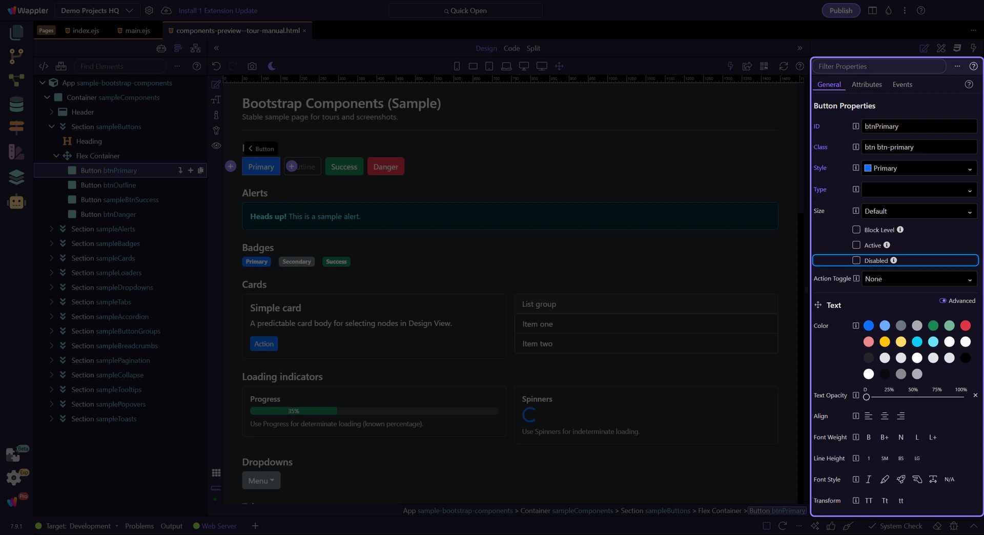
Button: Disabled
Use Disabled when an action is not available. Prefer disabled states over hiding actions when users need to understand what’s possible.
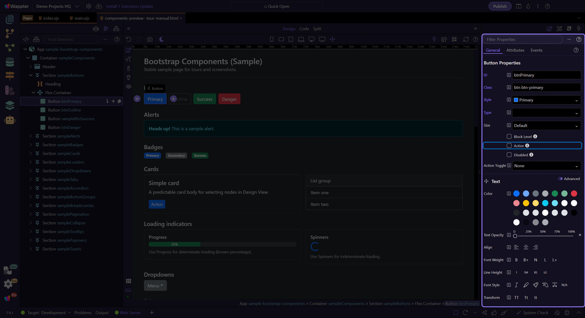
Tip: Active state
Use Active when a button represents a selected state (for example, toggle buttons or segmented controls). This step matters because Tip: Active state is part of Selection Panels Properties Btnactive, and understanding that context makes the next action easier to repeat in your own project.
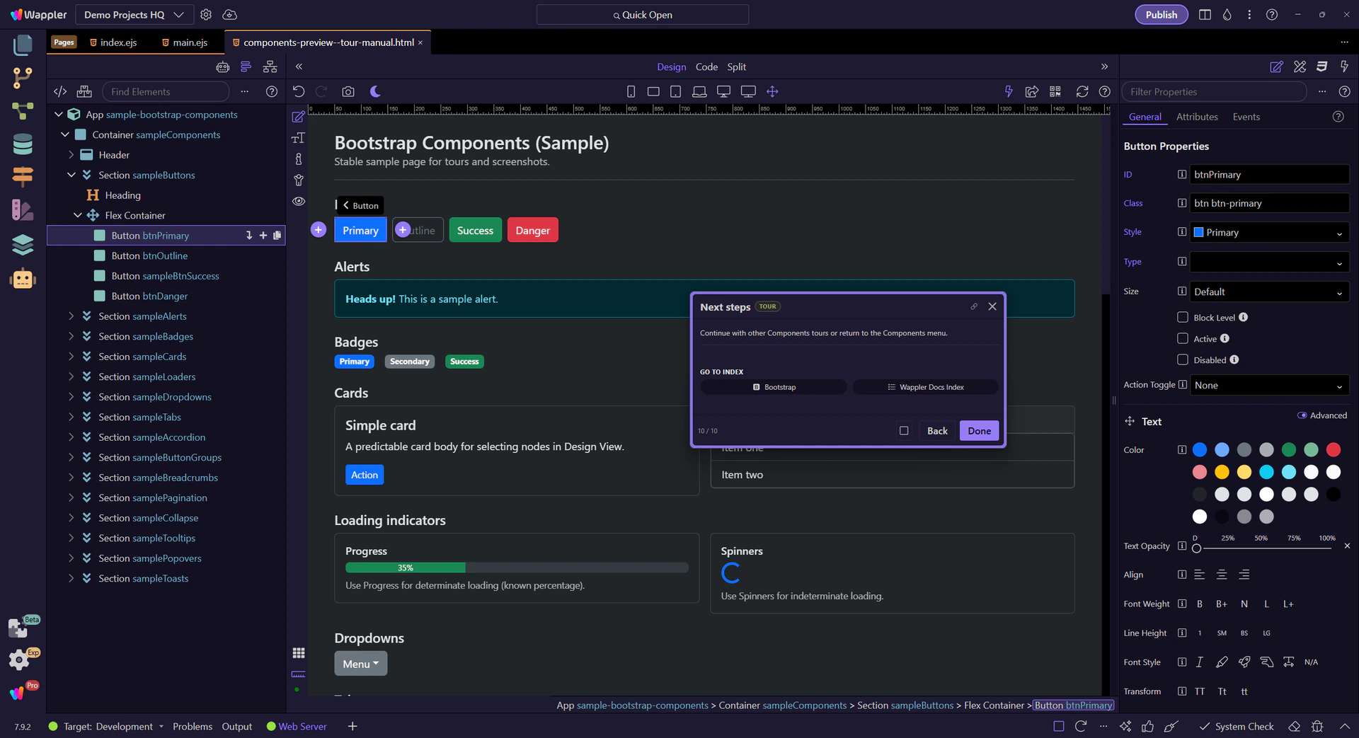
Next steps
Continue with other Components tours or return to the Components menu.