
Bootstrap Components
Explore Bootstrap components in Wappler: learn what’s available and how to use common UI building blocks.
Components on a Page
Section titled “Components on a Page”This tour uses a small set of common Bootstrap components to build a practical mental model for how Wappler exposes them in Design View and Properties. Start by seeing each example as a reusable pattern, then follow the properties that most often change appearance, behavior, and structure in real projects.
Button example
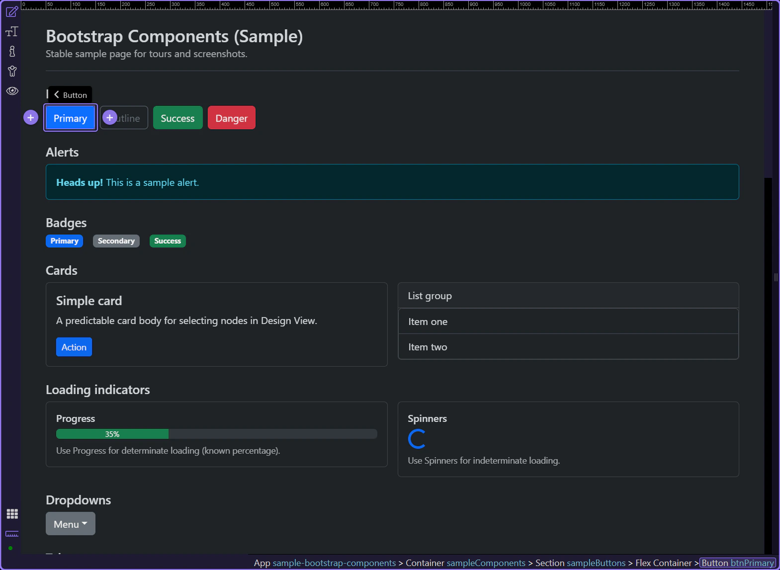
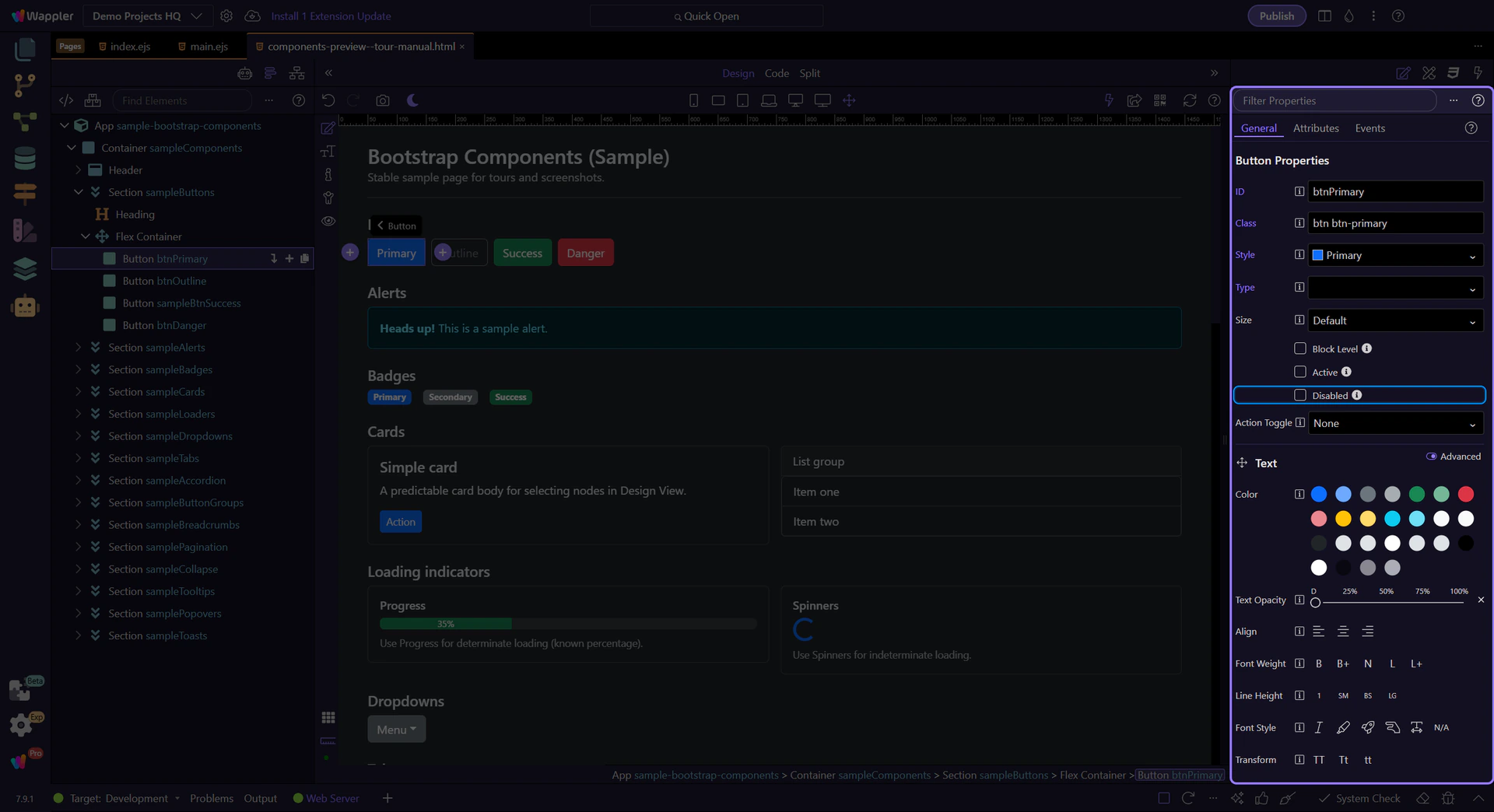
Section titled “Button example”Buttons trigger actions like submit, save, and navigation. Let’s start with a primary button and review the key options that shape its look and behavior.
tip: Use clear, descriptive labels (verb + object) so the action is obvious.
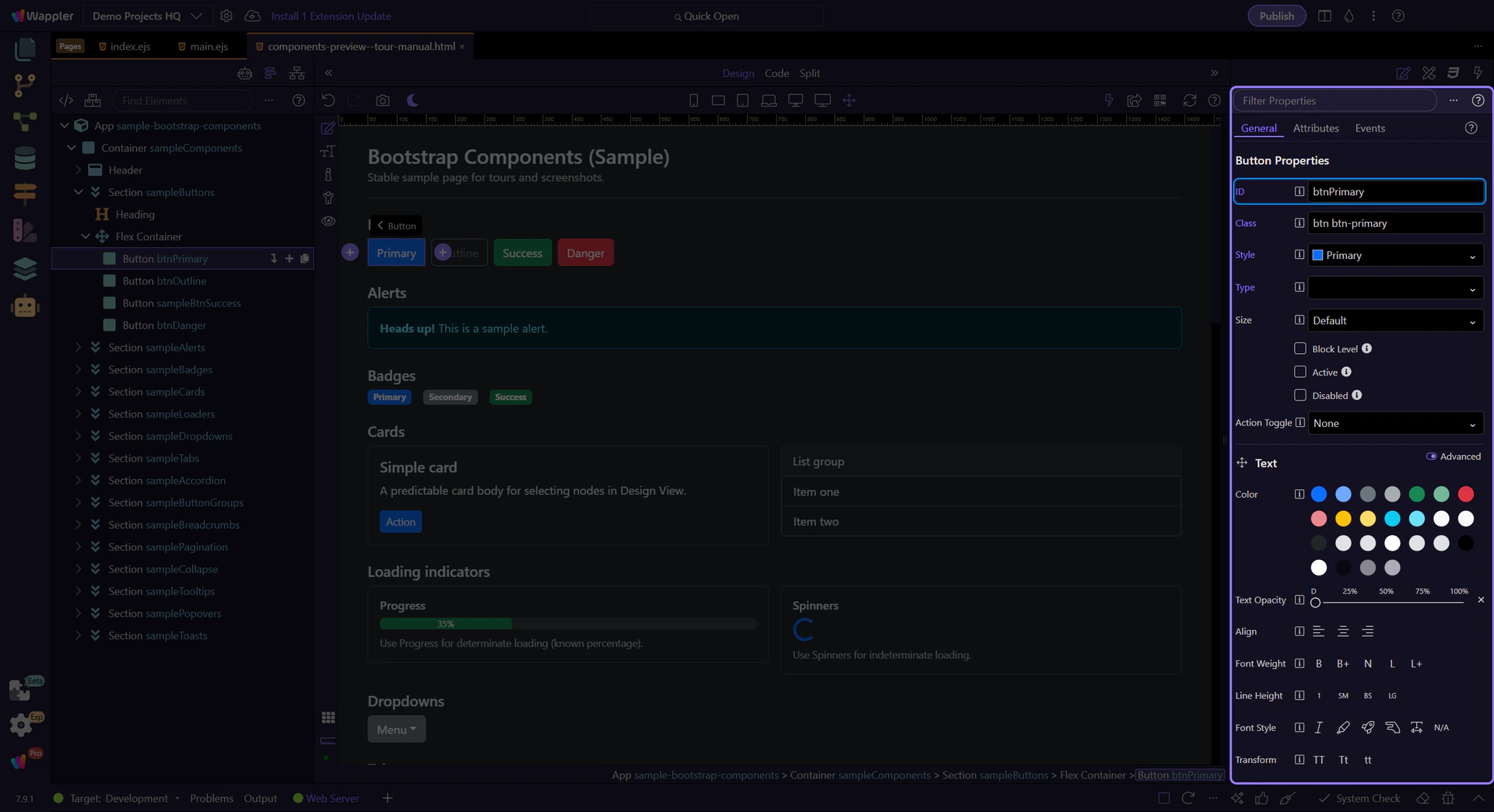
Button: ID
Section titled “Button: ID”Use ID to give the button a stable identifier (useful for CSS/JS targeting and deterministic tours).
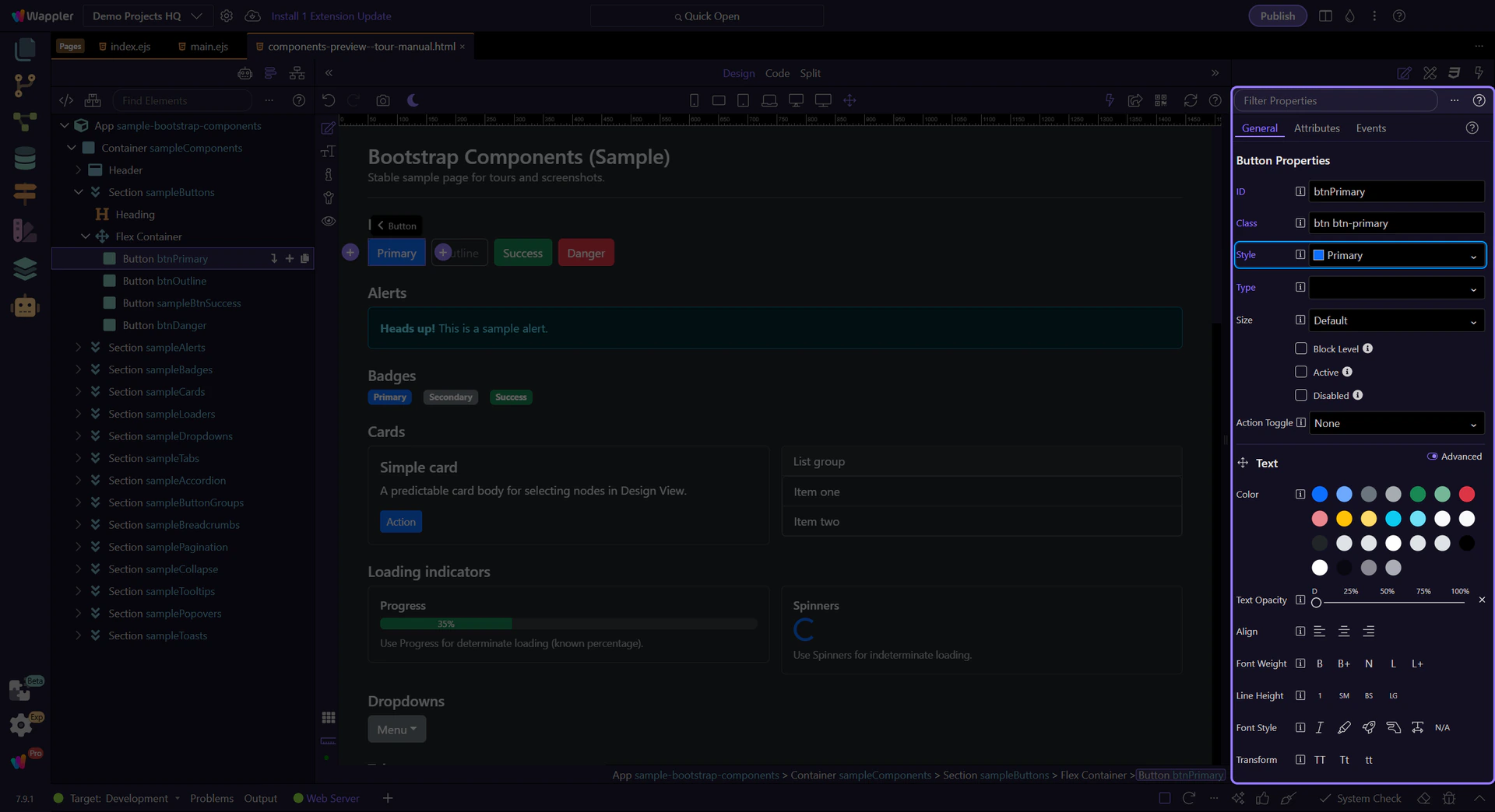
Button: Style
Section titled “Button: Style”Use Style to pick the button variant (primary/secondary/outline-*, etc.).
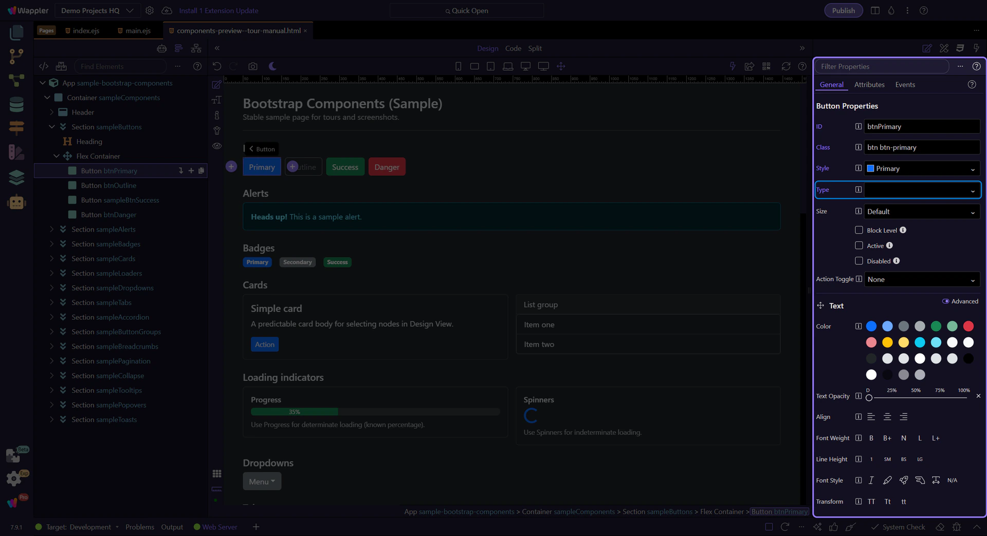
Button: type
Section titled “Button: type”Inside forms, the type attribute matters. Use button for non-submit actions and submit when the button should submit the form.
Button: Disabled
Section titled “Button: Disabled”Use Disabled for loading/locked states so users can’t click multiple times.
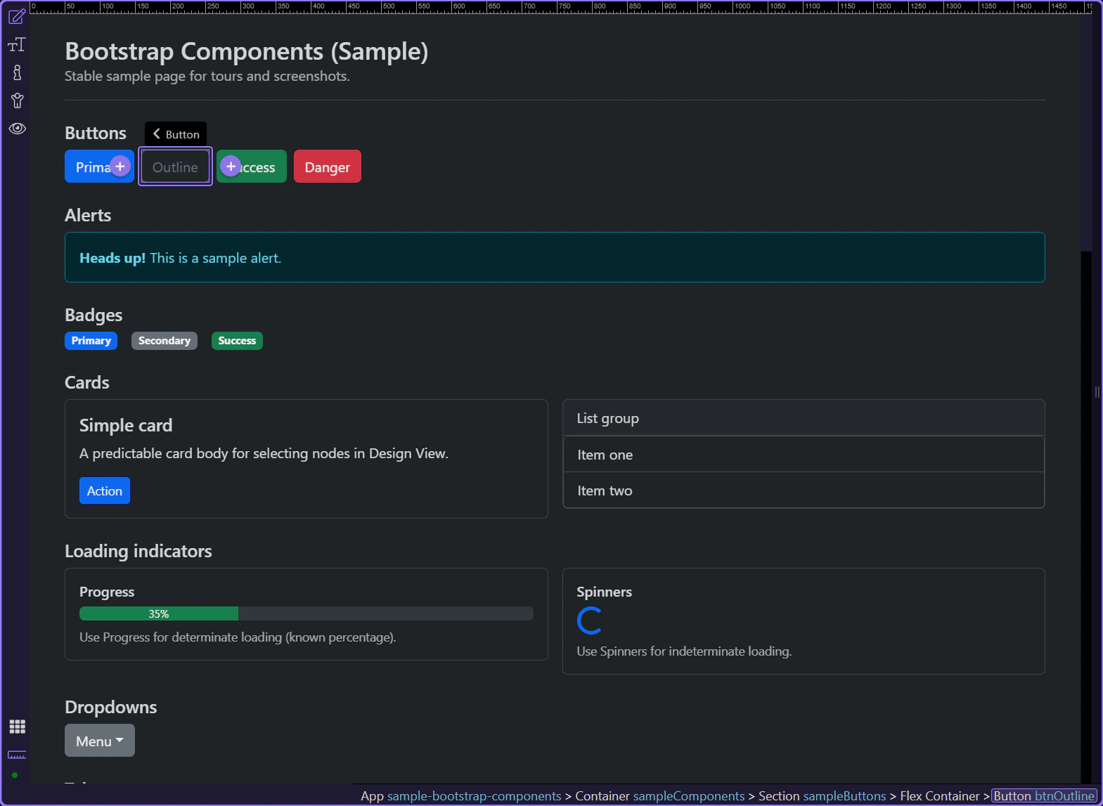
Button variants
Section titled “Button variants”Outline variants keep visual weight low and work well for secondary actions.
tip: If two buttons should be aligned and spaced consistently, set spacing on the parent container when possible.
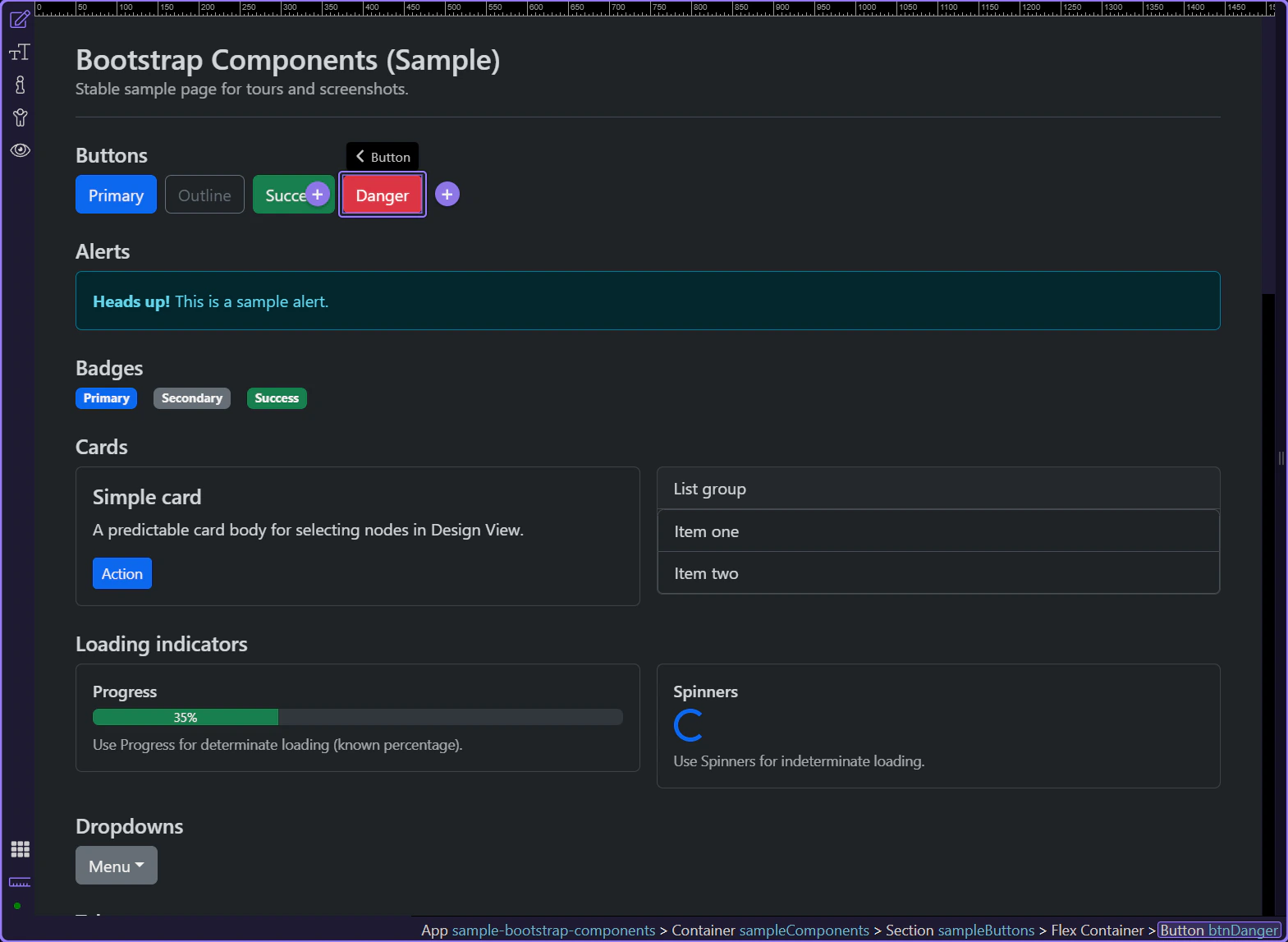
Destructive variant
Section titled “Destructive variant”Use the danger variant sparingly and only for actions that are genuinely destructive (delete, remove, revoke).
Alert example
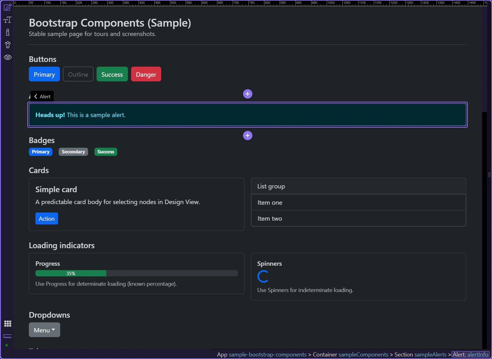
Section titled “Alert example”Alerts communicate status messages—success, warnings, errors, or neutral information.
tip: Choose the variant that matches severity, and keep the message short and actionable.
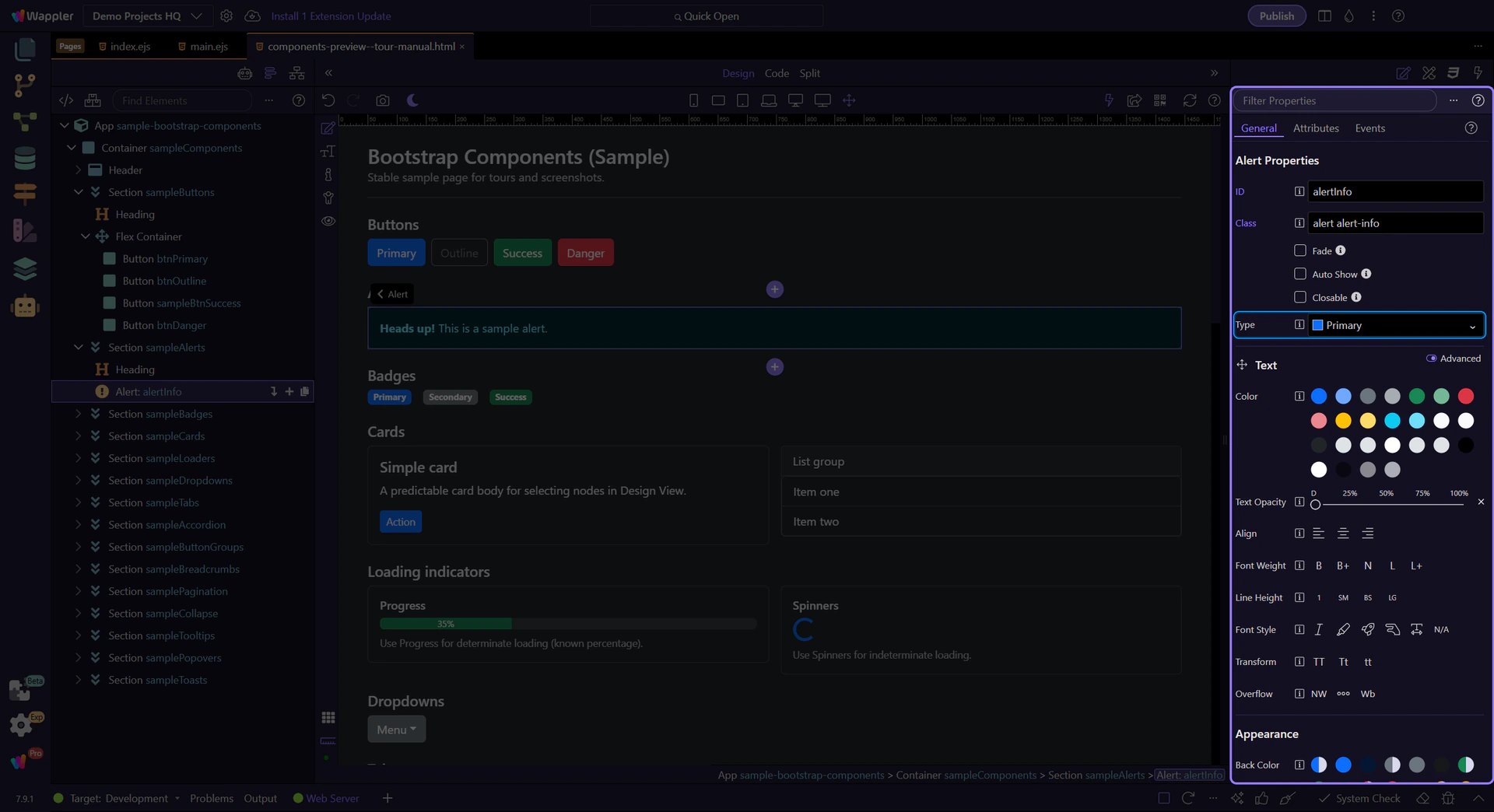
Alert: Type
Section titled “Alert: Type”Use Type to control the alert variant (info/success/warning/danger).
tip: Keep alert messages short and actionable. For more complex content, consider a card or a toast.
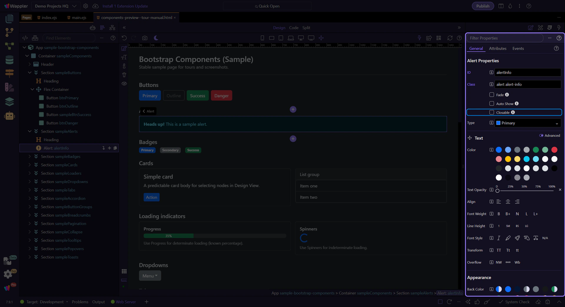
Alert: Closable
Section titled “Alert: Closable”Use Closable to add a close button so users can dismiss the alert.
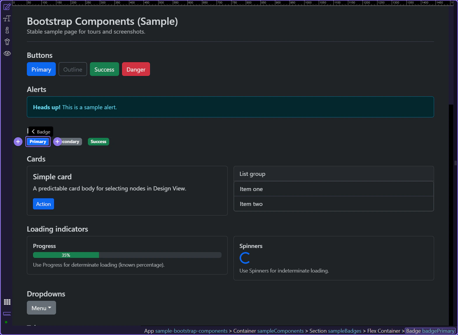
Badge example
Section titled “Badge example”Badges are compact labels for counts, status, and short metadata.
tip: Use badges for small, scannable metadata—not for long text.
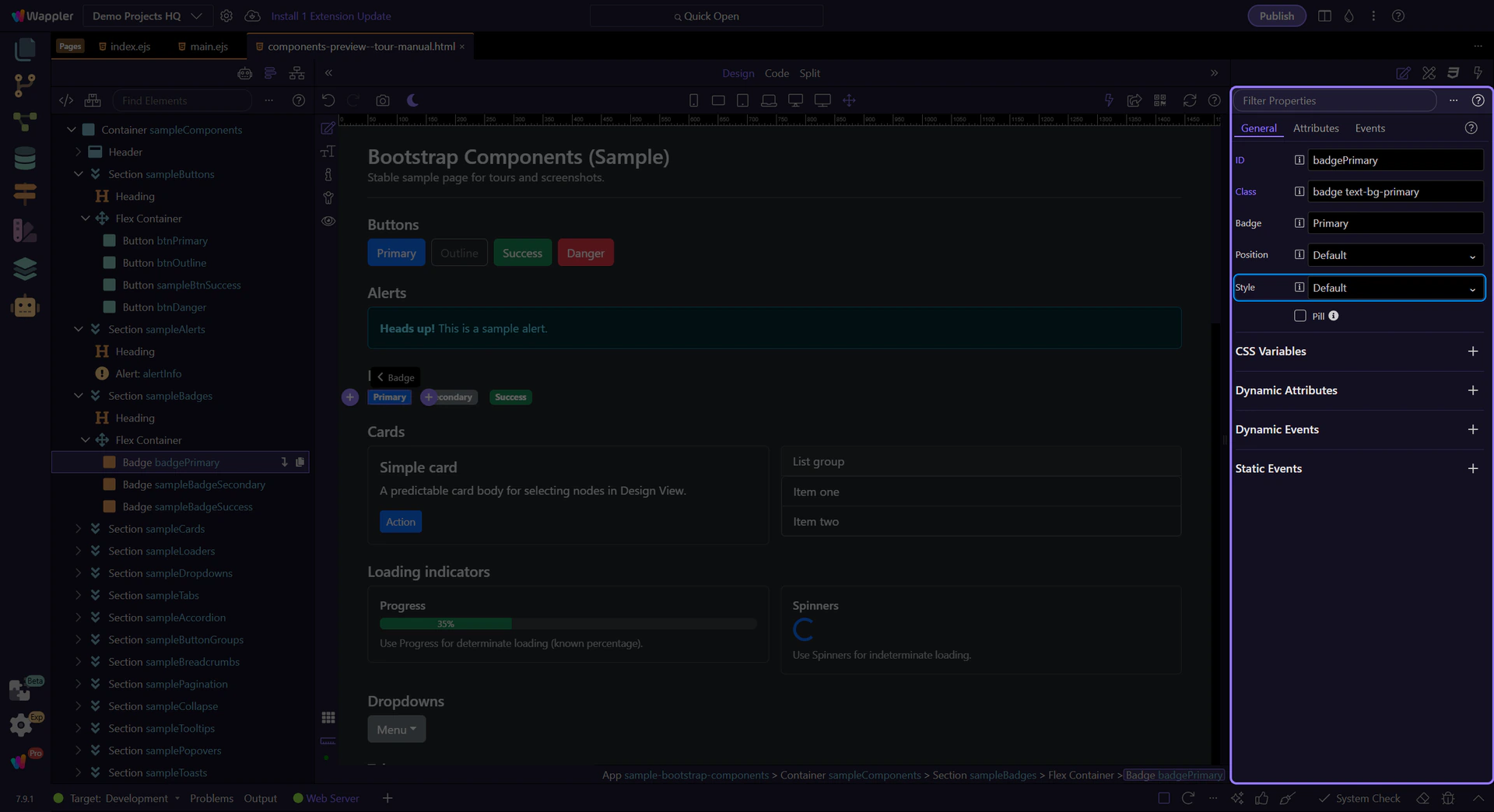
Badge: Style
Section titled “Badge: Style”Use Style to control the badge background color.
Badge: Text
Section titled “Badge: Text”Use Text to change the label or count shown.
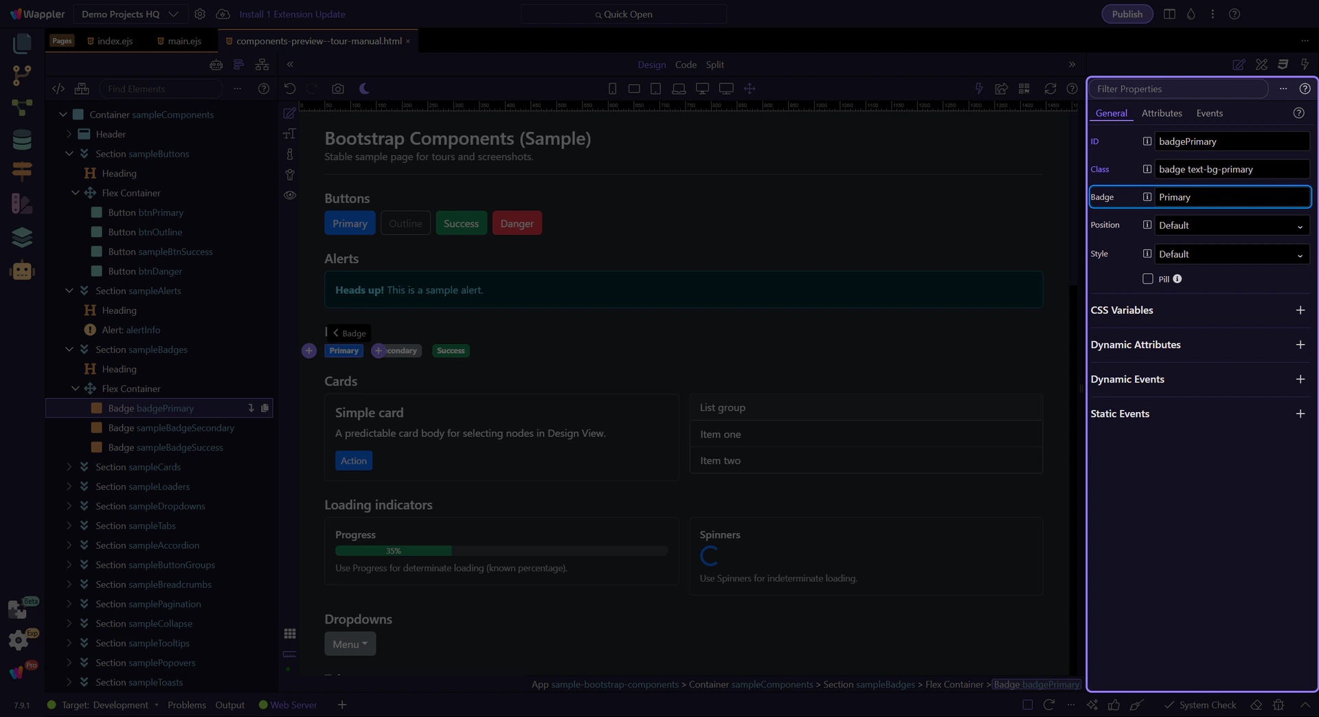
Card nested content
Section titled “Card nested content”Cards often contain nested content like links, buttons, and lists. Let’s look at a call-to-action link inside a card body.
tip: Aim for one clear primary action per card when possible.
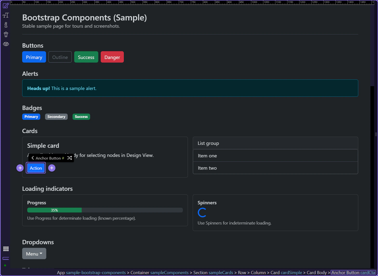
Card container
Section titled “Card container”Cards group related content into a single surface, with optional header/body/footer sections.
tip: Use the header/footer for repeated structure, and keep the body focused on the content.
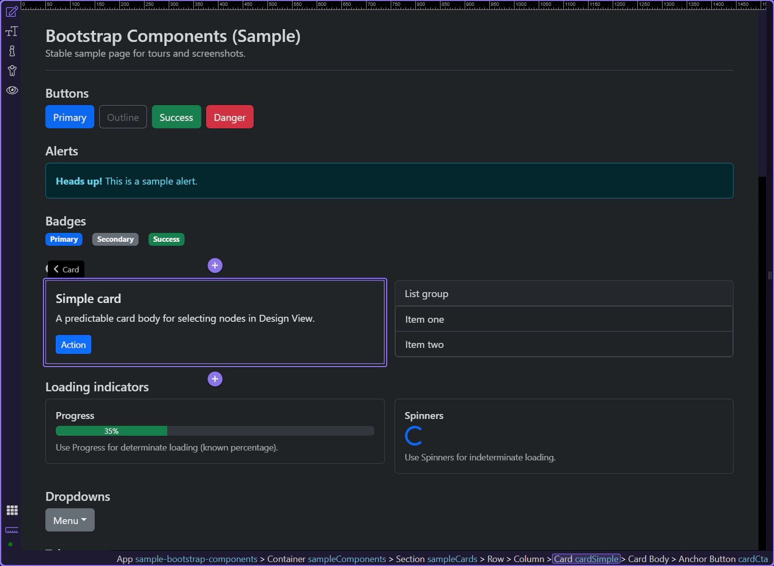
List group item in a card
Section titled “List group item in a card”List groups present a vertical series of related items and are often used inside cards for menus, results, and settings.
tip: List group items are great for menus, settings lists, and compact content blocks.
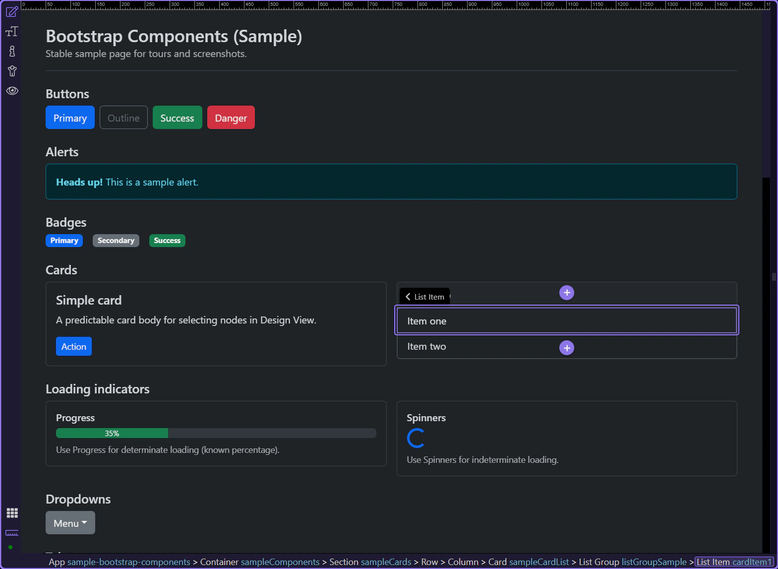
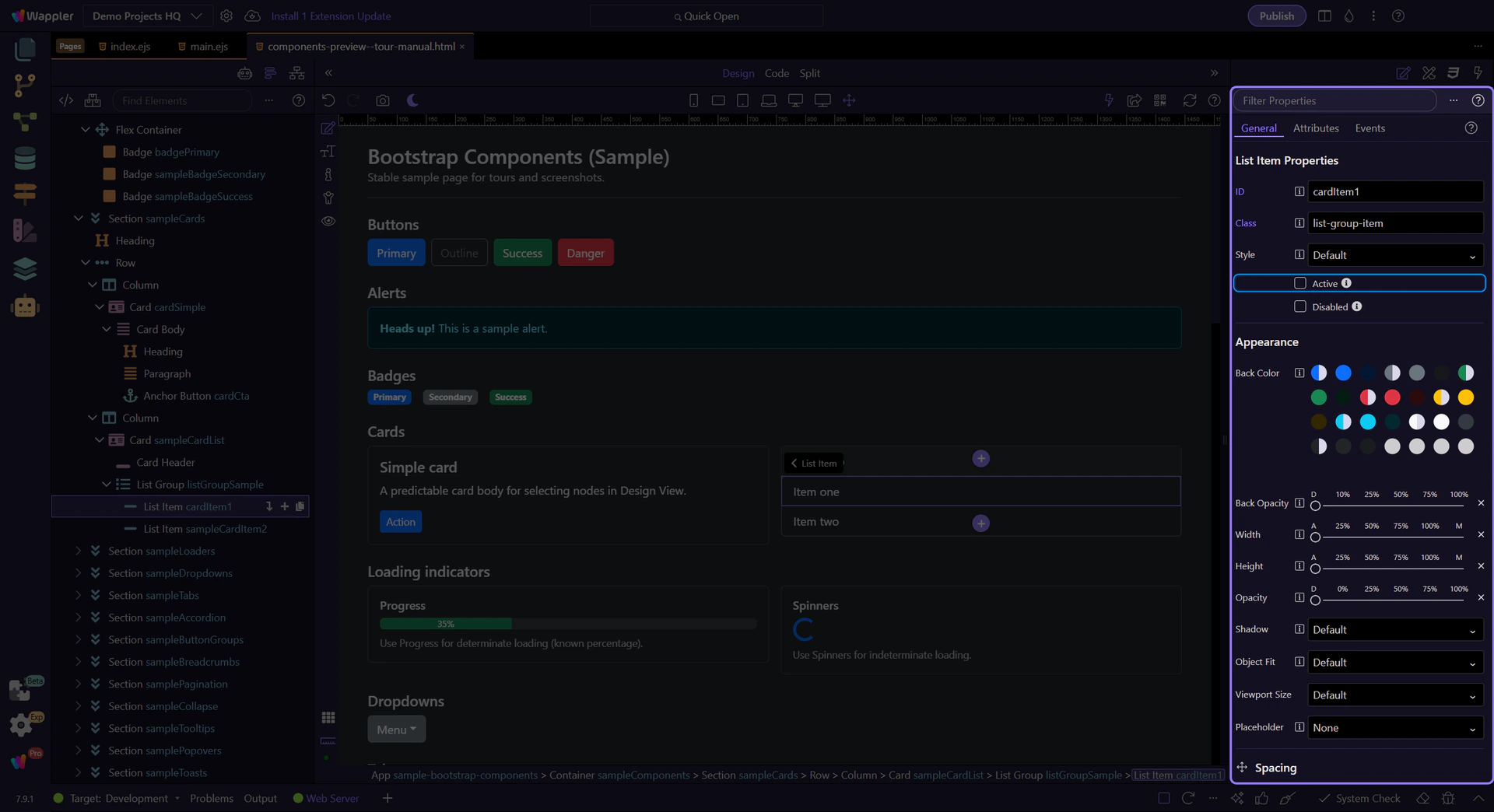
List group item: Active
Section titled “List group item: Active”Use Active to mark the current/selected item.
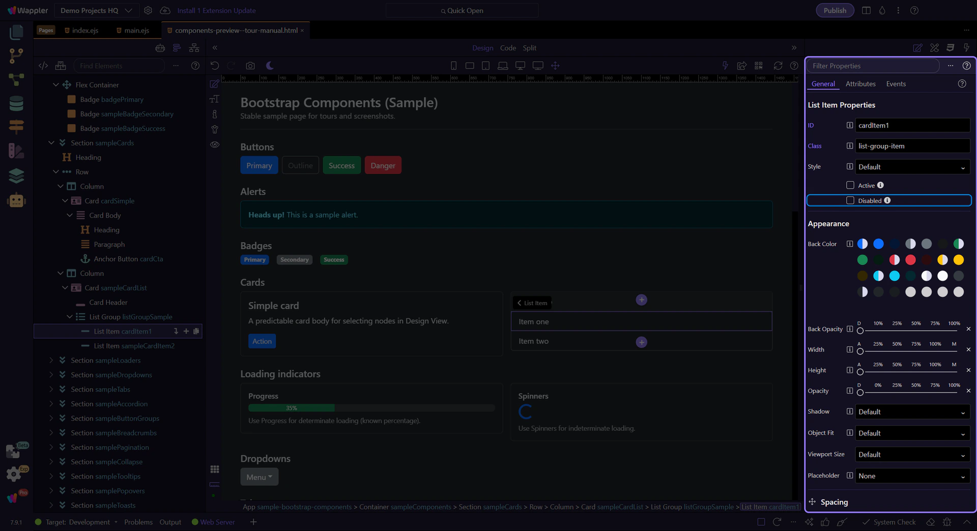
List group item: Disabled
Section titled “List group item: Disabled”Use Disabled to make the item non-interactive.
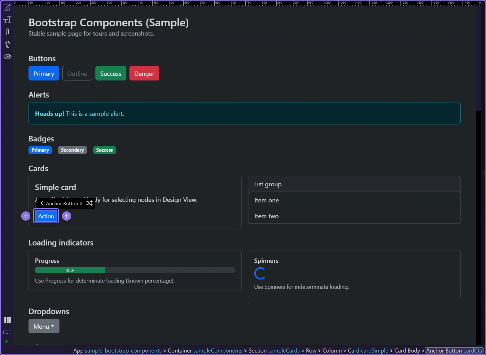
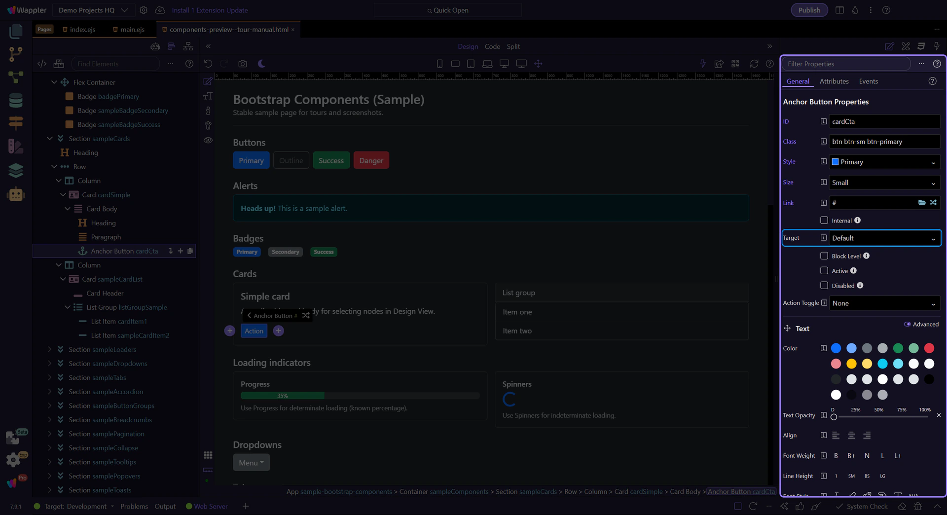
Card CTA
Section titled “Card CTA”Calls-to-action in cards are usually links or buttons that lead to detail pages or start a primary workflow.
Card CTA: href
Section titled “Card CTA: href”Use Link to control where the CTA navigates.
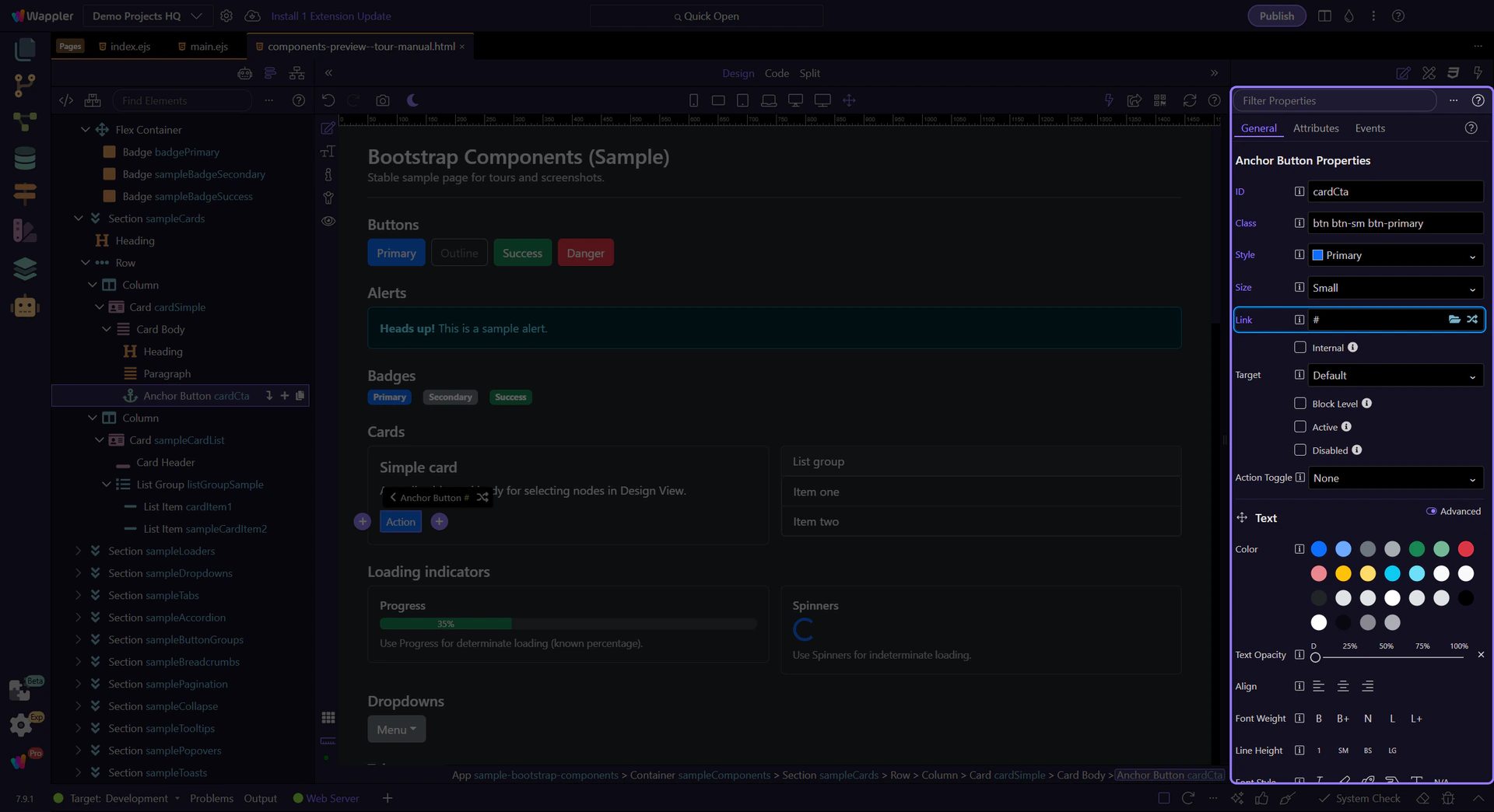
Card CTA: target
Section titled “Card CTA: target”Use target to open in the same tab or a new tab/window.
Next steps
Section titled “Next steps”Continue with a focused component tour, or go back to the Components index to browse the full list. For layout and styling patterns that apply everywhere, use the Utilities tours.