Button groups
Group related actions with button groups and toolbars, including sizing and alignment.
Button groups
Use button groups to combine related actions into a single connected control, keeping spacing and alignment consistent.
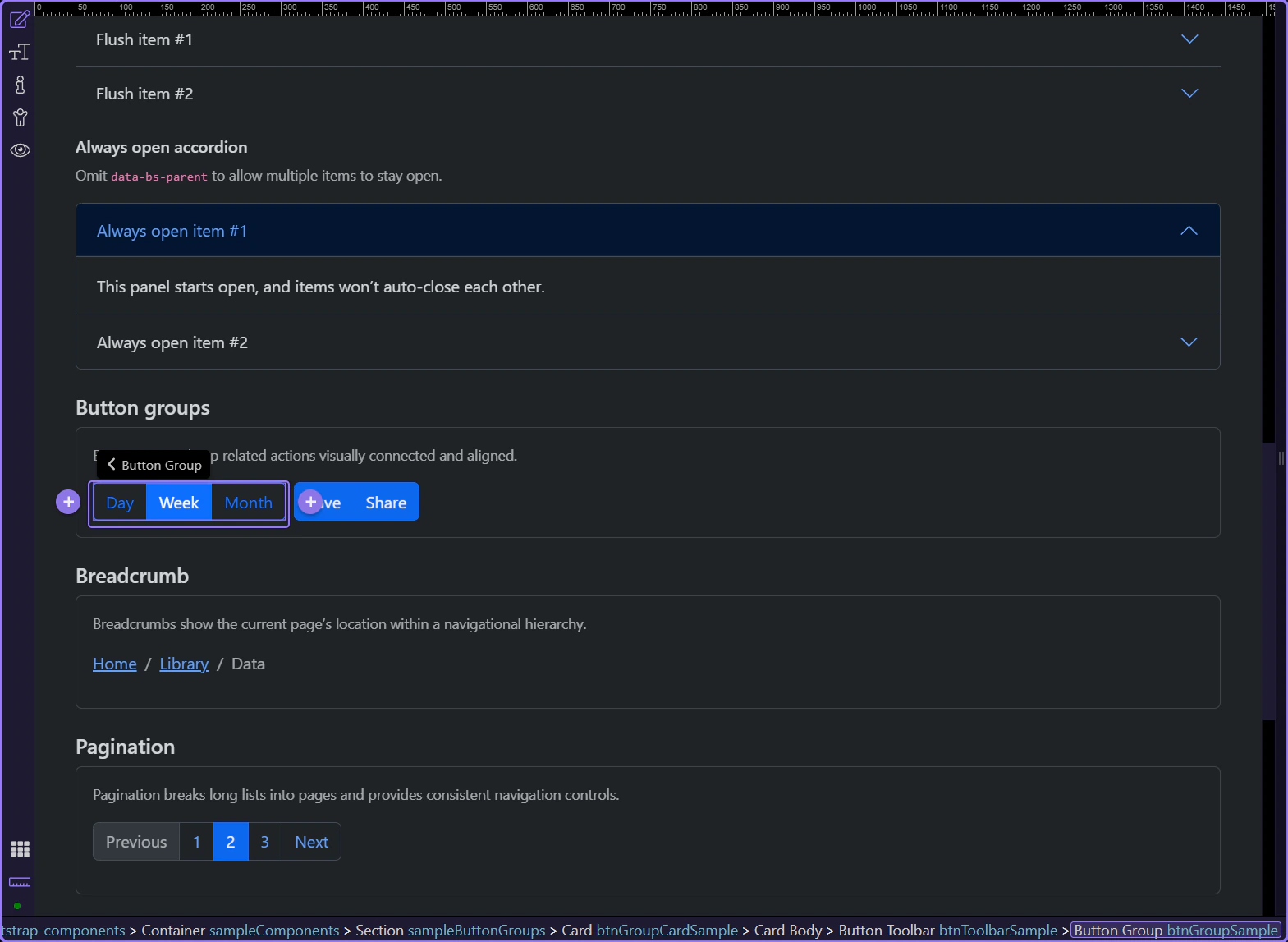
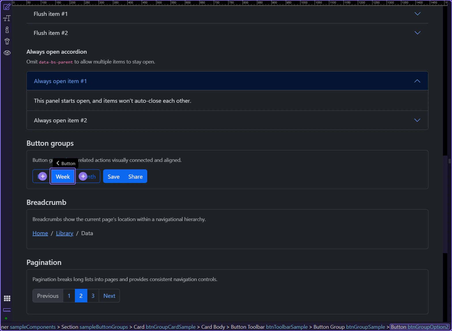
Button group example
Button groups combine related actions into a single connected control. The wrapper controls layout; the buttons inside control styling and states.
Orient yourself in Properties panel
Start with the wider context in the Properties panel so the next control makes sense in the full workflow. In the next step, you will focus on Group: Size and see how it fits into this area.
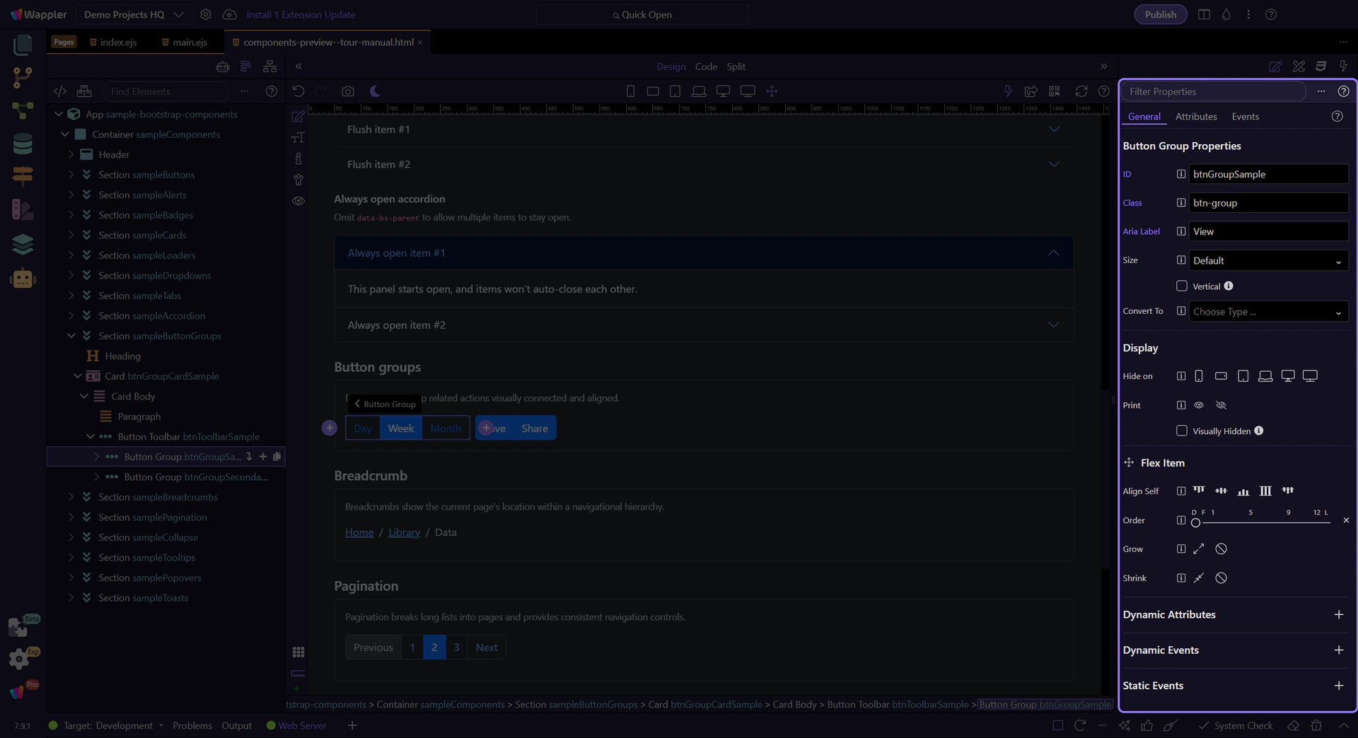
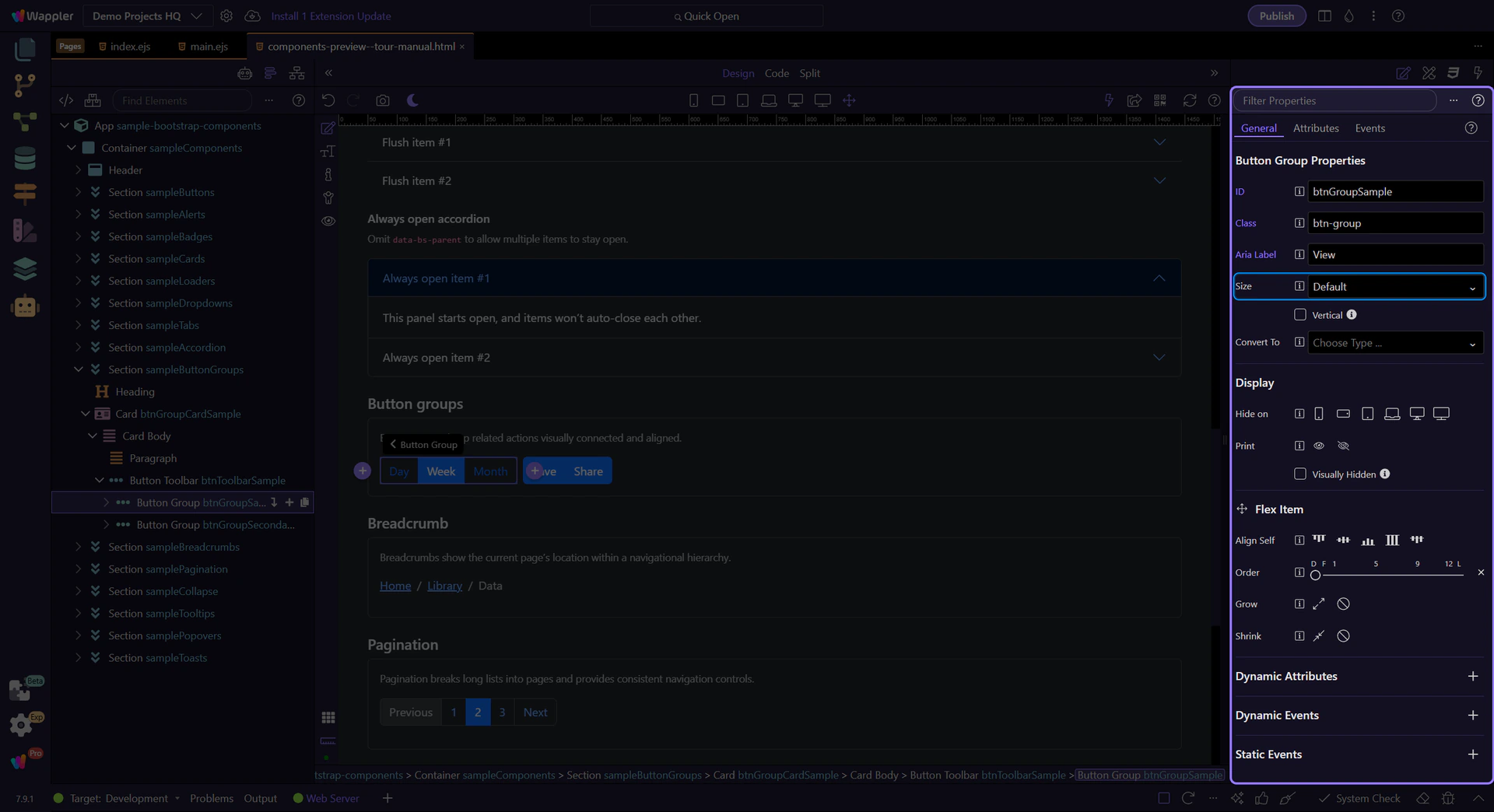
Group: Size
Use Size to make the whole group larger or smaller. This matches Bootstrap’s sizing guidelines (sm / default / lg). This step matters because Group: Size is part of Selection Panels Properties Btngroupsize, and understanding that context makes the next action easier to repeat in your own project.
Group: Vertical
Enable Vertical when you want stacked buttons (useful for narrow sidebars or compact tool panels).

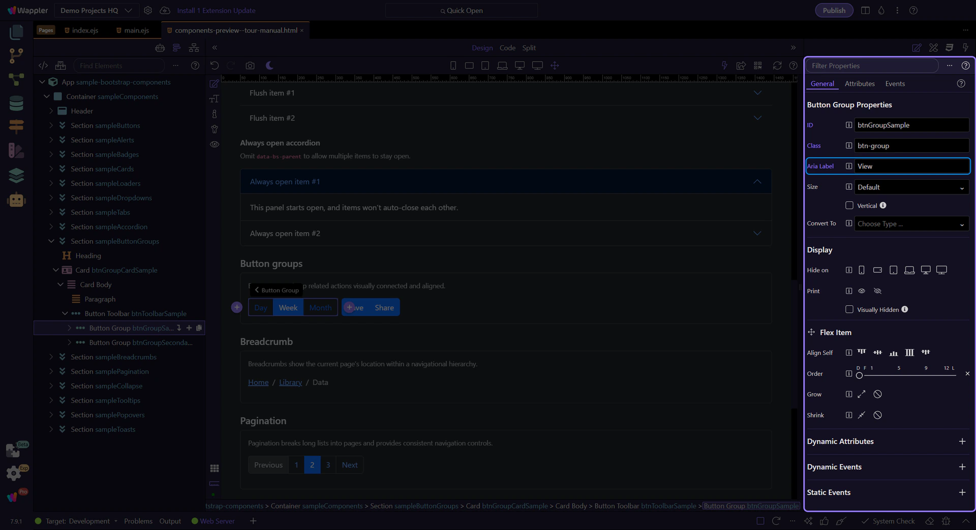
Accessibility: Aria Label
Use Aria Label to describe what the group represents (for example, “View mode” or “Text alignment”). This step matters because Accessibility: Aria Label is part of Selection Panels Properties Btngrouparialabel, and understanding that context makes the next action easier to repeat in your own project.
Style the buttons inside
Button groups handle layout; you still style each button (variant, size, disabled/active) like a normal button.
Button inside the group
Buttons inside a group still behave like normal buttons—this is where you review variant and state options.
Button: Style
Use Style to switch between solid/outline variants and semantic colors (primary, secondary, success, etc.). This step matters because Button: Style is part of Selection Panels Properties Btnbtnstyle, and understanding that context makes the next action easier to repeat in your own project.
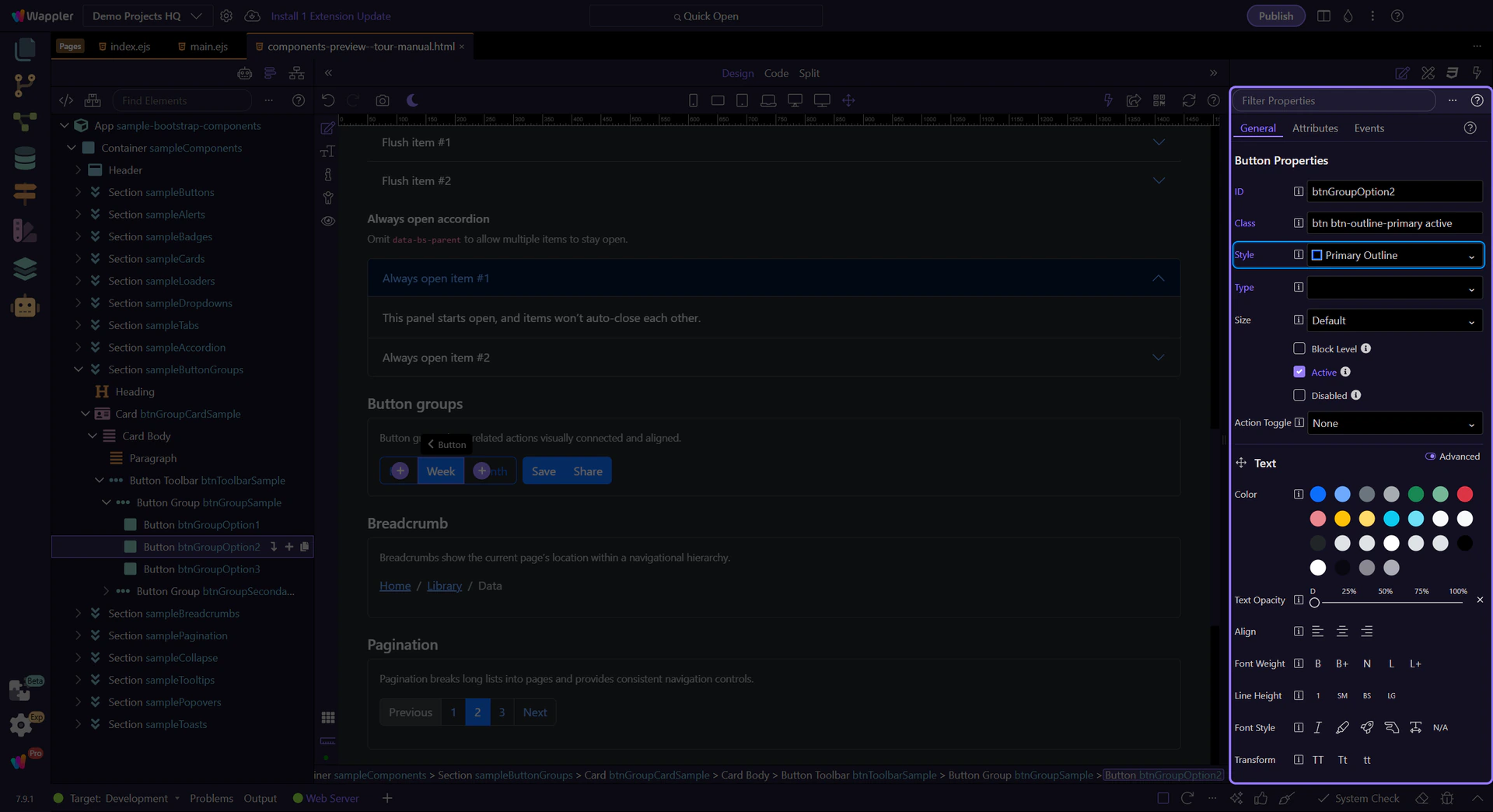
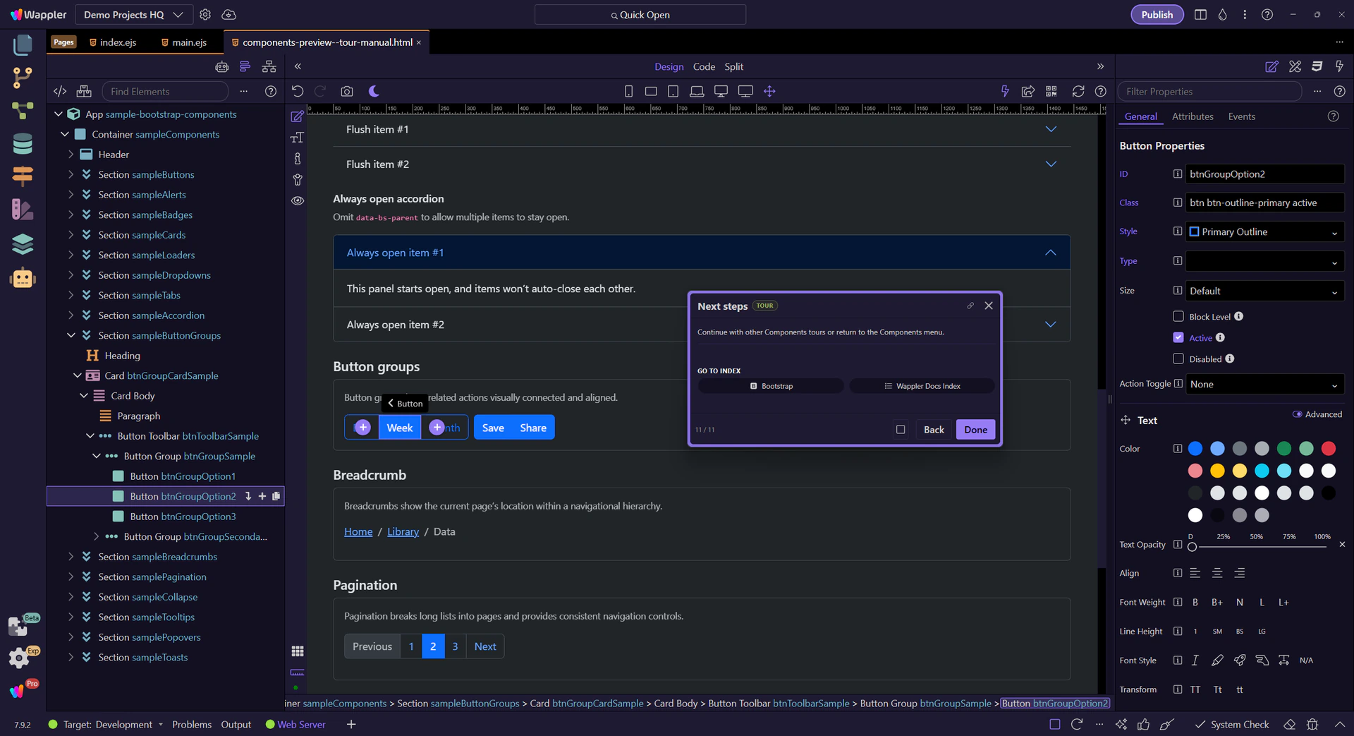
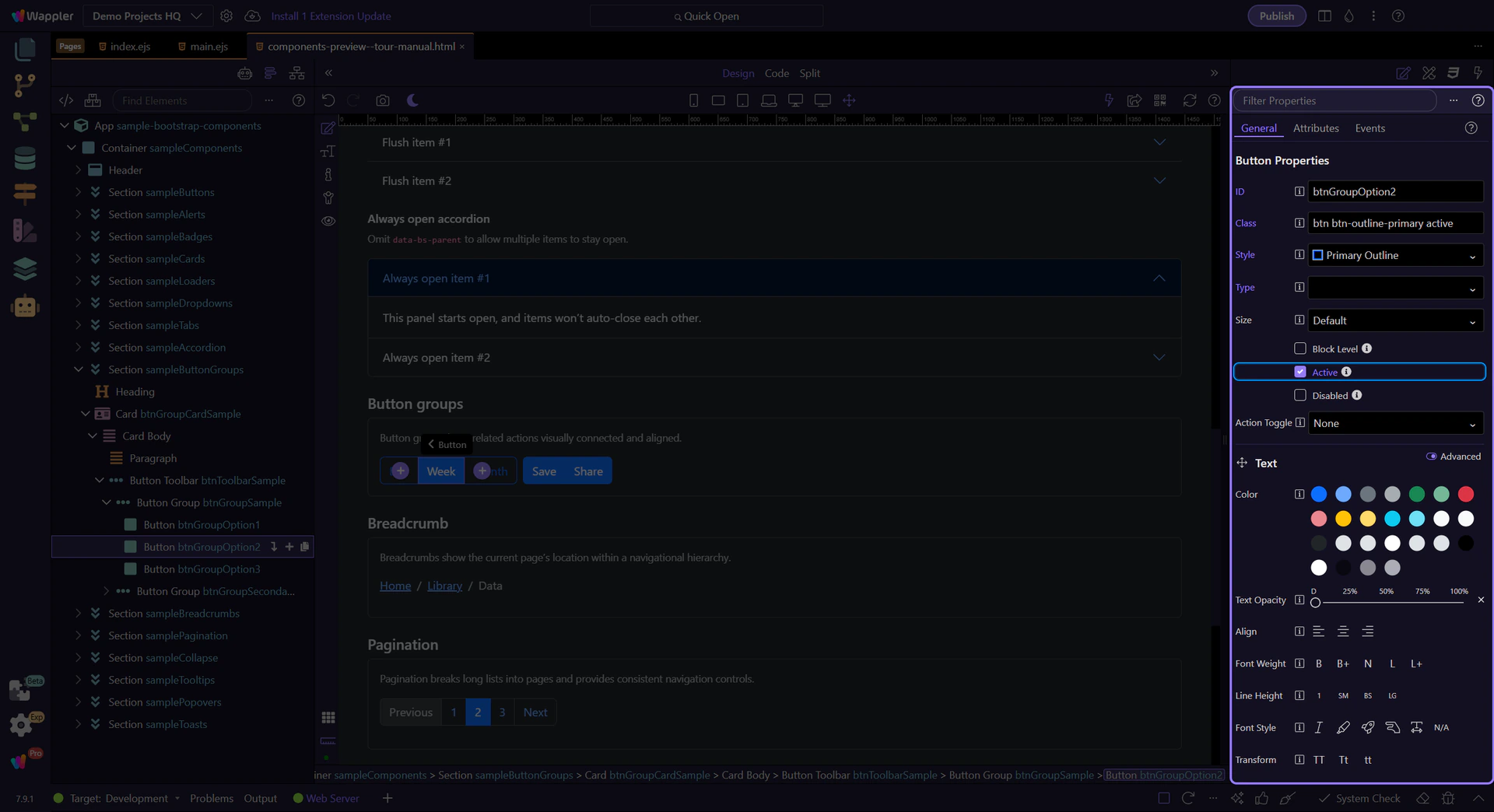
Tip: Active state
Use Active when the button represents the currently selected option (for example, “Week” in a Day/Week/Month switcher). This step matters because Tip: Active state is part of Selection Panels Properties Btnactive, and understanding that context makes the next action easier to repeat in your own project.
Next steps
Continue with other Components tours or return to the Components menu.