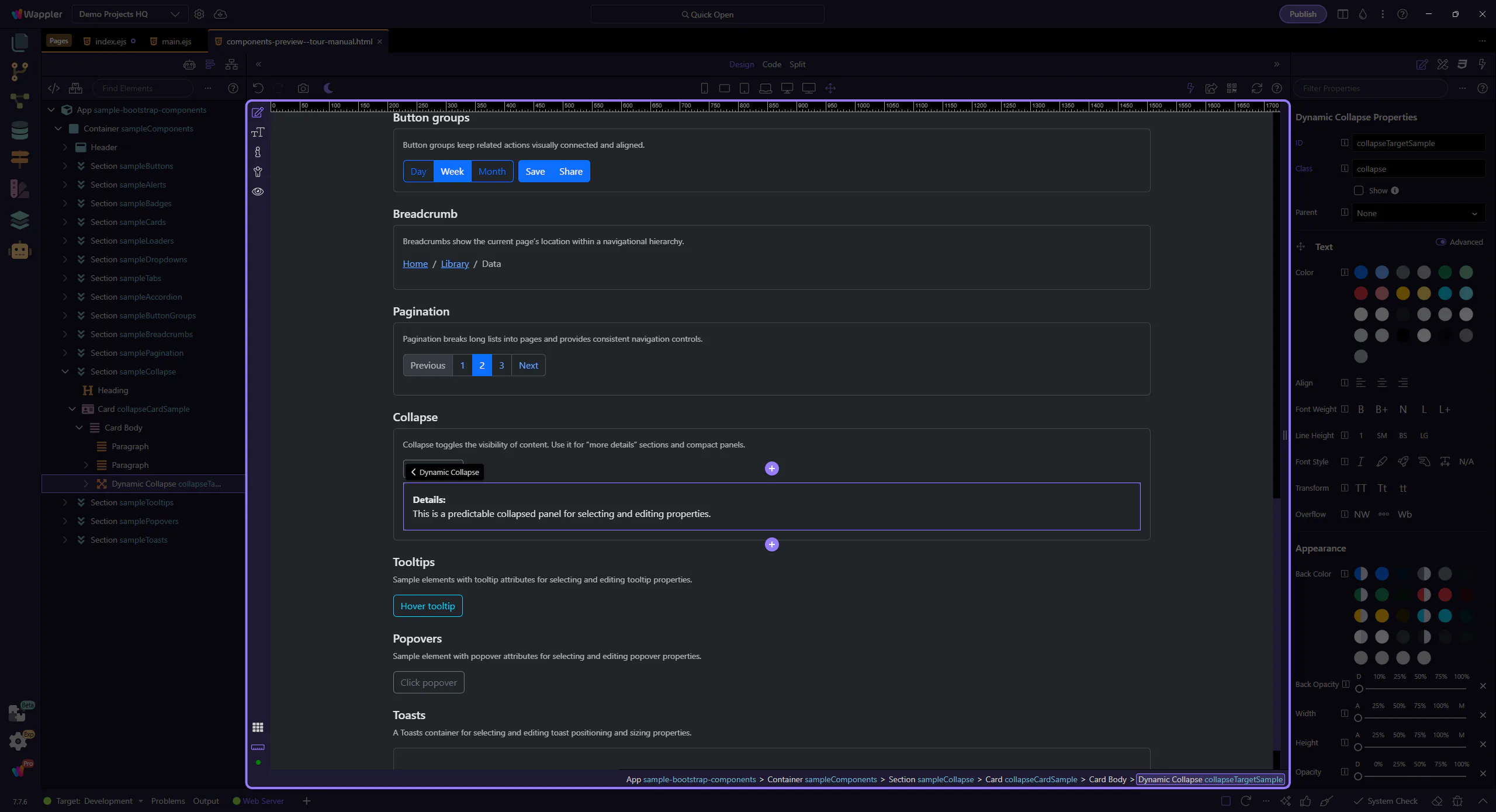
Collapse
Section titled “Collapse”Collapse is a lightweight way to show and hide content without leaving the page. It’s a great fit for “details” sections, compact filters, and progressive disclosure—especially when you want the page to stay scannable.
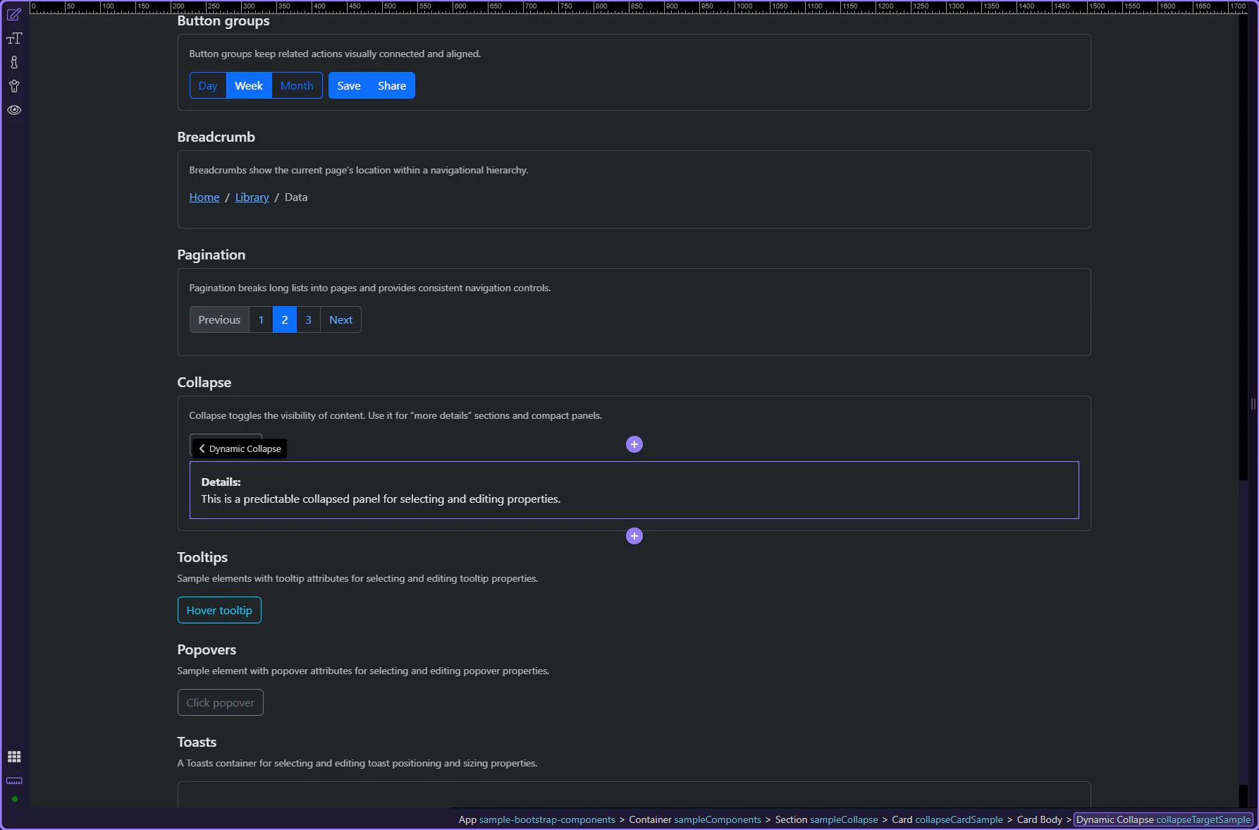
Collapse example
Section titled “Collapse example”The collapsible panel is now highlighted. A Collapse pattern has two parts: a trigger (usually a button or link) and a target panel that expands/collapses.
tip: Collapse works best when the trigger and the target are clearly named (IDs) and the intent is obvious from the UI label.
Orient yourself in Properties panel
Section titled “Orient yourself in Properties panel”Start with the wider context in the Properties panel so the next control makes sense in the full workflow. In the next step, you will focus on Collapse: Show and see how it fits into this area.
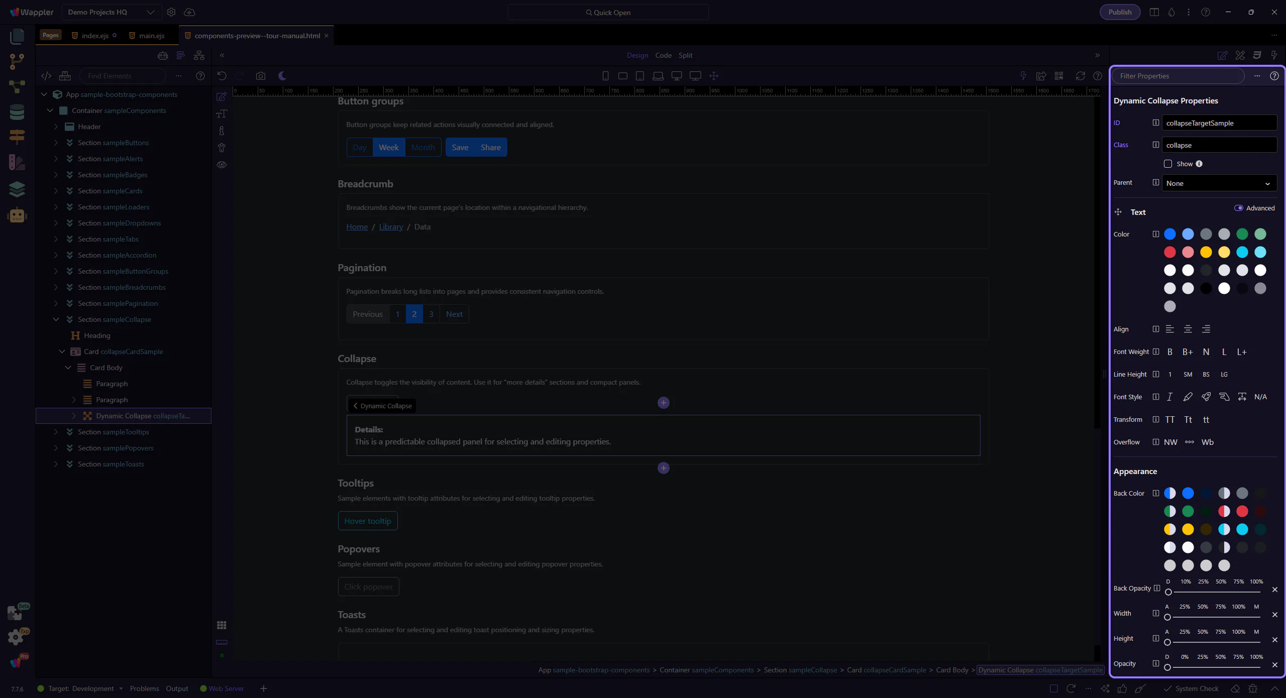
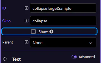
Collapse: Show
Section titled “Collapse: Show”The Show option controls whether the panel starts expanded. In documentation-like UIs, starting collapsed is a sensible default: the page stays shorter, and users can opt in to the extra detail.
note: If the content is required to complete a task, prefer keeping it visible and using Collapse only for truly optional sections.
How the trigger connects to the panel
Section titled “How the trigger connects to the panel”Behind the scenes, a trigger element (often a button or link) uses data-bs-toggle="collapse" plus a data-bs-target that points to the collapse panel’s ID. This keeps the behavior predictable and makes it easier for assistive technologies to understand the relationship.
tip: If toggling behaves oddly, the first thing to verify is that the target ID is unique and matches exactly.
Accordion behavior (optional)
Section titled “Accordion behavior (optional)”Collapse can also participate in an accordion pattern—useful when you want only one panel open at a time.
When to use accordion behavior
Section titled “When to use accordion behavior”Accordion behavior is a UX choice: it trades free exploration (multiple panels open) for a tighter, guided layout (one panel open). It’s common for FAQs, settings groups, and compact navigation-like panels.
important: If users might want to compare sections side-by-side, avoid forcing one-at-a-time behavior.
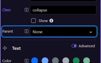
Collapse: Parent
Section titled “Collapse: Parent”The Parent option links this collapse panel to an accordion container. With a parent set, opening one panel can automatically close other panels within the same accordion.
Wrap-up
Section titled “Wrap-up”Collapse is ideal for optional content and progressive disclosure. For accordion-style layouts, link panels to a parent so behavior stays consistent.