Pagination
Understand Bootstrap pagination patterns and build paging controls that fit common list and table layouts.
Pagination
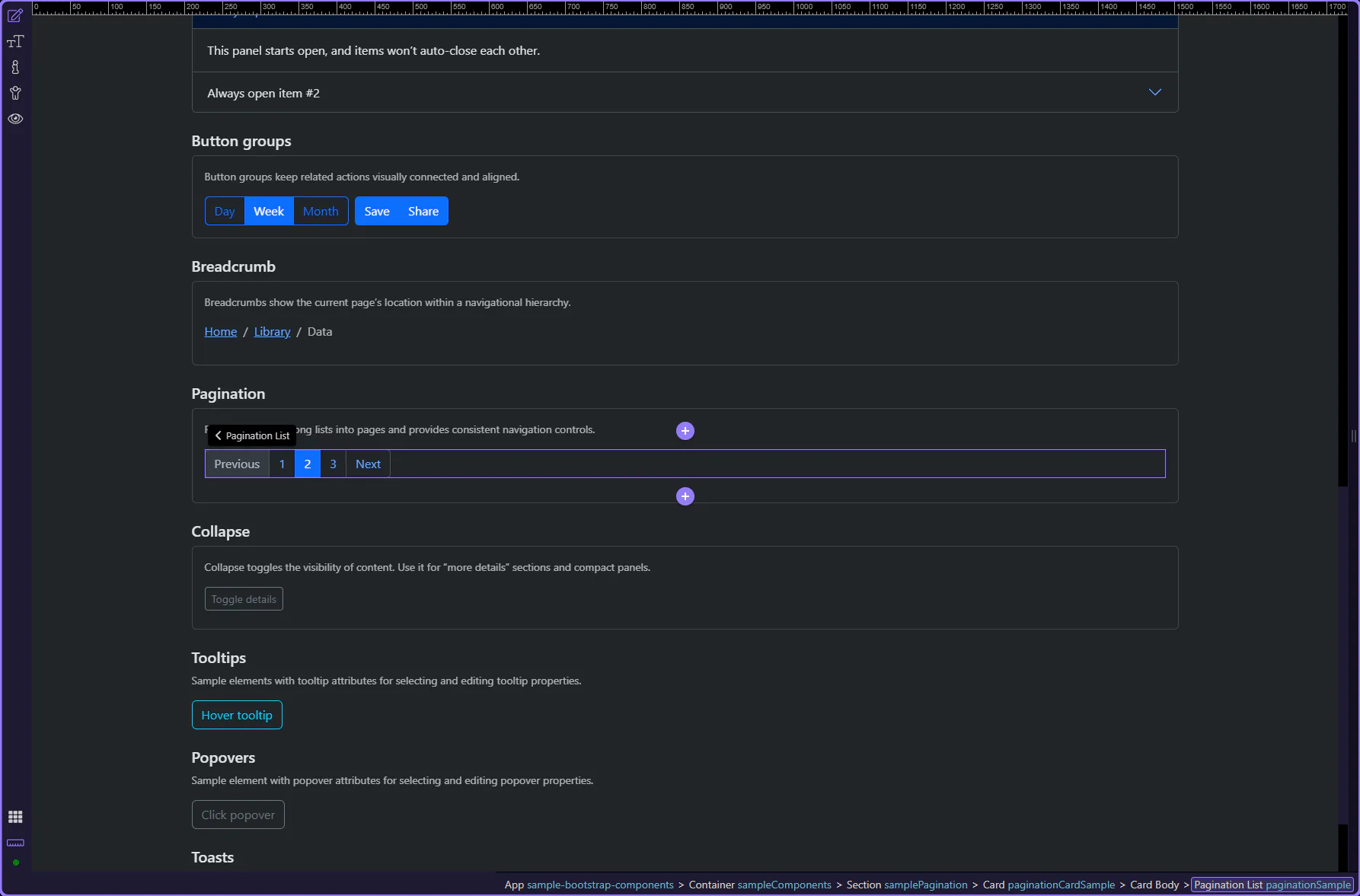
Section titled “Pagination”Pagination helps users move between pages of content. In Bootstrap, it’s built from a pagination container plus page items and links.
Pagination example
Section titled “Pagination example”Pagination is highlighted. Pagination provides navigable links across multiple pages of content, with clear active and disabled states.
Orient yourself in Properties panel
Section titled “Orient yourself in Properties panel”Start with the wider context in the Properties panel so the next control makes sense in the full workflow. In the next step, you will focus on Pagination: Size and see how it fits into this area.
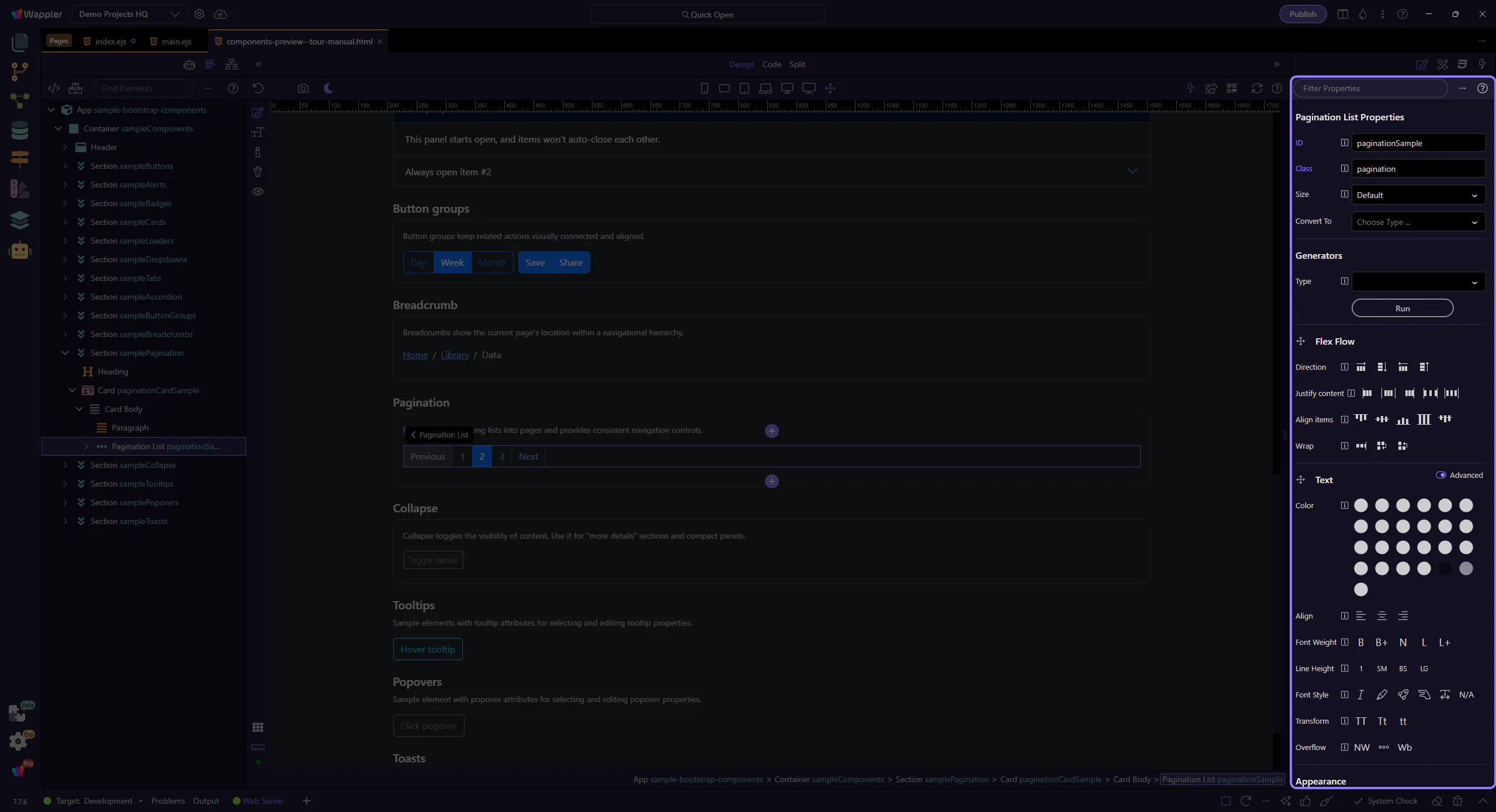
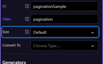
Pagination: Size
Section titled “Pagination: Size”Use Size to choose a larger or smaller pagination control. Keep it consistent with surrounding UI density. This step matters because Pagination: Size is part of Selection Panels Properties Paginationsize, and understanding that context makes the next action easier to repeat in your own project.
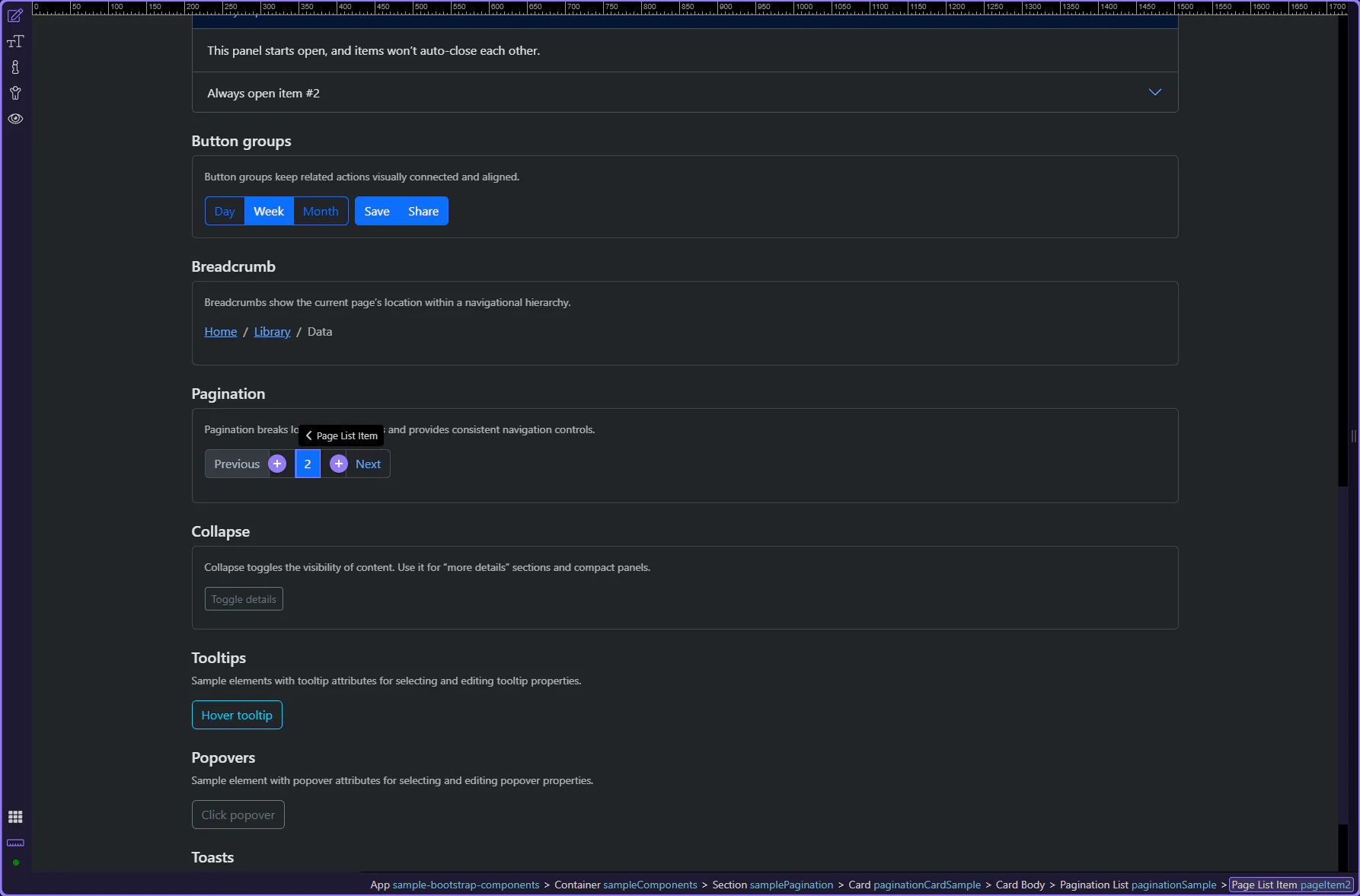
Page items and links
Section titled “Page items and links”Page items hold state (active/disabled). Page links hold the clickable label and destination.
Active page item
Section titled “Active page item”Active and disabled states live on the page item. Let’s review the current page state. This step matters because Active page item is part of Design View, and understanding that context makes the next action easier to repeat in your own project.
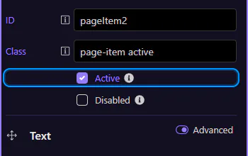
Page item: Active
Section titled “Page item: Active”Use Active for the current page. This step matters because Page item: Active is part of Selection Panels Properties Pageitemactive, and understanding that context makes the next action easier to repeat in your own project.
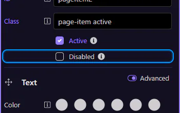
Page item: Disabled
Section titled “Page item: Disabled”Use Disabled for items that aren’t available (for example, “Previous” on the first page). This step matters because Page item: Disabled is part of Selection Panels Properties Pageitemdisabled, and understanding that context makes the next action easier to repeat in your own project.
Page link
Section titled “Page link”Page links control the visible label and navigation destination. This step matters because Page link is part of Design View, and understanding that context makes the next action easier to repeat in your own project.

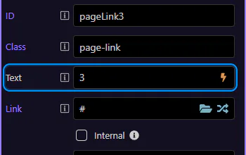
Page link: Text and Link
Section titled “Page link: Text and Link”Use Text to change the label and Link to choose a route or file. Keep numeric pagination consistent (1, 2, 3 …) and use words/icons for previous/next.
Next steps
Section titled “Next steps”Continue with other Components tours or return to the Components menu.