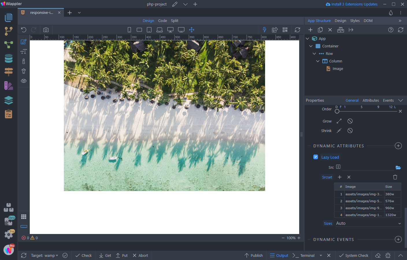
Responsive Images with srcset
Intro In most cases using the “Responsive” option for images with Bootstrap works perfectly fine. However, there are some cases where you need to serve different images for different devices - one for
In most cases using the “Responsive” option for images with Bootstrap works perfectly fine. However, there are some cases where you need to serve different images for different devices - one for desktop, a different one for tablets, and a third version for small devices, like phones. Also, your ultra high quality photo for desktop may be 5MB in size, which on a slower 3G connection would cause a really long loading times.
In these cases you can use the Lazy Load Component with the help of srcset attribute. When you want to display separate images (or usually, a separate asset of the same image) based on the device viewport size you’d go with a basic srcset implementation.
Prepare Images
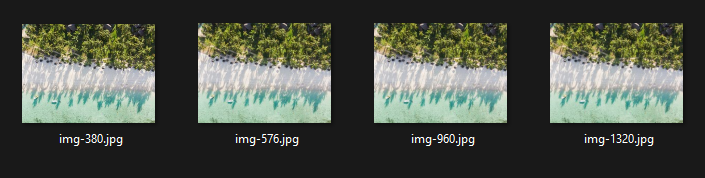
Section titled “Prepare Images”We prepared 4 different images with widths of: 380px, 576px, 960px and 1320px. You can use as many images with the srcset as you need for your page and for your breakpoints:
Responsive Image Setup
Section titled “Responsive Image Setup”First, let’s add an image on our page:
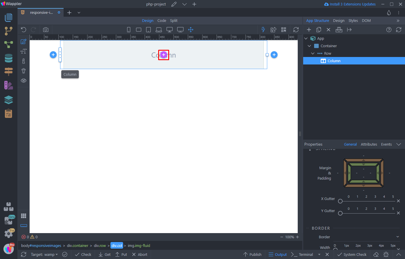
Select Image:
Section titled “Select Image:”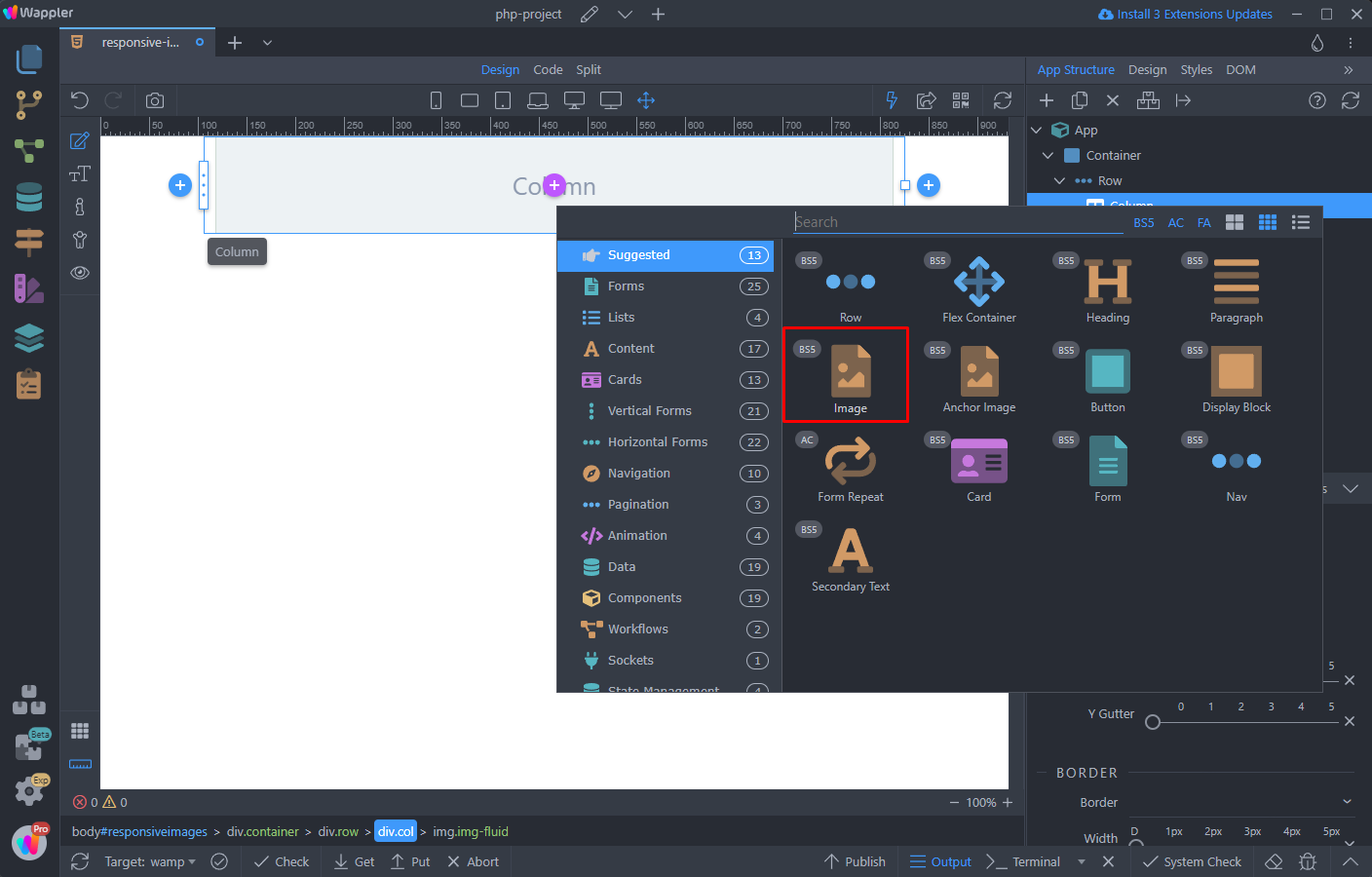
Do not use the normal src option here. Just set the width to 100%:
Section titled “Do not use the normal src option here. Just set the width to 100%:”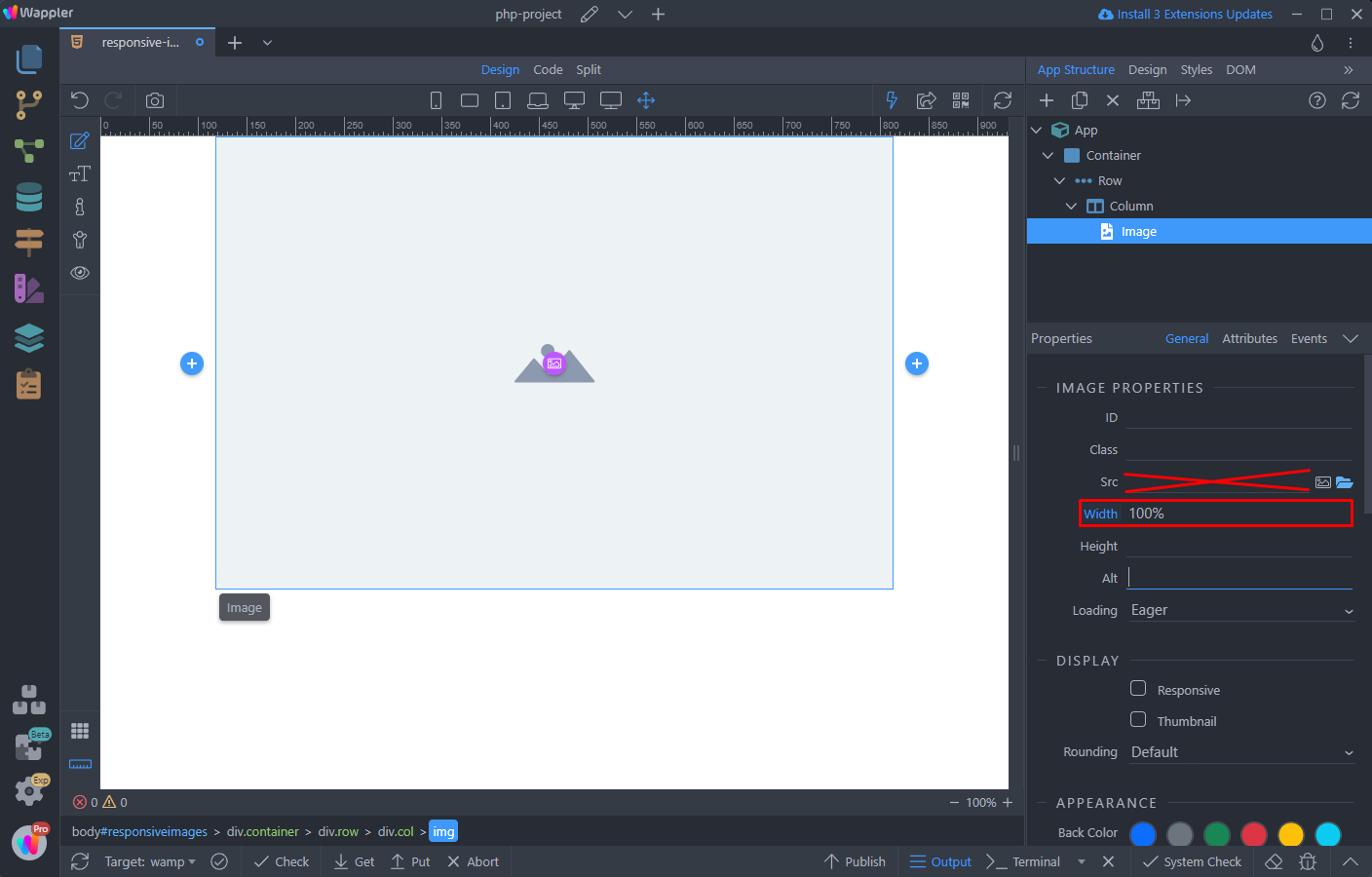
Add new dynamic attribute:
Section titled “Add new dynamic attribute:”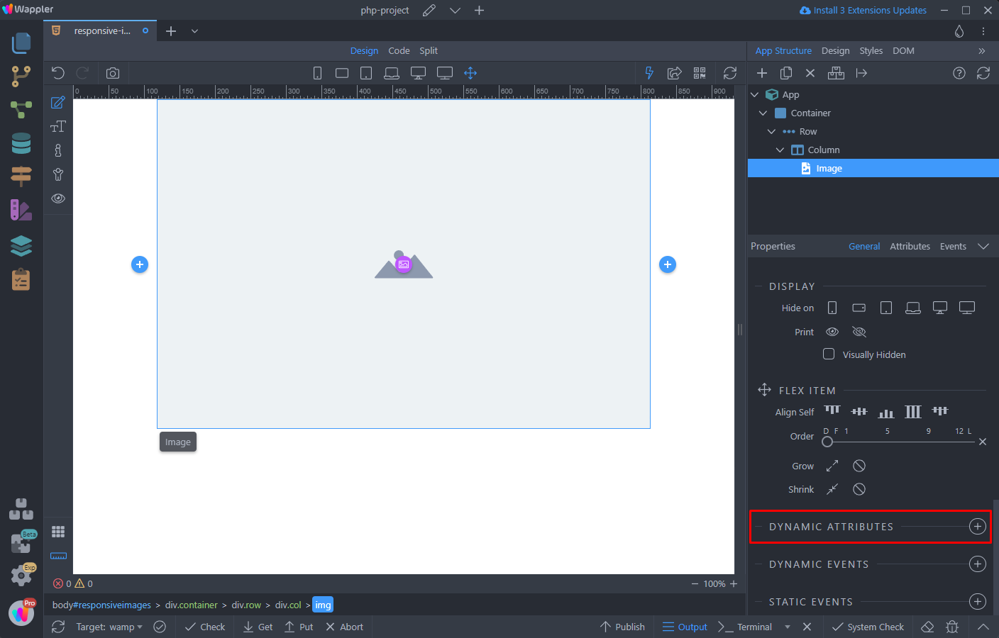
Open Display and select Lazy Load:
Section titled “Open Display and select Lazy Load:”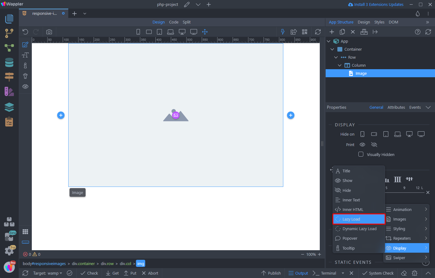
Click the Add New button, to add a value in the srcset table:
Section titled “Click the Add New button, to add a value in the srcset table:”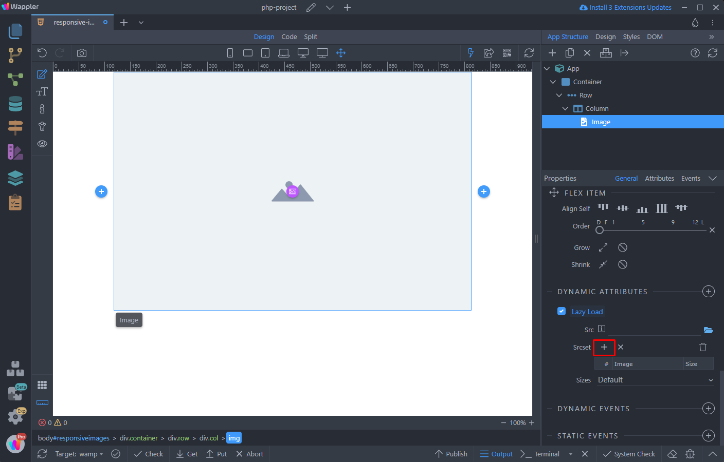
Click the little folder icon, to browse to your images:
Section titled “Click the little folder icon, to browse to your images:”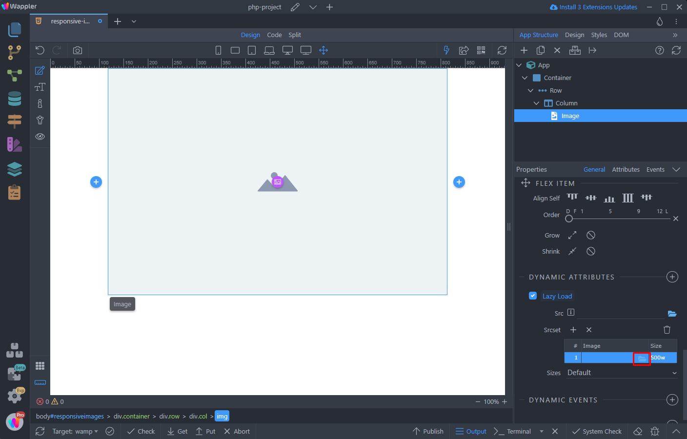
Select one - we start with the smallest (380px wide):
Section titled “Select one - we start with the smallest (380px wide):”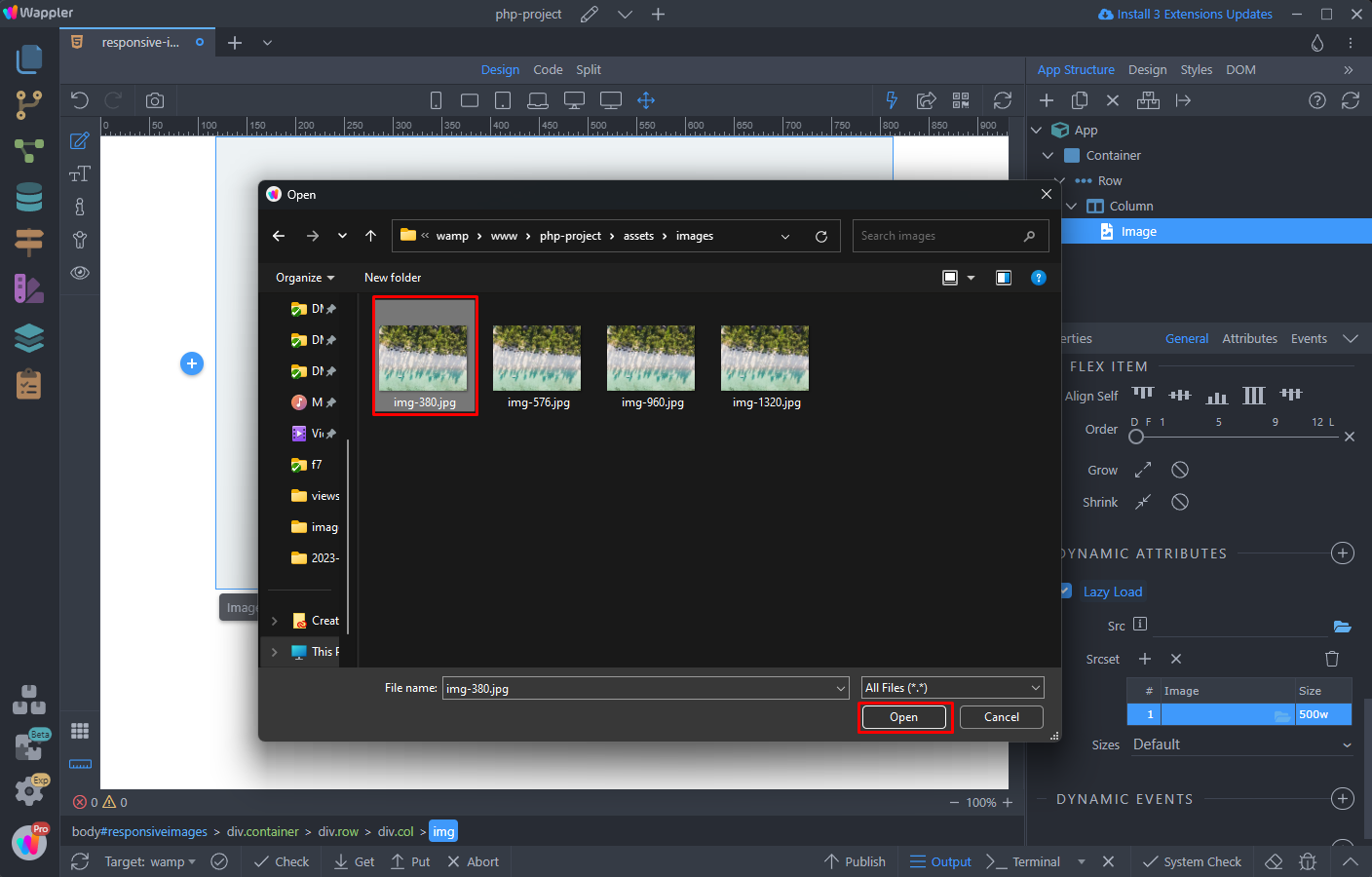
Step 13
Section titled “Step 13”Then, double click inside the size field and add the image width there, followed by: w - if your image width is 380px, you should enter 380w, if it is 800px then you should enter 800w:
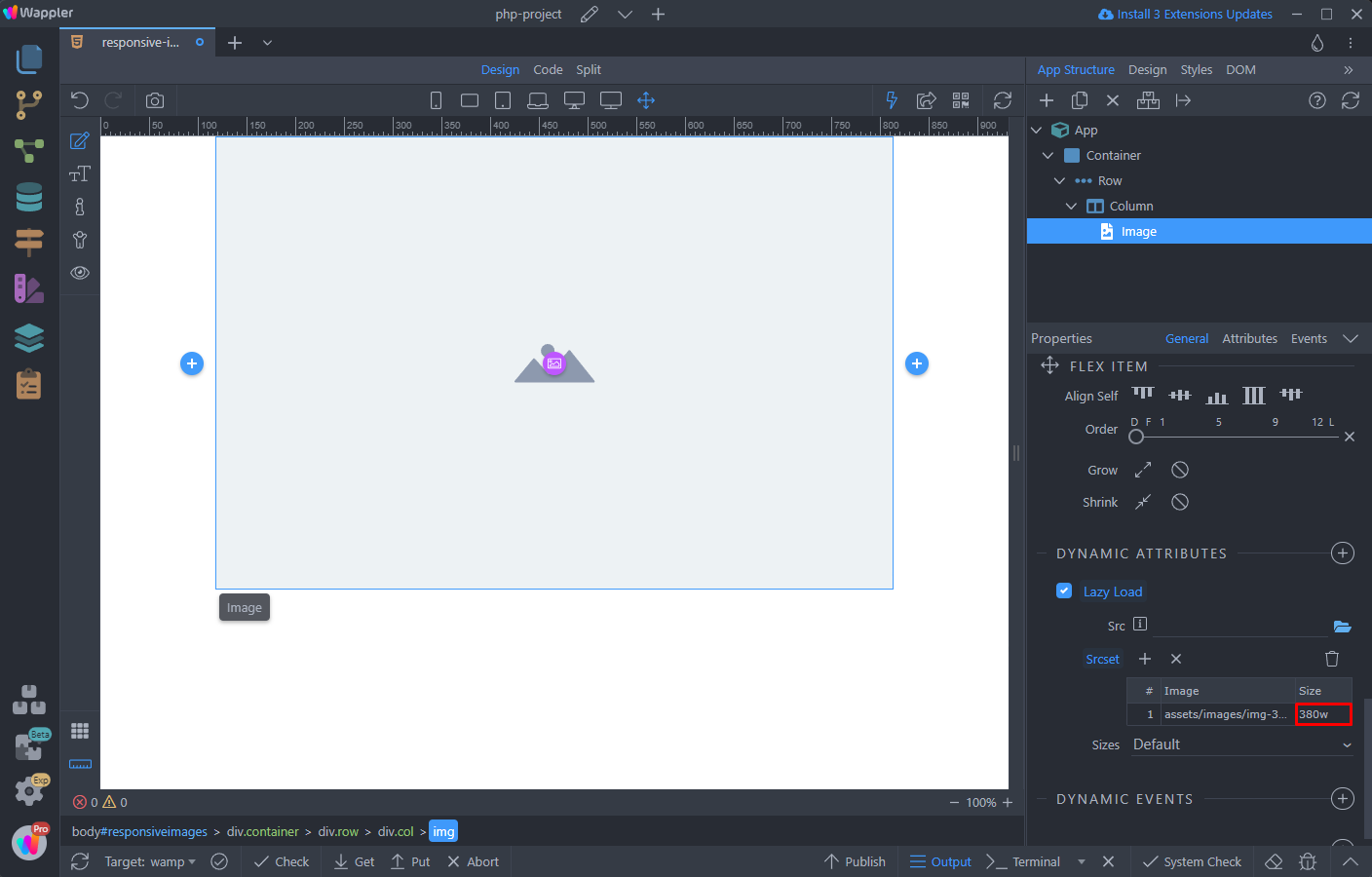
Do the same for all of your srcset images, entering their sizes as explained:
Section titled “Do the same for all of your srcset images, entering their sizes as explained:”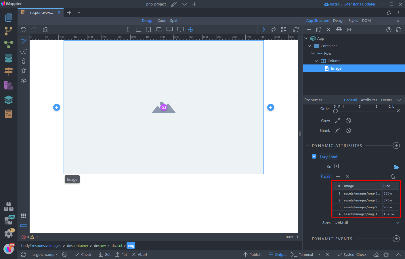
Step 15
Section titled “Step 15”When you are finished defining your images, open the sizes menu and select Auto. This way the correct image from the srcset list will be selected for the current viewport size:

Step 16
Section titled “Step 16”You are done! The Lazy Load component will automatically load only the image, which fits your device viewport size!