Adding Transitions to page elements
About Transitions Transitions are used to create a smooth animation between different states of an element. You can customize the duration, delay and the easing
About Transitions
Section titled “About Transitions”Transitions are used to create a smooth animation between different states of an element. You can customize the duration, delay and the easing for your transitions.
In this tutorial we will show you how to smoothly change the background color of an element on hover.
Page Overview
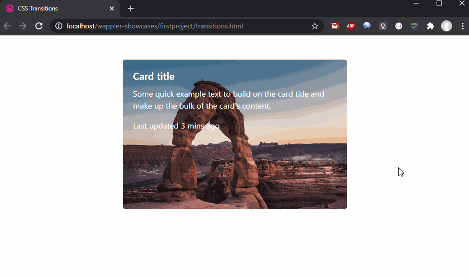
Section titled “Page Overview”We added a Card with Image Overlay on our page:

We’d like to change the background color of the overlay to semi transparent when the card is hovered. Select the Image Overlay element:

Applying Transitions
Section titled “Applying Transitions”Open the Design Panel.
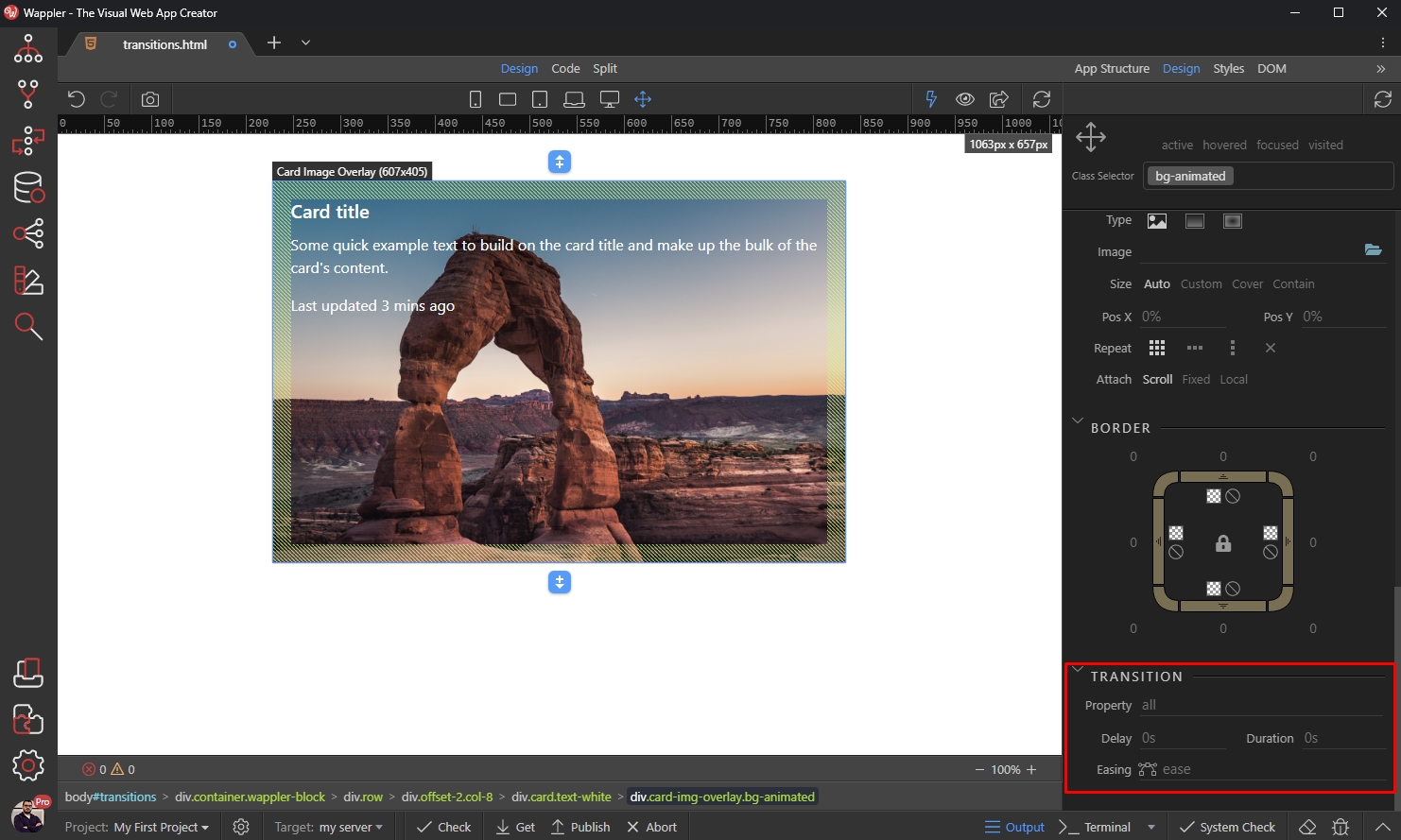
Create a new class
Section titled “Create a new class”The first thing we need to do here is to create a new class, so we can reuse this style for other cards as well. We enter bg-animated as a class name and select Create a new class option:

Transition Options
Section titled “Transition Options”Scroll down until you reach the Transitions properties:
You can apply the transition to different CSS properties, such as width, height, color, background-color etc. We enter all so it applies to all the properties of the selected element:
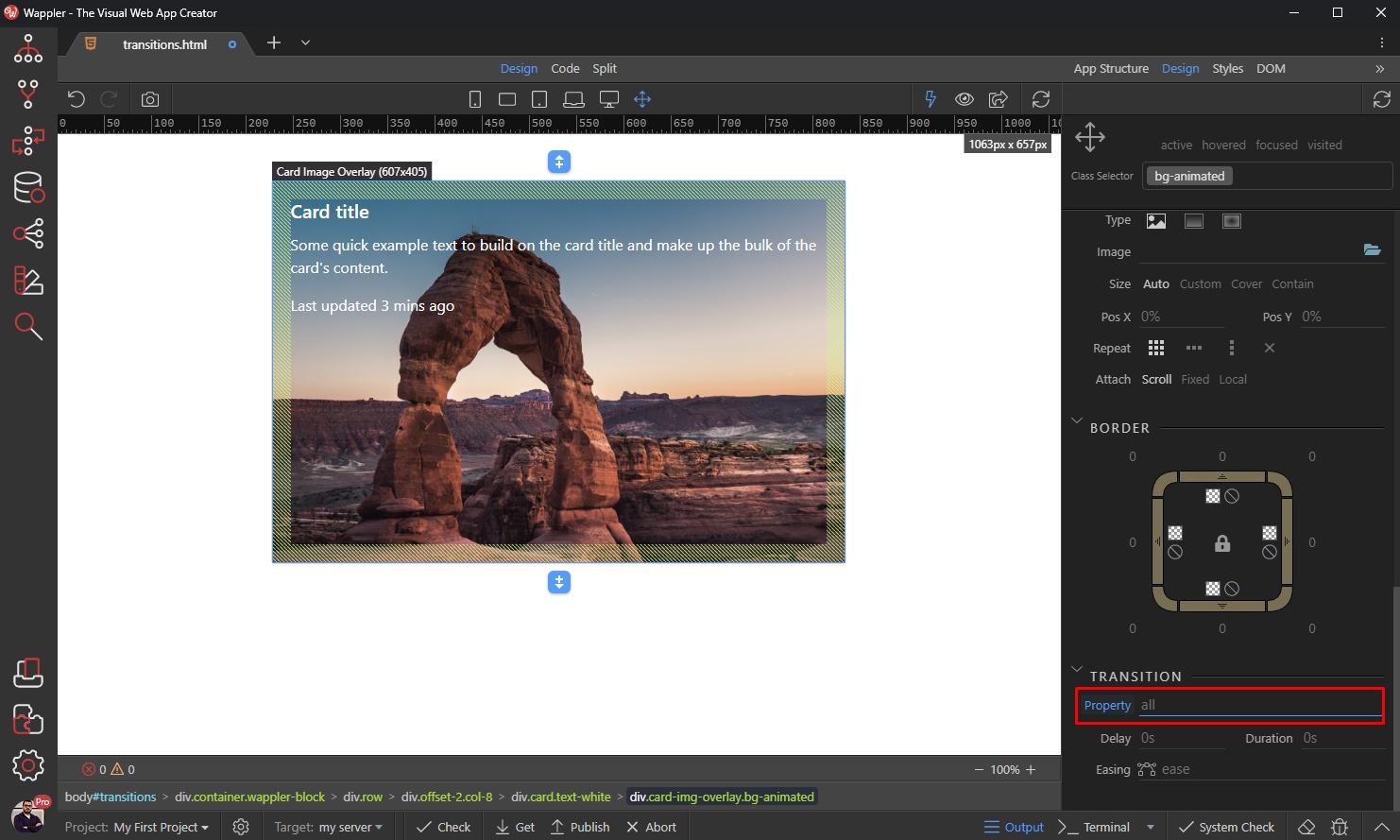
We leave the delay to 0, as we don’t need any delay in the animation here:

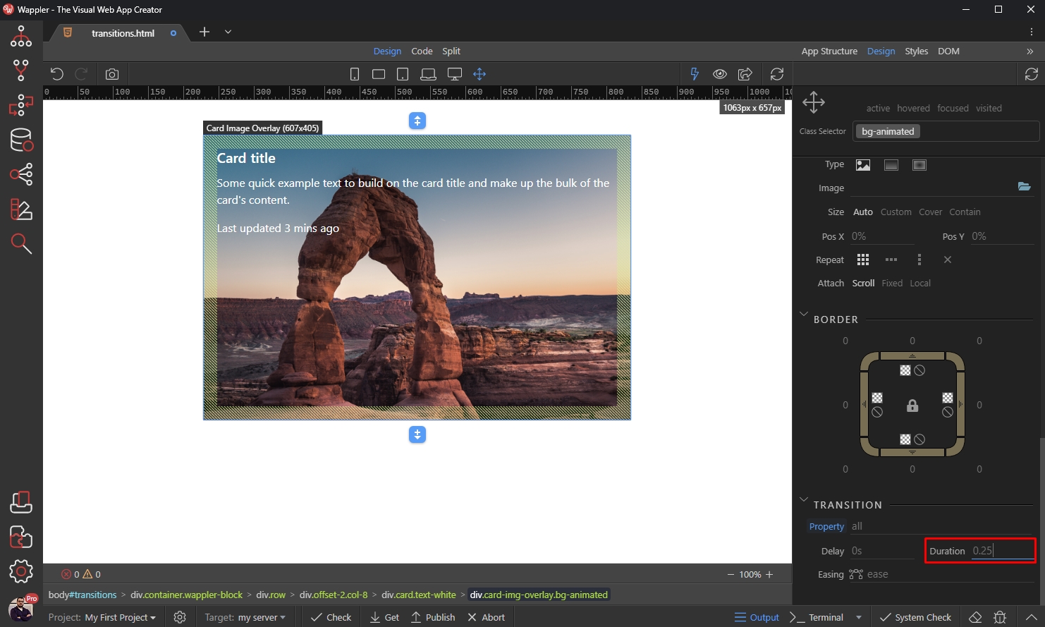
We set the duration to 0.25 - this means the animation will last 0.25 seconds:
You can right click to see the available predefined easings:

Customize the easing
Section titled “Customize the easing”You can also click the easing icon to bring up the easing editor:

You can fine-tune the easing here, using the two handles:
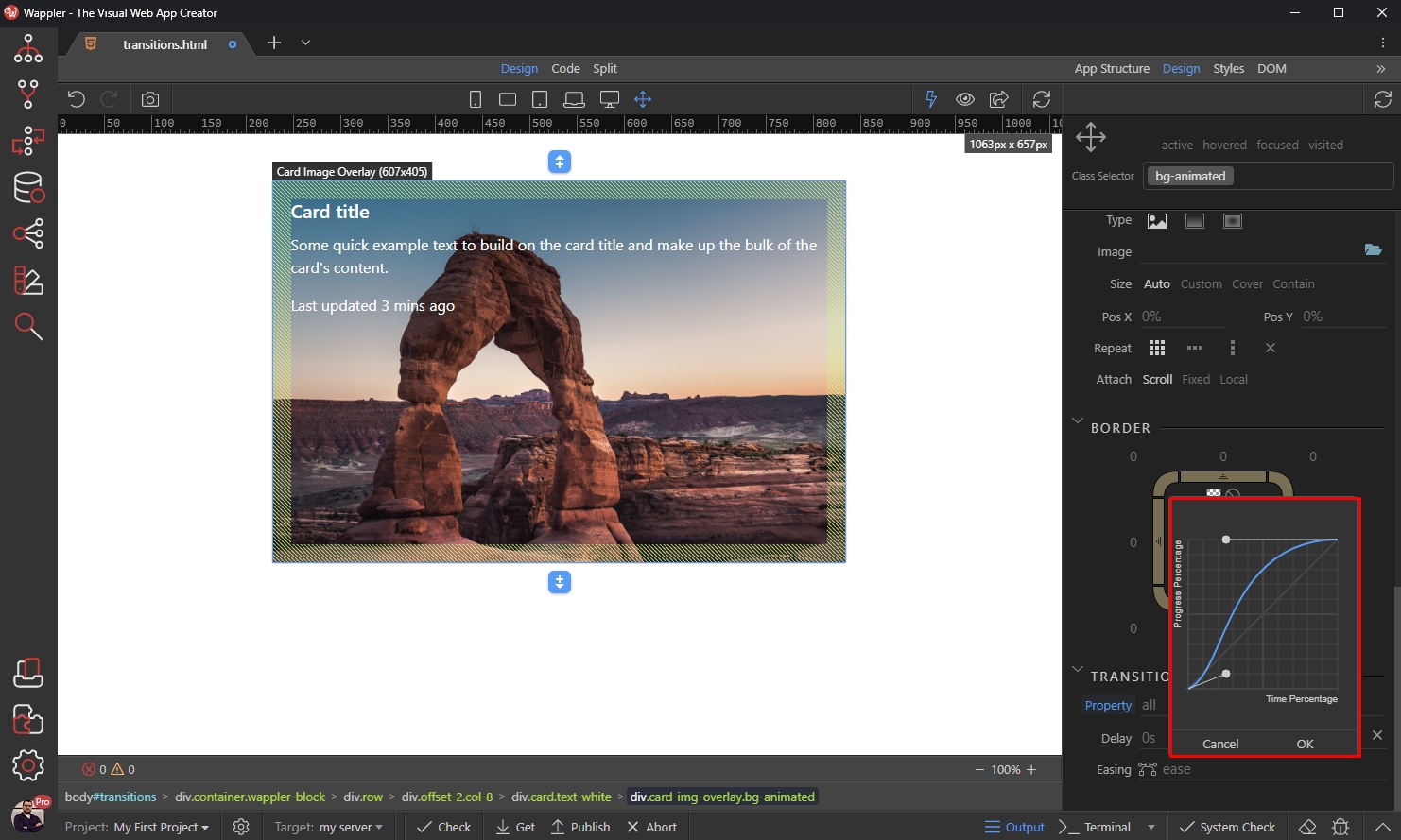
Click OK, when you are done:

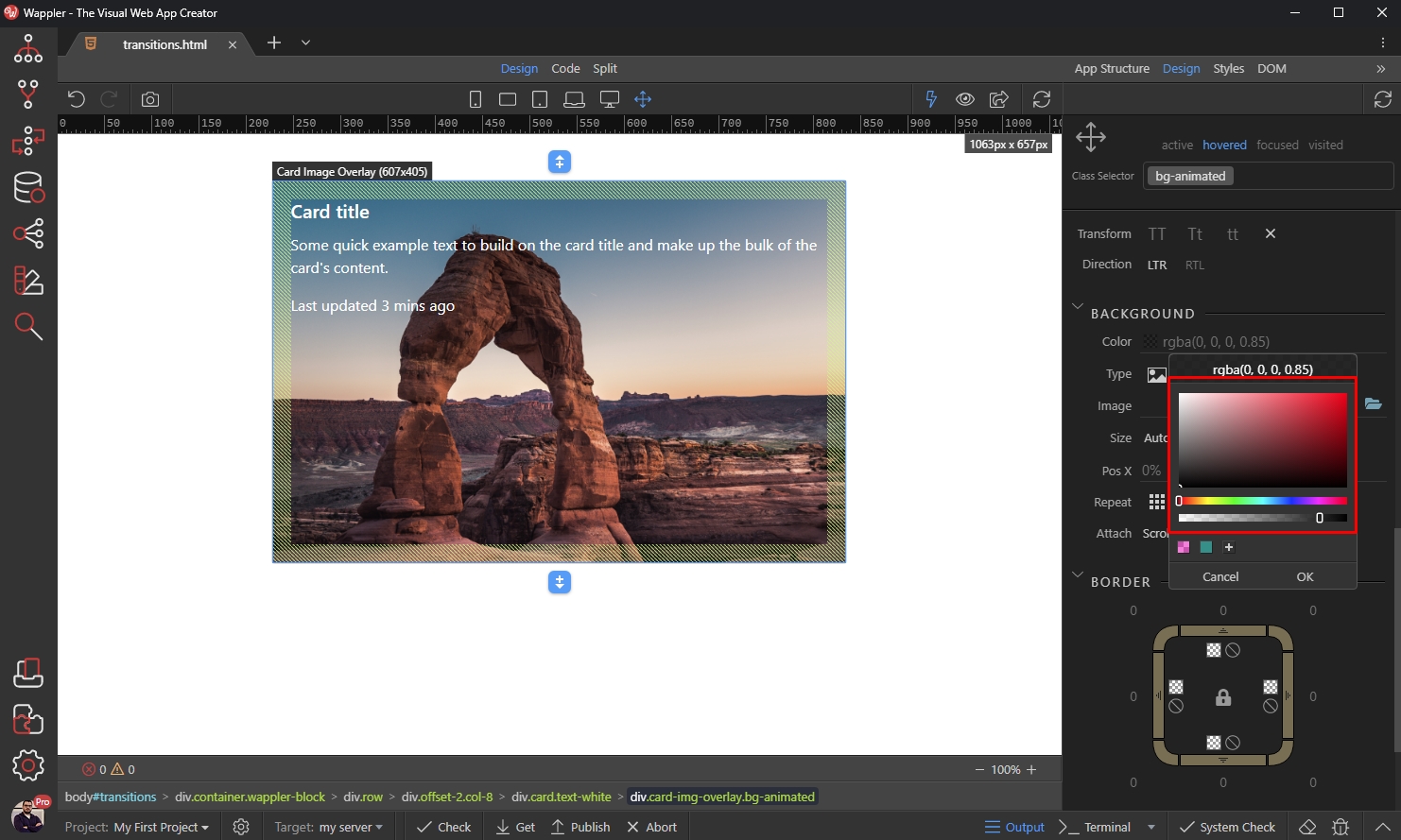
Style the hover state
Section titled “Style the hover state”We are done setting up the transition settings. We want to run the transition on hover while changing the background color of the element, so click the hovered state at the top of Design Panel:

Scroll to Background and pick a background color:

We select black color, and set the opacity to 0.85 using the opacity control:
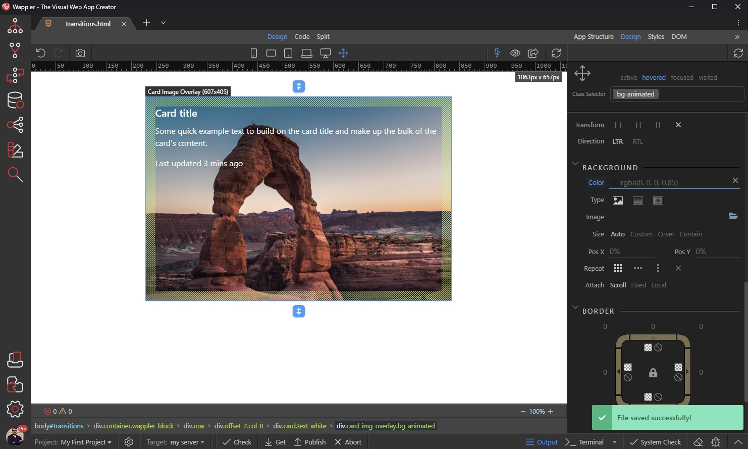
Save your page, and you are done:
You can see the background color changes smoothly on hover: