Real page, real data contract
The same field you inspect here is the one the task form submits and the server later persists.
Use Tagify for token-style input when users need to select, create, or manage multiple labels in one field.
In Demo Projects HQ, the Tags field on the task form is a real Tagify implementation, not a placeholder demo. It uses a curated data source, posts as tags[], and renders suggestion rows with a primary label plus a secondary category. This tour stays on that concrete field so you can connect what you see in Design View to the properties that shape selection, storage, and visual feedback.
This is the Tagify field used on the Demo Projects HQ task form. In Design View it appears as one compact token input, but on the page it can search, suggest, and collect multiple tags for the task.
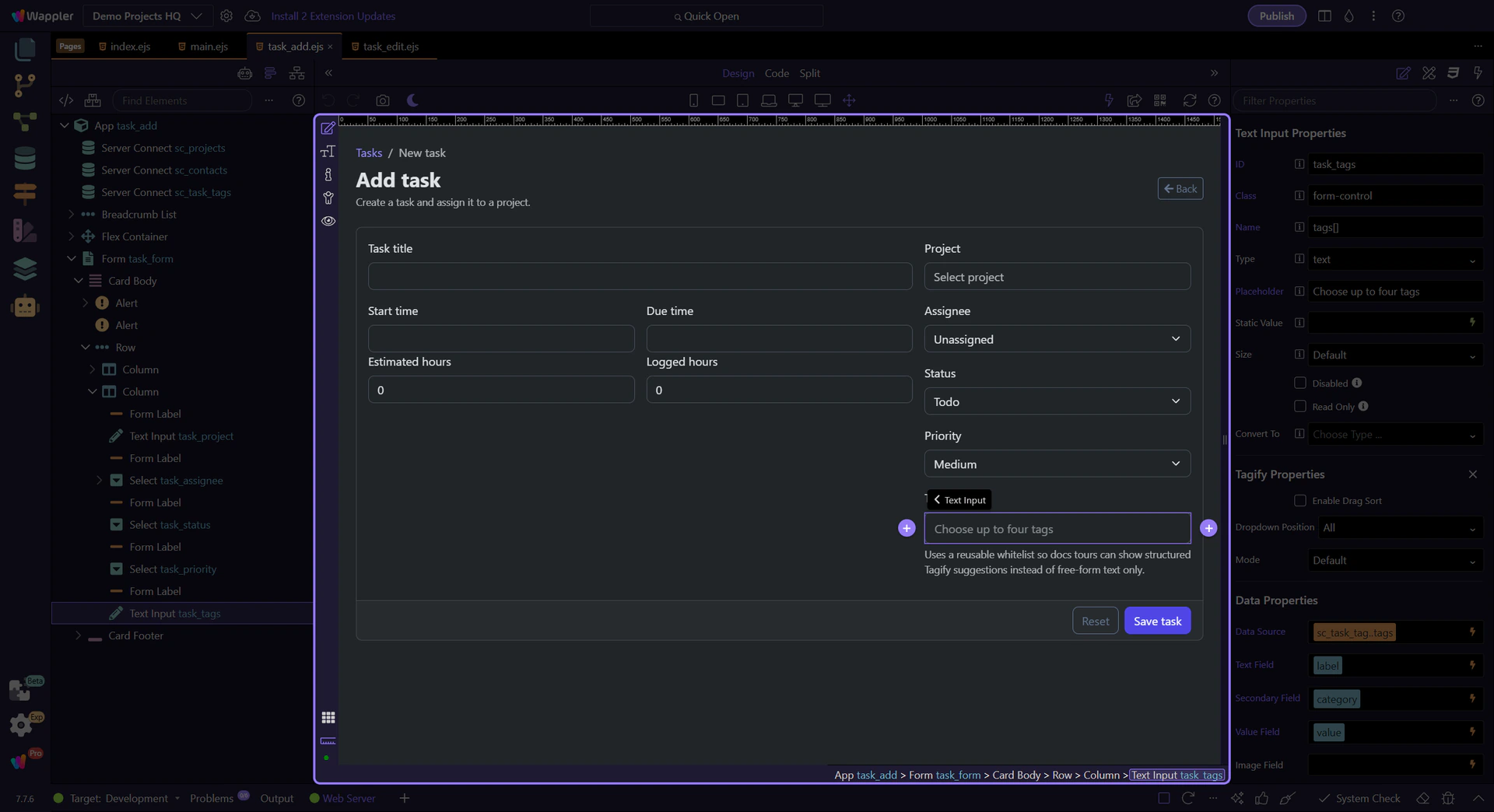
With the real task Tags field selected, the Properties panel is where the Tagify setup becomes readable. Stay in this panel as you review how Demo Projects HQ separates the suggestion source, the label fields, the editing guardrails, and the final form-posting contract.
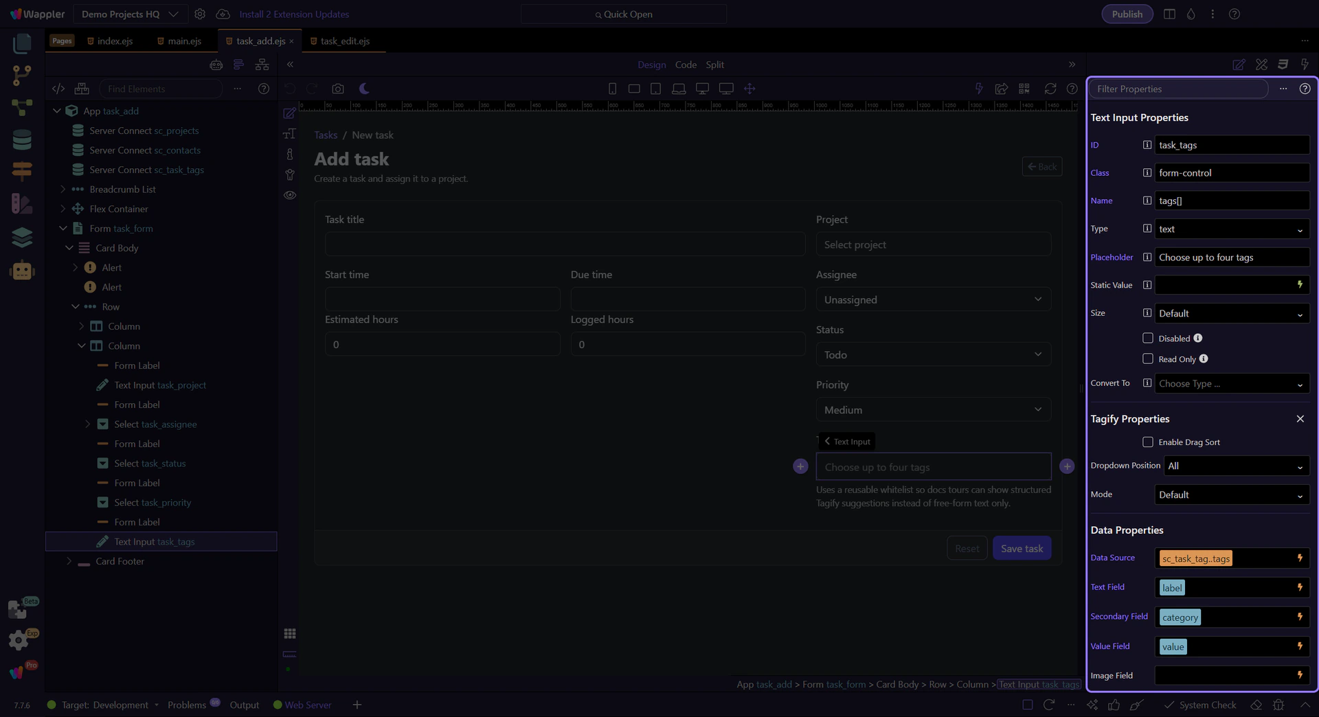
This binding points Tagify at the curated tag list loaded for the task form. In Demo Projects HQ that source gives the editor a controlled set of existing tags, which is why the field can offer meaningful suggestions instead of acting like freeform comma-separated text.

The task form shows a friendly label to the editor, but the saved value still needs to stay canonical. Text Field decides what the user reads in the suggestion list and token chip, while Value Field decides what gets stored inside the tags[] submission.
tip: Pair this with the Value Field in the same Data Properties group so labels can evolve without breaking stored values.

Demo Projects HQ also shows each suggestion’s category. That extra line helps users choose the right tag when labels are similar, but it does not change the value that gets submitted. This is a good pattern whenever you need richer suggestion rows but still want clean data underneath.
On this page, No Custom is one of the most important guardrails. It keeps the task form aligned with the curated data source, so editors choose approved tags instead of creating ad hoc values that the rest of the application does not yet know about.

These settings make the field feel deliberate on the task form: No Close On Select keeps the list open for multi-pick entry, Highlight First makes the first strong match easier to accept, and the Min Chars or Max Items limits keep the suggestions readable instead of noisy.
note: Review Highlight First, Min Chars, Max Items, and Max Tags in the same Display Options section to tune speed versus control.

The field still submits through the normal form name. In Demo Projects HQ the important part is that the input posts as tags[], so the selected tokens arrive on the server as an array-like contract the task actions can handle cleanly.

On the Demo Projects HQ task form, Tagify is doing three jobs at once: rendering a clean multi-token control in Design View, pulling from a curated suggestion source, and preserving a stable tags[] submission contract. That concrete baseline makes the next two questions much easier to study: how you enrich the visual content of each suggestion, and how you relax this selection-only model when your product needs new tags.