Getting Started with App Connect Event Calendar
App Connect Event Calendar is a full-sized event calendar with drag & drop support and lots of customization options. It allows you to add static events or
App Connect Event Calendar is a full-sized event calendar with drag & drop support and lots of customization options. It allows you to add static events or use different data sources for dynamic events.
Getting Started with the Event Calendar
Section titled “Getting Started with the Event Calendar”We’ll go through the basics of adding the calendar on the page, customizing it and adding static events.
Adding App Connect Event Calendar on Your Page
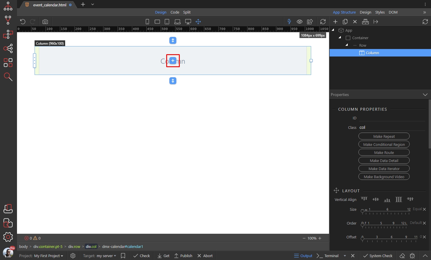
Section titled “Adding App Connect Event Calendar on Your Page”Click the add new element button:
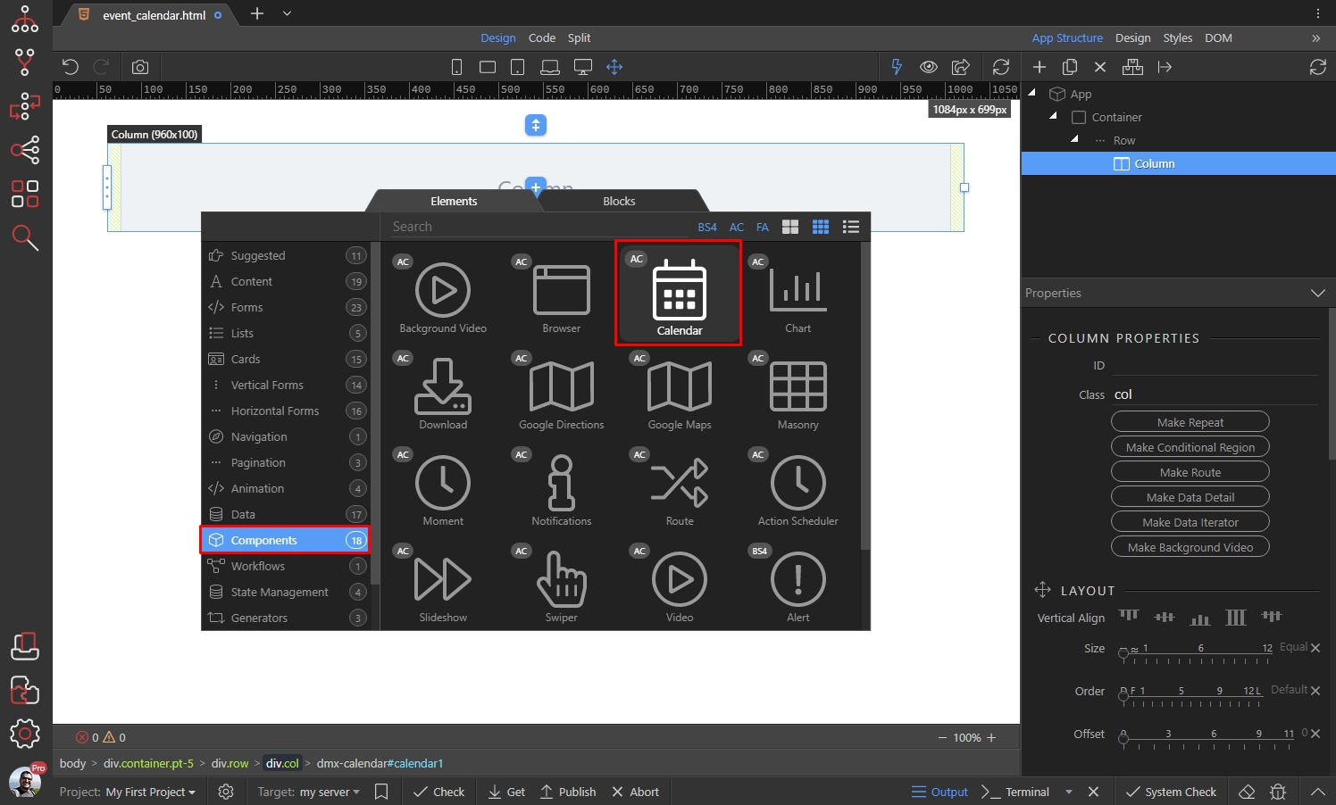
Open Components and select Calendar:
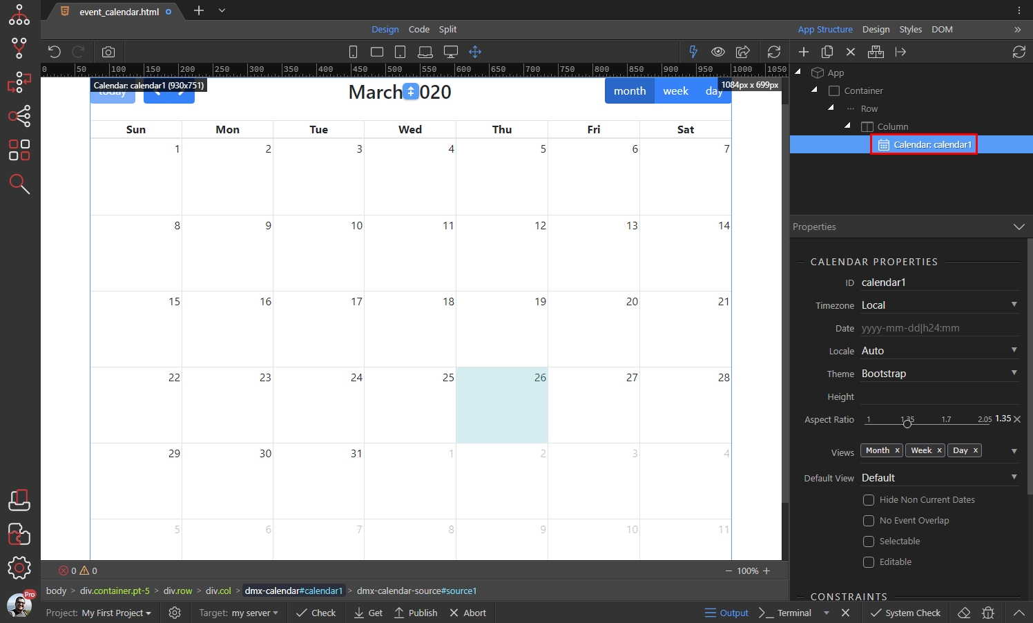
And you will see the Event Calendar in Design View and App Structure. Select it in the App Structure to see its properties:
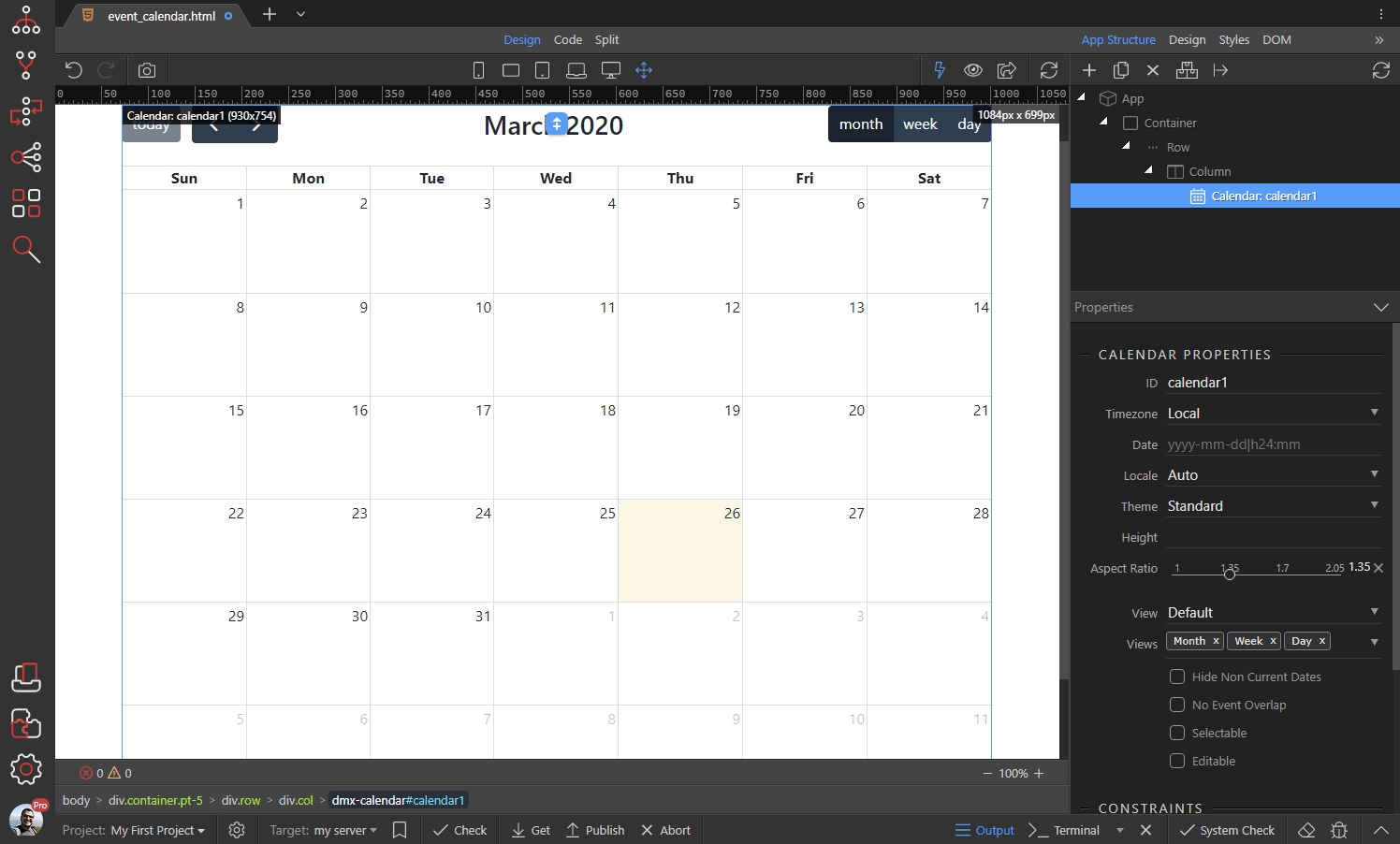
Main Properties
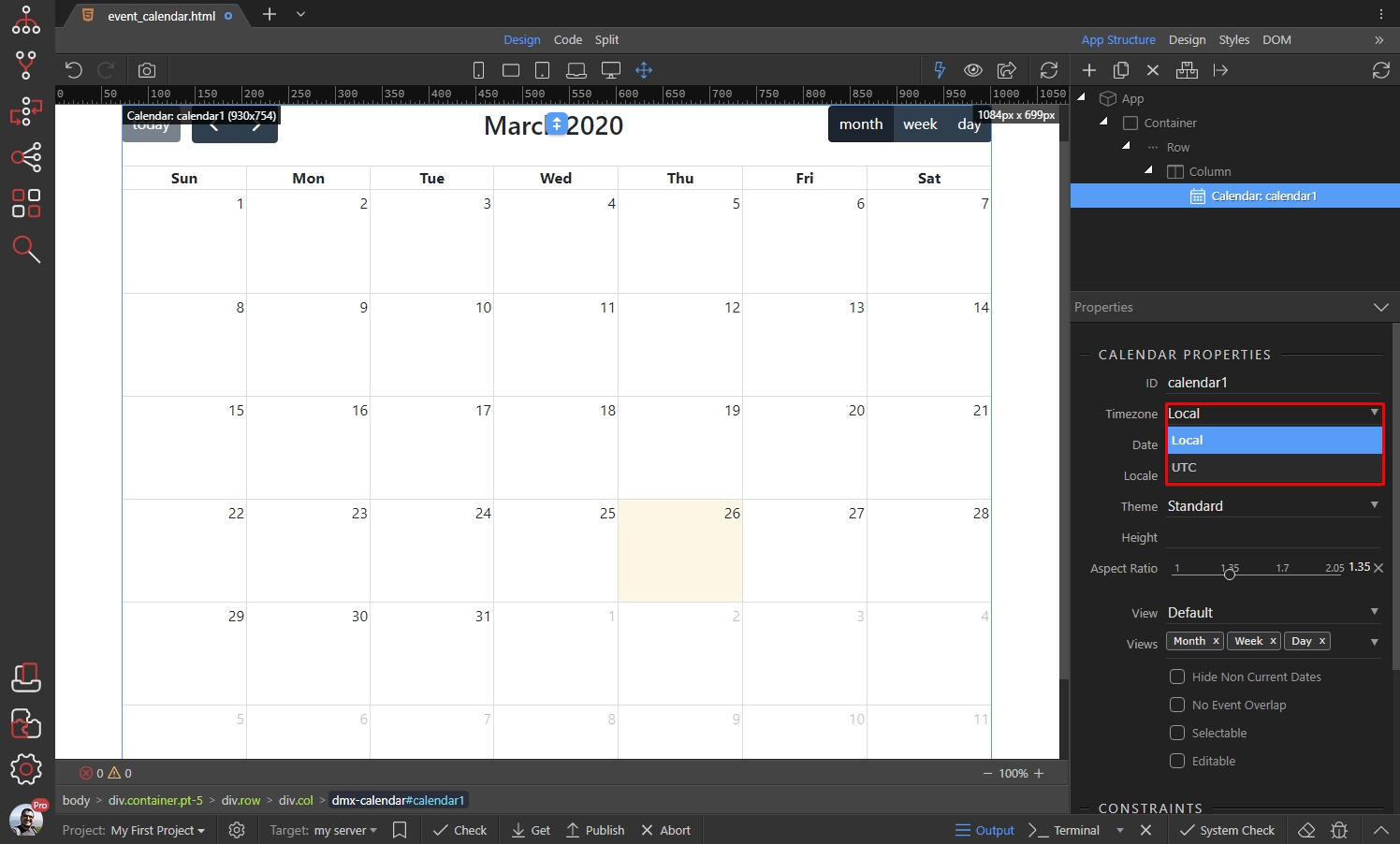
Section titled “Main Properties”You can select the default timezone for the calendar. Select between Local (the users browser time zone) and UTC:
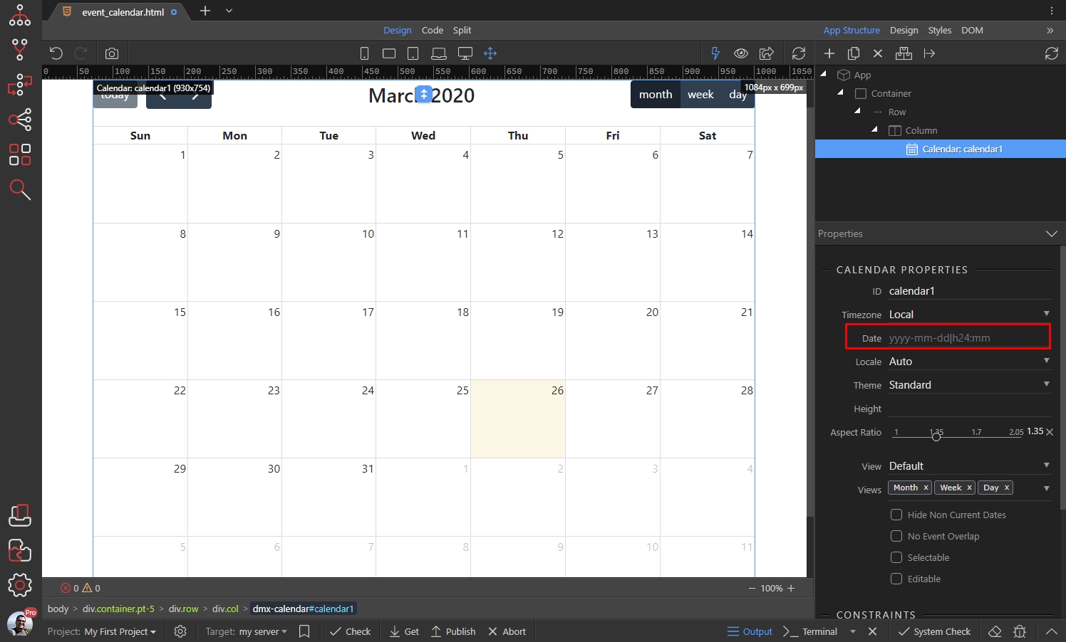
You can set an initial date displayed when the calendar first loads. If you leave this option empty it defaults to the current date:
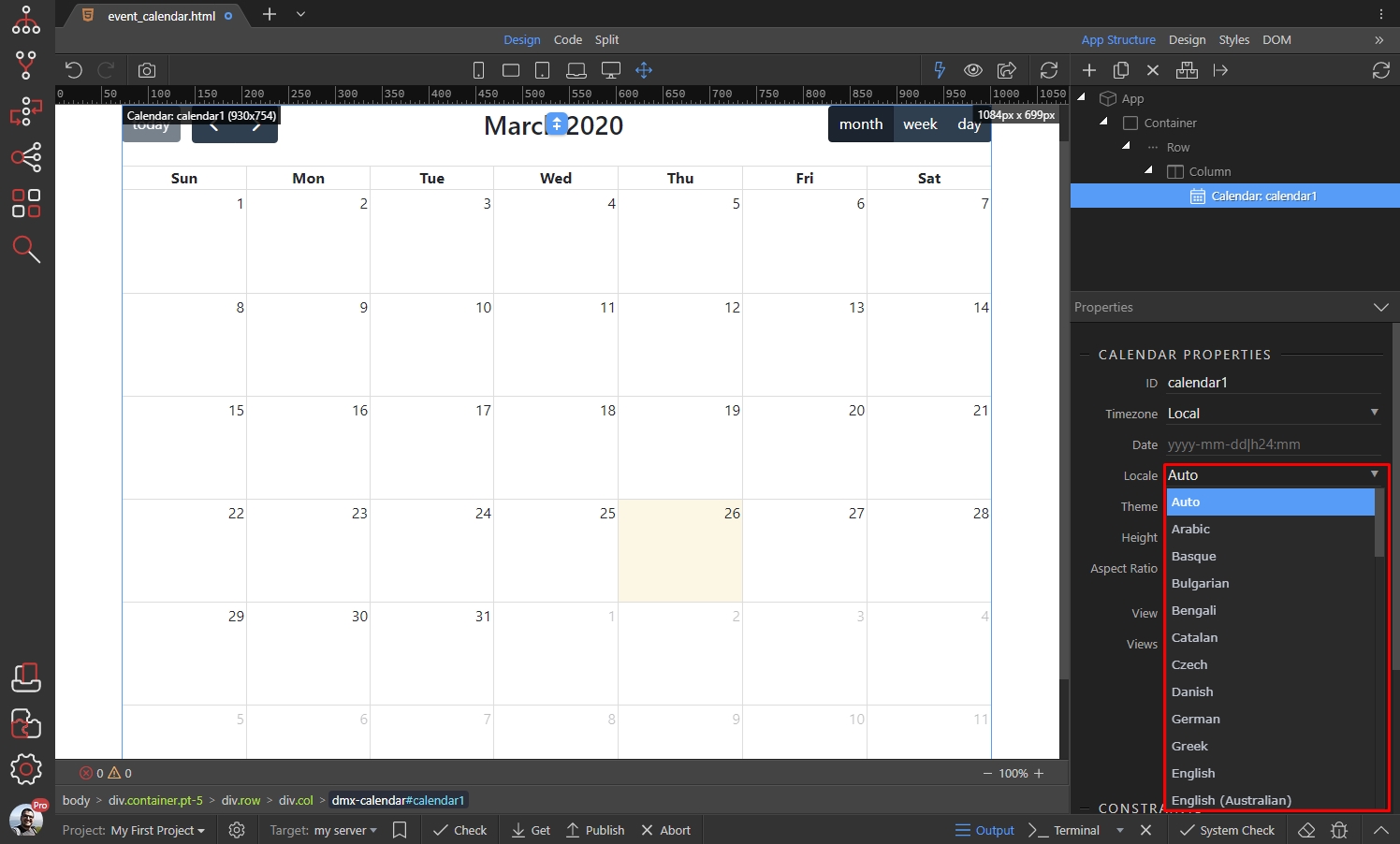
Select a Locale option. This option allows you to localize the calendar options such as buttons text, days, months and days of week, date formatting etc.:
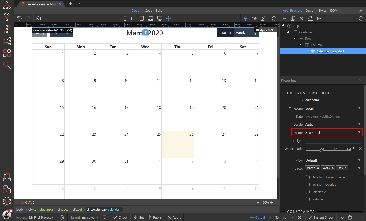
Choose between two themes - Default and Bootstrap. If you select the Bootstrap theme, the selected Bootstrap 4 (or any of the available Boostwatch themes) will be applied to the calendar:
You can enter a height for the calendar. By default this option is unset and the calendar’s height is calculated by the Aspect Ratio option:

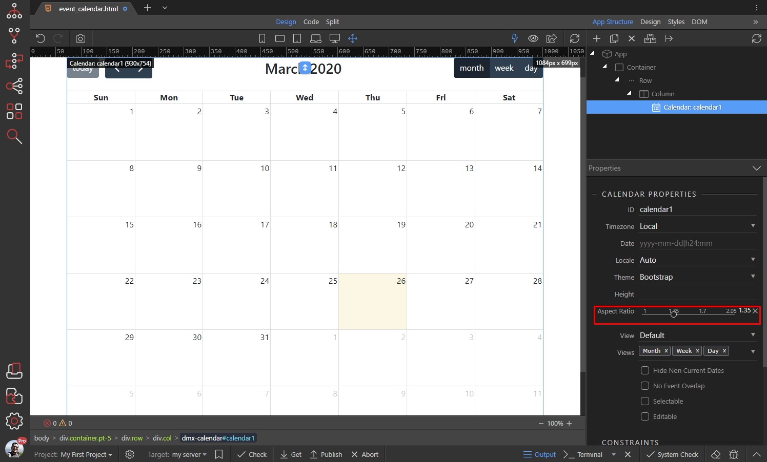
The Aspect Ratio option sets the width-to-height aspect ratio of the calendar. A calendar is a block-level element that fills its entire available width. The calendar’s height, however, is determined by this ratio of width to height. (Hint: larger numbers make smaller heights):
Choosing Different Views
Section titled “Choosing Different Views”App Connect Event Calendar provides options for setting up different views.
Select the views, which should be available in the calendar, the default ones are Month, Week and Day:
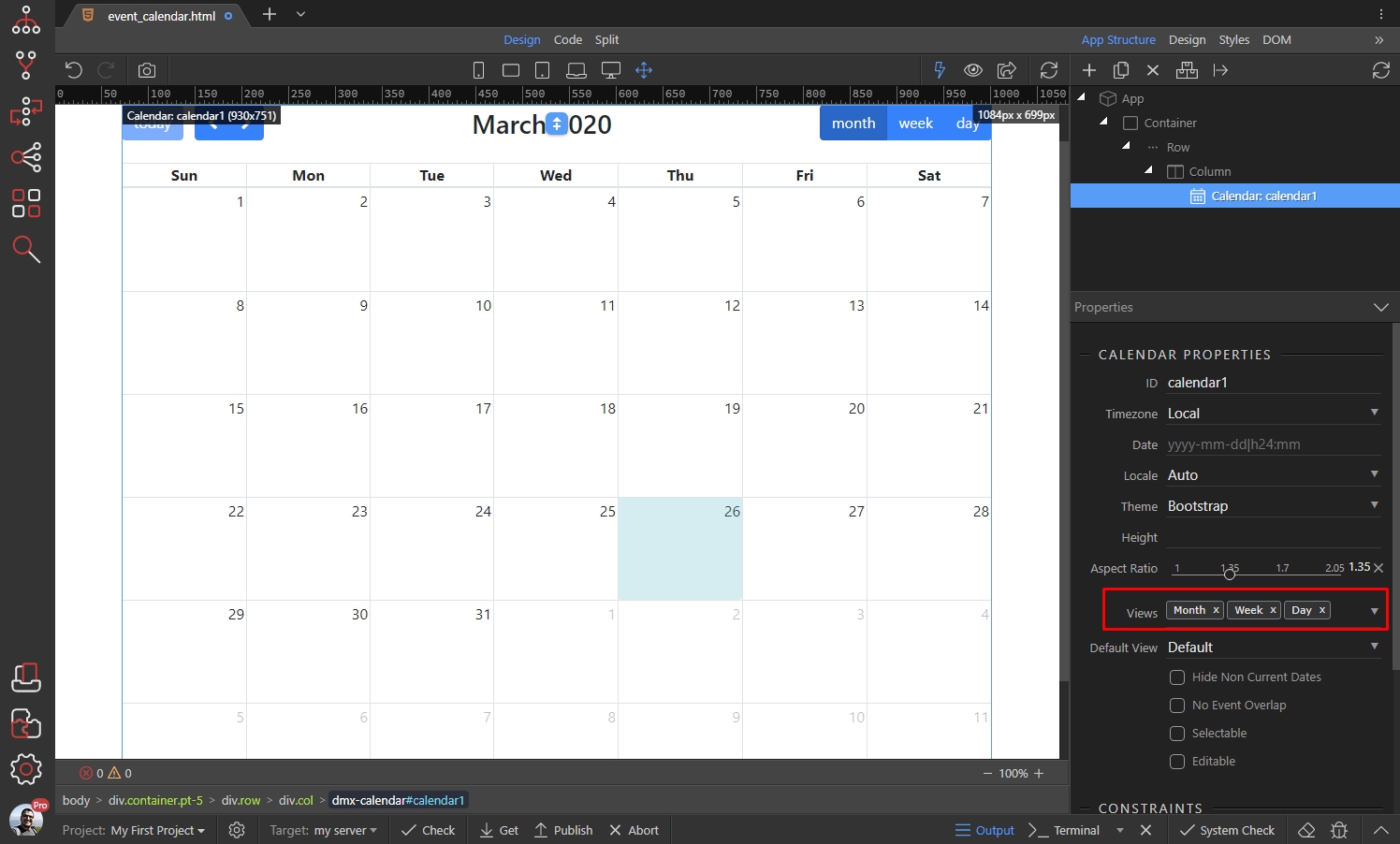
You can add more or remove any of the default ones:
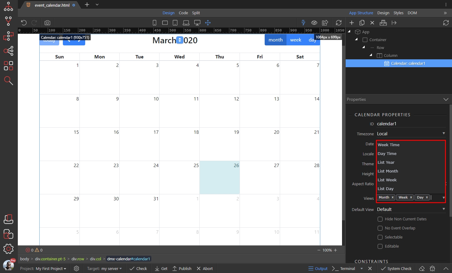
The default view for the calendar is the Month view. You can change it and set some other view as a default:

NOTE: In order to set a default view, make sure it’s also added to the Views option above!
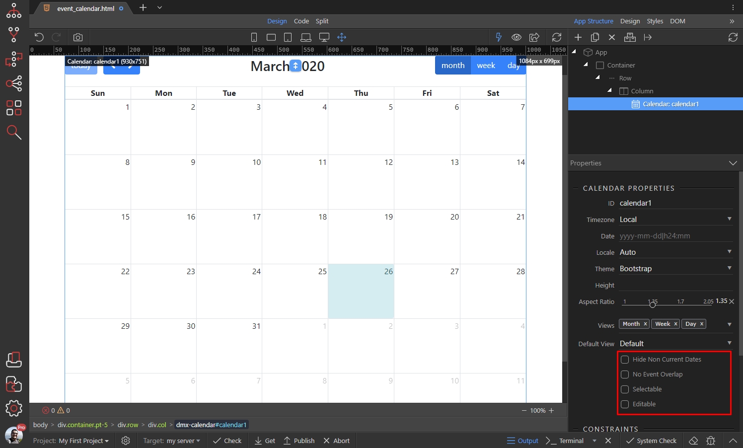
There are a few more options available for the views:
-
Hide Non Current Dates - Hides the dates in the previous or next month In month view.
-
No Event Overlap - By default all events are allowed to overlap each other, when they are being dragged and resized. Enable this option to disable this behavior, so the events won’t be allowed to overlap.
-
Selectable - Allows a user to highlight multiple days or timeslots by clicking and dragging.
-
Editable - Allows the events to be dragged and resized.
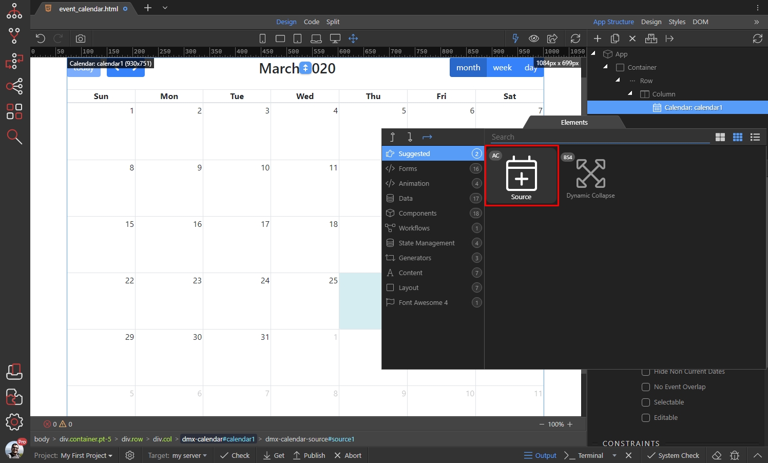
Adding Source and Static Events
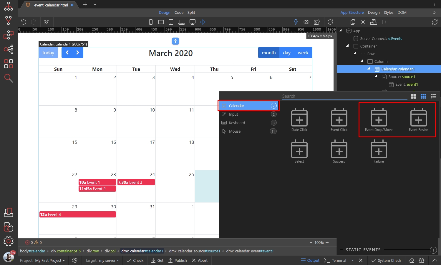
Section titled “Adding Source and Static Events”In order to add events in the calendar we need to add a Source. Right click the Calendar in the App Structure:
Then select Source:
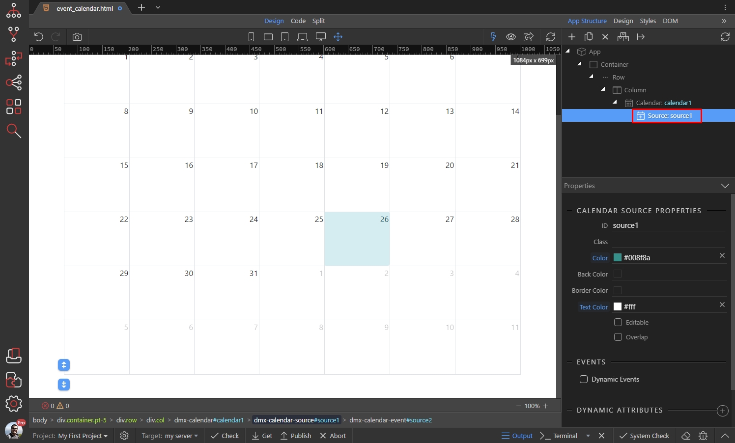
You can have multiple sources, with different events inside them - static and dynamic. You can add a default styling for each Source. This styling will be applied to all of the events added in this Source:
- Color: Sets the background and border colors for the events in this source.
- Back Color: Sets the background color for the events in this source.
- Border Color: Sets the border color for the events in this source.
- Text Color: Sets the text color for the events in this source.
So if you want to use the same color for the background and borders, just set the Color option. If you want different colors for the background and border - use the Back Color and Border Color options:

We add a color and text color for the events in this source:

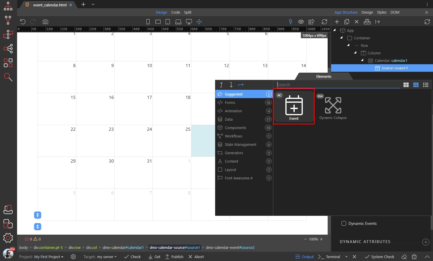
Now, let’s add a static event. Right click Source in the App Structure:
And select event:
Add a Title for this event:

Select a start date and time, using the date and time picker:
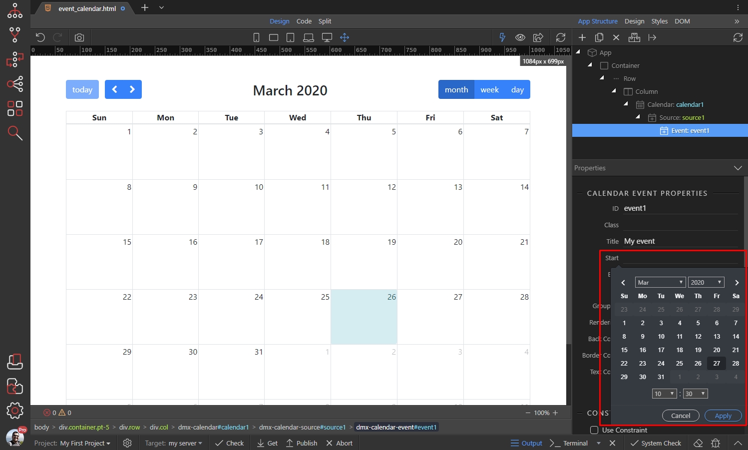
Then select an end date and time:

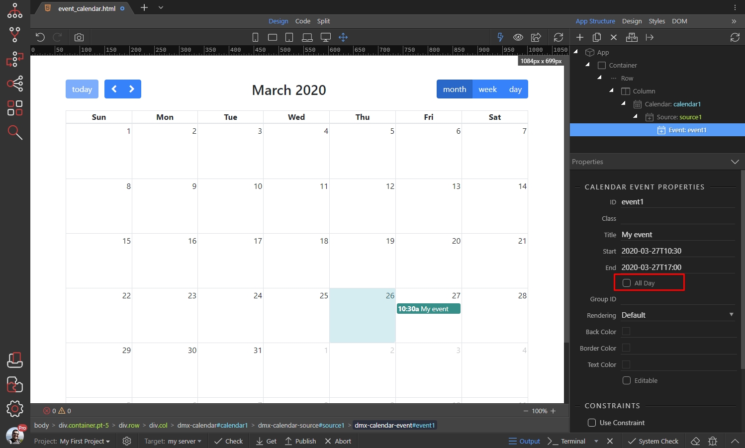
Enable the All Day option, if your event is a full-day event. When this option is enabled, the event will be shown in the “all-day” section of relevant views. In addition, the time will not displayed with the event:
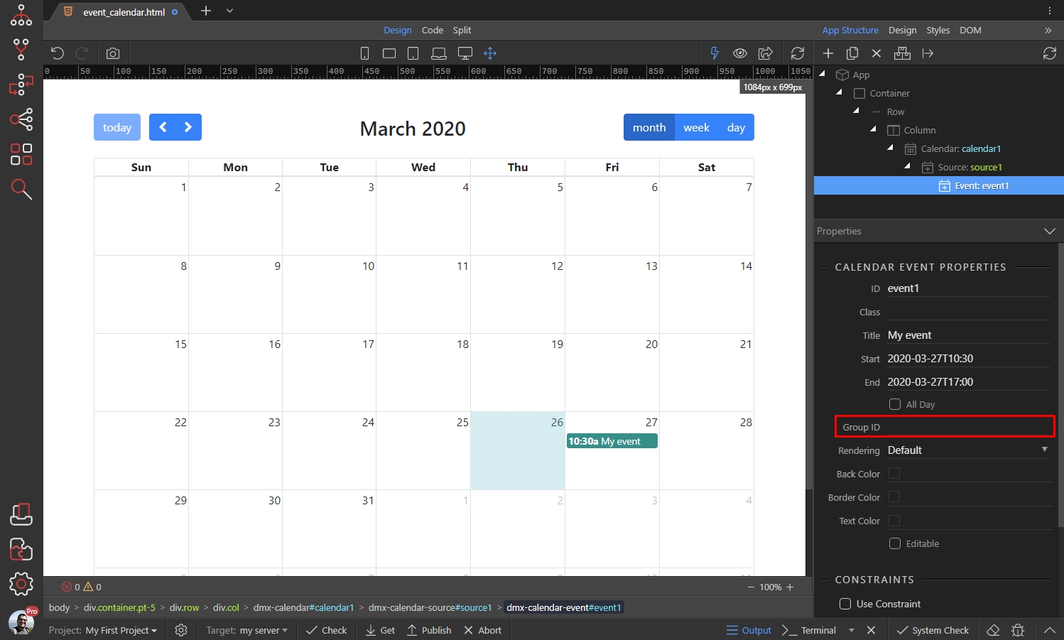
You can group your events together, entering the same Group ID for them. When the events are using the same group ID will be dragged and resized together automatically:
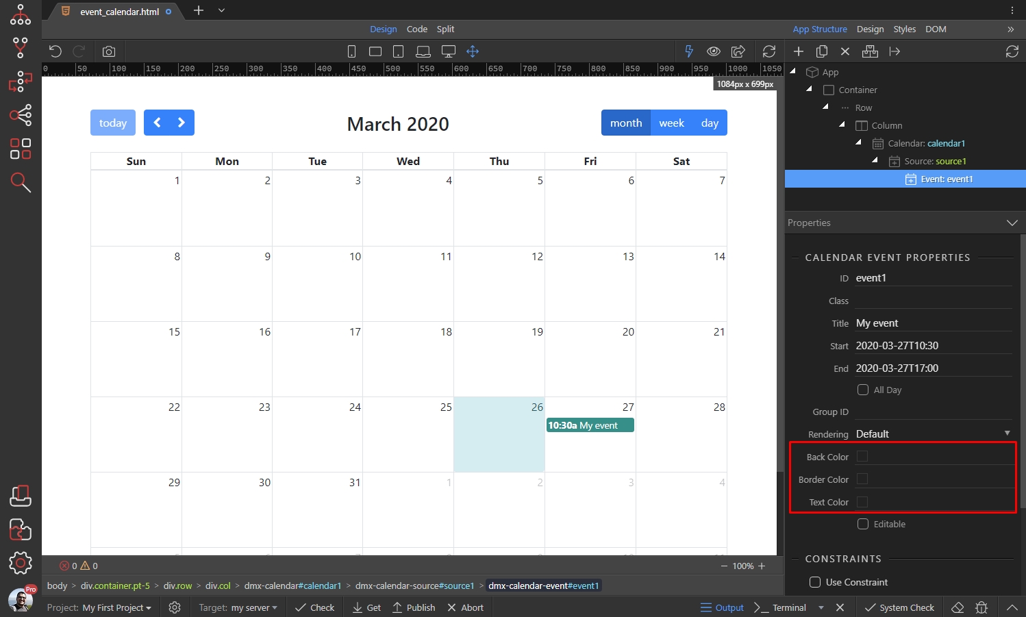
Styling Events
Section titled “Styling Events”You can override the styling option, which you applied for the Source, by adding custom styles per event:
Making the Event Calendar Dynamic
Section titled “Making the Event Calendar Dynamic”You can use any dynamic data source in Wappler to show dynamic dates in your calendar - a database query, a JSON data source or an API data source. In our example we will show you how to use a server action which returns records from our database table.
Using Dynamic Data Sources
Section titled “Using Dynamic Data Sources”We created a simple server action which contains a database query. Our database structure is as follows:
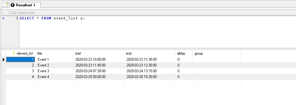
The start and end columns are DATETIME types so we store there the start date and times for the events. The allday is a BOOLEAN type and the title and group are simple VARCHAR fields.
We added a server connect component in App Structure which loads our Server Action:

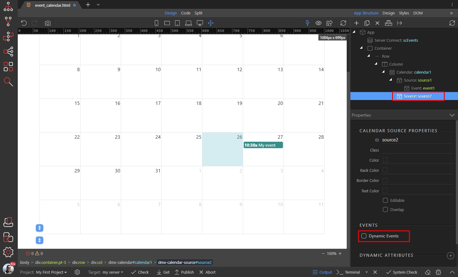
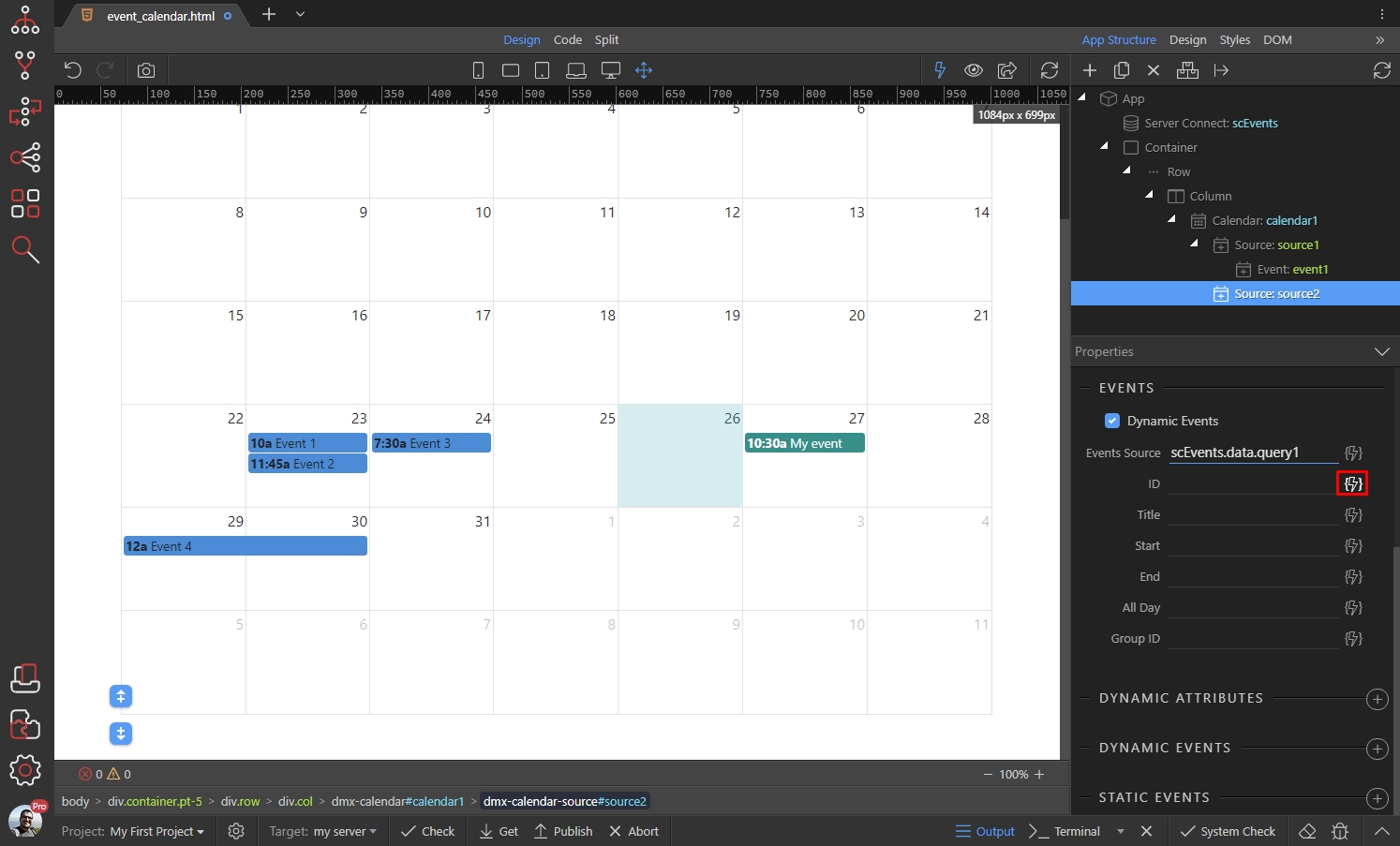
In order to add our dynamic events to the calendar we need to add a new Source. Right click the calendar:

Then select Source:

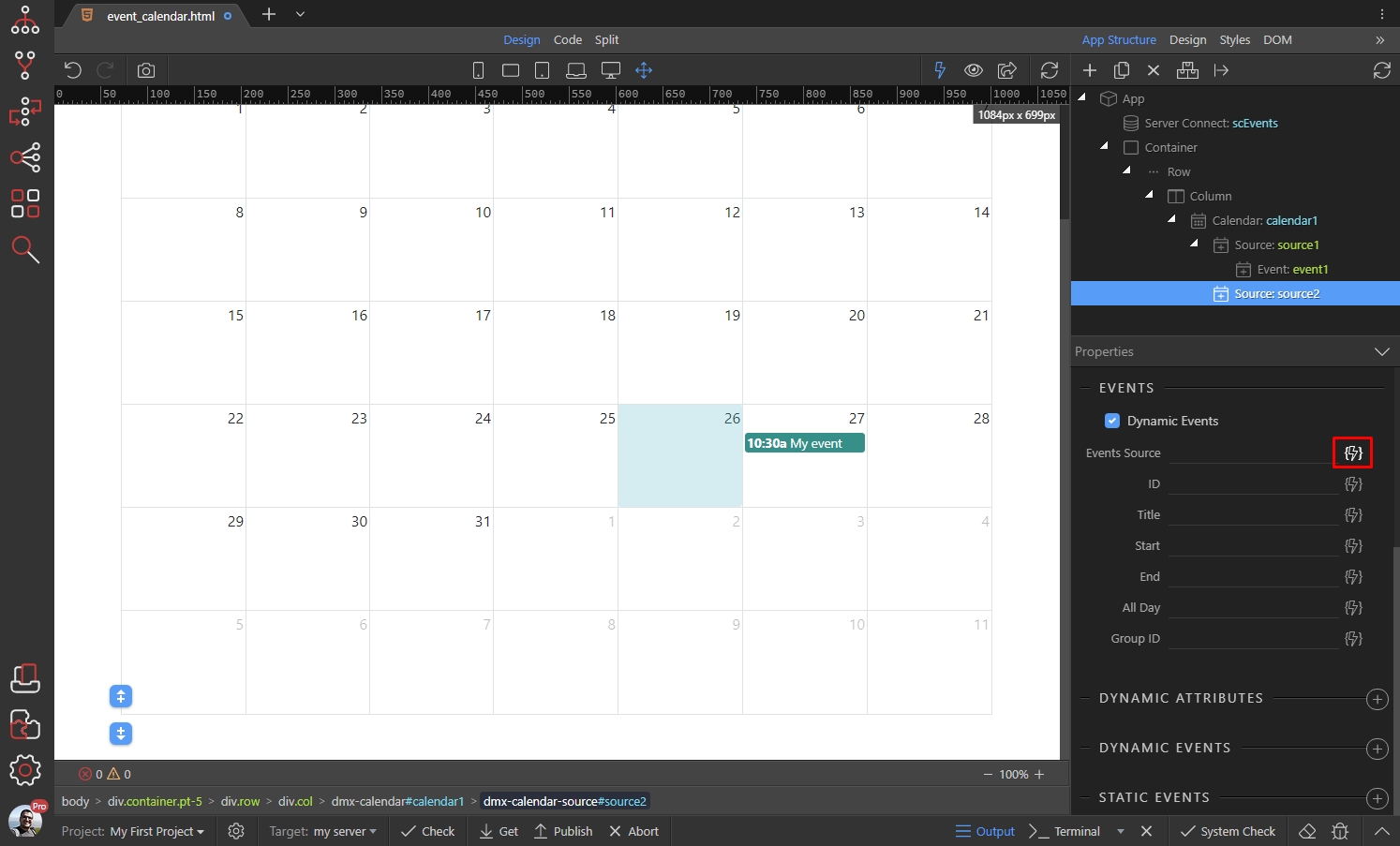
Scroll down the Source properties and enable the Dynamic Events option:
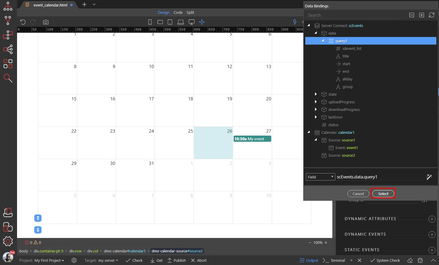
Click the dynamic data picker icon to select a dynamic Events Source:
This is the database query, returned by our server action:
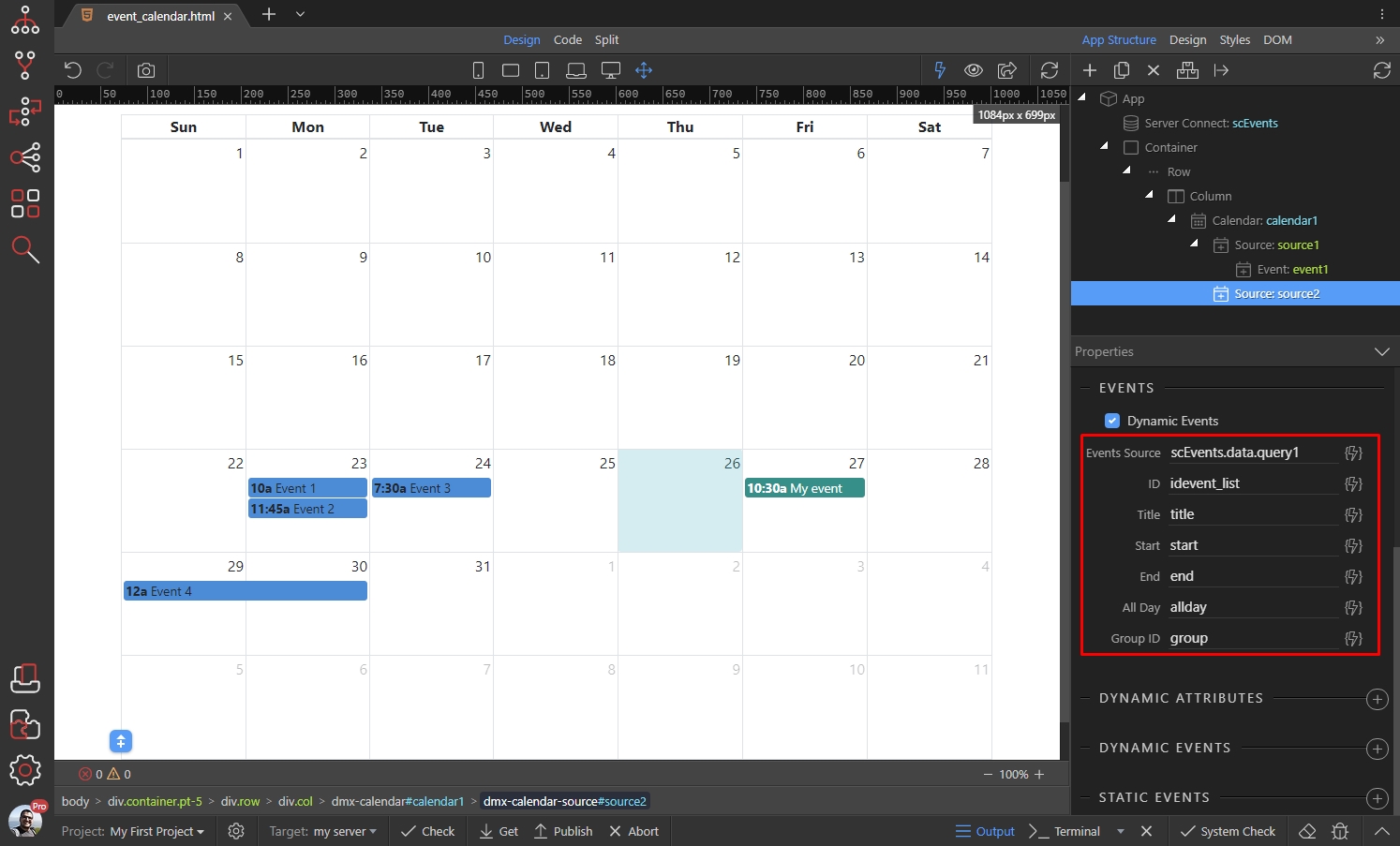
Select the dynamic data for the event ID:
This is the binding corresponding to the event IDs:

Do the same for the rest of the options, selecting the corresponding dynamic binding from the data picker:
You can customize the dynamic events, by applying styles to the Source which they belong to. Scroll up the properties panel and setup the style options:

We added a custom color and text color for the events:
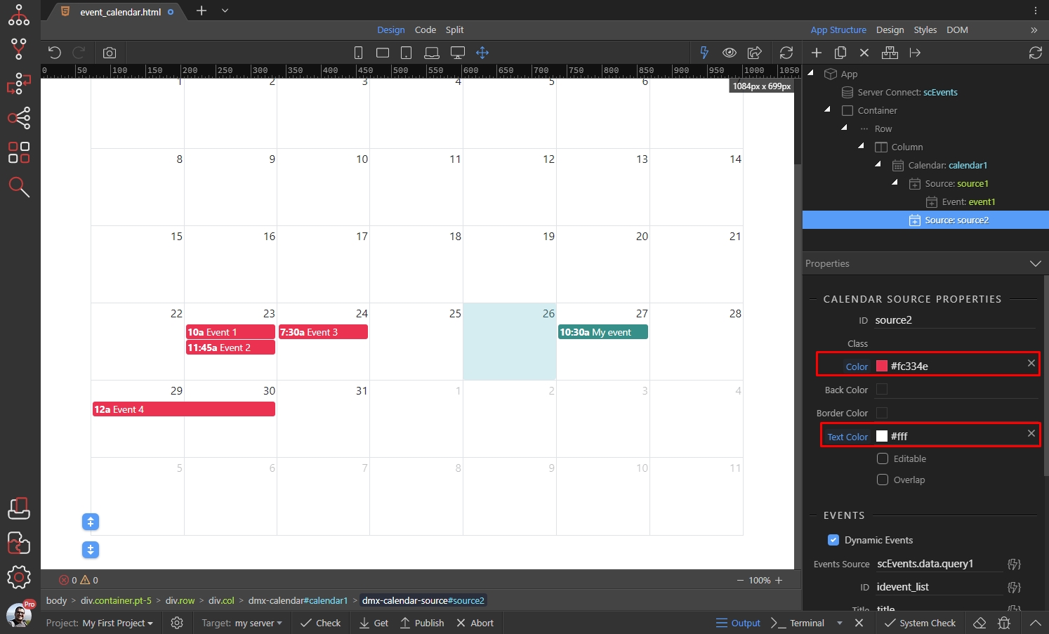
Our dynamic events are now displayed in the calendar and they are nicely styled. You can have as many Sources with dynamic events as you need.
Selectable Dates and Editable Events
Section titled “Selectable Dates and Editable Events”The Event Calendar includes advanced options like highlight multiple days or time slots by clicking and dragging and editing events - by dragging and resizing them.
Selectable Dates
Section titled “Selectable Dates”You can enable selectable dates in the Calendar Options. This will allow users to select multiple dates by click and drag over the dates. You can use the selected range with dynamic events - to set values, filter some data source, show notification etc.
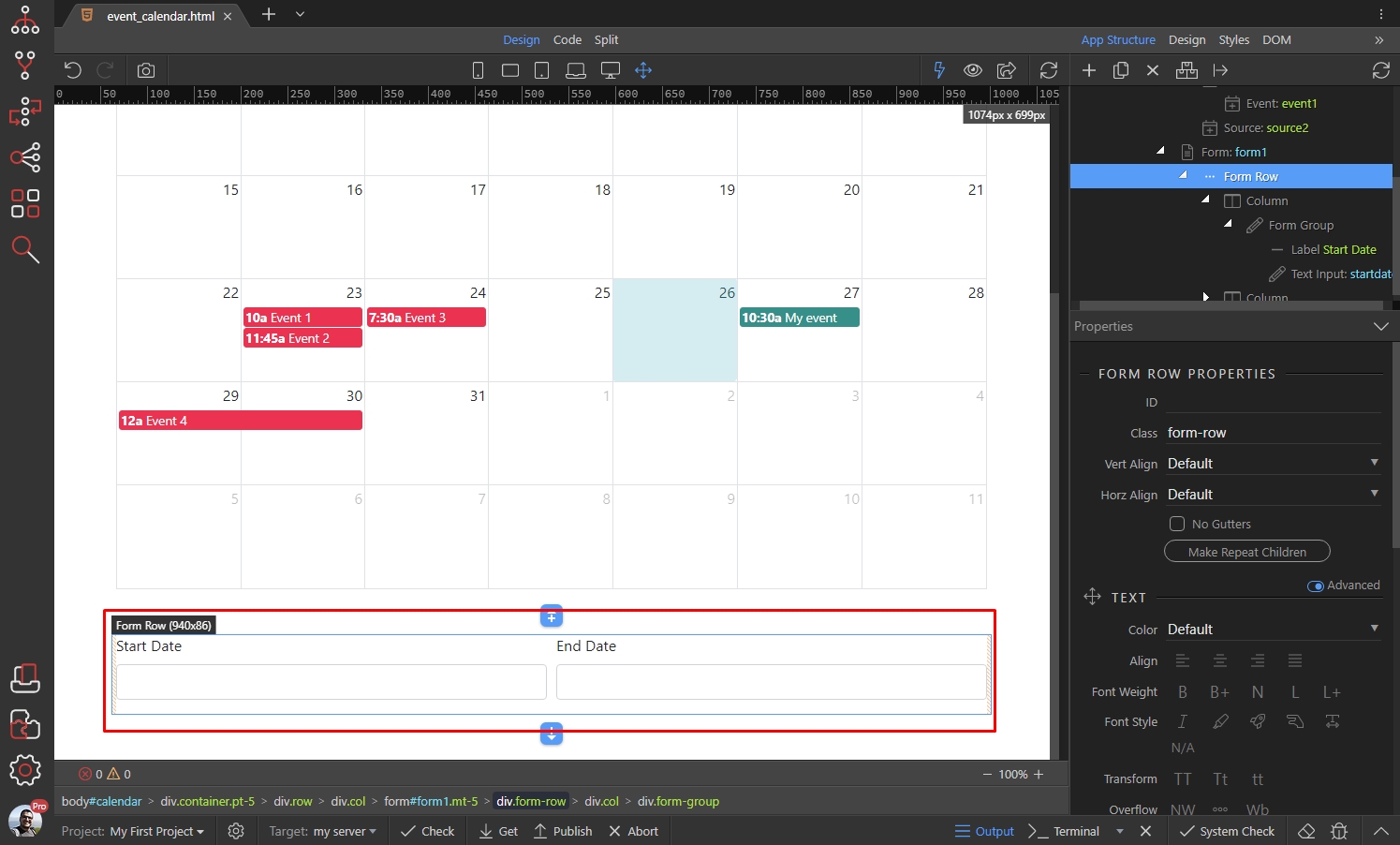
In our example we will show you how to set the selected start and end dates in form inputs. So we added 2 form inputs below the calendar. We will store the start and end dates of the selected date range in them:
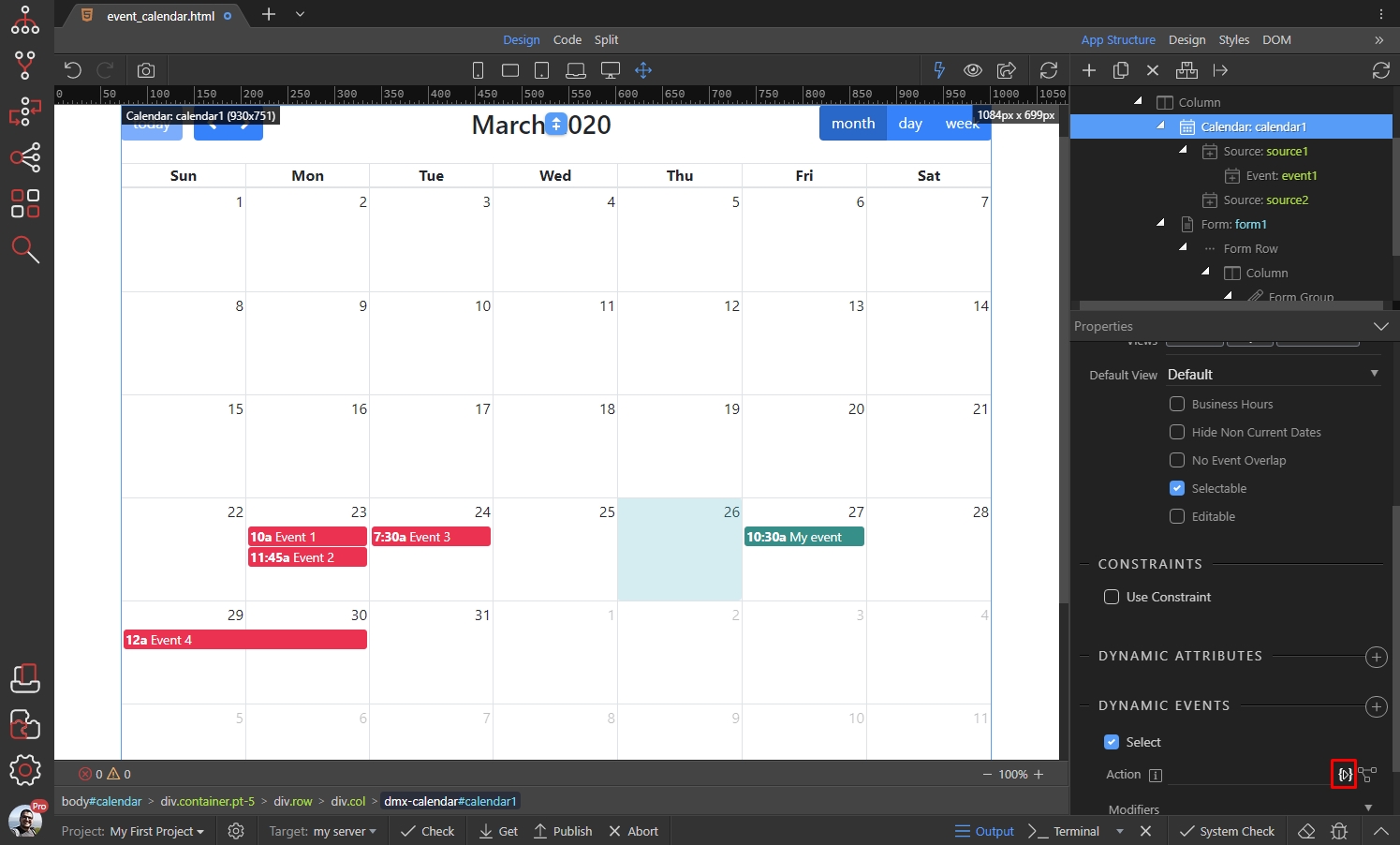
In order to allow selecting dates select the Calendar, and enable the Selectable option:

Then add new dynamic event:

Select Calendar > Select:

And click the dynamic action picker button:
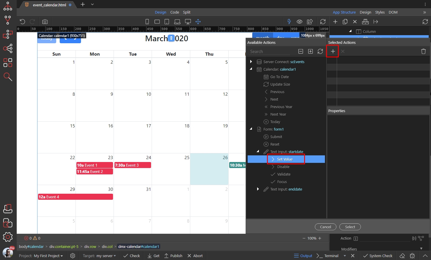
Select Set Value under the start date input and click the add button:
Click the dynamic data picker, to select what value to set to it:
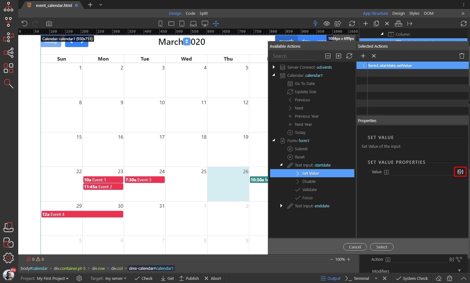
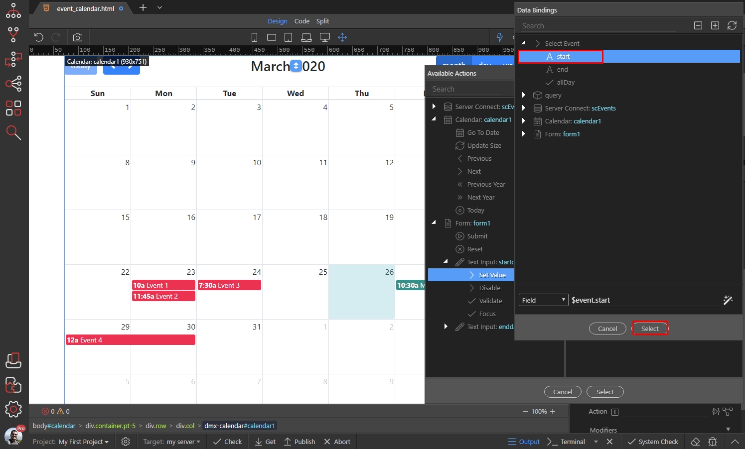
This is the start date, returned by the Select Event:
Then we select Set Value under the end date input and click the add button:

We do the same here, but select the end date returned by the Click Event:
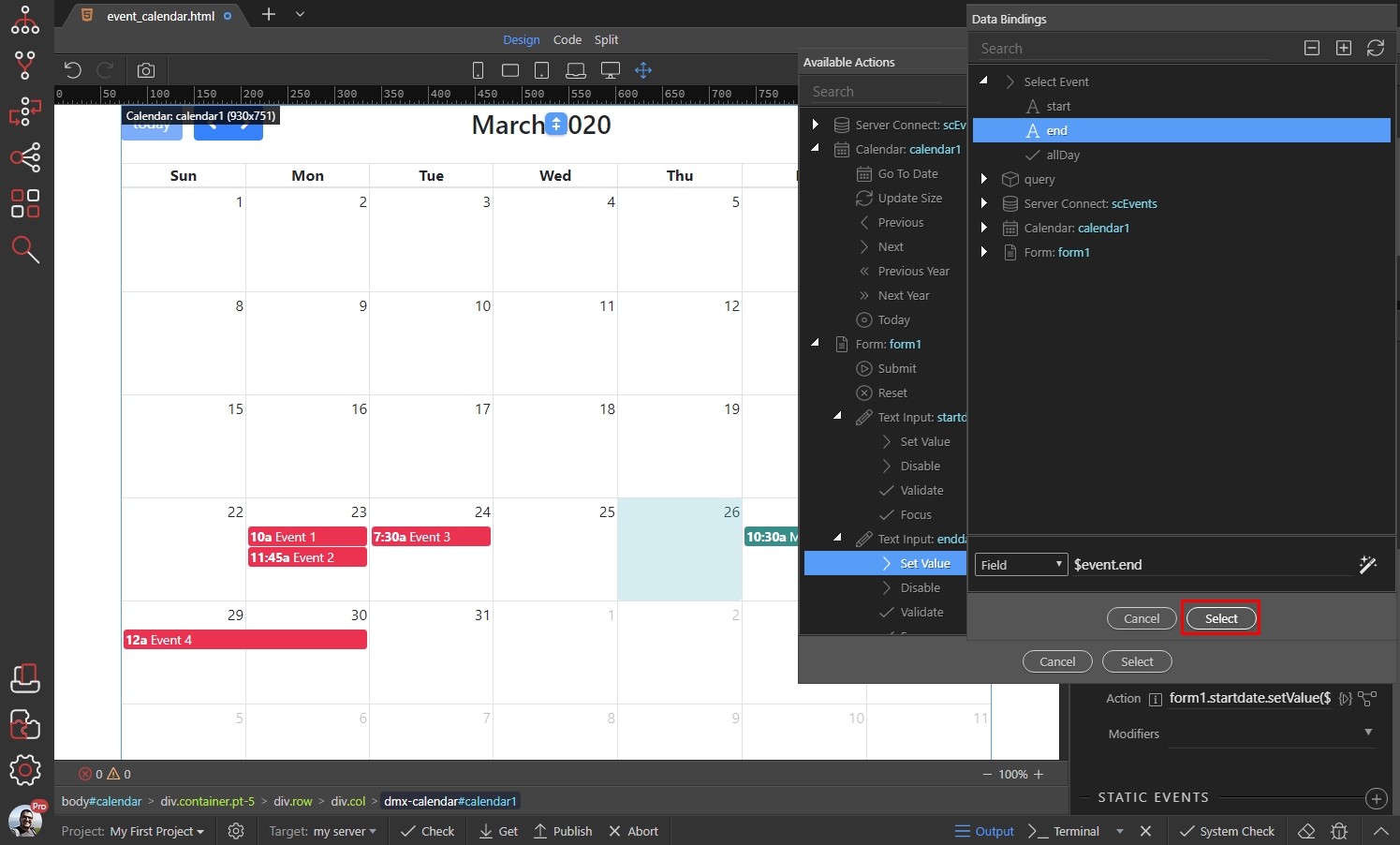
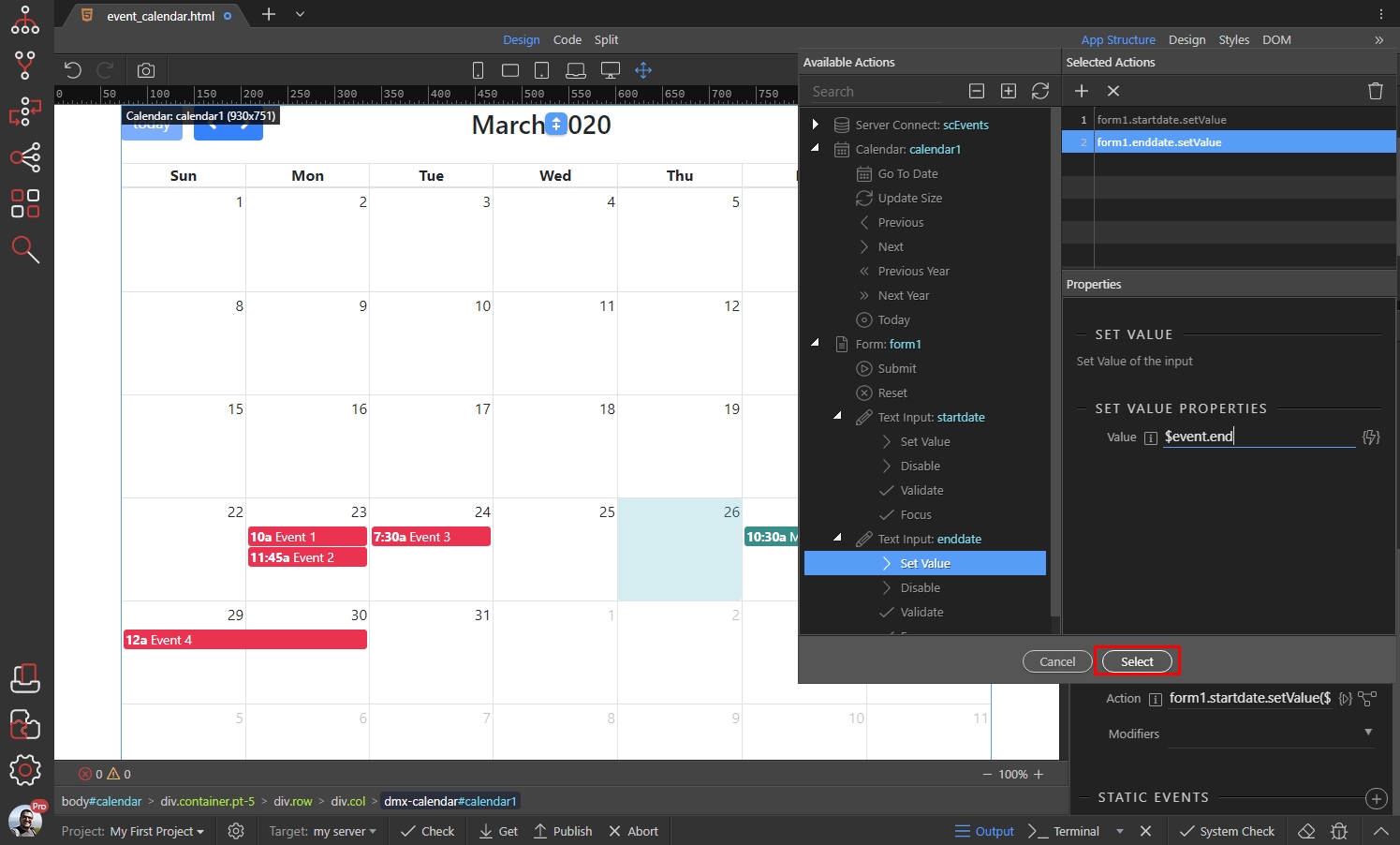
Click select when you are done:
Save your page. And here are the results:
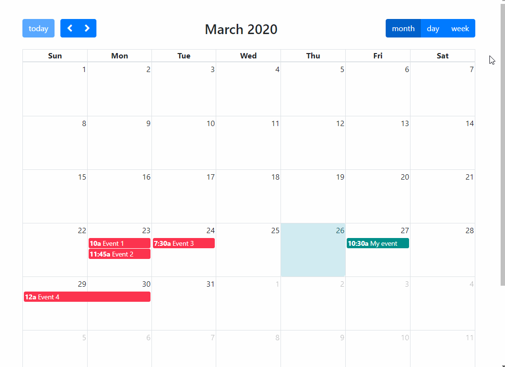
The selected start and end dates are set as values into the inputs.
Editable Events
Section titled “Editable Events”You can make your events editable allowing your users to drag and resize them in the Calendar. You can use the data returned by the drag/resize events to update data in your database, using an update record action.
There are several options to make your events editable:
Make all the events in the calendar editable
Section titled “Make all the events in the calendar editable”In order to make all the events in the calendar editable, select the Calendar and enable the Editable option:

Make all the events in a source editable
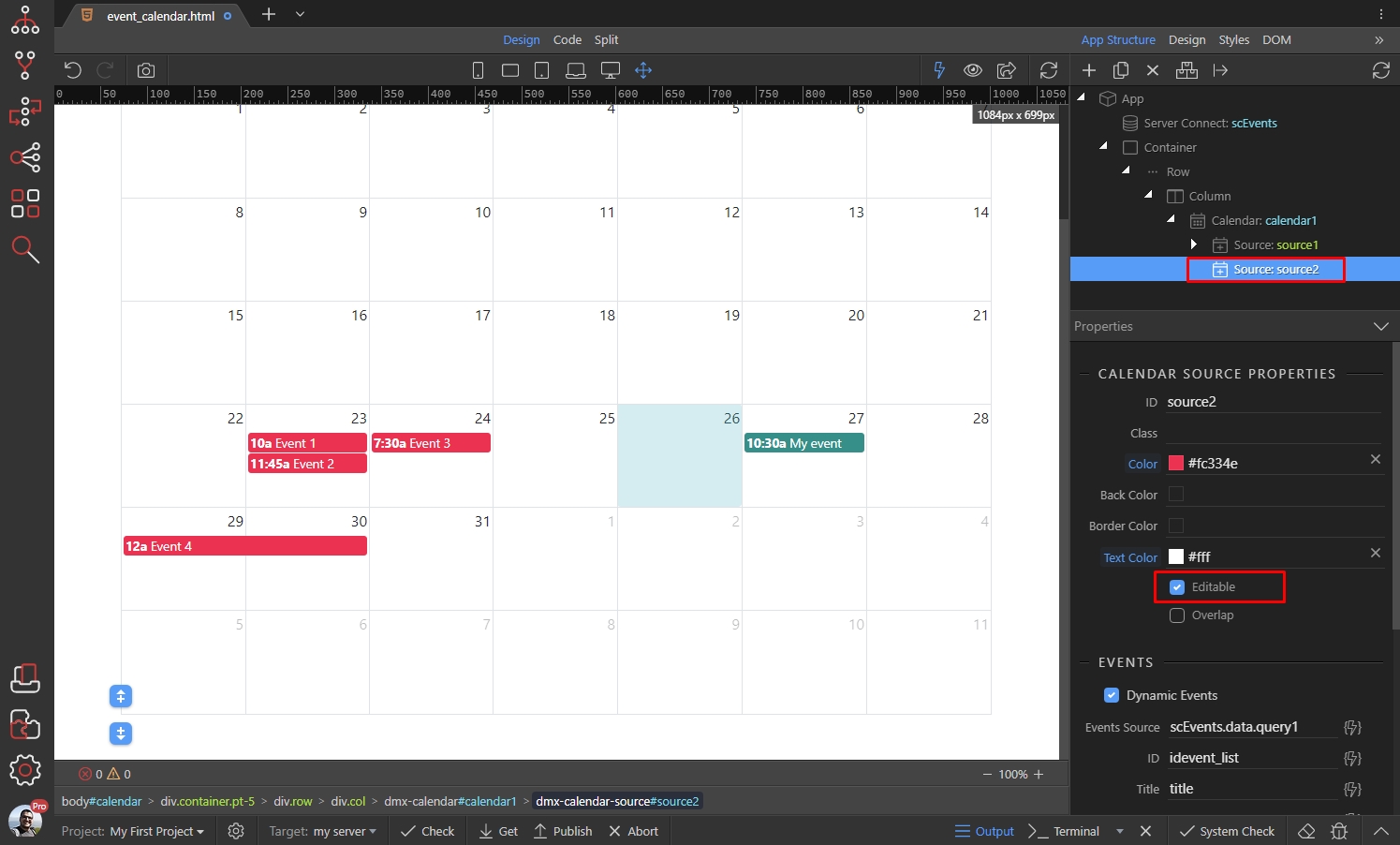
Section titled “Make all the events in a source editable”In order to make all the events in a source editable, select the Source and enable the Editable option:
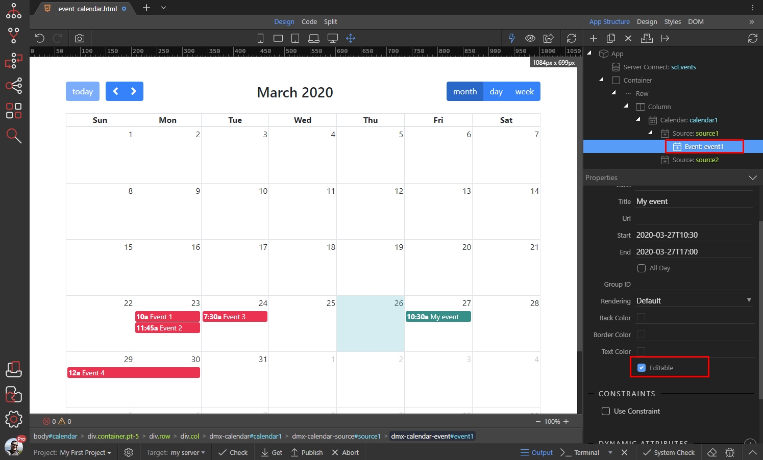
Make a single event editable
Section titled “Make a single event editable”In order to make a single event in your calendar editable, select the Event and enable the Editable option:
You can access the edited event ID, the new start and end dates and other data, using the Event Move/Drop and the Event Resize Dynamic Events: