Styling Bootstrap 4 Buttons
Sometimes the available Bootstrap 4 button styles may not suit your page design, so you need to customize them. That can easily be done using the Design panel i
Sometimes the available Bootstrap 4 button styles may not suit your page design, so you need to customize them. That can easily be done using the Design panel in Wappler.
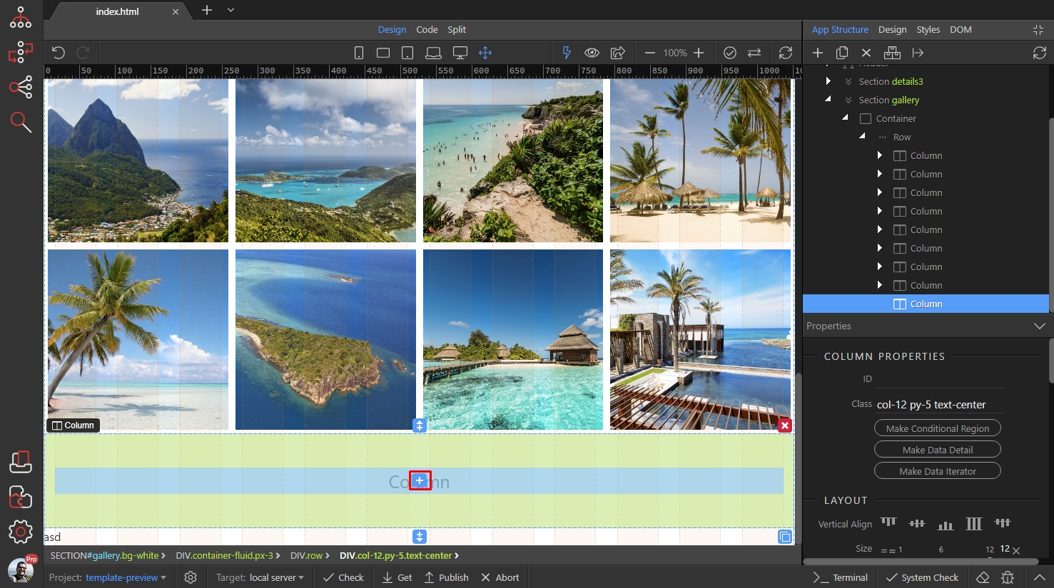
We created our page layout and we need to add a button. Click the Insert icon on your page:
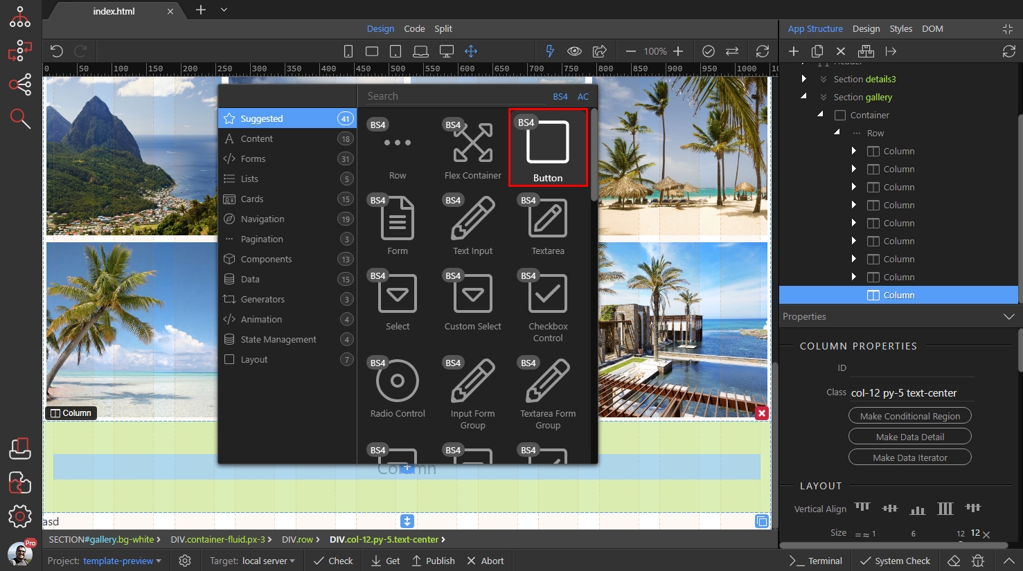
Select Button:
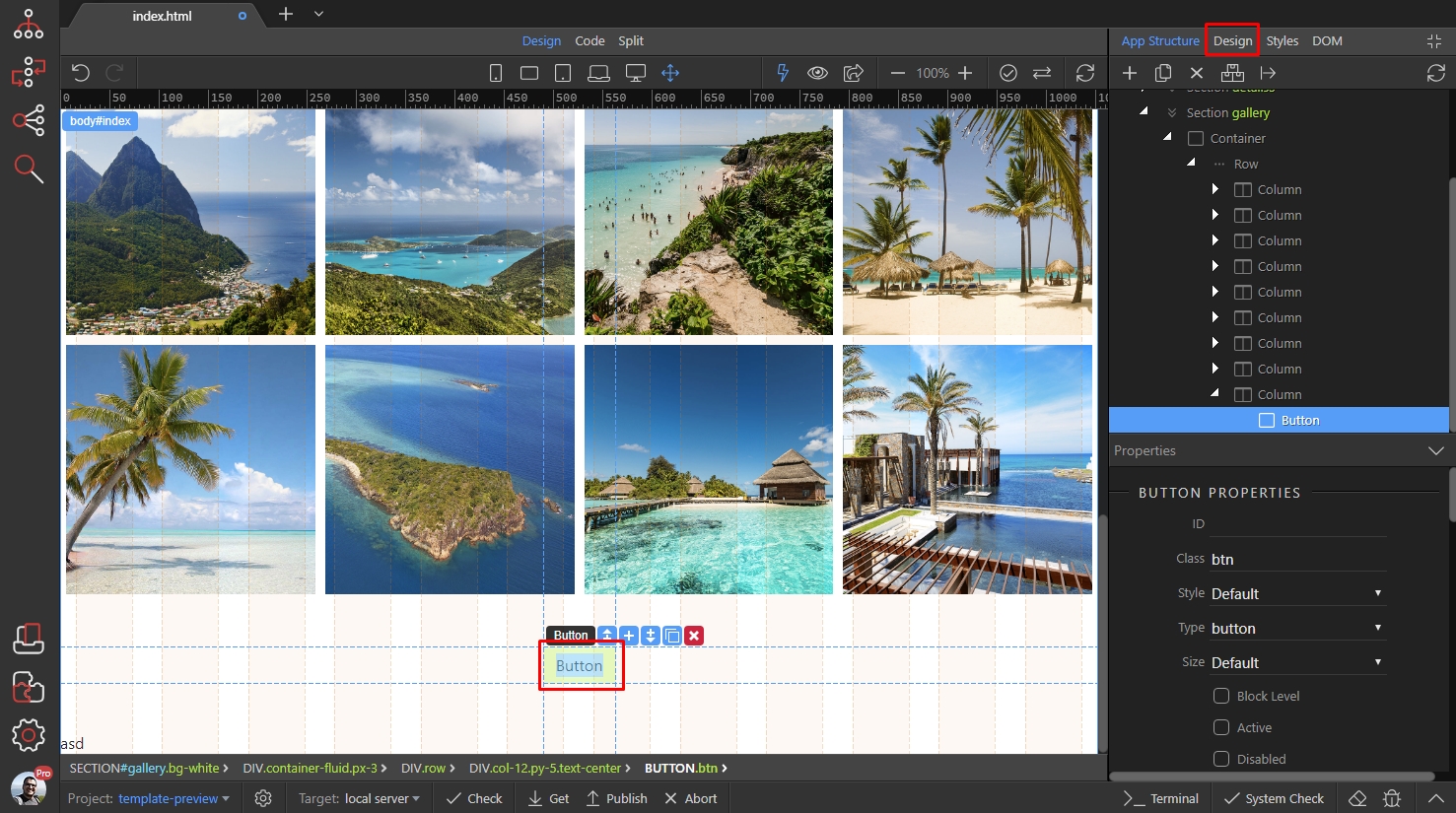
We leave the button style to ‘Default’ and switch to Design Panel:
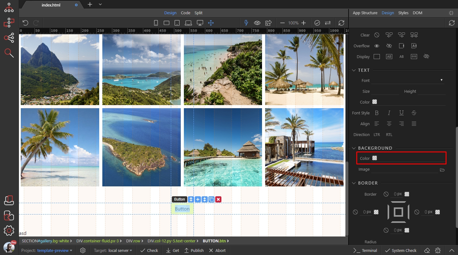
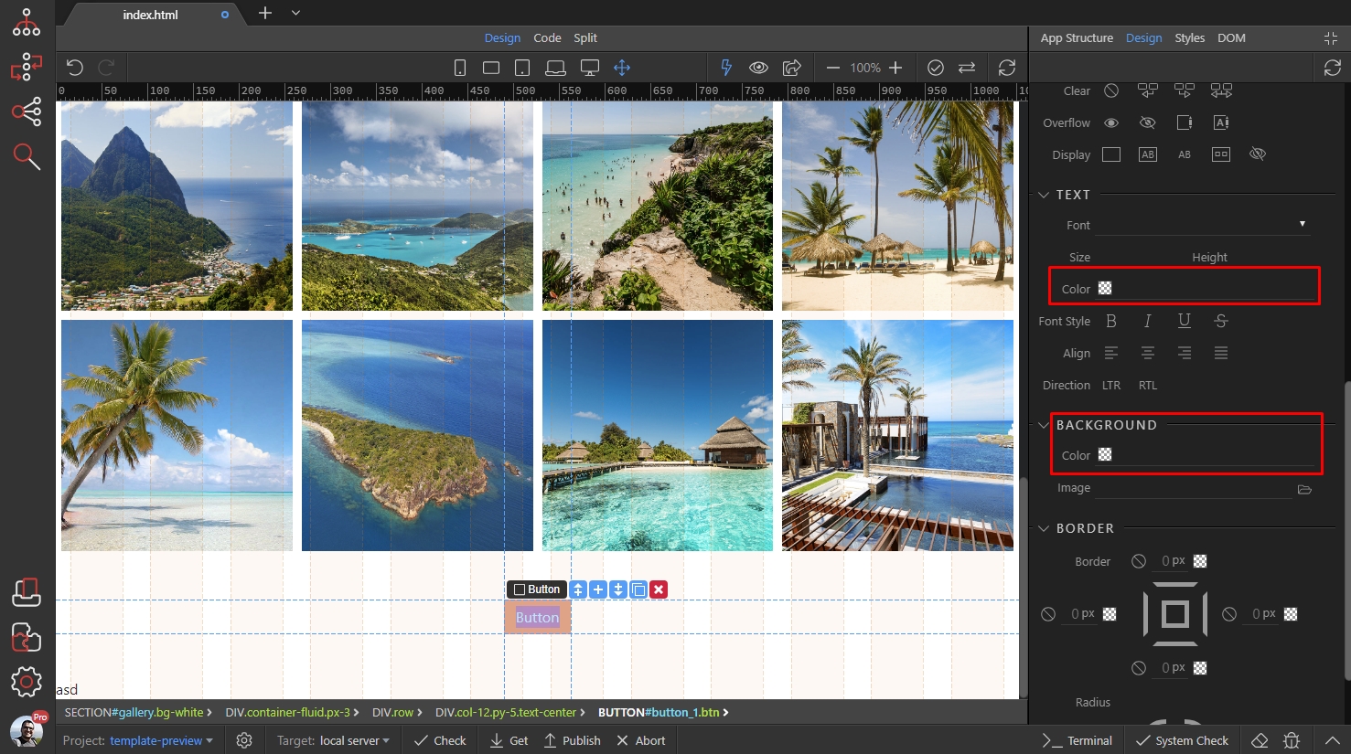
We want to change the background color, color and border radius of the button.
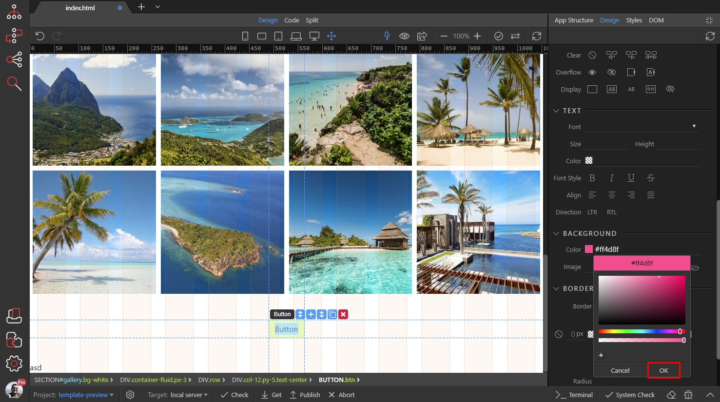
First, scroll down the Design Panel to the Background section. Click the color picker to select a background color:
We select a nice pink color for the background:
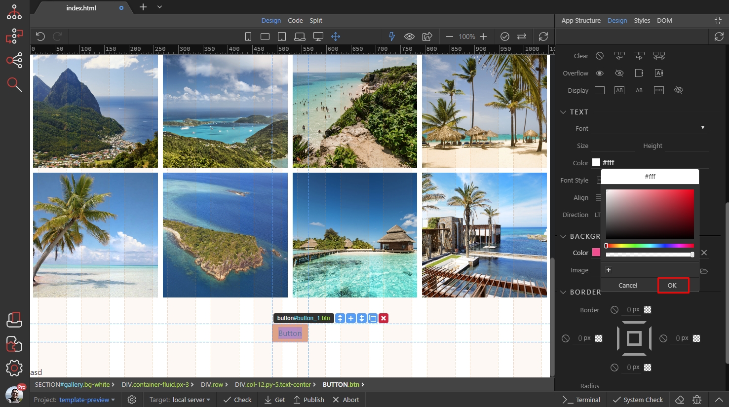
Then let’s select the button text color:

We set this it to white:
Then scroll down to the border radius tools:

Drag the inner handle, as it controls all the borders radius values simultaneously. We drag it to 0px:

We have our button styles set up, now let’s customize the styles for when we hover it. Scroll up and at the top of Design Panel select the hover state:
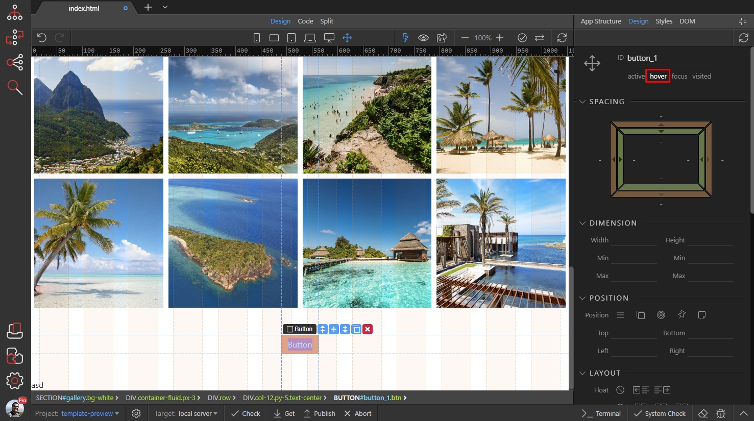
Now we are designing for when the button is hovered. We want to change the text color and background color:
Select the colors you want to use on hover and save your page:

Here’s the result - the default style of this button has been changed to our own style: