Using the Design Panel
Design panel provides you with visual tools to style your page content. You can design for different screen sizes, which creates the required styles and media q
Auth layouts and login pages
Section titled “Auth layouts and login pages”Use Demo Projects HQ to see why login pages use a different layout from the main app shell.
Auth pages often need a different shell
Section titled “Auth pages often need a different shell”Login-style pages usually need a tighter frame than the main app. Demo Projects HQ shows that split clearly with a dedicated auth layout and a separate routed login page.
Start by comparing shells and pages
Section titled “Start by comparing shells and pages”This topic only makes sense if you separate the shell from the routed page itself. Pages Manager gives you both views in one place: layouts in their folder, then the actual login page at the Pages root.

The layouts folder exposes auth shells
Section titled “The layouts folder exposes auth shells”Start in layouts so you can inspect the dedicated auth shell before jumping into the login page that uses it. This makes the relationship between wrapper and destination explicit.

auth.ejs keeps access pages focused
Section titled “auth.ejs keeps access pages focused”auth.ejs is the reusable shell for access-related pages. Its job is to provide just enough framing for login and similar screens without carrying the whole signed-in application experience.

Return to the Pages root
Section titled “Return to the Pages root”After inspecting the shell, go back to the real Pages root so the login destination page becomes visible. That shift is the core mental model: shell first, destination second.

login.ejs is the routed destination
Section titled “login.ejs is the routed destination”login.ejs is the actual routed page users visit. It owns the login form and action wiring, while the auth layout supplies the wrapper around it.

Handoff into login.ejs
Section titled “Handoff into login.ejs”Opening login.ejs is the right handoff into the login walkthrough. From there, the form wiring, submit action, and shared security provider all become visible in context.

Conclusion
Section titled “Conclusion”The maintainable auth pattern is a dedicated shell plus a dedicated login destination page. That keeps access flows focused while still making the login form and security wiring easy to inspect in the editor.
Pages Recipes
Section titled “Pages Recipes”Task-focused Pages recipes: choose the right page surface, move into editing, and hand off cleanly into layout building.
Pages Recipes
Section titled “Pages Recipes”Use these recipes when the job is to organize the page, move into editing, and choose the right next family once the page exists.
Choose Pages Manager First
Section titled “Choose Pages Manager First”Start with Pages Manager when the task is about finding, creating, or organizing the page itself. That keeps navigation and file choice clear before editing begins.
Move to HTML Editor
Section titled “Move to HTML Editor”Once the page is chosen, move into the HTML Editor for actual building work. This is the main handoff that makes the Pages family understandable for beginners.
Choose the Next Family
Section titled “Choose the Next Family”After the page is open, use the next family that matches the work: Bootstrap for layout, HTML Editor deep dives for editor behavior, or App Connect for dynamic page behavior.
Next steps
Section titled “Next steps”Return to the Pages tours menu to continue with quick orientation, workflow guidance, or reference.
Layout pages and shared shells
Section titled “Layout pages and shared shells”Use Demo Projects HQ to understand layout pages, shared shells, and the content slot that routed pages fill.
Layout pages hold the shared frame
Section titled “Layout pages hold the shared frame”In Demo Projects HQ, layout pages are the reusable shell above individual screens. They carry the persistent frame, then leave a content slot for the routed page that belongs inside it.
Start from the Pages tree
Section titled “Start from the Pages tree”Pages Manager separates structure from editing. The tree on the left decides which folder you are reading, so it is the fastest way to understand whether you are looking at shared layouts or regular routed pages.
Anchor yourself in the Pages root
Section titled “Anchor yourself in the Pages root”Start from the real Pages (views) root so the story begins at the top of the project page structure. From there, the layouts folder reads as a special-purpose branch instead of just another random directory.

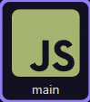
The layouts folder reveals shared shells
Section titled “The layouts folder reveals shared shells”The layouts folder is where Demo Projects HQ keeps the reusable shells. Selecting it filters the template list so you can compare the shared frame files directly.

main.ejs is the authenticated app shell
Section titled “main.ejs is the authenticated app shell”main.ejs is the broad application frame. It is the layout that carries navigation and the shared structure for the main signed-in experience, then leaves the page body to the routed content file.

auth.ejs is the focused access shell
Section titled “auth.ejs is the focused access shell”auth.ejs exists because not every route should inherit the full application frame. Login-style screens usually need a smaller, quieter wrapper so the user can complete a focused access task first.

Handoff into main.ejs
Section titled “Handoff into main.ejs”Opening the real main.ejs layout is the practical handoff from page organization into editing. That next view lets you inspect the shared shell and the dmx-view content slot that routed pages fill.
Conclusion
Section titled “Conclusion”Layouts make more sense when you treat them as reusable shells, not destination pages. From here, opening the real layout in the HTML Editor is the right next step because that is where the shared structure and content slot become visible.
Pages: Quick Overview
Section titled “Pages: Quick Overview”Get a quick overview of Pages: where page management ends, where editing begins, and how the family fits together.
Pages Overview
Section titled “Pages Overview”Pages is where a project starts turning into visible screens. The key mental model is simple: manage pages in Pages Manager, then build inside the HTML Editor.
Manager Versus Editor
Section titled “Manager Versus Editor”The Pages family becomes easier to grasp when you separate two jobs: management and editing. One surface helps you find pages; the other helps you shape them.
Family Follow-Up
Section titled “Family Follow-Up”This family is also a handoff path. After pages are open, the next useful questions are about editing, layout, styling, and dynamic data.
Conclusion
Section titled “Conclusion”The beginner takeaway is simple: Pages is the bridge from project setup into real screen-building. Learn the handoff from Pages Manager to HTML Editor first, and the rest gets easier.
Pages Reference
Section titled “Pages Reference”Reference tour for Pages: Pages Manager UI, the HTML Editor entry points, and how page-building flows connect to layout and design tools.
Introduction
Section titled “Introduction”Treat this reference tour as a quick orientation to the Pages area rather than a list of labels to memorize. It shows where page-related actions live, how the area fits into everyday editing, and what to revisit later when you need to add, organize, or inspect project pages.
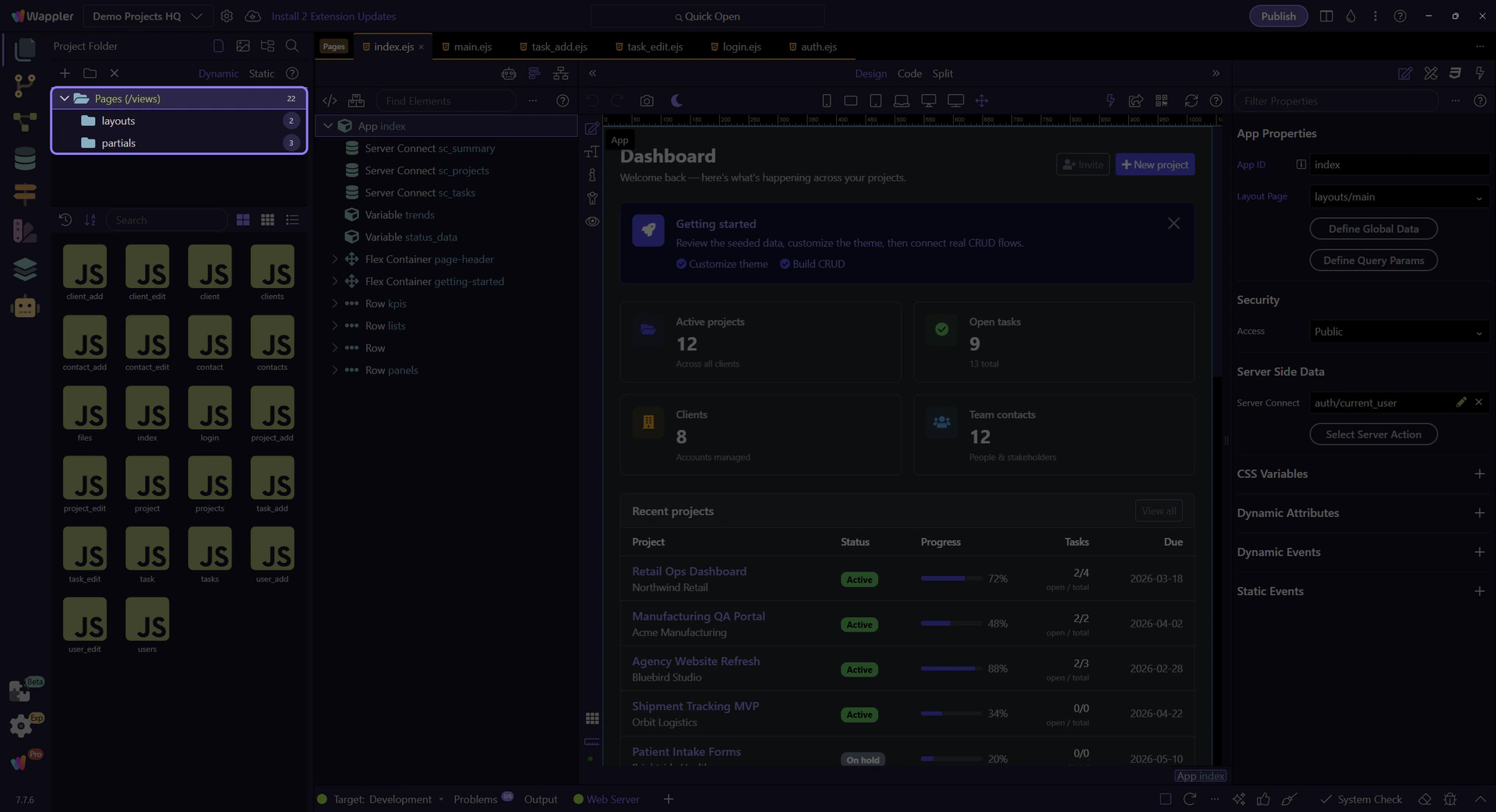
Pages Manager Role
Section titled “Pages Manager Role”Pages Manager is the real reference point for page selection, page creation, and page organization. In Demo Projects HQ, it shows the live folder tree and page listing that determine which page or layout you are actually about to open.
Pages tree reference
Section titled “Pages tree reference”Keep the full Pages tree in view first. The next steps stay inside this live Pages Manager surface while the tour selects the real Pages root, moves into the layouts folder, and then points at a real layout tile from Demo Projects HQ.
Pages root selection
Section titled “Pages root selection”This step selects the real Pages (views) root node so the rest of the reference tour stays grounded in the actual Demo Projects HQ page structure.

Real layouts folder selection
Section titled “Real layouts folder selection”This step selects the real layouts folder so the reference tour can discuss folder-level actions from the actual Demo Projects HQ tree node.

Real layouts folder context
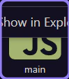
Section titled “Real layouts folder context”This step opens the real context menu on the already-selected layouts folder. That makes page-management actions concrete: folder operations such as Rename, Delete, Upload, and Show in Explorer are attached to the actual tree node you selected.

HTML Editor Role
Section titled “HTML Editor Role”The HTML Editor is the real destination for actual page editing. This step points at the live main.ejs layout tile from Demo Projects HQ, which is the handoff point from page management into layout and structure work.
Follow-Up Families
Section titled “Follow-Up Families”Bootstrap and App Connect are common next families because page building often moves from structure into styling and then into dynamic behavior.
Next steps
Section titled “Next steps”Continue with the Pages hub for guided entry points, or move into Pages Manager, HTML Editor, Bootstrap, or App Connect for deeper detail.
Route-aware content pages
Section titled “Route-aware content pages”Use Demo Projects HQ page tiles to see the list, detail, and form pages that routing targets.
Content pages are the routed destinations
Section titled “Content pages are the routed destinations”Once a layout is chosen, the routed content page becomes the screen-specific destination. Demo Projects HQ makes that easy to read because its list, detail, and form pages are all visible as real page tiles.
Use the tree to separate page roles
Section titled “Use the tree to separate page roles”The Pages tree is the quickest way to tell whether you are looking at shared layouts or the actual routed screens users visit. For route-aware work, the interesting files live at the Pages root rather than inside layouts.

The Pages root exposes routed screens
Section titled “The Pages root exposes routed screens”Selecting the real Pages root exposes the content page tiles that map to meaningful routes in Demo Projects HQ. That makes the list, detail, and form patterns visible as concrete files instead of documentation vocabulary.

projects.ejs is the collection page
Section titled “projects.ejs is the collection page”projects.ejs is the list-style destination. This is the page pattern you open when a route needs to summarize many records and give the user a starting point for navigation.

project.ejs is the detail page
Section titled “project.ejs is the detail page”project.ejs is the detail-style destination. It exists for a route that identifies one specific record, which is why detail pages usually depend on route parameters or record context.
project_add.ejs is the task page
Section titled “project_add.ejs is the task page”project_add.ejs is the task-oriented page pattern. It turns navigation into a concrete user job like adding a record, which is why form pages deserve their own route instead of being hidden inside a list screen.
Conclusion
Section titled “Conclusion”After the page roles are clear, the next question is how URLs choose between them. That is the routing layer’s job.
General Usage
Section titled “General Usage”Typical Pages path: organize pages, open the right file, and continue building in the HTML Editor.
Introduction
Section titled “Introduction”A typical Pages path is straightforward: choose the right page, open it, then keep working in the editor that matches the job instead of treating every page task as the same kind of work.
Start with Page Management
Section titled “Start with Page Management”Use Pages Manager to stay oriented in the project and pick the correct file. In Demo Projects HQ, that starts with the live tree and page list so you can see exactly which folder and tile you are about to work from.
Pages root selection
Section titled “Pages root selection”This step selects the real Pages (views) root node so the tour starts from the actual Demo Projects HQ page structure instead of a generic description.

layouts folder selection
Section titled “layouts folder selection”This step selects the real layouts folder so the page list on the right reflects a concrete folder choice. That is the practical Pages habit: choose the correct folder first, then choose the actual page or layout item from its listing.

Move into Editing
Section titled “Move into Editing”Once the right folder is selected, the next move is to open the actual page or layout tile you want. This step points at the live main.ejs layout tile from Demo Projects HQ and uses it as the concrete handoff into the HTML Editor.
Continue into Specialized Topics
Section titled “Continue into Specialized Topics”After the page is open, the next decision depends on the job: layout and components, styling, or dynamic data binding. That is why Pages is a bridge family, not the final end point for every lesson.
Workflow Finish
Section titled “Workflow Finish”The practical Pages habit is to separate finding a page from building a page. That keeps the workflow easy to understand and makes the rest of the manual feel more logical.