Lazy Load Images
Use lazy loading, placeholders, and responsive image sources so media-heavy pages stay fast while still looking polished.
Introduction
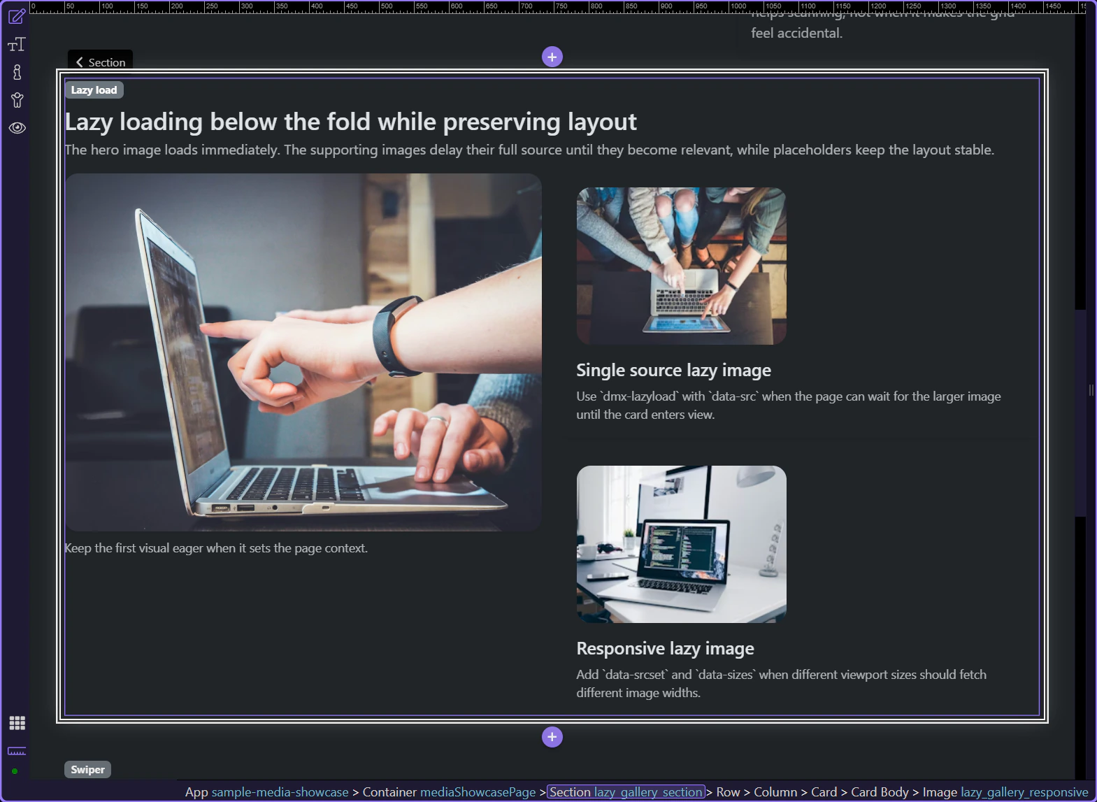
The preview below shows the finished result first: the main image loads immediately, supporting images wait until they are needed, and the section keeps its shape while the larger files arrive.
Not every image should be lazy loaded
This hero image sets the first impression of the section, so it should stay eager. That is the practical rule in Wappler as well: do not turn on Lazy Load for the first image that defines the page context just because the option exists.
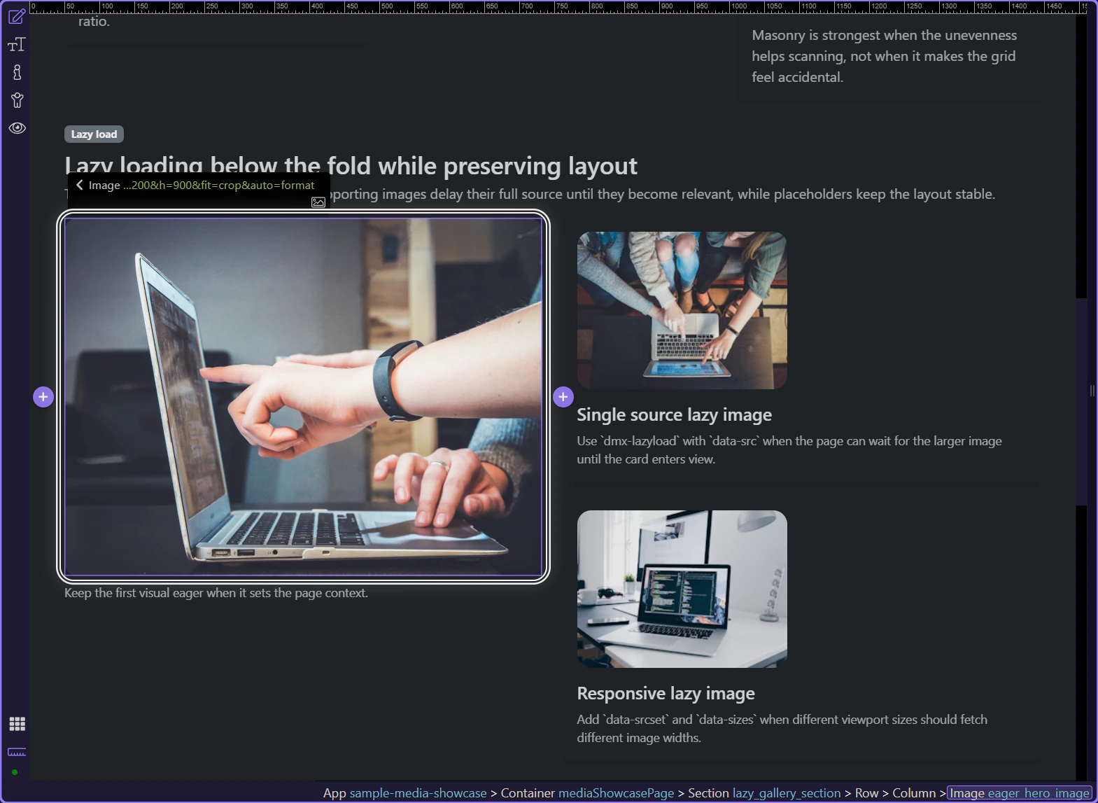
A supporting image that can load later
This step selects one of the supporting images in Design View. It is a good lazy-load candidate because the page still reads correctly before this image appears, so visitors do not need to download it immediately.
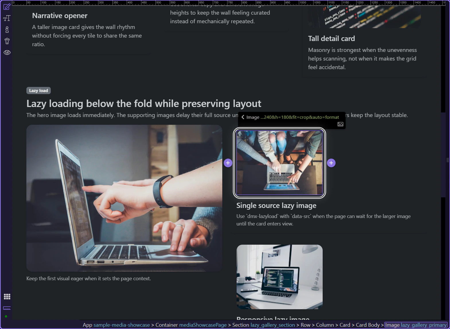
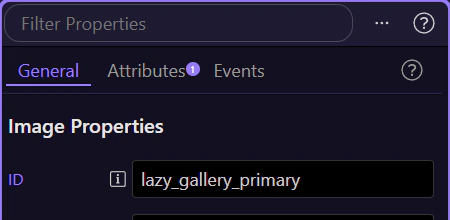
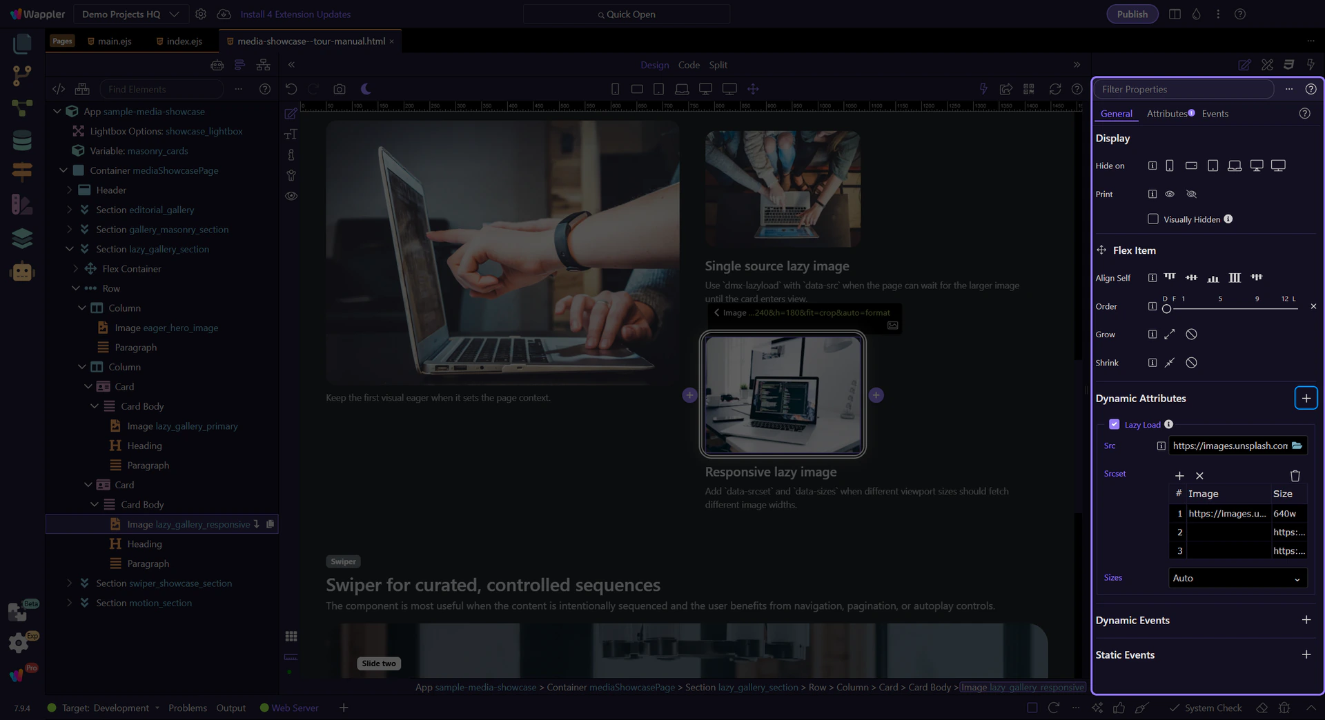
Use the Properties panel for the selected image
Keep the image selected and look at the Properties panel on the right. This panel shows the image settings, and it is where you add lazy loading to the image you already selected.
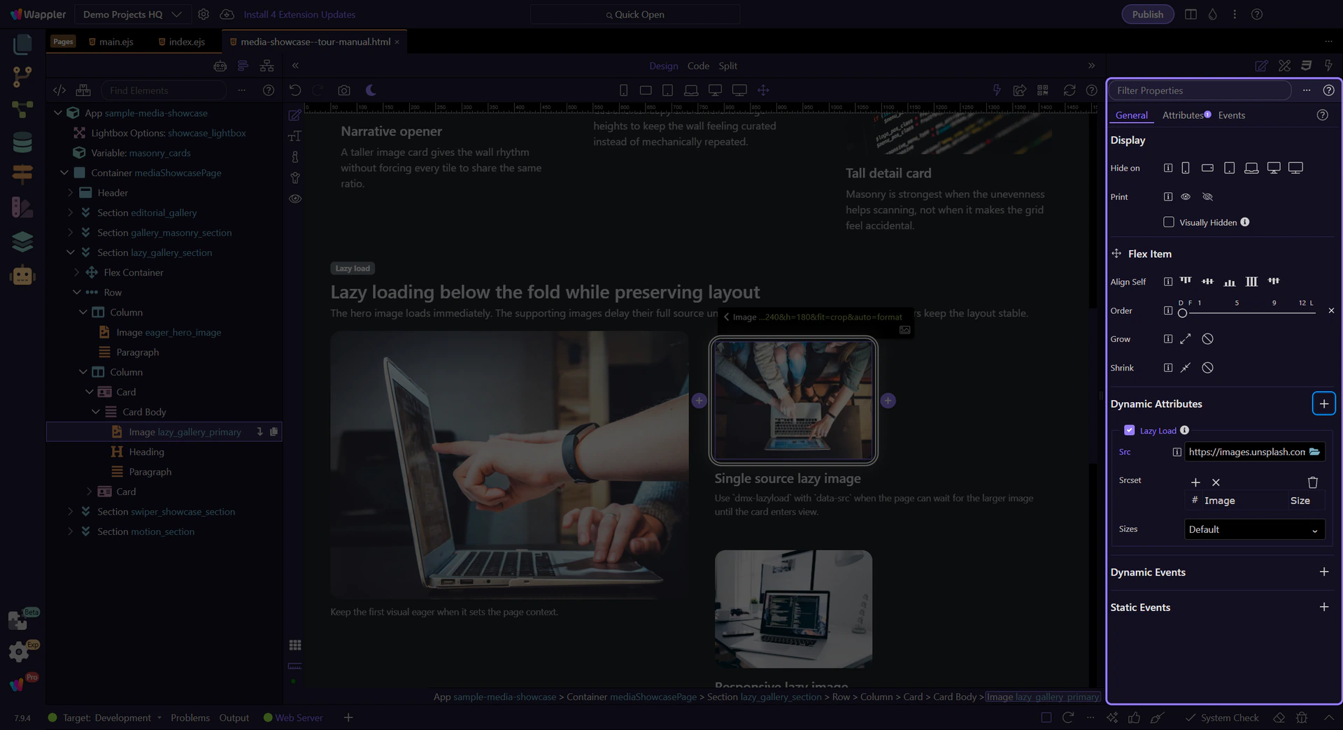
Add Lazy Load from Dynamic Attributes (+)
The Dynamic Attributes (+) menu in the Display section is where Lazy Load is added. Choosing it adds the lazy-load attribute to the selected image so the browser can wait to load that image until it is needed on screen.

Use a placeholder first, then the real source
After Lazy Load is enabled, the Dynamic Attributes section shows the lazy-load source fields. Keep a lightweight placeholder for the image itself, then put the full image in the lazy-load source here so visitors download the larger file only when this image scrolls into view.
Working in Wappler
Once the basic lazy-load setup is in place, the next decision is whether this image also needs responsive sources. Use them only when different screen widths benefit from different image sizes.
Add responsive sources only when they help
This second image uses the same Dynamic Attributes section, but here it also fills in Srcset and Sizes. That lets smaller screens download smaller files while larger screens can still receive a sharper image when the extra source variants are worth it.
The visual layout still has to work before the full image arrives
This section works because the placeholders already reserve the space and the surrounding cards still read clearly before the larger assets load. Lazy loading only improves the page when the layout stays calm and the user can still understand the section while the real images are pending.
Conclusion
You now know the main lazy-load decisions in Wappler: keep the first important image eager, lazy load supporting images, use a placeholder so the layout holds its space, and add responsive sources only when different screens need different file sizes.
Next media tours from here
From here, the next useful tour is Background Video if the same section also needs subtle motion. The media hub is the better next stop when you want to compare galleries, slideshows, and other image-heavy patterns.
